Specialist Pharmacy Software Comparison Website Template
Safeguard is a pharmacy safety management landing page template built around a high-impact comparison table layout. It targets pharmacy directors, hospital risk managers, and independent pharmacy owners who need to show, in hard numbers, why manual workflows and legacy systems fall dangerously short. The template pairs a Teal Catalyst color system with a Stats-First Impact structure to move visitors from doubt to action fast.
by Rocket studio
Quick summary
Safeguard is a single-page comparison template for pharmacy safety management platforms. It opens with a trust-building logo bar, drops a headline stat in oversized mint type, then walks visitors through a three-column comparison table, cost-per-event data, and case-study cards. Every section earns the next click before the primary call to action appears.
Who this template is for
This template is built for pharmacy safety software companies and compliance platforms that need to convert high-stakes buyers. The audience already knows the problem; they need to see proof that your solution is the clear choice.
- Pharmacy directors preparing for Food and Drug Administration (FDA) audit cycles who need to justify a platform switch
- Hospital risk managers tracking near-miss ratios across multiple dispensing stations
- Independent pharmacy owners currently running compliance off spreadsheets who are ready to upgrade
What problem this template solves
Manual safety workflows and disconnected legacy incident systems leave dangerous gaps. Pharmacy teams spend hundreds of hours on audit prep, miss drug interaction flags, and file incident reports too slowly to prevent harm. This template makes those gaps visible by letting the numbers speak first.
- Visitors arrive skeptical; the comparison table immediately quantifies the cost of doing nothing
- Gated content and a sticky call-to-action bar capture leads at the exact moment a visitor feels the urgency
- The layout removes the need to explain your product at length before earning contact information
What you get with this template
The template delivers a full single-page layout structured around proof, contrast, and momentum. Every section is designed to accelerate the decision rather than slow it down.
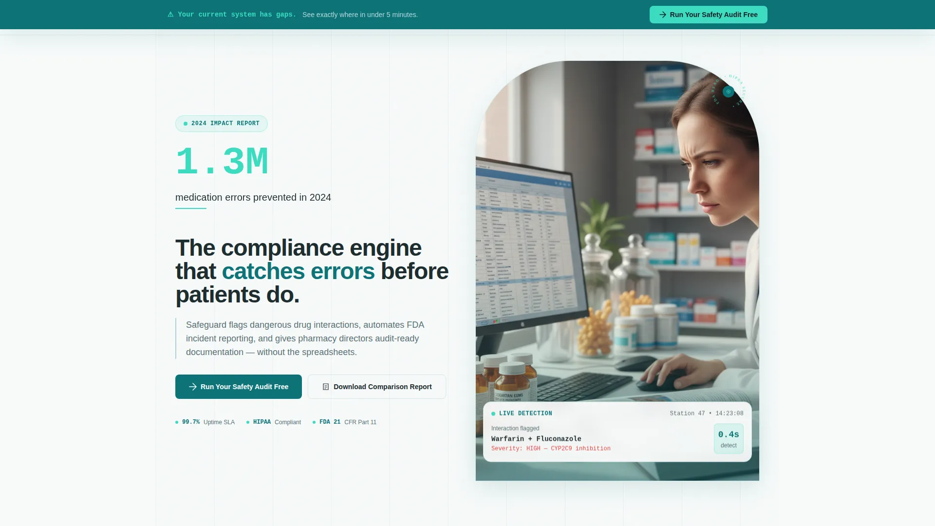
- A scrolling logo bar, an oversized impact stat, and a direct comparison subhead in the header block
- A three-column comparison table, a cost-per-event counter section, and three case-study cards with leading percentages
- A sticky call-to-action bar and a gated report download form with pharmacy-type segmentation
Feature list
This template is built around six purpose-driven layout components, each tied directly to the Comparison/Versus conversion path.
Scrolling Logo Bar Header
A horizontal ribbon of pharmacy and hospital system logos scrolls at a calm, institutional pace. Above it, a single oversized stat in activated mint type anchors immediate credibility. Below it, a tight subhead frames the comparison before the visitor scrolls a single pixel.
Three-Column Comparison Table
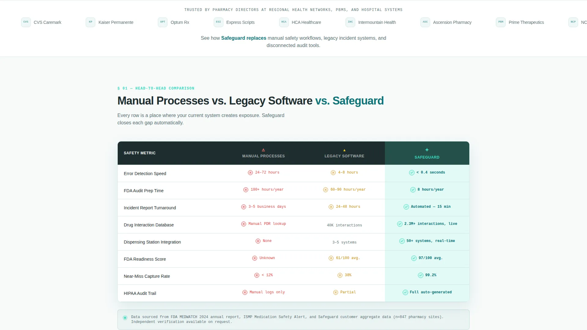
The core section pits Manual Processes against Legacy Software against the featured platform across five measurable rows: error detection speed, audit preparation hours, incident report turnaround, integration count, and FDA readiness score. The platform column uses mint cell backgrounds and bold checkmarks to make the winning column impossible to miss.
Cost-Per-Event Counter Section
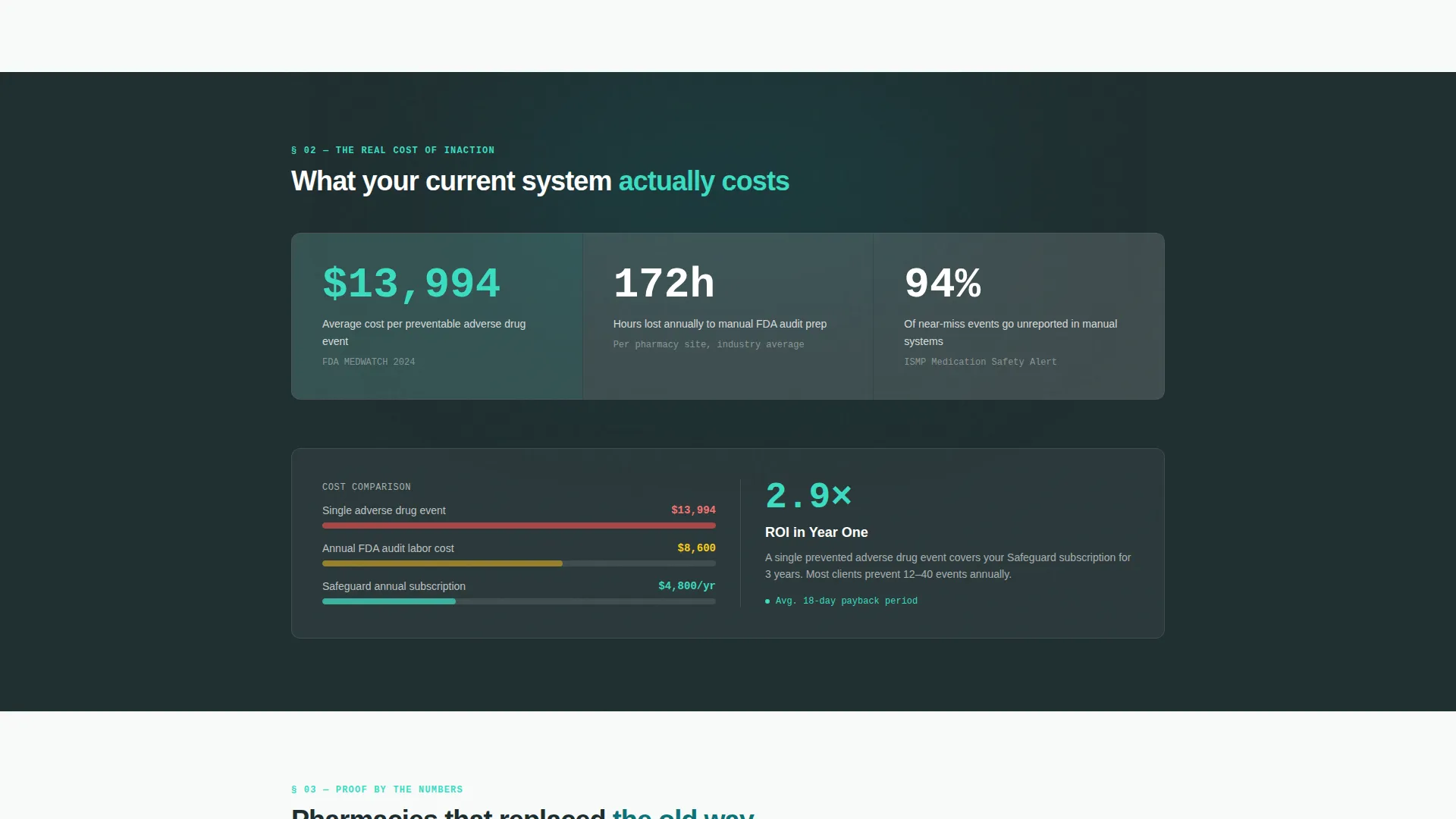
A dedicated section surfaces the average cost per preventable adverse drug event alongside the platform's annual subscription figure. The contrast is stark and immediate. No explanation is needed because the numbers make the case on their own.
Case Study Percentage Cards
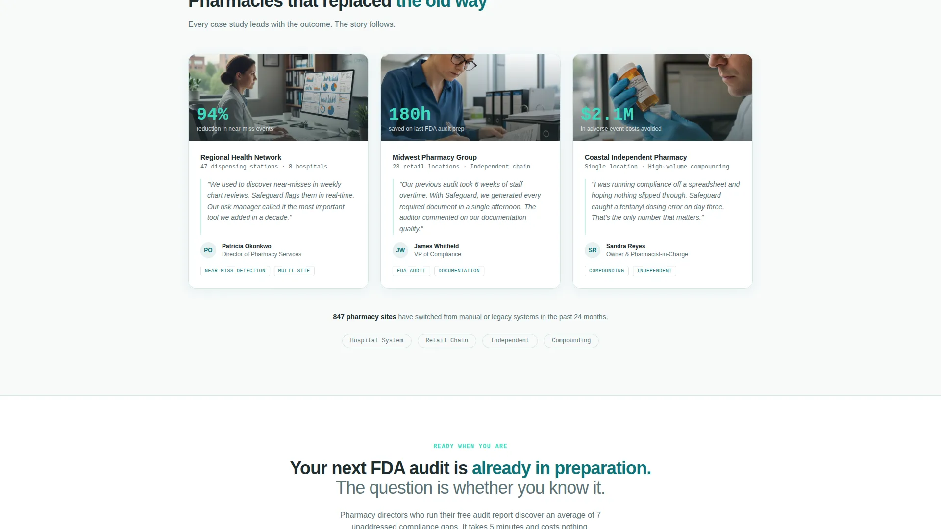
Three stacked cards each lead with a bold percentage, such as a 94 percent reduction in near-miss events, before naming the pharmacy system behind the result. The card-first format rewards skimmers and builds compounding proof as the visitor scrolls.
Sticky Call-to-Action Bar
A "Run Your Safety Audit Free" button pins to the screen after the visitor scrolls past the first comparison table. It stays present through every subsequent section without interrupting reading. The timing is intentional: urgency is built before the ask is made.
Gated Report Download Form
A secondary conversion path offers a downloadable comparison report behind a short form collecting email address and pharmacy type (hospital, retail chain, independent, or compounding). Segmenting by pharmacy type makes follow-up conversations more relevant from the first touchpoint.
Page sections overview
| Section | Purpose |
|---|---|
| Logo Bar Header | Establish trust with institutional social proof and a headline stat |
| Comparison Table | Contrast three workflow approaches across five performance rows |
| Cost Counter Section | Quantify the financial risk of inaction with a single stark number |
| Case Study Cards | Deliver percentage-led proof from real pharmacy system outcomes |
| Sticky call to action Bar | Keep the primary conversion action visible after first table scroll |
| Gated Report Form | Capture segmented leads via a downloadable comparison report |
Design & branding system
The Teal Catalyst color system gives the page the feel of a clinical environment: precise, focused, and unambiguous. The palette is purpose-built for a pharmacy safety context where visual clarity signals trustworthiness.
- Deep clinical teal (#0D7377) anchors headers, table column labels, and data rows for a grounded, authoritative base
- Activated mint (#3CDBC0) highlights hover states, the winning comparison column, and oversized impact stats to inject energy without breaking clinical tone
- Sterile white (#F7FAFA) fills table backgrounds and content areas, while alert charcoal (#1E2D2F) keeps body text sharp and readable throughout
Mobile & speed optimization
The Startup Velocity theme is designed to keep the layout clean and responsive as screen sizes change. A comparison table this data-dense needs careful handling on smaller screens, and the template accounts for that.
- The comparison table is structured to reflow gracefully, keeping the platform column prominent on narrower viewports
- The sticky call-to-action bar is sized and positioned to remain usable on mobile without covering critical content
- Section spacing and type scaling maintain the Stats-First Impact rhythm so mobile visitors still encounter a number before an explanation at each scroll point
How this template helps you convert
The Comparison/Versus conversion path works because it makes the visitor's current system look costly before asking for anything. The template follows a deliberate sequence that builds urgency step by step.
- The header stat and logo bar establish credibility in the first viewport, reducing early bounce before a visitor even reaches the table
- The comparison table and cost-per-event section reframe the buying decision as a risk calculation, not a software purchase, making the primary call to action feel like the safe choice
- The gated report form creates a second conversion lane for visitors who are not ready to start an audit but are willing to trade an email for a detailed comparison document
Other information about this template
This template is part of the Startup Velocity theme family and uses the Teal Catalyst color system as its visual foundation. It is designed specifically for the pharmacy safety management niche within the broader pharmacy software category.
- The template style is a Comparison Table layout, making it well suited for platforms that compete directly with manual processes or outdated legacy incident reporting tools
- The Stats-First Impact creative direction means the page structure prioritizes data visibility over narrative, which aligns with the decision-making style of pharmacy directors and hospital risk managers
- The Logo Bar header concept is pre-built to accommodate regional health networks, pharmacy benefit managers (PBMs), and state pharmacy boards as trust signals
- The lp_direction is Comparison/Versus, meaning the entire page architecture is optimized to contrast options and drive a single clear decision toward the featured platform
Theme
Startup Velocity
Creative direction
Stats-First Impact
Color system
Teal Catalyst
Style
Comparison Table
Direction
Comparison/Versus
Page Sections
Scrolling Logo Bar with Impact Stat
Three-column Comparison Table
Cost-per-event Counter Section
Percentage-led Case Study Cards
Sticky Conversion Bar
Segmented Gated Report Form
Related questions
Can I edit the comparison table rows to match my platform's actual metrics?
How does the gated report download form work?
What triggers the sticky call-to-action bar to appear?
Is this template suitable for an independent pharmacy, not just large hospital systems?
What color system does this template use?



