Fitness & Gym Software Professional Website Template
The Saferep Live Safety Command Dashboard Landing Page Template is a modular card-grid layout built for fitness and gym safety management platforms. It follows a Problem→Solution Arc with flip cards, a metrics band, a bento dashboard preview, and a freemium trial call to action. The Data Command visual theme uses deep slate, sky blue, and amber alert colors to create calm, operational authority.
by Rocket studio
Quick summary
This template gives gym safety platforms a focused, single-page conversion experience. It opens with a full-width product screenshot hero, walks visitors through escalating problem and solution card pairs, breaks the scroll with a proof metrics band, and drives toward a no-credit-card free trial signup. The tone is calm command authority, not promotional noise.
Who this template is for
This template is built for B2B software products in the fitness and gym safety management space. It works best when the product centralizes incident data, inspection records, and compliance reporting into one live view.
- Multi-site gym operators managing liability across five to fifty locations
- Boutique studio owners preparing for their first formal safety program
- Regional fitness directors currently tracking compliance across many shared spreadsheets
What problem this template solves
Gym safety platforms face a specific sales problem. Visitors understand the chaos they live in, but they need to feel it reflected on the page before they trust any solution. Generic feature lists do not create that moment of recognition.
- Manual incident tracking scattered across clipboards, group chats, and spreadsheets
- Missed equipment inspections that create real legal and liability threats
- No single view that lets a safety director begin their morning with confidence
What you get with this template
You get a fully structured, modular card-grid landing page designed to support a freemium or free-trial conversion goal. Every section has a defined visual and narrative role.
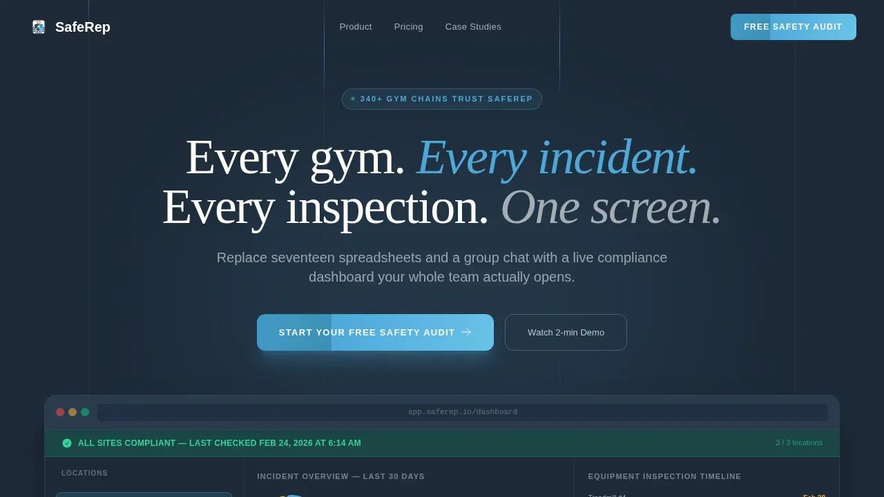
- A full-width hero with an embedded product screenshot and a primary call to action
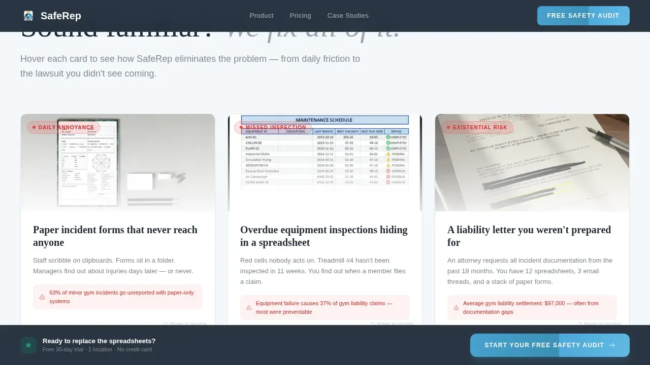
- Three flip-card problem and solution pairs that escalate from daily friction to existential risk
- A sticky bottom call-to-action bar that continues to drive signups as visitors scroll
Feature list
This template includes six core layout and interaction components, each designed to support a specific moment in the visitor journey.
Full-Width Product Screenshot Hero
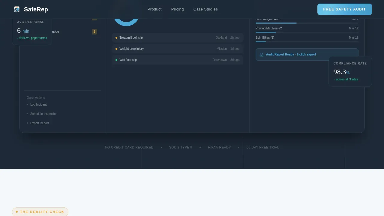
The header displays a high-fidelity dashboard mockup showing location lists, a donut chart of open versus resolved incidents, an equipment inspection timeline, and a green compliance banner. The product image does the selling before a single word of copy is read.
Problem-to-Solution Flip Cards
Three card pairs escalate the narrative from daily annoyance to existential threat. Each problem card shows a recognizable pain point. Its paired solution card flips or slides to reveal the feature that eliminates it. Visitors see their own chaos reflected, then resolved.
Metrics Proof Band
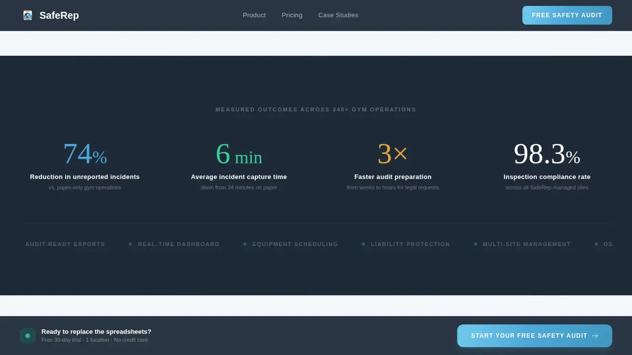
A full-width band breaks the card grid midway through the page. It displays four concrete proof numbers, including a 74 percent reduction in unreported incidents. This section adds shared social credibility before the visitor reaches pricing.
Asymmetric Bento Dashboard Grid
A bento-style grid shows individual product components in action. Each cell focuses on one data view, providing a second, closer look at the live safety command dashboard interface without requiring a product demo.
Testimonial Spotlight Cards
Three named gym operator testimonials each cite a specific outcome. This section continues to build trust after the problem cards resolve and before the final call to action appears.
Sticky Freemium Call-to-Action Bar
A persistent bottom bar appears after the problem cards and continues visible as the visitor scrolls. Clicking opens a three-field modal form: gym name, number of locations, and work email. No credit card is required.
Page sections overview
| Section | Purpose |
|---|---|
| Hero Screenshot | Anchor product credibility immediately |
| Problem Solution Cards | Escalate pain then resolve it |
| Metrics Proof Band | Deliver concrete social proof |
| Bento Dashboard Grid | Show product depth visually |
| Testimonial Spotlights | Reinforce trust with named outcomes |
| Sticky call to action Bar | Drive freemium trial signups persistently |
| Footer Single Row | Close with minimal distraction |
Design & branding system
The visual language follows a Data Command theme drawn from air traffic control interfaces. The palette is functional, not decorative. Every color has a job.
- Deep operational slate (#1E2A38) as the primary background, brushed graphite (#3B4A5C) for card surfaces, and cloud white (#F4F7FA) for readable text panels
- Open-sky blue (#4DA8DA) for active states, data highlights, and interactive elements; alert amber (#E8A838) reserved strictly for warning indicators
- Fraunces for display headings and DM Sans for body text and interface labels, maintaining precise typographic hierarchy throughout
Mobile & speed optimization
The template is designed desktop-first to match the morning review habits of gym operators, while providing full mobile support for on-the-go access. Interactive components use client-side rendering only where needed.
- Server components handle static hero, metrics band, and footer sections to keep initial load lean
- Client components are scoped to flip cards, the sticky call-to-action bar, and the modal signup form
- Scroll reveal animations and spotlight card border effects are layered progressively so the layout remains usable before animation runs
How this template helps you convert
The conversion architecture is deliberate. Every scroll position moves the visitor closer to the free trial form, not away from it.
- The hero embeds the primary call-to-action button directly inside the product screenshot frame, so the first moment of product recognition and the first signup prompt arrive together
- The problem and solution card arc creates emotional momentum by letting visitors feel the weight of manual tracking before watching it resolve, making the freemium offer feel earned rather than pushed
Other information about this template
This template draws on the design principles behind digital safety reporting tools like those used across defense and aviation environments, where a live safety command dashboard must prioritize clarity, speed, and cross-functional accessibility. Historically, safety knowledge was shared informally, but today we operate in environments where technology is required to capture hazardous situations systematically.
The template's card structure reflects how effective safety programs work: every Airman and Guardian in a safety-conscious organization needs to begin their shift with a shared picture of current conditions. The same principle applies to gym operators. A program manager overseeing multiple sites needs a single screen that surfaces open hazards, inspection status, and incident counts without hunting through logistics spreadsheets.
The Department of the Air Force's digital reporting program, known as SAFEREP, illustrates why centralized digital tools matter. SAFEREP is the department's only fully digital safety reporting avenue, and it was created to expand reporting beyond aviation into occupational, space, and weapons disciplines. Its development reflects how a structured program can turn fragmented safety data into actionable shared intelligence. The air force chief safety mission and the Space Force's participation in joint platforms demonstrate that multi-service, multi-site safety visibility is a solved problem when the right tools exist.
This template is designed for builders who want to speak clearly to operators who need safety solutions now, not after another incident fills another spreadsheet.
- The template supports a freemium direction with a three-field signup form and a 30-day free trial for one location
- The sticky call-to-action bar and modal form continue to provide conversion opportunity throughout the full page scroll
- The design and section structure can support a gen-one product launch or an established platform adding a new acquisition channel
- The secretary-level messaging tone is confident and direct, which matches how safety-responsible operators prefer to be addressed
Theme
Data Command
Creative direction
Problem→Solution Arc
Color system
Slate & Sky
Style
Card Grid (Modular)
Direction
Freemium/Trial
Page Sections
Product Screenshot Hero Section
Problem-to-solution Flip Card Pairs
Metrics Proof Band
Asymmetric Bento Dashboard Grid
Testimonial Spotlight Cards
Sticky Freemium Call to Action Bar and Modal Form
Related questions
What type of product is this template designed for?
Does this template include a signup form?
Can I use this template for a product serving multiple gym locations?
What interactive elements does the template include?
How does the page structure support conversion?



