Spa & Wellness Center Expert Booking Website Template
Sanctuary is a bento grid landing page template built for spa and wellness centers that need to communicate data privacy with clarity and confidence. It uses a dark, technical visual system to walk visitors through a problem-to-solution arc, showing exactly how this center handles personal health data differently. The result is a page that removes booking hesitation before it starts.
by Rocket studio
Quick summary
Sanctuary is a single-page privacy policy landing page for spa and wellness centers. It uses a bento grid layout, a Carbon Fiber color system, and a Problem-to-Solution Arc structure to turn a typically dry legal page into a trust-building conversion tool. Visitors leave with no doubts about how their personal and health data is handled.
Who this template is for
This template is designed for spa and wellness businesses that attract privacy-conscious clients. It speaks directly to visitors who research before they book and who need reassurance before sharing sensitive health information.
- Day spas and wellness centers handling health intake forms and health disclosures
- Businesses targeting overworked professionals, couples booking anniversary treatments, and clients managing chronic pain
- Spa owners who want a privacy policy page that actively supports bookings rather than just fulfilling a legal requirement
What problem this template solves
Most spa websites bury their privacy policy in a footer link. Visitors who care about data protection either never find it or find a wall of legal text that raises more questions than it answers. This template puts data trust at the center of the page experience.
- Visitors comparing day spas before booking often abandon when they cannot quickly verify how health data is stored
- Chronic pain sufferers and health-sensitive clients need to trust that intake forms and health disclosures stay protected
- A generic privacy page fails to differentiate a spa from competitors who may sell data to third parties or wellness apps
What you get with this template
You get a fully structured bento grid landing page that guides visitors through a layered trust narrative. Every section has a defined role, and the layout builds conviction steadily from the header to the final call to action.
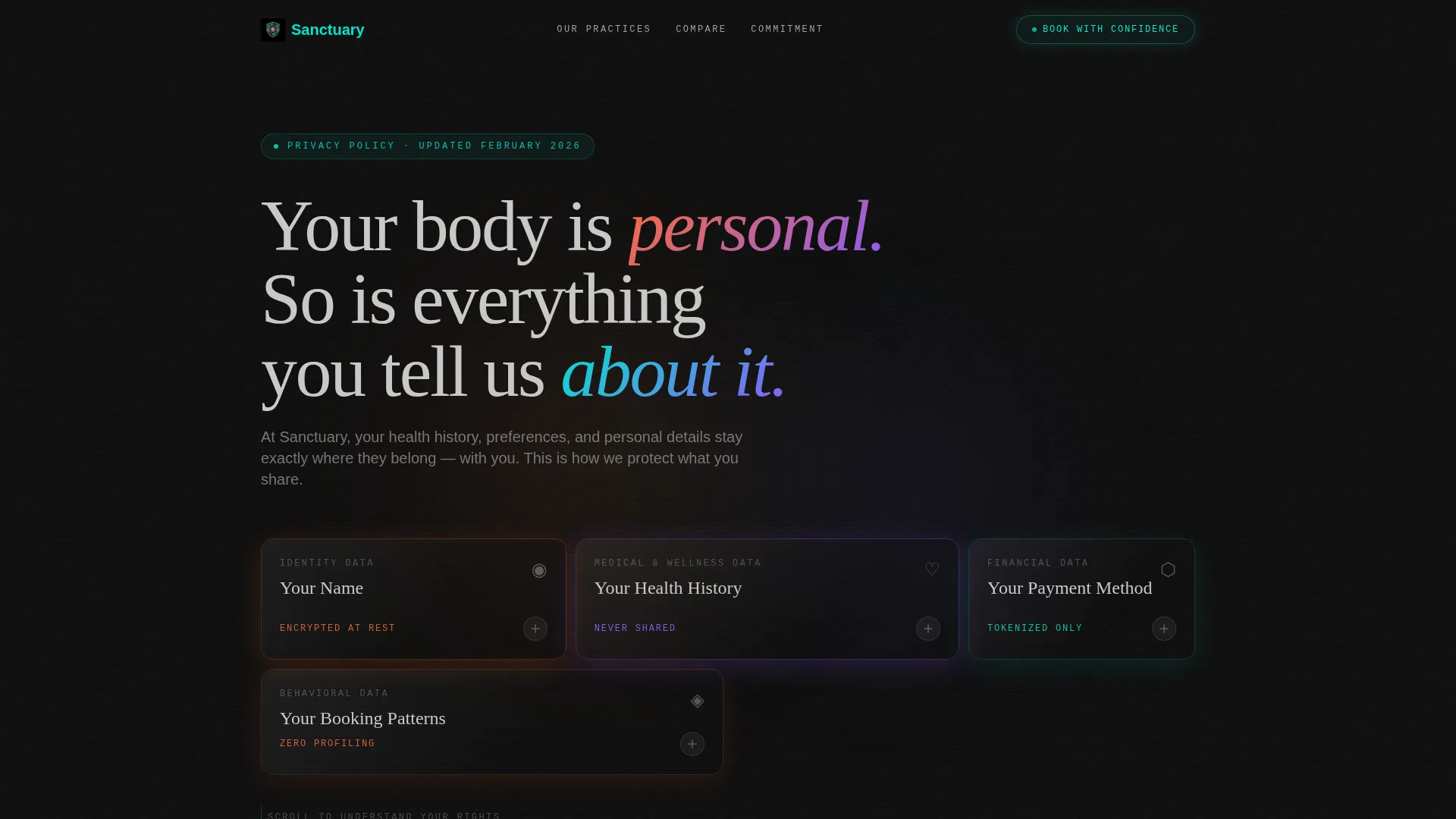
- A Dark Glass Panels header with frosted bento cards naming each data category your spa collects
- A three-row Problem-to-Solution Arc with stark problem cards, pivot statements, and draggable Industry Standard versus Our Standard comparison cards
- A sticky bottom bar with a primary "Book With Confidence" call-to-action and a secondary "Download Our Full Privacy Policy" path
Feature list
This template is built around several purposeful design and layout features that work together to move a hesitant visitor toward booking.
Dark Glass Panel Header
The header stacks translucent frosted rectangles in a bento arrangement. Each panel displays a single data category in whisper-thin typography: "Your Name," "Your Health History," "Your Payment Method," "Your Booking Patterns." Behind the glass, abstract body-heat gradients in deep orange and violet shift slowly, suggesting data that is visible but untouchable. The headline materializes letter by letter on load.
Problem Row with Red-Shift Cards
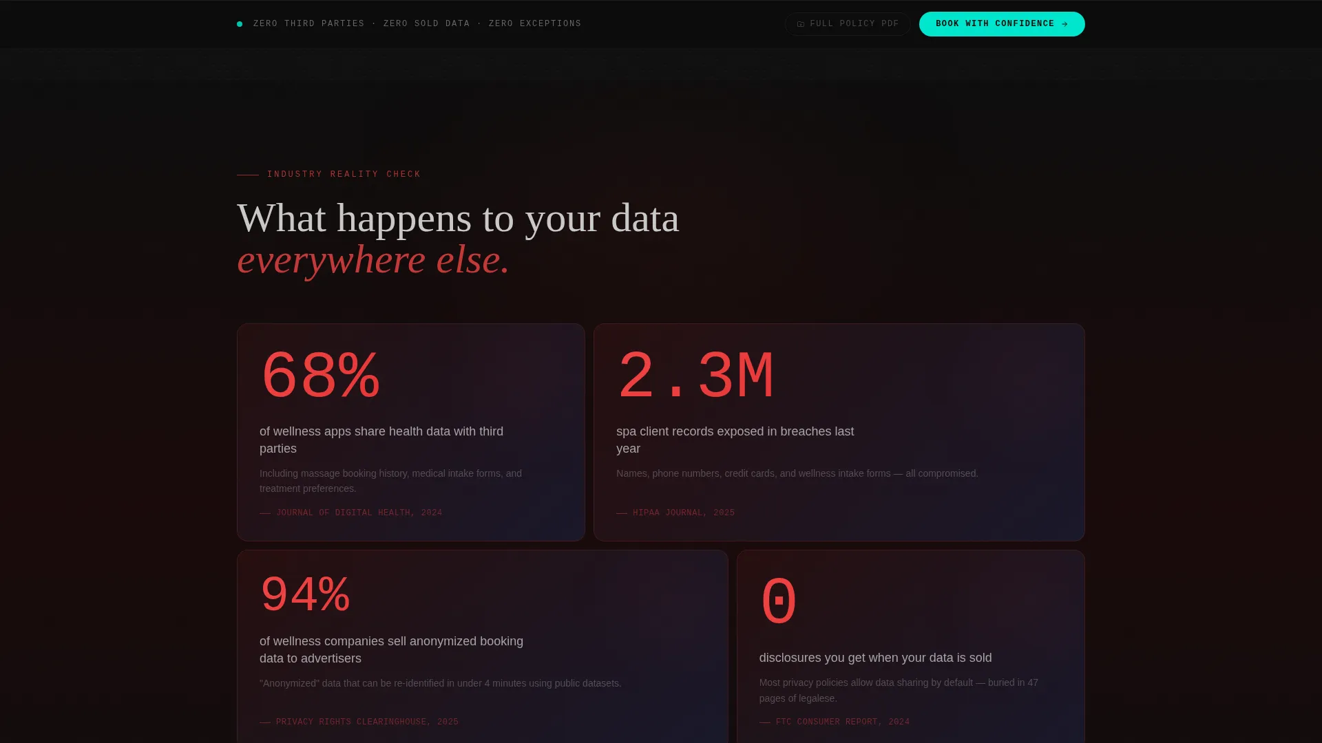
The first bento row presents the problem directly. Each card holds a stark statistic about spa data breaches, third-party sharing, and wellness apps selling health profiles. Cards use a red-shift background to signal risk without shouting. This creates immediate context for why this spa's approach matters.
Versus Comparison Cards with Draggable Toggle
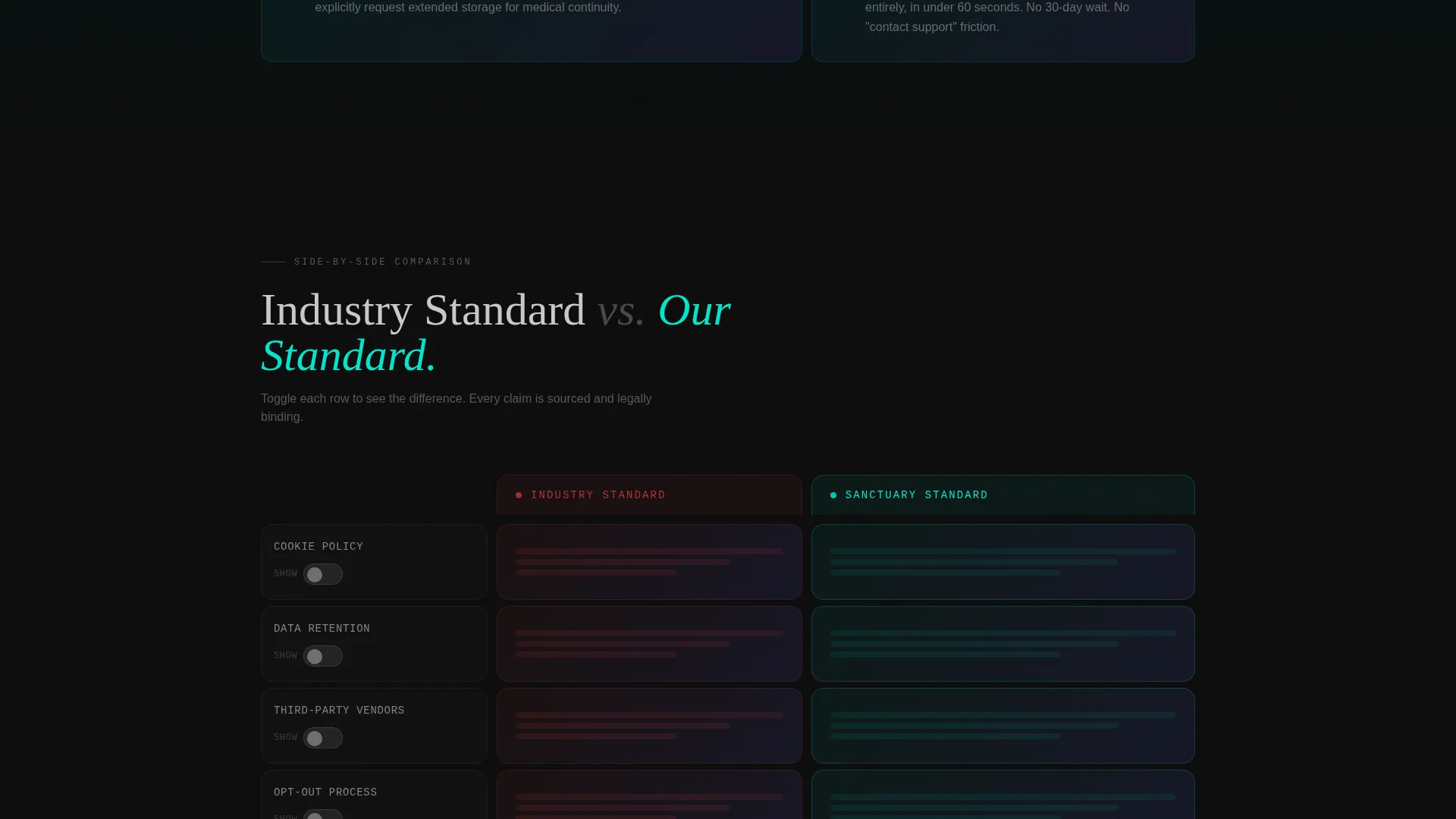
The third bento row places "Industry Standard" side by side with "Our Standard." Visitors can flip between columns using a draggable toggle built into each comparison card. The comparison covers cookie policies, data retention windows, third-party vendor counts, and opt-out friction. This is the template's most direct trust mechanism.
Tightening Grid Scroll Effect
As visitors scroll, the bento panels draw closer together visually. This tightening grid creates a sense of enclosure that mirrors the feeling of a protected, private space. It reinforces the core message through layout behavior rather than additional copy.
Sticky Conversion Bar
A sticky bottom bar appears after the first comparison row. It holds the primary call-to-action "Book With Confidence" linking to the booking flow, alongside the secondary PDF download path. There are no form fields on this page; conversion works by removing friction, not adding steps.
Final Zero-Claim Closing Card
The last bento panel is intentionally minimal. It reads: "Zero third parties. Zero sold data. Zero exceptions." This closing card functions as the logical endpoint of the trust narrative and makes the booking button feel inevitable.
Page sections overview
| Section | Purpose |
|---|---|
| Dark Glass Header | Introduce data categories and set the protective tone |
| Problem Statistics Row | Highlight industry-wide data risks with red-shift cards |
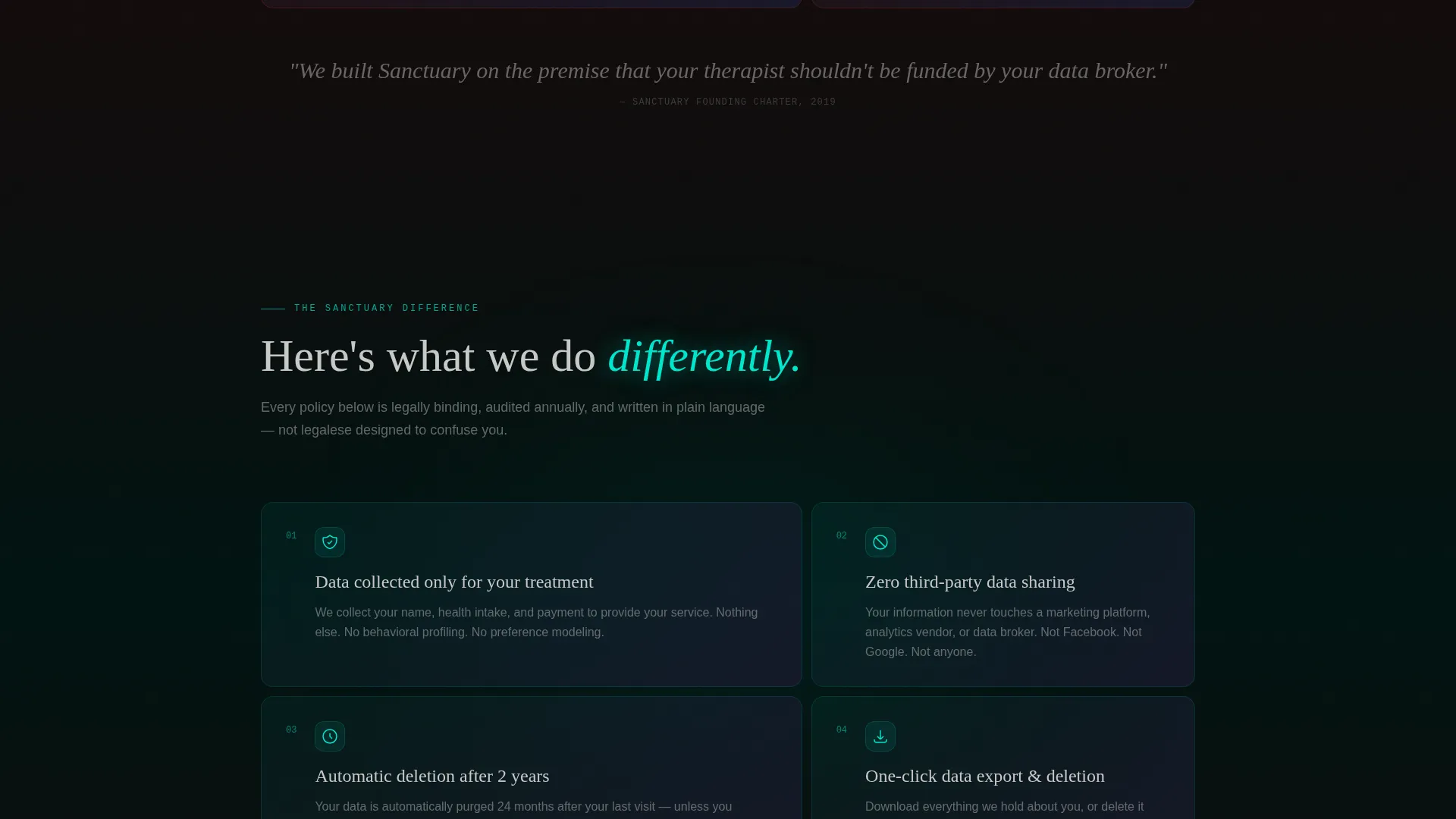
| "Here's What We Do Differently" Pivot | Transition from problem to solution using electric teal |
| Versus Comparison Row | Compare industry norms against this spa's practices side by side |
| Sticky Booking Bar | Keep the primary call-to-action accessible throughout scroll |
| Zero-Claim Closing Card | Deliver a final, clear commitment before the booking action |
Design & branding system
The visual identity follows a Startup Velocity theme expressed through a Carbon Fiber color system. Every color and typographic choice is deliberate, designed to feel technical and protective rather than soft or decorative.
- Core palette: deep cockpit black (#0D0D0D), woven carbon gray (#1A1A2E), brushed titanium (#A0A0A0), and electric teal (#00E5CC) used as the single interactive accent on hover states and data-flow indicators
- Typography uses whisper-thin weights for data labels inside glass panels, creating contrast between the heavy dark backgrounds and the delicate category names
- The overall aesthetic references the interior of a luxury electric vehicle dashboard at night: engineered, protective, and precise
Mobile & speed optimization
The bento grid layout is structured to adapt across screen sizes without losing the visual hierarchy that makes the trust narrative readable. The scroll behavior and panel tightening effect are designed to work within a single-page flow.
- Bento grid columns restack on smaller viewports, preserving the card-by-card reading order of the problem-to-solution arc
- The sticky bottom bar stays accessible on mobile, so the "Book With Confidence" call-to-action is always within reach as visitors scroll
- No form fields on the page means fewer interactive elements to manage across devices, keeping the mobile experience clean and focused
How this template helps you convert
This landing page converts by systematically removing the reasons visitors hesitate before booking at a spa. It does not rely on discounts or urgency tactics. It relies on demonstrated transparency.
- The Problem Row activates awareness of a real industry issue, making visitors actively want to know how this spa is different before they continue comparing alternatives.
- The draggable versus comparison cards let visitors interact with the data at their own pace, which builds active understanding rather than passive reading and increases the credibility of the claims.
- The zero-friction conversion path, with a sticky call-to-action bar and a PDF download as a secondary option, means every visitor type finds a next step that matches their comfort level.
Other information about this template
Sanctuary is suited for any wellness business that handles sensitive client data and wants that care to be visible to prospective clients. The template works as a standalone page within a broader spa website or as a destination page linked from booking confirmation emails and marketing campaigns.
- The template style is a bento grid, which means each section is a self-contained panel rather than a continuous scroll layout
- Creative direction follows a Problem-to-Solution Arc, a structure well suited to comparison-focused visitors who arrive already skeptical
- The header concept, Dark Glass Panels, is a visual metaphor for protection: data is present but shielded
- The Comparison/Versus landing page direction makes this template particularly effective for spas operating in markets where multiple competitors are being evaluated simultaneously
- This template sits within the Spa and Wellness Center Website Templates subcategory and is specifically designed for the privacy policy page use case within that niche
Theme
Startup Velocity
Creative direction
Problem→Solution Arc
Color system
Carbon Fiber
Style
Bento Grid
Direction
Comparison/Versus
Page Sections
Dark Glass Panel Header with Animated Headline
Red-shift Problem Cards
Draggable Versus Comparison Cards
Tightening Bento Grid Scroll
Sticky Conversion Bar
Zero-claim Closing Panel
Related questions
Does this template include actual legal privacy policy text?
Is a booking system included in this template?
Can I edit the versus comparison cards with my spa's real policy details?
Who is this landing page template designed for?
Can this page work as part of a larger spa website?



