Religious Organization Scheduling Landing Page
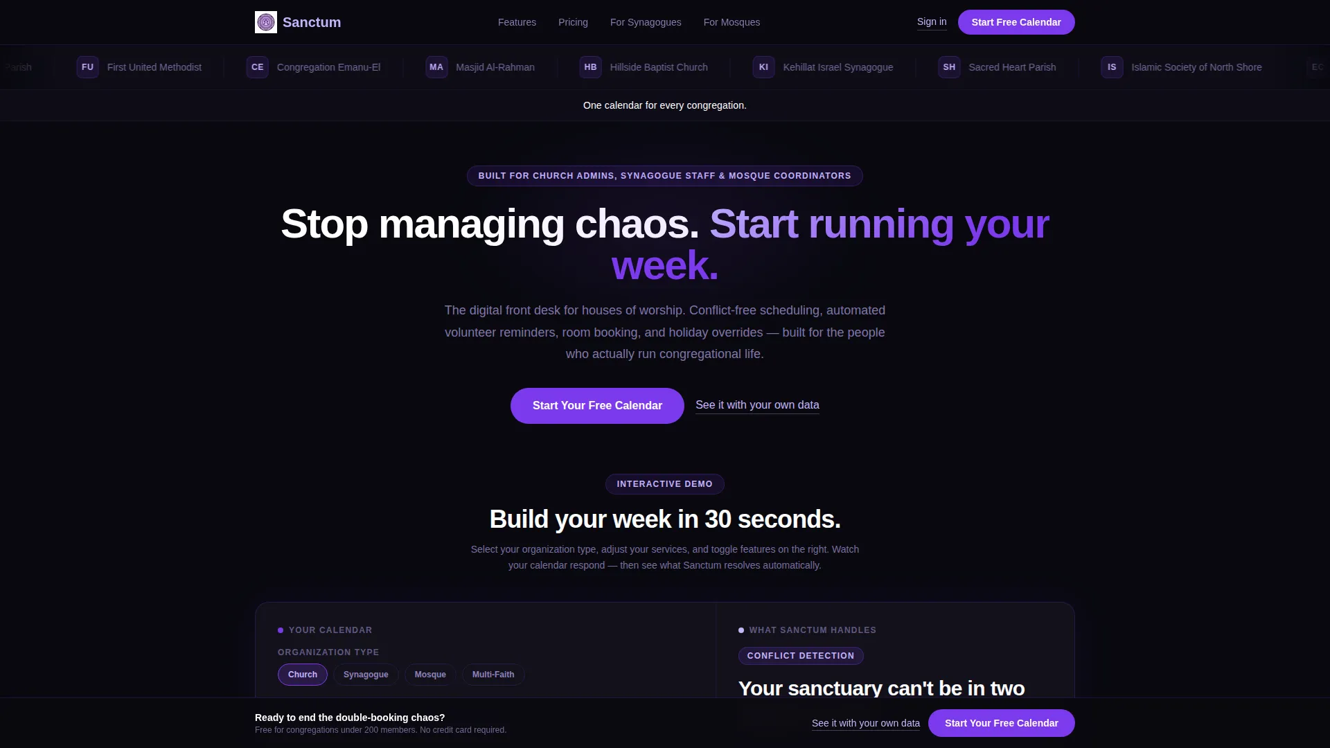
Sanctum is a split-screen landing page template built for religious organization scheduling and booking. It combines an interactive weekly calendar simulator with a clean Dashboard Pro design in a Void and Violet color system. Administrators from churches, synagogues, and mosques can visualize their real schedule in seconds, then convert with a single click.
by Rocket studio
Quick summary
Sanctum is a single-page scheduling landing page template designed for houses of worship. It uses a 50/50 split-screen layout where an interactive simulator lives on the left and supporting narrative lives on the right. The Void and Violet color system gives it a composed, trustworthy feel. The primary call to action routes visitors directly to a signup flow.
Who this template is for
This template is built for the people who keep congregations running on schedule. It speaks directly to the administrators, coordinators, and staff who manage layered weekly programming across shared physical spaces.
- Church administrators juggling Sunday services alongside weeknight programs like grief support groups
- Synagogue staff coordinating High Holiday overflow seating and multi-room event logistics
- Mosque coordinators aligning recurring Jumu'ah prayer times with community iftar dinners and hall reservations
What problem this template solves
Religious organizations often manage complex, overlapping schedules across multiple rooms, staff members, and volunteer groups. The result is double-booked sanctuaries, missed reminders, and coordination happening through long reply-all email chains. This template is designed to present a focused scheduling product in a way that makes the cost of the old workflow feel immediate and personal.
- Staff spending hours resolving calendar conflicts that a clear booking system would prevent
- Volunteers and coordinators working without a shared, reliable view of weekly room availability
- Organizations with no easy way to show prospective users what a structured scheduling tool actually looks like in practice
What you get with this template
You get a fully structured, single-page landing page layout ready for a religious organization booking and scheduling product. Every section is purposefully built around the interactive simulator experience and the click-through conversion goal.
- A 50/50 split-screen layout with a left-panel scheduling simulator and a right-panel benefit narrative
- A scrolling logo bar header featuring recognizable denomination names rendered in monochrome lilac
- A sticky bottom call-to-action bar that appears after the third scroll section, alongside a secondary demo-booking text link
Feature list
This template packages several deliberate design and structural decisions that work together to build trust and drive action.
Interactive Scheduling Simulator Panel
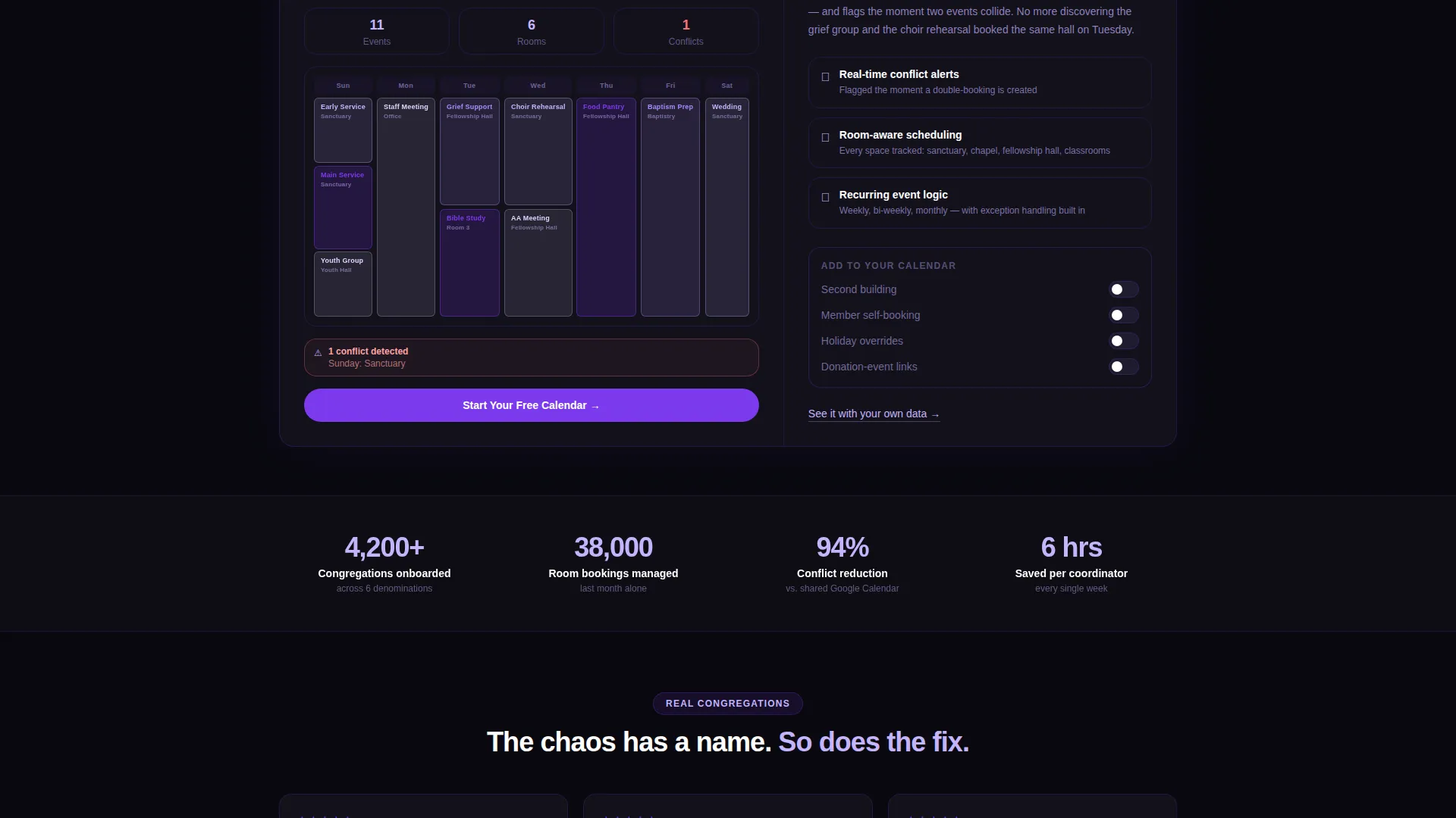
The left panel of the split screen holds a live scheduling simulator. Visitors select their organization type, number of weekly services, and recurring room bookings. The simulator instantly generates a color-coded weekly calendar grid reflecting their inputs.
Scroll-Driven Variable Expansion
Each scroll section introduces a new variable to the simulator rather than presenting static feature bullets. Visitors can add a second building, toggle member self-booking, or layer in donation-event links. The left panel updates in response, making the product demonstration feel personal and active.
Conflict Detection Narrative Panel
The right panel narrates what the visitor just built inside the simulator. It highlights conflict detection, automated volunteer reminders, and holiday override rules in context. The explanation follows the experience rather than preceding it.
Scrolling Denomination Logo Bar
The header opens with a horizontal ribbon of religious organization logos and denomination names scrolling slowly left. Each logo renders in monochrome lilac against the void background. A single white headline below the ribbon reads "One calendar for every congregation."
Dual Call-to-Action Placement
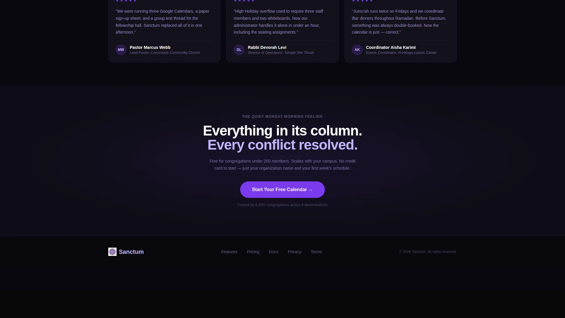
The primary call to action, labeled "Start Your Free Calendar," appears first beside the simulator output. It reappears as a sticky bottom bar after the third scroll section. A secondary text link offering a personalized demo booking provides an alternative path for visitors who want to see the tool with their own data.
Dashboard Pro Visual Theme
The Dashboard Pro theme structures the page around floating data cards on a deep dark background. Each card uses a 1px violet border. The layout feels like a well-organized scheduling dashboard rather than a traditional religious organization webpage.
Page sections overview
| Section | Purpose |
|---|---|
| Logo Bar Header | Builds trust through denomination recognition and a single unifying headline |
| Split Screen Simulator | Lets visitors build their own weekly schedule and see it rendered live |
| Conflict Detection Narrative | Explains what the simulator just showed using real scheduling language |
| Second Building Toggle | Expands the simulator with a multi-building variable to deepen relevance |
| Self-Booking Layer | Introduces member self-booking as a toggleable option within the live demo |
| Donation Event Link | Adds a final simulator variable connecting scheduling to donation-event logic |
| Sticky call to action Bar | Captures conversion intent after sufficient scroll engagement |
Design & branding system
The visual identity uses a Void and Violet color system that feels intentional and composed, not decorative. Every color choice reinforces the sense of calm control that a scheduling product should communicate.
- Core palette: absolute void black (#09090F), cathedral violet (#7C3AED), muted vestment gray (#1E1B2E), and spirit lilac (#C4B5FD) for hover states and active indicators
- Data cards float on #13111C with a 1px violet border that reads like candlelight against a dark interior
- Headings render in pure white, body text in spirit lilac, and every clickable surface pulses in cathedral violet
Mobile & speed optimization
The template is structured with a layout that translates from desktop split-screen to a stacked single-column view on smaller screens. The simulator and narrative panels reflow naturally without losing the scroll-driven interaction logic.
- The sticky call-to-action bar remains accessible at the bottom of the viewport on mobile devices throughout the scroll experience
- The scrolling logo bar and color-coded calendar grid are designed to remain legible and functional at reduced screen widths
How this template helps you convert
The conversion strategy is built into the template structure itself. Visitors are not asked to read about the product; they are asked to use it. That shift from passive reading to active demonstration removes the skepticism that static feature lists create.
- The simulator lets administrators reconstruct their actual week in seconds, making the value of the product tangible before any form or commitment appears
- The primary call to action appears exactly when the visitor has just experienced a resolved scheduling conflict inside the simulator, placing the click at peak motivation
- The sticky bottom bar and secondary demo-booking link ensure that visitors who scroll past the first call to action still have a clear, low-friction path to the next step
Other information about this template
This template is categorized under Technology with a subcategory focus on religious organization digital presence. It is built for the niche of religious organization booking and scheduling sites, and every design and copy decision reflects that specific context.
- The template style is Split Screen (50/50), the theme is Dashboard Pro, and the creative direction is Calculator and Tool First
- The header concept is a Logo Bar and the landing page direction is Click-Through, routing visitors to an external signup flow rather than collecting form data on the page
- The Void and Violet color system was selected to evoke the quality of a stained-glass window at dusk, which aligns with the spiritual but professional tone appropriate for this audience

Theme
Dashboard Pro
Creative direction
Calculator/Tool First
Color system
Void & Violet
Style
Split Screen (50/50)
Direction
Click-Through
Page Sections
Interactive Weekly Calendar Simulator
Scroll-driven Simulator Expansion
Conflict Detection Narrative
Scrolling Denomination Logo Bar
Dual Call-to-action Placement
Related questions
Who is this landing page template designed for?
Does this template include a form or data collection element?
What makes the split-screen layout effective for this use case?
Can I adapt the simulator panel for my specific organization type?
Is the sticky call-to-action bar present throughout the entire page?



