Premium & Landing Page Template
Sole is a Bold Brutalist landing page built for sandal and summer footwear brands that lead with attitude. A full-bleed ankle-level header, a modular card grid escalating from daytime heat to midnight grit, and a persistent upgrade bar make every section feel intentional. The result is a page that earns the sale before the visitor reaches the cart.
by Rocket studio
Quick summary
Sole is a single-page, card grid landing page template designed for premium sandal and summer footwear brands. It pairs a Bold Brutalist visual identity with a Holographic Chrome color system to create a buying experience that feels as considered as the product itself. Every section builds atmosphere before it asks for a click.
Who this template is for
This template is built for footwear brands that treat sandals as a serious design object, not an afterthought. If your product has a story worth telling through texture, material, and mood, this layout gives you the space to tell it.
- Sandal and summer footwear brands selling premium or customisable styles
- Festival, resort, and streetwear-adjacent labels that build identity from the ground up
- Independent footwear makers who want to present standard and upgraded tiers on a single page
What problem this template solves
Most footwear product pages flatten the buying experience into a list of specs and a single product photo. That approach kills desire before it can build. Sole solves the problem of making a sandal feel worth the premium price without relying on a full editorial shoot.
- Atmosphere-first card layout that makes each product feel distinct, not duplicated
- Built-in upsell path that introduces premium options only after the base model earns desire
- A visual hierarchy that guides visitors from curiosity to configuration without a hard sell
What you get with this template
You get a complete, ready-to-customise landing page structure that covers every stage of the buyer journey, from first impression to upgrade decision. The layout is modular, so you can rearrange, add, or remove cards without breaking the design logic.
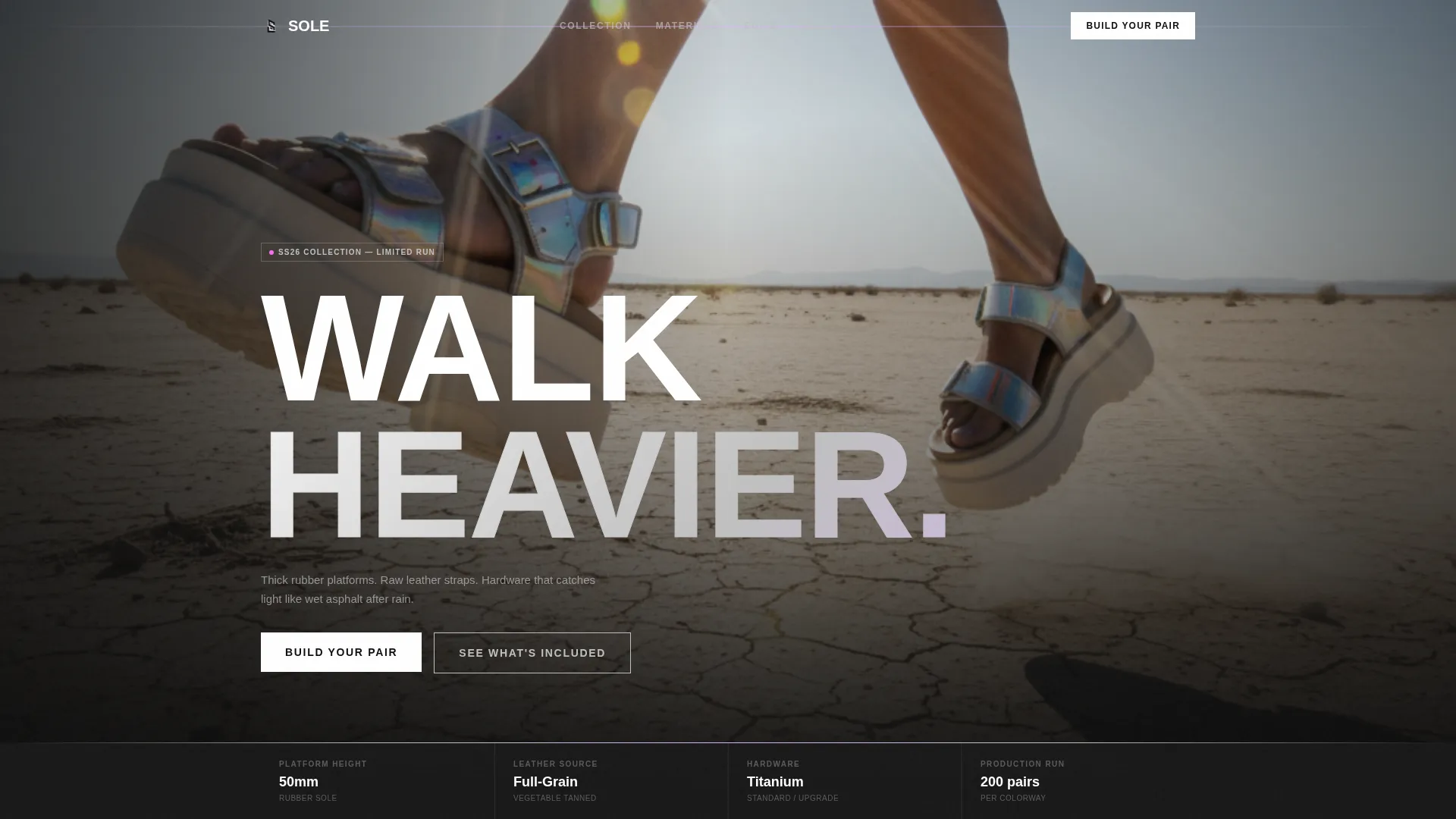
- Full-bleed ankle-level header with oversized condensed headline and lens-flare framing
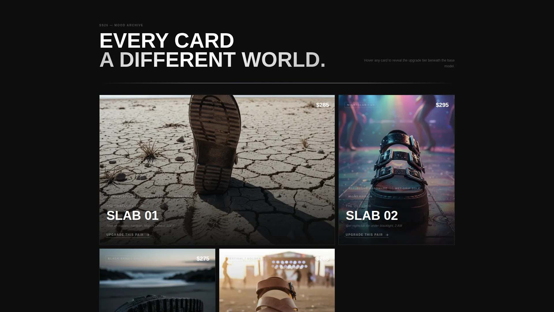
- Asymmetric modular card grid with mood escalation from daytime heat to midnight grit
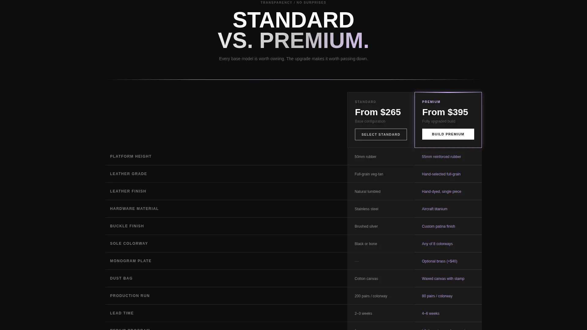
- Persistent upgrade bar, configurator modal trigger, and standard versus premium comparison path
Feature list
This section covers the core design and functional components delivered with the Sole template.
Full-Bleed Confrontational Header
The header is a single ankle-height photo on cracked desert hardpan. A chunky platform sandal mid-stride fills the frame, with sun flaring into the lens so buckle hardware throws a holographic streak across the image. The oversized condensed headline "WALK HEAVIER." lands directly on the photo, no padding, no apology.
Modular Atmosphere Card Grid
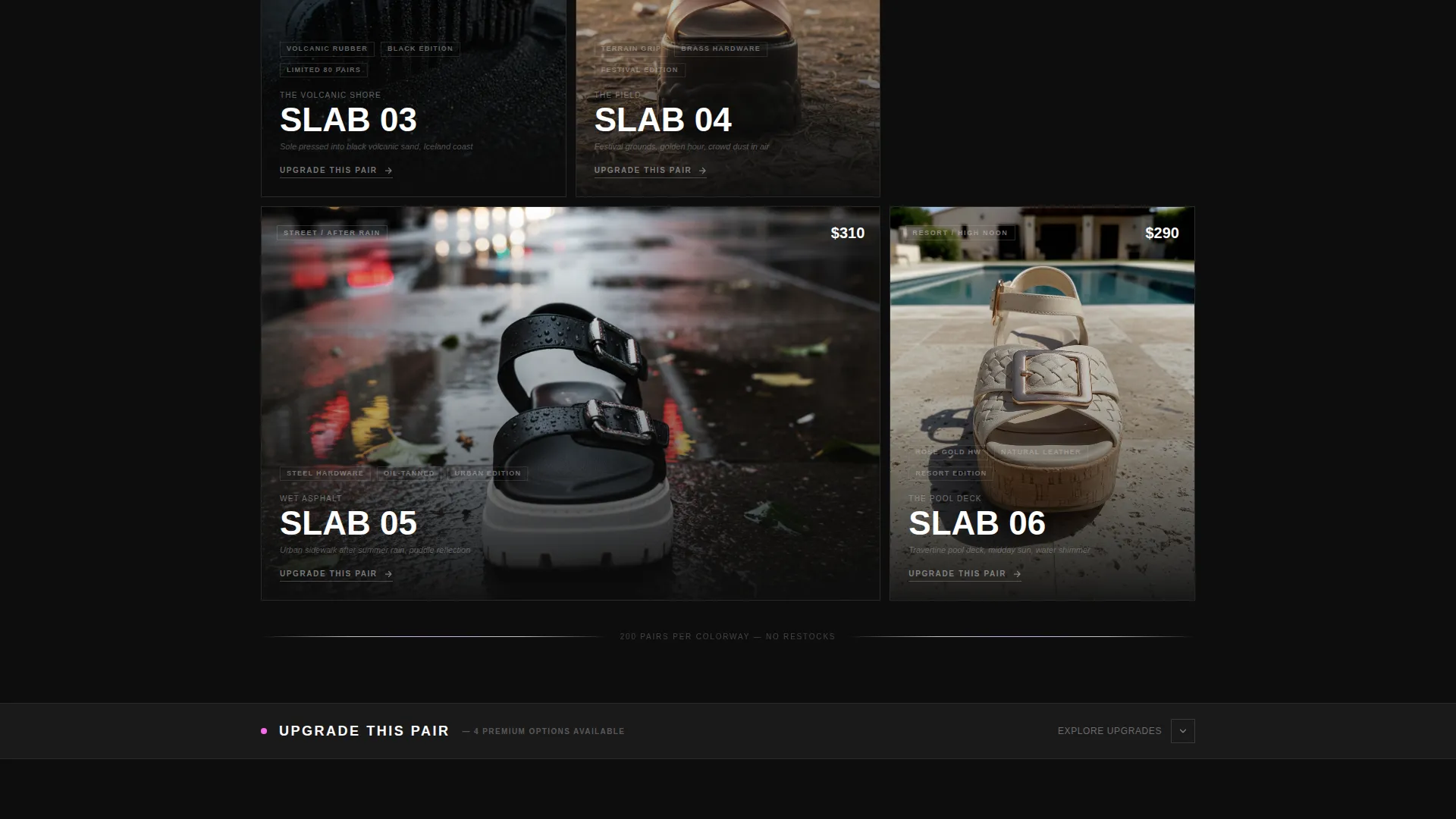
Each card is a self-contained world, not a product listing. Cards span one or two columns, stack tight or breathe wide, and escalate in mood from sun-scorched concrete to UV-lit nightclub tile to black volcanic sand. Brutalist tension lives in every gutter, and no two cards repeat a setting.
Hover Chrome Colour Shift
Hovering any card triggers a chrome colour-shift on the product image. The interaction rewards curiosity with shimmer rather than announcing itself with a button. The prismatic lilac and molten iridescent pink tones appear only at this moment, making hover feel like a material reveal.
Persistent Upgrade Bar
A persistent bottom bar reads "Upgrade This Pair" and slides open to show premium options: titanium buckles, hand-dyed leather, and custom sole colorways. The bar stays visible as the visitor scrolls, keeping the upgrade path accessible without interrupting the atmosphere-building sections above.
Build Your Pair Configurator Modal
The primary call to action, "Build Your Pair," opens a configurator modal directly from any card. This keeps the customisation moment close to the point of desire rather than sending the visitor to a separate page.
Standard versus. Premium Comparison Path
A secondary call to action, "See What's Included," opens a side-by-side comparison of standard and upgraded tiers. Material close-ups and wear footage inside each card prepare the visitor for this moment so the upgrade feels earned, not pushed.
Page sections overview
| Section | Purpose |
|---|---|
| Full-bleed header | Establish product as subject with confrontational crop and headline |
| Atmosphere card grid | Build mood escalation across modular product cards |
| Two-column card spans | Create brutalist visual tension and pacing variation |
| UV nightclub card | Shift mood from daytime heat toward midnight grit |
| Volcanic sand card | Anchor the darkest mood beat in the grid sequence |
| Persistent upgrade bar | Keep premium options visible throughout scroll |
| Configurator modal | Convert desire into a customised pair build |
| Comparison reveal | Show standard versus upgraded tiers side by side |
Design & branding system
The Holographic Chrome color system is built on industrial restraint with iridescent payoff. Black dominates card backgrounds, liquid silver structures typography and dividers, and the prismatic tones appear only on interaction, so every hover feels like a reward.
- Core palette: liquid silver (#C0C0C0), deep asphalt black (#1A1A1A), prismatic lilac (#D8B4FE), and molten iridescent pink (#FF6FF2) reserved for hover states and price callouts
- Typography uses oversized condensed type for headlines, keeping the Bold Brutalist tone confrontational and legible at any scroll speed
- Card backgrounds stay black by default, with chrome colour-shifts and prismatic bleed-ins triggered only by interaction, so the palette feels earned rather than decorative
Mobile & speed optimization
The modular card grid is structured to reflow cleanly from desktop asymmetry to a single-column mobile stack. Mood escalation and card pacing remain legible even when two-column spans collapse to full width.
- Card spans adapt from asymmetric desktop layouts to stacked single-column mobile views without breaking the mood sequence
- Hover states translate to tap interactions on touch devices, keeping the chrome colour-shift and upgrade reveal accessible on mobile
- The persistent upgrade bar remains anchored at the bottom of the viewport on all screen sizes, so the upsell path is never out of reach
How this template helps you convert
Sole earns the conversion by making desire concrete before it asks for a decision. The layout sequences atmosphere, material detail, and upgrade options in a deliberate order.
- The header establishes the product as the subject from the first frame, so the visitor arrives with intent rather than curiosity alone.
- The card grid builds progressively darker, more textured moods, each one showing material close-ups and wear footage that justify the premium price before the upgrade bar appears.
- The "Build Your Pair" modal and side-by-side comparison bring the visitor from mood to decision in a single session, reducing the gap between wanting and buying.
Other information about this template
Sole is designed specifically for the sandal and summer footwear niche, where product photography and material storytelling do more conversion work than copy alone. The template structure supports that reality at every level.
- The template is categorised under Fashion and Lifestyle, Footwear Brand, and is purpose-built for the sandal and summer footwear intersection
- The Bold Brutalist theme and Holographic Chrome color system are matched design choices for brands whose identity is built on industrial materials and iridescent hardware
- The Atmosphere and Mood creative direction means the page reads like a curated editorial sequence, which suits resort, festival, and streetwear-adjacent brand positioning equally well
Theme
Bold Brutalist
Creative direction
Atmosphere & Mood
Color system
Holographic Chrome
Style
Card Grid (Modular)
Direction
Upsell/Upgrade
Page Sections
Full-bleed Confrontational Header
Modular Atmosphere Card Grid
Hover Chrome Colour Shift
Persistent Upgrade Bar
Build Your Pair Configurator Modal
Standard Versus. Premium Comparison Path
Related questions
Can I rearrange the card grid without breaking the design?
Does the template include the configurator modal as a built-in component?
How does the hover colour-shift work on mobile devices?
Is the persistent upgrade bar always visible during scroll?