Savor — Gourmet Cuisine Landing Page Template
Ticket is a scroll-reveal restaurant analytics dashboard landing page built for operators who need financial clarity right now, not at month-end. It surfaces labor cost as a live percentage, food cost down to the plate, and daypart revenue in one command-center view. The template uses a Problem→Solution Arc to convert curious visitors into demo sign-ups.
by Rocket studio
Quick summary
Ticket is a single-page, scroll-reveal landing page template for a restaurant analytics dashboard. It opens with a real-looking product screenshot mid-service, then walks visitors through increasingly specific financial pain points before revealing each solution layer. Every section is designed to mirror the product itself, making the page feel like live data in motion.
Who this template is for
This template is built for restaurant technology companies, SaaS founders, and product teams who need to communicate the value of a real-time analytics tool to a specific, high-stakes audience.
- Multi-unit operators running several locations who need to spot financial bleed before month-end
- Executive chefs and kitchen leads who want hard margin data to back their menu engineering decisions
- Independent restaurant owners who currently reconcile sales against a spreadsheet late at night
What problem this template solves
Most restaurant operators find out about a labor overrun or a food cost spike days after the damage is done. A generic SaaS landing page cannot communicate the urgency of that problem, or the relief of solving it. This template is built specifically to close that gap.
- Visitors arrive already feeling the pain of delayed financial visibility
- Generic landing pages fail to show the depth of plate-level and daypart-level insight
- The scroll-reveal structure teaches the product's value progressively, matching how operators actually think
What you get with this template
You get a fully structured, single-page layout that guides a restaurant software buyer from problem awareness to demo click-through. The page is built around a clear narrative arc and a focused conversion goal.
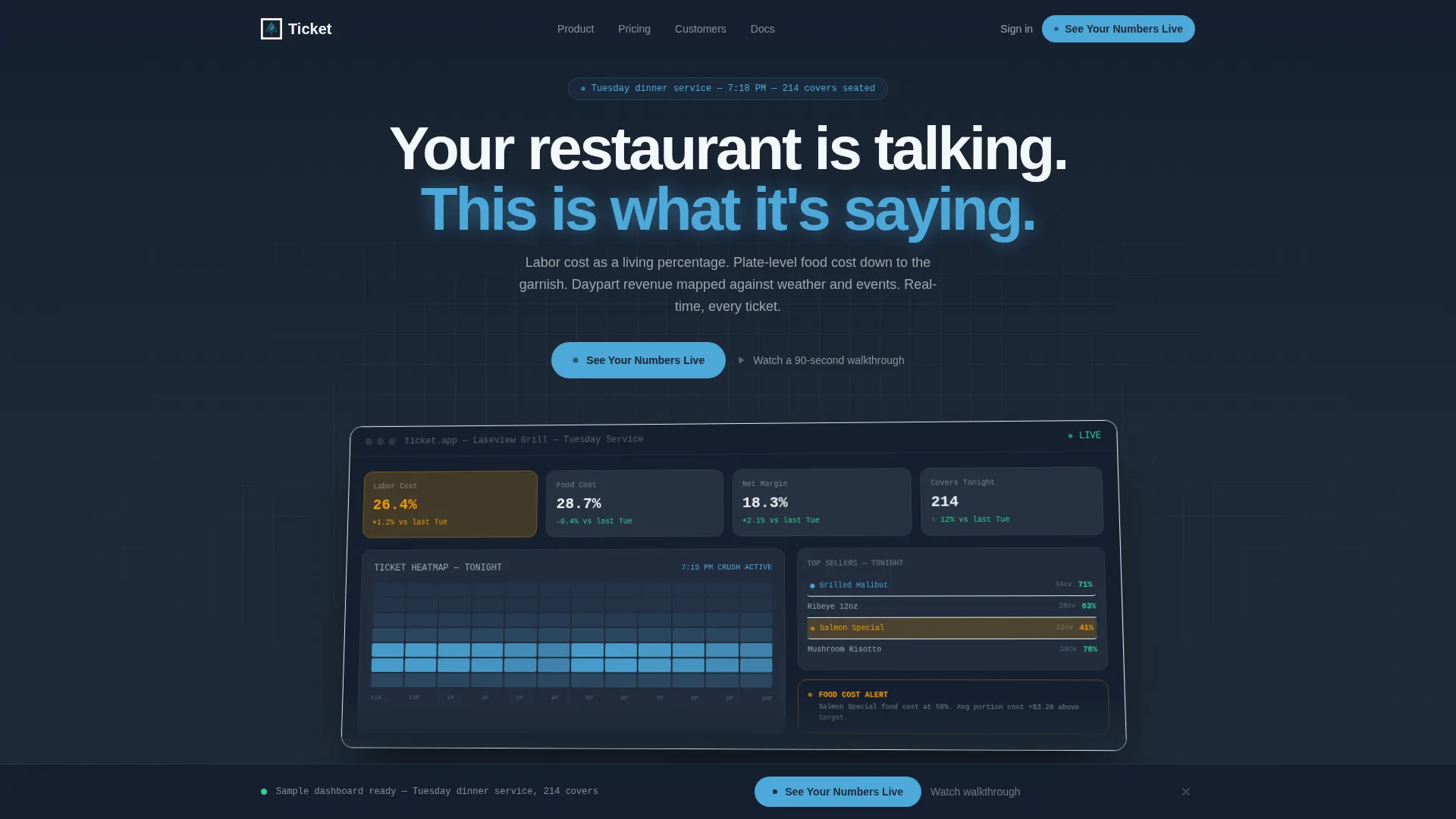
- A full-width product screenshot hero showing a live Tuesday dinner service with real-looking KPIs
- A Problem→Solution Arc scroll structure with micro-animations that mimic live data populating
- Two primary call-to-action placements plus a persistent bottom bar that slides in after 40 percent scroll
Feature list
This template ships with a precise set of layout and interaction features drawn directly from the brief. Each one serves the conversion goal without adding noise.
Full-Width Product Screenshot Hero
The header uses the dashboard itself as the hero image. It shows labor running at 26.4 percent, a live ticket heatmap for the 7:15 PM service crush, a top-selling entrée highlighted in sky blue, and a food cost alert flagged amber on the salmon special. The screenshot floats at a slight angle with a soft shadow above the slate background.
Scroll Reveal Progressive Structure
Each section appears only after the visitor has absorbed the one before it. The scroll opens with a sharp pain point, then reveals surface metrics, plate-level drill-downs, and predictive forecasting in sequence. This mirrors how an operator naturally moves from problem awareness to product understanding.
Live Data Micro-Animations
Every solution section loads with a micro-animation that mimics live data populating on screen. The effect reinforces the product's real-time positioning without requiring a live integration on the page itself.
Problem-to-Solution Narrative Arc
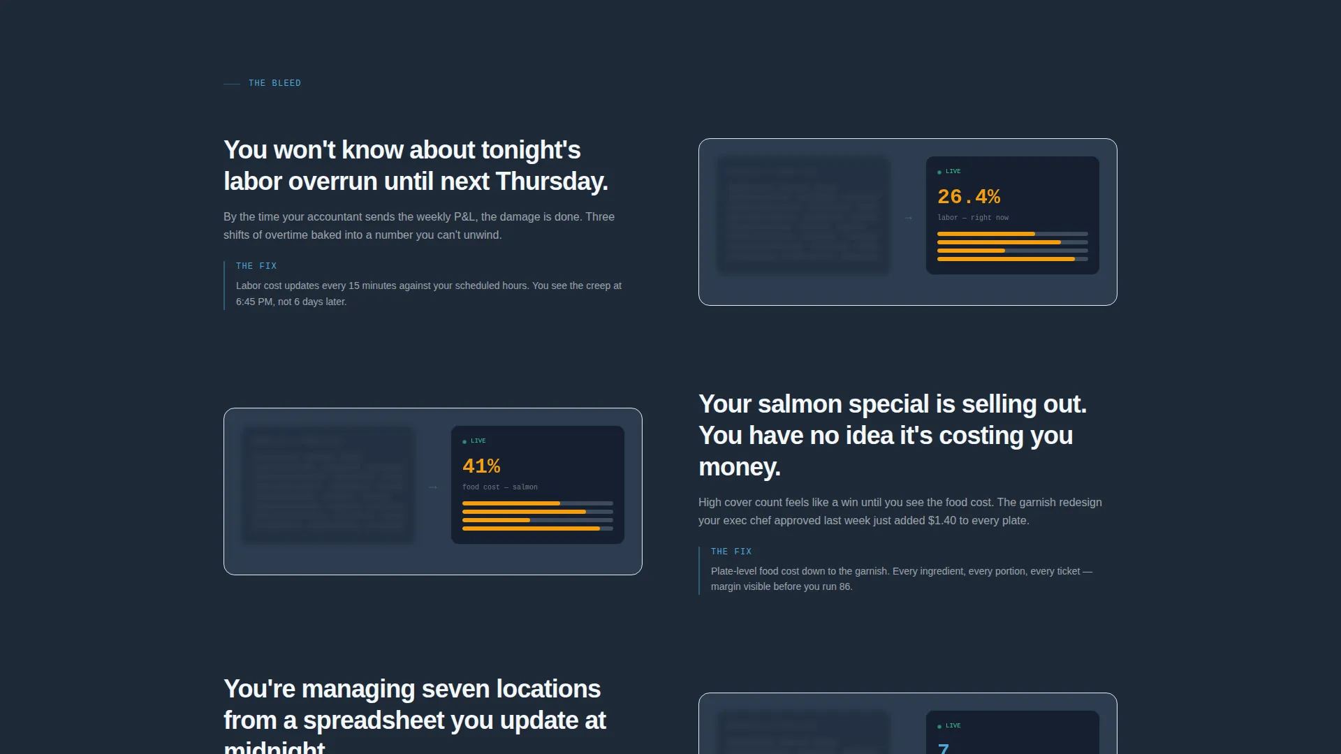
The page opens the wound before offering the fix. The first reveal below the hero is titled with a direct operator pain point. A subtle animation shows a blurring spreadsheet replaced by a sharpening dashboard, making the value shift visceral and immediate.
Persistent Click-Through call to action System
The primary call to action, "See Your Numbers Live," appears first beneath the hero, again after the deepest feature reveal, and finally as a persistent bottom bar that slides in after 40 percent scroll. A secondary text link, "Watch a 90-second walkthrough," holds visitors who are curious but not yet ready to click through.
No-Form Click-Through Flow
There is no form on this page. The primary call to action carries visitors directly to a sandbox demo pre-loaded with sample restaurant data. This removes friction and shortens the path from first impression to product experience.
Page sections overview
| Section | Purpose |
|---|---|
| Hero Screenshot Header | Anchors the product as the visual centerpiece with real-looking KPIs |
| Pain Point Reveal | Opens the first emotional wound with a specific labor overrun headline |
| Spreadsheet versus Dashboard | Contrasts the old workflow with the new using a blur-to-focus animation |
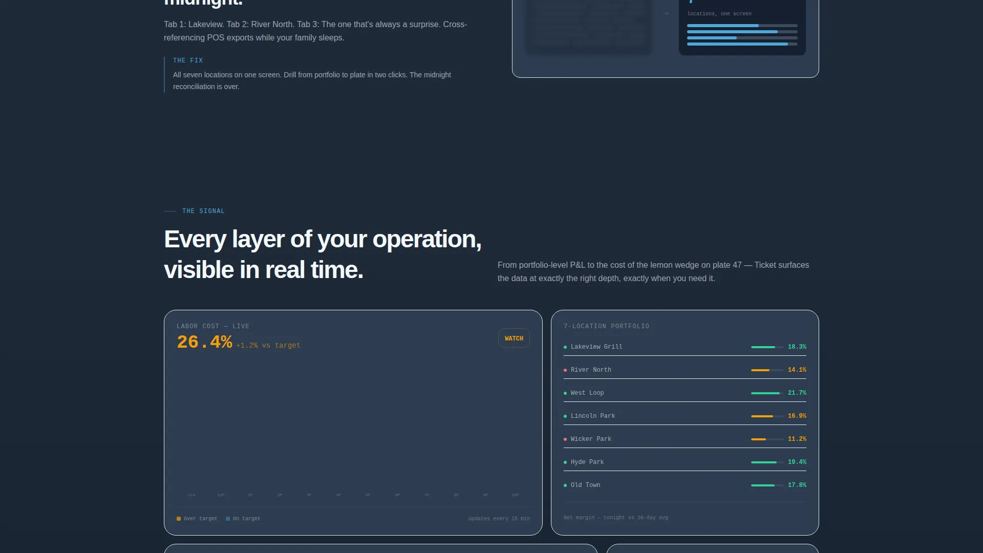
| Surface Metrics Layer | Introduces top-line financial visibility including labor and revenue |
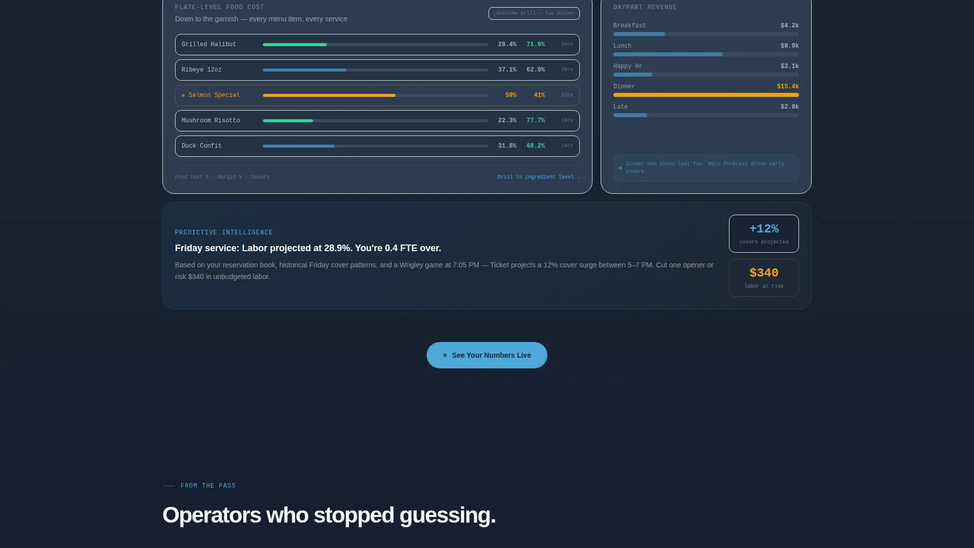
| Plate-Level Drill-Down | Reveals food cost tracking down to individual garnish and ingredient |
| Daypart Revenue Mapping | Shows revenue patterns mapped against weather and local event data |
| Predictive Forecasting | Demonstrates the deepest layer of analytical capability on the page |
| Primary call to action Block | Delivers the second "See Your Numbers Live" placement after peak engagement |
| Persistent Bottom Bar | Slides in at 40 percent scroll and stays visible through conversion |
Design & branding system
The visual identity follows a Dashboard Pro theme using a Slate & Sky color palette. The result feels like a chef's office after close: one monitor glowing in a dark room, blue light on brushed steel, every number finally making sense.
- Deep charcoal slate (#1E2A38) for primary backgrounds, mid-tone graphite (#3B4A5C) for card surfaces, sky blue (#4DA8DA) for KPI highlights and interactive accents, and cloud white (#F4F7FA) for typography and data labels
- No decorative imagery anywhere on the page; the product screenshot carries all visual weight
- Typography and labels stay high-contrast against dark surfaces, keeping data readable at a glance
Mobile & speed optimization
The scroll-reveal structure and micro-animations are designed with a single-page, section-led flow in mind. The layout adapts naturally to smaller screens without losing the progressive narrative.
- Section-by-section reveal keeps mobile users engaged through the same problem-to-solution sequence
- The persistent bottom bar call to action remains accessible on mobile without blocking content
- Dark-palette design reduces visual clutter on small screens and keeps focus on data labels
How this template helps you convert
This landing page is optimized as a click-through to a live interactive demo. Every structural decision points toward a single action: getting the visitor into the sandbox.
- The product screenshot hero creates immediate product credibility before the visitor reads a single word, reducing bounce at the top of the page
- The progressive scroll structure delays the primary call to action until the visitor has absorbed enough context to feel the value, increasing the quality of clicks through to the demo
Other information about this template
This template sits at the intersection of restaurant software, SaaS product marketing, and data-driven hospitality operations. It is built for teams who need to communicate complex, real-time financial insight to a skeptical, time-poor audience.
- The template style is Scroll Reveal (Progressive), meaning sections animate into view as the visitor scrolls rather than loading all at once
- The color system and Dashboard Pro theme are designed to align with the visual language of modern analytics software, not traditional restaurant branding
- The secondary call to action, "Watch a 90-second walkthrough," is a built-in fallback for visitors in a research phase who are not ready to enter the demo
- This template can support use cases across restaurant groups, food and beverage technology startups, and hospitality SaaS platforms that need a high-conviction single-page experience
Theme
Dashboard Pro
Creative direction
Problem→Solution Arc
Color system
Slate & Sky
Style
Scroll Reveal (Progressive)
Direction
Click-Through
Page Sections
Full-width Product Screenshot Hero
Problem-to-solution Scroll Arc
Live Data Micro-animations
Persistent Click-through Call to Action System
No-form Demo Click-through
Slate & Sky Dashboard Visual Identity
Related questions
Who is this landing page template designed for?
Does this template include a contact form or lead capture form?
What makes the scroll-reveal structure different from a standard landing page layout?
Can I adapt this template for a single restaurant location rather than a multi-unit group?
Is the product screenshot in the hero a real dashboard or a design mockup?



