Advanced Construction Software & SaaS Comparison Website Template
Scaffold is a bold, brutalist-themed construction landing page template built for contractors, roofers, and concrete crews. It features a full-viewport product screenshot header, a side-by-side comparison table, and an app download call to action. The design uses void black, chartreuse, and signal white to deliver an industrial, high-impact first impression that gets trades businesses online fast.
by Rocket studio
Quick summary
Scaffold is a single-page, comparison-table landing page template designed for construction website builder software. It targets trades business owners who need a professional online presence without writing code or hiring an agency. The layout is built around a brutal product screenshot header, a feature-by-feature competitor comparison, and a frictionless app download path.
Who this template is for
This template is built for the trades professional who needs a site that works as hard as they do. Whether you run a roofing crew, a concrete operation, or a general contracting firm, Scaffold gives you a launch-ready landing page that looks agency-built without the agency bill.
- Owner-operators managing multiple trucks and no dedicated office staff
- Subcontractors losing bids because their online presence is a blank Google listing
- Growing trades firms stuck with an outdated or amateur-built website
What problem this template solves
Most website templates are designed for retail shops or creative studios. They assume you have time to tinker, a team to manage content, and a budget for ongoing subscriptions. Trades professionals have none of those things. Scaffold solves the credibility gap directly.
- Competing website builders cost more, require code knowledge, or ignore trades-specific features like estimate request forms
- A poor or nonexistent web presence costs contractors real bids and real revenue
- Generic templates make construction businesses look like everyone else, not like the reliable crew they actually are
What you get with this template
Scaffold delivers a complete, single-page layout with every structural element already in place. You get a persuasive, scrollable landing page built to promote a construction website builder app and drive free downloads.
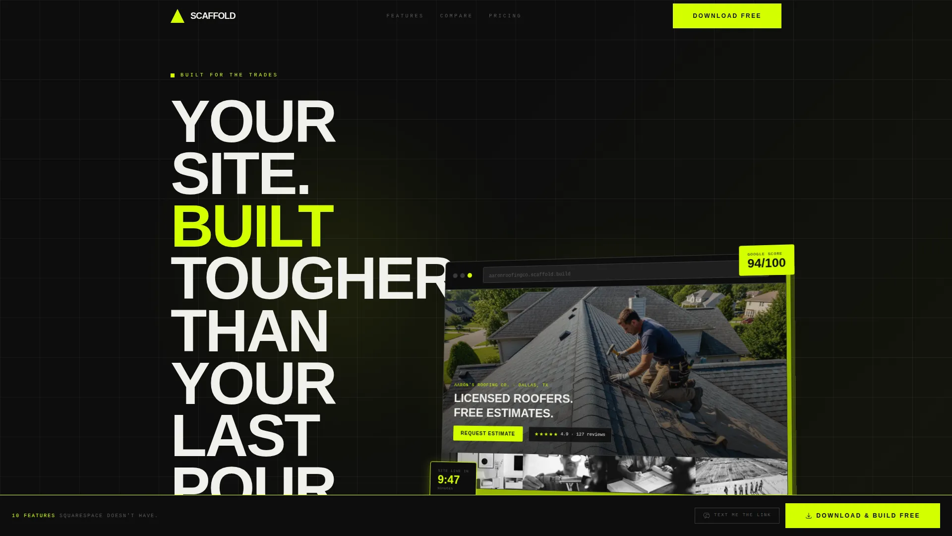
- A full-viewport product screenshot header with an all-caps brutalist headline
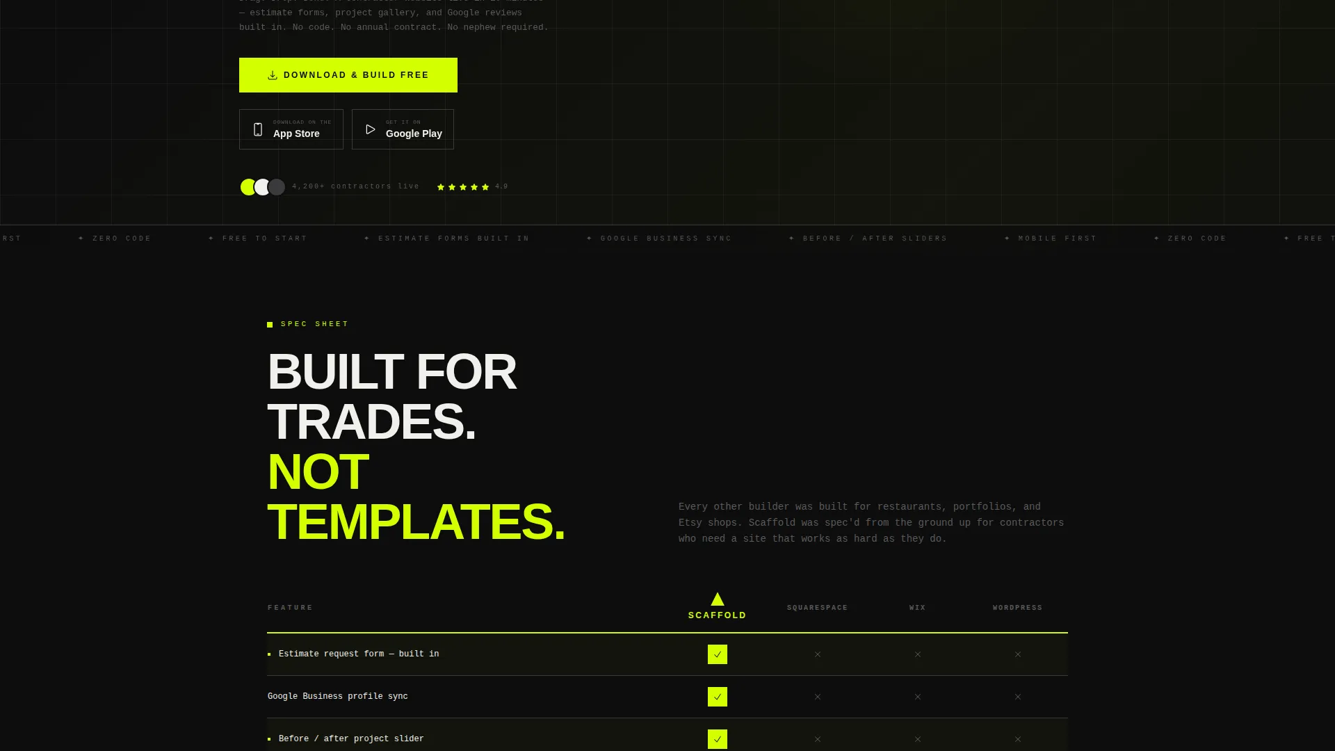
- A feature comparison table stacking the builder against rival platforms row by row
- Individual spec-callout feature sections, a primary app download call to action, and a sticky bottom bar for mobile conversions
Feature list
Scaffold packs a focused set of components that serve one purpose: convince a trades professional to download the app before they finish their coffee.
Full-Viewport Product Screenshot Header
The header stretches edge to edge at full viewport width against a void black background. It displays the app dashboard mid-build, showing a roofer's project gallery, a "Request Estimate" button, and a five-star Google review widget. The screenshot sits on a three-quarter axis with a chartreuse drop shadow, and the headline "YOUR SITE. BUILT TOUGHER THAN YOUR LAST POUR." is punched above it in all-caps type.
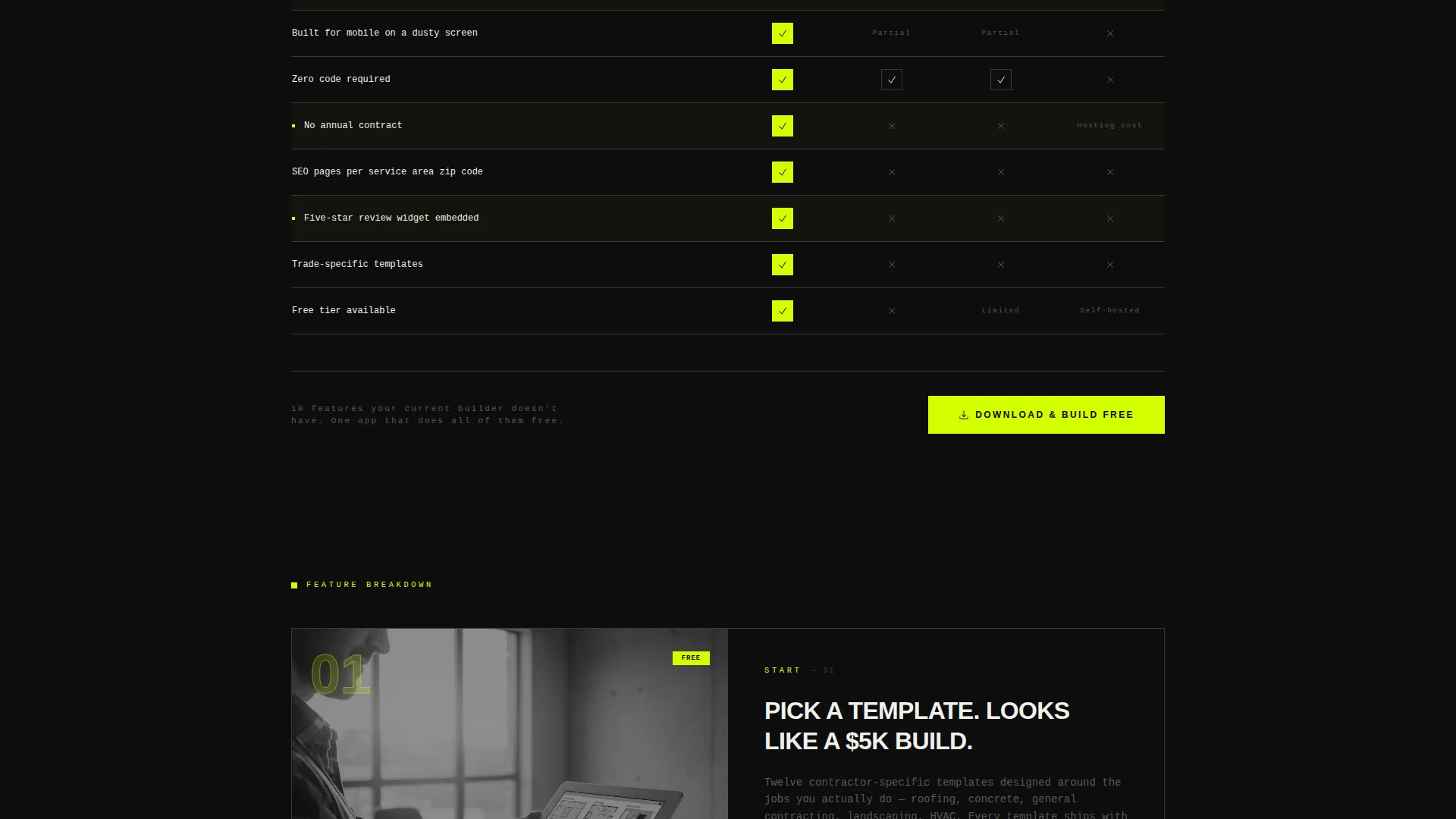
Side-by-Side Comparison Table
The comparison table benchmarks Scaffold against rival platforms across rows that construction owners actually care about. Rows cover built-in estimate request forms, Google Business sync, before/after project sliders, mobile usability on dusty screens, and zero-code zero-contract operation. Chartreuse checkmarks and rebar-gray X marks make the winner clear at a glance.
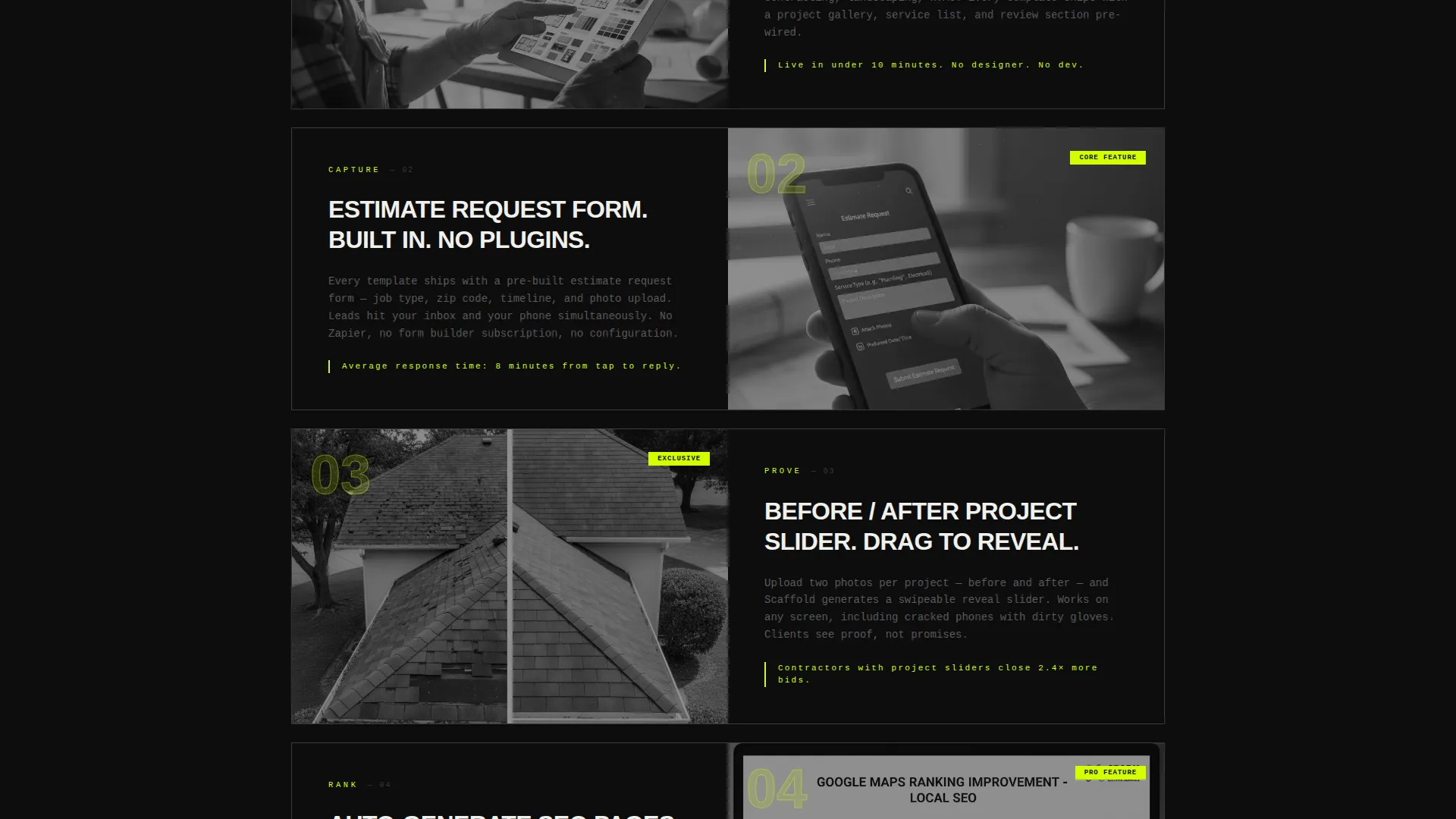
Spec-Callout Feature Sections
Below the table, individual feature sections open like callouts on a product data sheet. Each section uses a tight headline, a short paragraph, and an inline screenshot. The rhythm escalates from basic tasks like picking a template to advanced capabilities like auto-generating search engine optimization pages per service area zip code.
Primary App Download Call to Action
The main call to action reads "Download & Build Free" with paired App Store and Google Play badges placed at the header. This removes purchase friction by leading with a free tier and a ten-minute setup promise.
Sticky Bottom Bar
After the comparison table, a sticky bottom bar slides into view and stays anchored as the user scrolls. It repeats the download call to action so the tap opportunity is always one thumb-reach away on mobile.
"Text Me the Link" Secondary Path
A secondary conversion path offers a single phone number input field so users can text themselves the download link. This is built for trades professionals who are browsing on a job-site phone and want to act without switching devices.
Page sections overview
| Section | Purpose |
|---|---|
| Product Screenshot Header | Anchors the page with a bold visual proof of the app and a punchy headline |
| Comparison Table | Proves feature superiority over rival platforms row by row |
| Spec Callout Sections | Walks through individual features with headlines, copy, and inline screenshots |
| App Download call to action | Drives the primary conversion action with App Store and Google Play badges |
| Sticky Bottom Bar | Keeps the download call to action visible throughout the scroll experience |
| Text Link Field | Offers a frictionless secondary path for mobile users on the go |
Design & branding system
The visual identity follows a Bold Brutalist theme powered by an Acid Digital color palette. Every design decision reinforces the feeling of a precision tool pulled straight out of a hard case on a job site.
- Colors: void black (#0D0D0D) dominates backgrounds; high-vis chartreuse (#D4FF00) hits every button, toggle, and hover state; rebar gray (#3A3A3C) structures table rows and dividers; signal white (#F0F0EC) handles body text and specs
- Typography: monospaced or heavy grotesque typefaces that read like stamped steel, set in all-caps for headlines and tight sentence case for body copy
- Interaction details: chartreuse drop shadow on the rotated header screenshot, chartreuse checkmarks in the comparison table, and hover states that feel like wet paint on a construction barricade
Mobile & speed optimization
This template is designed from the ground up for users browsing on a work phone between job sites. The layout prioritizes thumb-friendly tap targets and a fast path to conversion.
- The sticky bottom bar ensures the download button is always reachable without scrolling back to the top
- The "Text Me the Link" field handles the reality that many trades users switch devices mid-session and need a zero-friction hand-off option
How this template helps you convert
Scaffold earns the download tap before it asks for it. The layout is structured as a logical argument, not just a pretty page.
- The comparison table removes every competing option one row at a time, making Scaffold the only rational choice for a trades professional by the time they reach the bottom
- The free tier and ten-minute setup promise eliminate the two biggest objections: cost and complexity, so the only remaining action is tapping the download button
Other information about this template
Scaffold is purpose-built for a construction website builder product operating in the construction software and SaaS space. It is ideal for technology brands targeting the trades niche who want a high-conviction landing page that converts mobile visitors.
- The template style is a Comparison Table layout, making it well suited for any software product competing against established platforms
- The header concept is a Product Screenshot, giving prospective users immediate visual proof of the product before they read a single word
- The creative direction follows a Spec Sheet rhythm, where every scroll step reveals another reason to choose the product
- The landing page direction is App Download, meaning the entire layout is optimized for a single, clear conversion action
Theme
Bold Brutalist
Creative direction
Spec Sheet
Color system
Acid Digital
Style
Comparison Table
Direction
App Download
Page Sections
Full-viewport Product Screenshot Header
Side-by-side Comparison Table
Spec-callout Feature Sections
Primary App Download Call to Action
Sticky Bottom Bar
Text Me the Link Field
Related questions
Who is this template designed for?
What type of page does this template create?
Can I customize the comparison table rows?
Does the sticky bottom bar appear on mobile?
Is there a free way to get started with this template?



