Construction Company Reviews Website Template
Scaffold is a modular card grid landing page built for construction company blogs. It combines a Dark Glass Panels header, a staggered animated card layout, and a Carbon Fiber color system to serve project managers, estimators, and commercial developers. Every card drives a click with article previews, amber call-to-action labels, and a sticky newsletter signup bar.
by Rocket studio
Quick summary
Scaffold is a single-page blog landing page template built for construction companies with serious content to share. It uses a modular card grid layout with Dynamic Motion animations, a Carbon Fiber color palette, and a click-focused design language. The result feels industrial, deliberate, and built to turn a scanning visitor into a committed reader.
Who this template is for
This template is designed for construction businesses that publish knowledge content and want their blog page to reflect the same precision as their builds. It speaks directly to the people already on-site, mentally and professionally.
- Project managers who check industry trends and want a blog hub that respects their limited time
- Estimators and cost analysts scanning for benchmarks and technical deep-dives
- Commercial developers evaluating builders based on systems thinking and published expertise
What problem this template solves
Most construction company blog pages look like repurposed news feeds. They lack hierarchy, visual weight, and any real reason to click. Scaffold solves the credibility gap between a firm's field expertise and its digital presence.
- Visitors arrive and immediately scan without a clear signal of what content matters most
- Generic layouts fail to communicate the scale and authority of a construction firm's knowledge base
- No visual rhythm means readers bounce before reaching the content that would convert them into leads
What you get with this template
You get a complete, ready-to-customize blog landing page built around one goal: turning a casual visitor into an engaged reader. Every section is purposeful, from the immersive header to the sticky newsletter bar at the bottom.
- A full-viewport Dark Glass Panels header with parallax photo reveals and a centered "Built Knowledge." headline
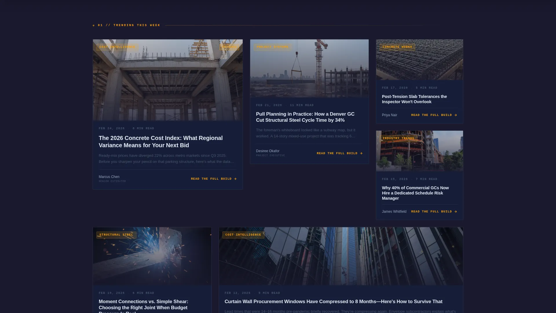
- A staggered modular card grid with upward-entry animations, article previews, amber category chips, and per-card call-to-action buttons
- A sticky bottom bar with a single-field newsletter signup offering "Get the Weekly Pour"
Feature list
This template ships with a focused set of structural and interactive components drawn directly from the design brief.
Dark Glass Panels Header
The header spans the full viewport width as a row of tall, semi-transparent rectangular panels arranged edge-to-edge. Each panel holds a ghosted construction photograph behind smoked glass. As a visitor moves their cursor, parallax motion reveals the image beneath, whether that is a tower crane mid-swing, a frozen welding arc, or a rebar grid. A single titanium silver headline, "Built Knowledge.", anchors the center with no decorative additions. The panels themselves act as navigation, each representing a featured content category.
Staggered Modular Card Grid
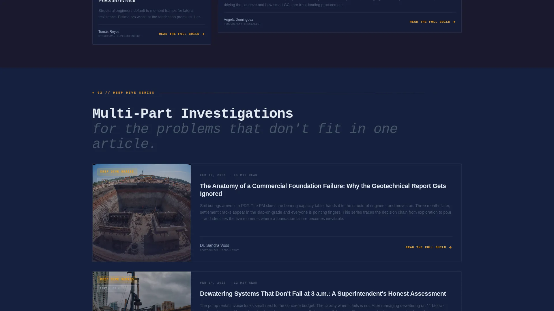
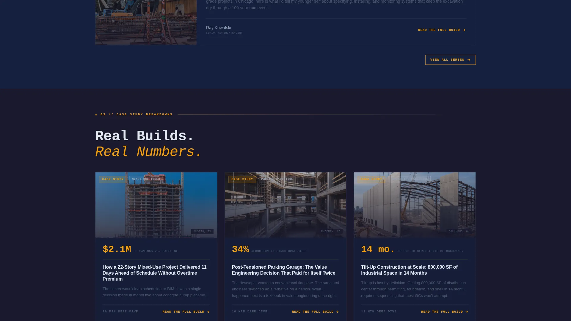
Blog content appears in a modular grid where cards vary in size to signal content weight. Smaller cards represent lighter reads. Larger cards signal deep-dive series or case study breakdowns. As visitors scroll, cards animate in with a subtle upward thrust, as if lifted by hydraulic pressure. The grid tightens progressively as visitors scroll deeper, shifting the experience from scanning to committing.
Amber Category Chips and Read Previews
Every card displays a color-coded amber category chip, an estimated read time, and the first two lines of the article. This combination creates an open loop that pushes the visitor to resolve the incomplete thought by clicking through. No card asks for a click without earning it first.
Per-Card Click-Through Call to Action
Each card carries a primary call-to-action button reading "Read the Full Build" in amber text set against a charcoal background. The label is consistent and action-oriented across the entire grid, reinforcing the click-focused landing page direction without visual clutter.
Sticky Newsletter Signup Bar
After two scroll depths, a sticky bar appears at the bottom of the viewport. It offers "Get the Weekly Pour" and requires only a single email field. This serves as the secondary conversion path, capturing visitors who are engaged but not yet ready to click into a specific article.
Dynamic Motion Animation System
The Launch Energy creative direction is baked into the scroll experience. Cards enter with upward thrust animations. The parallax header responds to cursor movement. The overall motion language feels like energy building toward a groundbreaking, purposeful, directional, and never decorative.
Page sections overview
| Section | Purpose |
|---|---|
| Glass Panels Header | Full-viewport featured category navigation with parallax photo reveals and centered headline |
| Trending Articles Grid | Top-of-page staggered card grid for high-priority and recently published content |
| Deep-Dive Series Row | Mid-page larger cards highlighting long-form editorial and technical series |
| Case Study Breakdowns | Lower-grid section with expanded cards dedicated to project case studies |
| Sticky Newsletter Bar | Persistent bottom bar collecting email signups after two scroll depths |
Design & branding system
The Carbon Fiber color system gives this template a look that feels engineered rather than decorated. Every color choice has a structural role, just like materials on a real build.
- Deep graphite black (#1A1A2E) and reinforced charcoal (#16213E) form the layered dark base, evoking the weave pattern of carbon fiber under resin
- Titanium silver (#E2E8F0) handles headlines and body text, providing high contrast without softening the industrial tone
- High-vis amber (#F59E0B) is reserved for category chips, hover states, call-to-action labels, and badges, functioning like a safety vest accent cutting through a dim jobsite
Mobile & speed optimization
The template is built with a modular grid structure that adapts naturally across screen sizes. The card-based layout means content reflows cleanly without breaking the visual hierarchy.
- Card grid columns collapse into a single-column or two-column stack on smaller viewports, keeping article previews readable and tappable
- The sticky newsletter bar remains accessible on mobile without obscuring core content, maintaining the secondary conversion path across all devices
How this template helps you convert
Scaffold is built around a click-through landing page direction, meaning every design decision points toward a measurable reader action.
- The parallax header panels double as category navigation, so visitors orient themselves and click into a relevant section before they have fully processed that they are navigating
- Each card shows a category chip, read time, and two-line article preview before the call-to-action appears, reducing friction by making the value visible before asking for the click
- The sticky newsletter bar captures secondary intent from visitors who are engaged but not yet ready to commit to a single article, extending the conversion window beyond the first scroll
Other information about this template
Scaffold fits naturally into a broader construction company web presence. The blog landing page can function as a standalone content hub or as a linked section within a larger site structure.
- The template style is Card Grid (Modular), suited for content libraries that grow over time and need clear visual hierarchy
- The Dynamic Motion theme and Launch Energy creative direction make this template a strong fit for firms that want their digital presence to match the energy of an active build site
- The Dark Glass Panels header concept is unique to this template and gives it a visual signature that is difficult to replicate with generic page builders
- The amber accent system is restrained by design, used only for interactive and categorical elements, keeping the palette disciplined and professional

Theme
Dynamic Motion
Creative direction
Launch Energy
Color system
Carbon Fiber
Style
Card Grid (Modular)
Direction
Click-Through
Page Sections
Dark Glass Panels Header with Parallax
Staggered Modular Card Grid
Amber Category Chips and Article Previews
Per-card Click-through Call to Action
Sticky Newsletter Signup Bar
Launch Energy Motion System
Related questions
Who is this landing page template designed for?
Can I change the category labels shown in the header panels?
What does the sticky newsletter bar do?
Does every blog card show the same type of information?
Is this template suitable for a construction company with a large content archive?



