High-Velocity Construction Services Landing Page
Scaffold is a high-velocity construction services landing page built for firms that move fast and win big contracts. The split-screen layout, interactive tab switcher, and feature matrix work together to communicate capability, speed, and proof in one focused scroll. It is designed to drive clicks to an estimate intake page before visitors lose momentum.
by Rocket studio
Quick summary
Scaffold is a single-page construction services landing page built around speed and proof. A three-tab header lets visitors self-select their project type, and a scrolling feature matrix stacks capability evidence row by row. The AI Iridescent color system and split-screen layout make every section feel sharp, modern, and built for decision-makers in a hurry.
Who this template is for
This template is built for construction companies that handle multiple service lines and need to communicate capability without slowing visitors down. It works especially well for firms that want to win fast-moving clients who are already mid-decision.
- General contractors offering ground-up builds, tenant improvements, and emergency structural repairs
- Construction firms targeting startup founders, property managers, and multi-location restaurant groups
- Teams ready to route inbound interest directly to an estimate intake flow
What problem this template solves
Most construction company service pages bury the proof. Visitors land, scroll past generic copy, and leave before they find the project that matches their need. Scaffold fixes that by front-loading service selection and stacking visual and data-driven evidence fast.
- Visitors cannot easily self-identify their project type on a flat, single-service page
- Capability claims without timelines, trade credentials, or budget context fail to convert fast-moving clients
- A contact form on the same page creates friction; routing to a dedicated intake page removes it
What you get with this template
Scaffold delivers a complete, production-ready landing page structure with distinct visual identity and interaction logic built in. Every section is purpose-built to carry a specific conversion job.
- A Feature Tab Switcher header with three tabs: Ground-Up, Tenant Improvement, and Emergency Structural
- A scrolling Feature Matrix with capability tags, full-bleed project photography slots, and a condensed portfolio grid
- Two calls to action: a primary "Get Your Build Timeline" button and a secondary "See Full Project Gallery" link
Feature list
This template is built around a small set of high-impact components. Each one is designed to carry the page forward without adding noise.
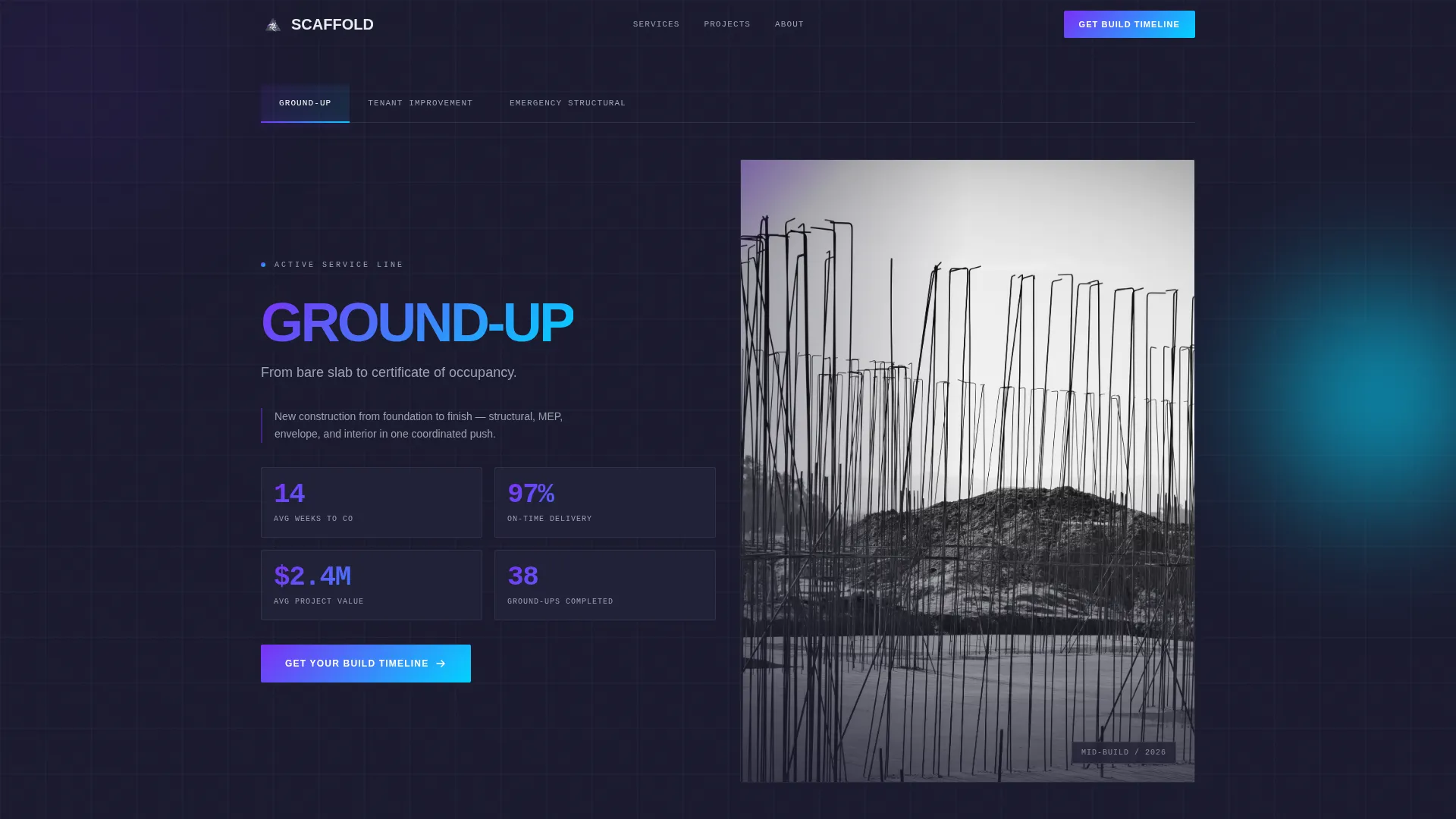
Three-Tab Service Header
The header uses a Feature Tab Switcher with tabs labeled Ground-Up, Tenant Improvement, and Emergency Structural. Each tab swap triggers a lateral slide transition that refreshes both the bold stat cluster on the left panel and the mid-build project photo on the right. The active tab glows with the violet-to-cyan gradient so the selected state is always obvious.
Split-Screen Layout
Every major section divides the viewport 50/50. The left panel carries text, stats, or matrix rows. The right panel holds high-contrast project photography. This structure keeps the page visually grounded in real physical work while the copy delivers the commercial argument.
Scrolling Feature Matrix
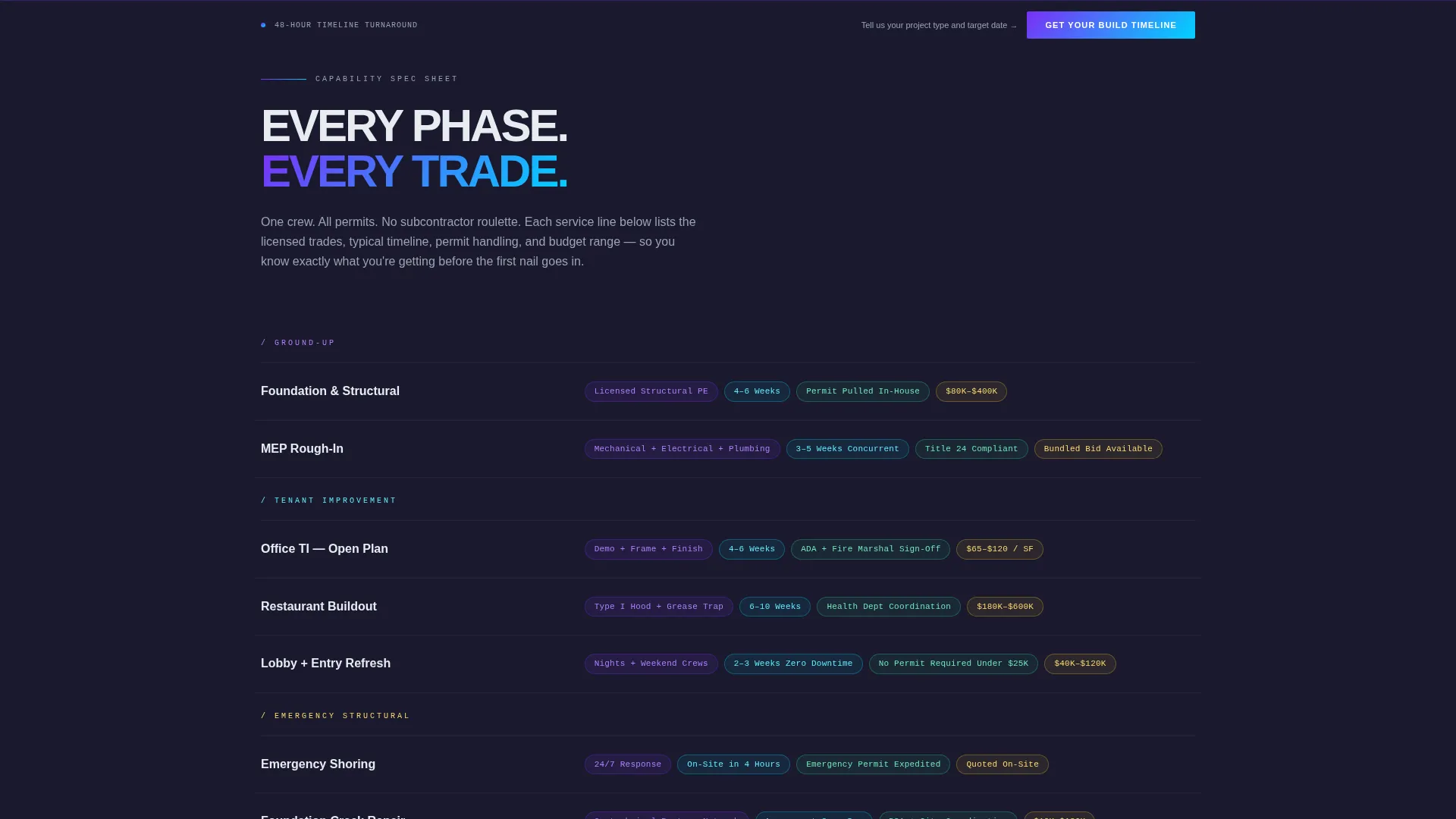
The matrix turns each service line into a comparison row. The left column names the service. The right column stacks three to four capability tags as pill-shaped badges covering licensed trades, typical timelines, permit handling, and budget range. The matrix builds as the visitor scrolls, mimicking the pace of a spec sheet being filled in.
Full-Bleed Project Photography Slots
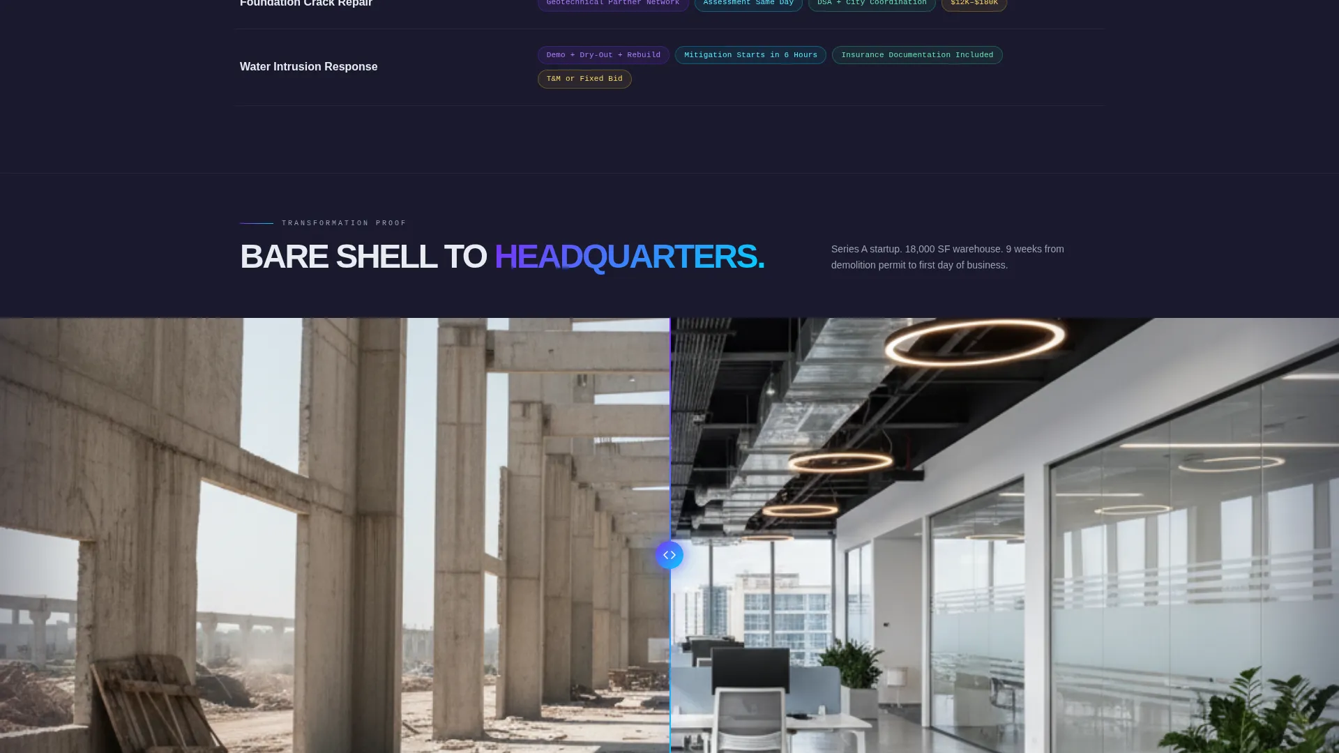
Between matrix sections, full-bleed before-and-after project shots interrupt the scroll rhythm. These image slots are positioned to re-inject emotional context at points where pure data rows could become flat. They keep the page feeling like a live job site rather than a brochure.
Sticky Bottom call to action Bar
After the second scroll section, a sticky bottom bar appears carrying the primary call to action. It persists through the remainder of the scroll so the "Get Your Build Timeline" prompt is always within reach without interrupting the content flow above it.
Condensed Portfolio Grid
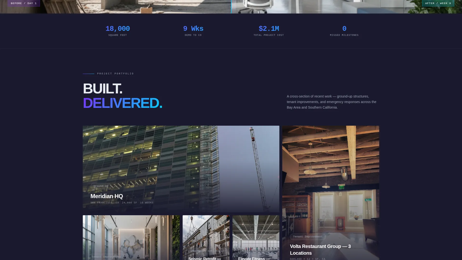
The page closes with a tight portfolio grid that functions as a final trust layer. A secondary call to action, "See Full Project Gallery," sits directly beneath it for visitors who want more evidence before they commit.
Page sections overview
| Section | Purpose |
|---|---|
| Tab Switcher Header | Service self-selection and first impression |
| Left Stat Panel | Bold project metrics per tab |
| Right Photo Panel | Mid-build visual proof per tab |
| Feature Matrix Rows | Capability tags per service line |
| Before-and-After Breaks | Emotional rhythm between data rows |
| Portfolio Grid | Final visual trust layer |
| Sticky call to action Bar | Persistent primary conversion prompt |
| Secondary call to action Block | Softer ask for undecided visitors |
Design & branding system
The visual identity follows a Startup Velocity theme using an AI Iridescent color palette. The system is built to feel like futuristic precision layered onto raw physical work.
- Base colors: deep graphite (#1A1A2E) for all backgrounds, pearl white (#E8ECF1) for body text and section dividers
- Accent system: holographic violet (#7B2FF7) and electric cyan (#00D4FF) blend into a gradient used exclusively on buttons, active tabs, and hover states
- Interactive states pulse with the violet-to-cyan gradient so every clickable element signals action immediately
Mobile & speed optimization
The layout is structured so the split-screen and tab switcher adapt cleanly at smaller viewports. The design choices prioritize fast visual scanning on any screen size.
- The 50/50 split collapses to a stacked single-column view on mobile without losing section hierarchy
- Tab labels and call to action buttons remain large and thumb-friendly at mobile breakpoints
- The sticky bottom call to action bar is designed to stay accessible on shorter screens without covering critical content
How this template helps you convert
Scaffold earns the click by structuring the page as a logical progression from self-selection to proof to ask. Every interaction is designed to reduce hesitation rather than add steps.
- The tab switcher lets visitors identify their project type immediately, so the content they see next feels relevant rather than generic.
- The feature matrix builds credibility row by row, answering the practical questions (trades, timelines, permits, budget) that fast-moving clients need answered before they act.
- The sticky call to action and portfolio grid catch visitors at both the mid-scroll confidence point and the end-of-page decision point, giving two natural moments to click through.
Other information about this template
Scaffold is designed specifically for the construction company services page niche and fits naturally into the broader category of construction company website templates. The template style is split-screen, the theme is Startup Velocity, and the creative direction is Feature Matrix.
- The header concept is a Feature Tab Switcher, making it easy to present multiple service lines without building separate pages
- The landing-page direction is Click-Through, meaning the goal is routing visitors to a dedicated estimate intake page rather than capturing leads on-page
- The color system is AI Iridescent, a palette that sets this template apart from conventional earthy or neutral construction site aesthetics
- This template is categorized under Technology, reflecting its forward-looking visual language and interaction design even within a traditional trades context
Theme
Startup Velocity
Creative direction
Feature Matrix
Color system
AI Iridescent
Style
Split Screen (50/50)
Direction
Click-Through
Page Sections
Three-tab Feature Switcher Header
50/50 Split-screen Layout
Scrolling Feature Matrix with Capability Tags
Full-bleed Before-and-after Image Slots
Sticky Bottom Call to Action Bar
Condensed Portfolio Grid with Secondary Call to Action
Related questions
Can I add more service tabs to the header?
Does the template include actual project photos?
Where does the primary call to action button route visitors?
Is this template a good fit for a single-trade contractor?
Can I update the color palette to match my own brand?



