Developer Documentation Professional Website Template
Scaffold is a production-ready Angular component library built for speed and precision. It ships 140+ components including sortable data tables, validated form systems, and dashboard shells. Designed for senior Angular developers and engineering leads at mid-size SaaS companies, it cuts repetitive wiring and gets you building faster from the first file you open.
by Rocket studio
Quick summary
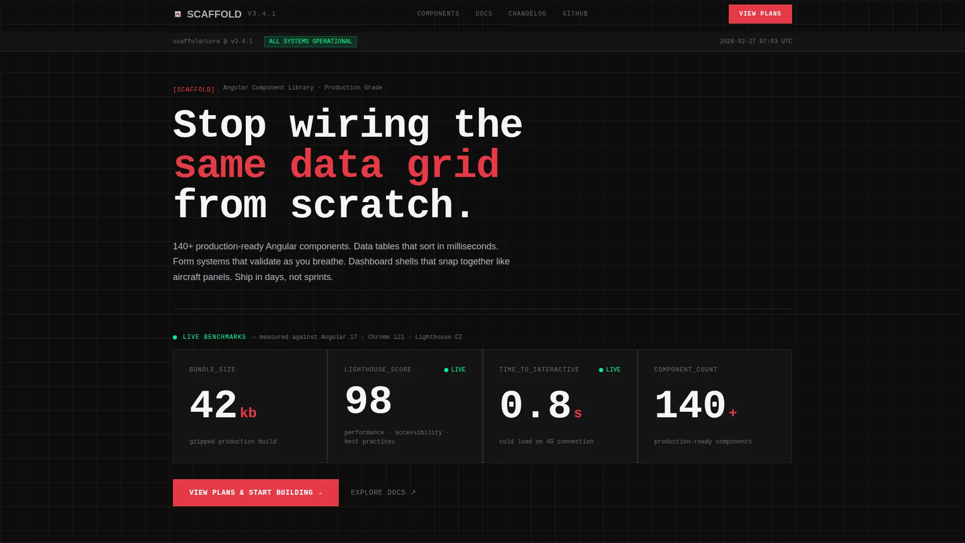
Scaffold is an Angular landing page template built around a live dashboard header and an interactive component picker. It ships with 140+ production-ready components, a 42kb gzipped bundle, a Lighthouse score of 98, and a time-to-interactive of 0.8 seconds. It is built for engineering teams who need to stop rebuilding the same data grid and start shipping.
Who this template is for
This template is built for developers and technical leads who are already deep in the stack and have no time to waste on cosmetic scaffolding.
- Senior Angular developers building admin panels, analytics dashboards, or CRM back-offices
- Engineering leads at mid-size SaaS companies managing tight sprint deadlines
- Front-end teams tired of wiring up data grids and form validation from scratch
What problem this template solves
Most component libraries ship raw building blocks with no production context. You get a button, a table, and a form input, then spend three sprints connecting them. Scaffold closes that gap.
- Eliminates repetitive boilerplate for data tables, form systems, and dashboard shells
- Removes the need to configure sorting, validation, and layout logic from zero
- Gives teams a coherent, deployable starting point instead of a component sandbox
What you get with this template
Scaffold delivers a complete Angular landing page structured as a dashboard and data grid showcase. Every section is functional, not decorative.
- A live stats header rendering real benchmarks: 42kb gzipped bundle, 98 Lighthouse score, 0.8s time-to-interactive, and 140+ components
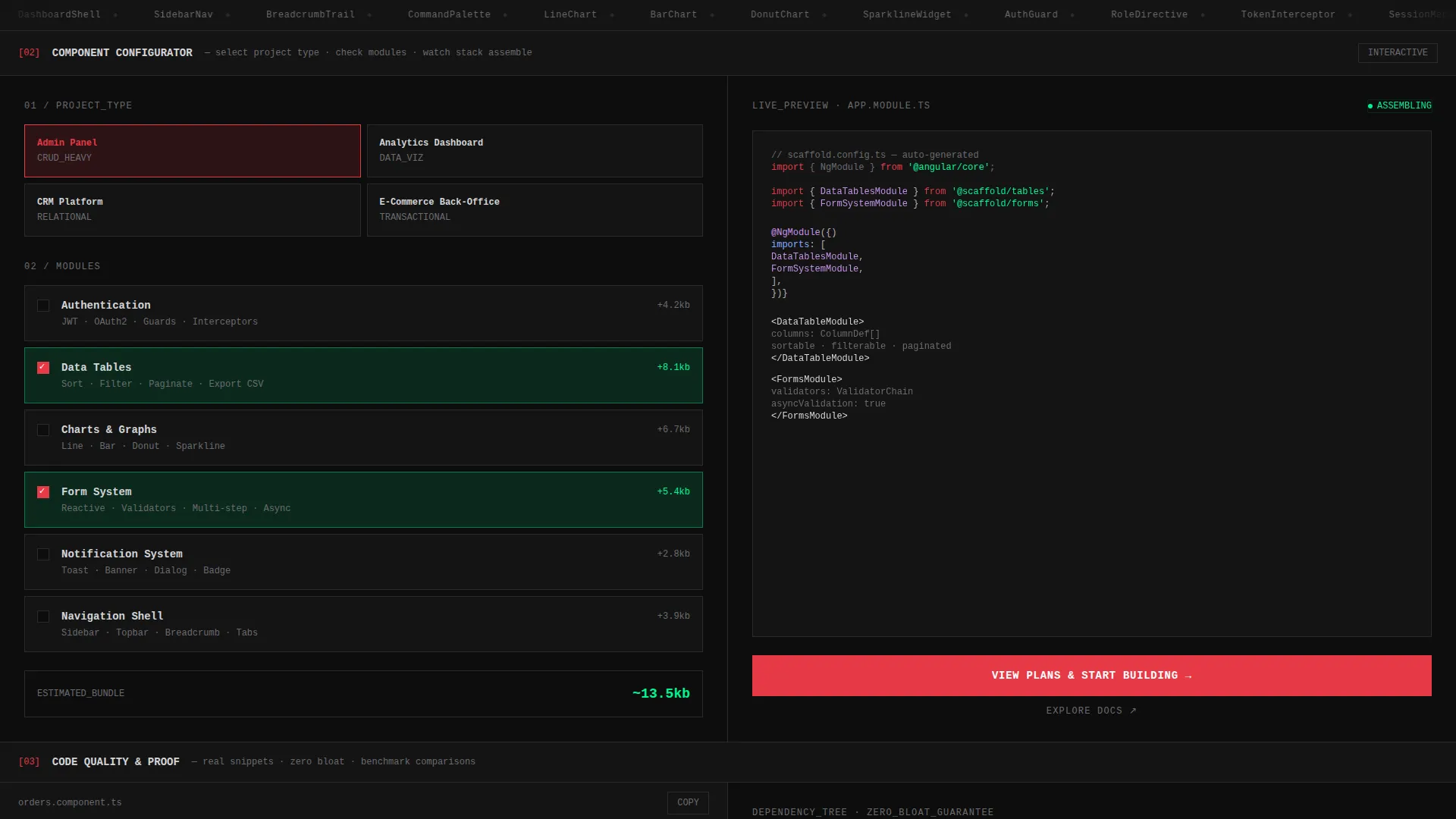
- An interactive component picker where visitors select a project type and modules, then watch a live preview assemble in real time
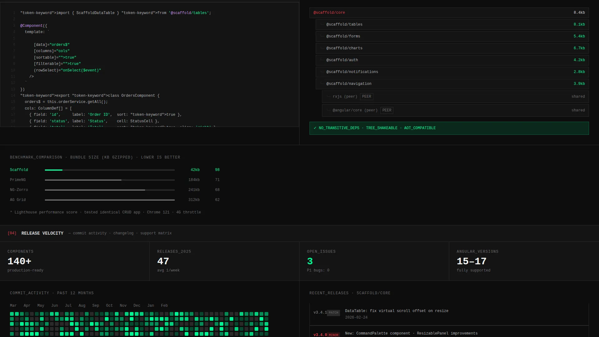
- Proof sections including code snippets with copy buttons, a dependency tree visualization, render comparisons, and a commit activity graph
Feature list
Scaffold's feature set is purpose-built for Angular teams who value function over flourish. Every component earns its place.
Live Benchmark Stats Header
The header renders real performance numbers directly in the viewport as a functioning data grid. Bundle size, Lighthouse score, time-to-interactive, and component count display in oversized monospace type, ticking upward on load like a deployment monitor.
Interactive Component Picker
Visitors select a project type (admin panel, analytics dashboard, CRM, or e-commerce back-office) and check off required modules such as auth, tables, charts, forms, and notifications. A live preview assembles on the right half of the grid in real time.
Production-Ready Data Tables
Data tables are built to sort in milliseconds with no configuration overhead. They slot into any Angular project without rebuilding sorting logic, column management, or state handling from scratch.
Validated Form Systems
Form components validate as input happens. The system handles field-level feedback without requiring custom validator wiring, reducing setup time across complex multi-field layouts.
Dashboard Shell Components
Dashboard shells snap together like prefabricated panels. Layout regions, sidebars, and content zones are pre-composed so teams can populate structure rather than build it.
Code Snippet Sections with Copy Buttons
Each proof section includes real code examples with one-click copy buttons. Developers can read implementation context directly on the page before making any purchase decision.
Page sections overview
| Section | Purpose |
|---|---|
| Live Stats Header | Displays real benchmark numbers as a functioning data grid in the viewport |
| Component Picker Tool | Lets visitors configure a project type and module set with a live preview |
| Code Snippet Proof | Shows real implementation examples with copy buttons for developer trust |
| Dependency Tree View | Visualizes zero-bloat architecture with a clear dependency breakdown |
| Render Comparison | Side-by-side performance comparison against alternative approaches |
| Commit Activity Graph | GitHub-style release velocity graph showing consistent development activity |
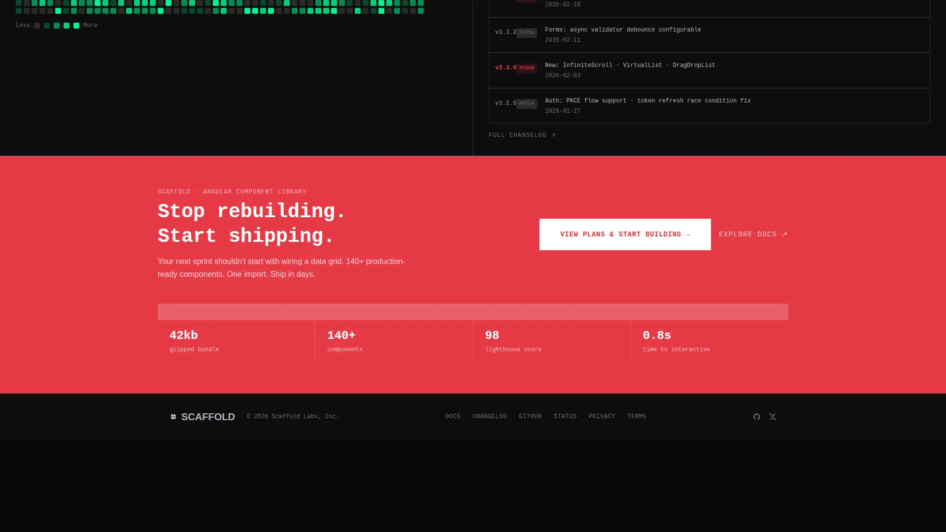
| Primary call to action Bar | Full-width click-through prompt to the pricing and plans page |
Design & branding system
The visual identity follows a Bold Brutalist theme built on a Carbon Fiber color system. Every design decision is intentional and functional, nothing is decorative without a purpose.
- Core palette: deep carbon black (#0D0D0D) backgrounds, machined aluminum (#B0B0B4) text, exposed-wire red (#E63946) for interactive borders and hover states, and status-green (#00F593) reserved strictly for live data and success states
- Typography uses monospace type throughout, giving numbers and code a raw, mechanical precision
- Grid structure is strict with exposed borders and hard alignment, no gradients, no soft edges, no overlapping elements
Mobile & speed optimization
The template is engineered around the same performance standards it advertises. The benchmark numbers on the page reflect real delivery targets built into the template.
- 42kb gzipped bundle size keeps initial load lean across connection speeds
- 0.8 second time-to-interactive means the page responds almost immediately on load
- Grid-based layout with no floating elements translates cleanly across viewport sizes
How this template helps you convert
The landing page is optimized as a click-through flow directing visitors to the pricing and plans page. Conversion happens through demonstration, not persuasion.
- The interactive component picker lets visitors configure their exact stack before clicking anything, making the primary call to action feel like a natural next step rather than a cold ask
- The primary call to action "View Plans & Start Building" in exposed-wire red appears first at the bottom of the component picker tool, then again as a full-width bar after all proof sections
- A secondary "Explore Docs" text link sits beside the primary call to action for developers who need to review documentation before committing
Other information about this template
Scaffold is built specifically for the Angular ecosystem and reflects the real workflow of engineering teams shipping production software on deadlines.
- The template style is a Dashboard and Data Grid layout, suited for Angular documentation and component library showcase pages
- The Bold Brutalist theme and Carbon Fiber palette are deliberate trust signals, the design communicates that this library is engineered, not marketed
- The Calculator and Tool First creative direction means the interactive picker does the selling before any pricing is shown
- This template fits Angular template library use cases including admin panels, CRM dashboards, analytics back-offices, and e-commerce management tools
- The header concept draws from Stats and Metrics dashboards, using live numbers to replace traditional hero imagery
Theme
Bold Brutalist
Creative direction
Calculator/Tool First
Color system
Carbon Fiber
Style
Dashboard/Data Grid
Direction
Click-Through
Page Sections
Live Benchmark Stats Header
Interactive Component Picker
Production-ready Data Tables
Validated Form Systems
Dashboard Shell Components
Code Proof Sections with Copy Buttons
Related questions
What types of Angular projects can Scaffold support?
How many components does Scaffold include?
What does the interactive component picker do?
Can I review code examples before purchasing?
What are the performance benchmarks for this template?



