Software & SaaS Professional Website Template
Scaffold is a bento grid landing page template built for no-code and low-code platforms. It uses a glassmorphic Dashboard Pro visual system with dark ambient surfaces, frosted glass cards, and electric indigo accents. The layout leads with live-looking user interface fragments, stat proof, and side-by-side comparison modules designed to move skeptical builders toward signing up.
by Rocket studio
Quick summary
Scaffold is a single-page bento grid landing page template for no-code and low-code platform products. It opens with a viewport-filling dark glass panel header, flows immediately into scroll-triggered stat cards, then builds conviction through relentless comparison modules. The visual language is glassmorphic: near-black backgrounds, frosted panels, and indigo and mint accents that feel alive.
Who this template is for
This template is built for teams and founders who need to communicate the speed and power of a no-code or low-code platform without resorting to long feature lists or generic hero sections.
- Startup founders and CTOs launching a builder or internal tool platform
- Marketing and ops leaders promoting a workflow automation or dashboard product
- Agency founders who need a polished, high-converting landing page ready fast
What problem this template solves
Most software landing pages lead with abstract value propositions and buried feature grids. Visitors leave before they feel the product. This template flips that structure entirely.
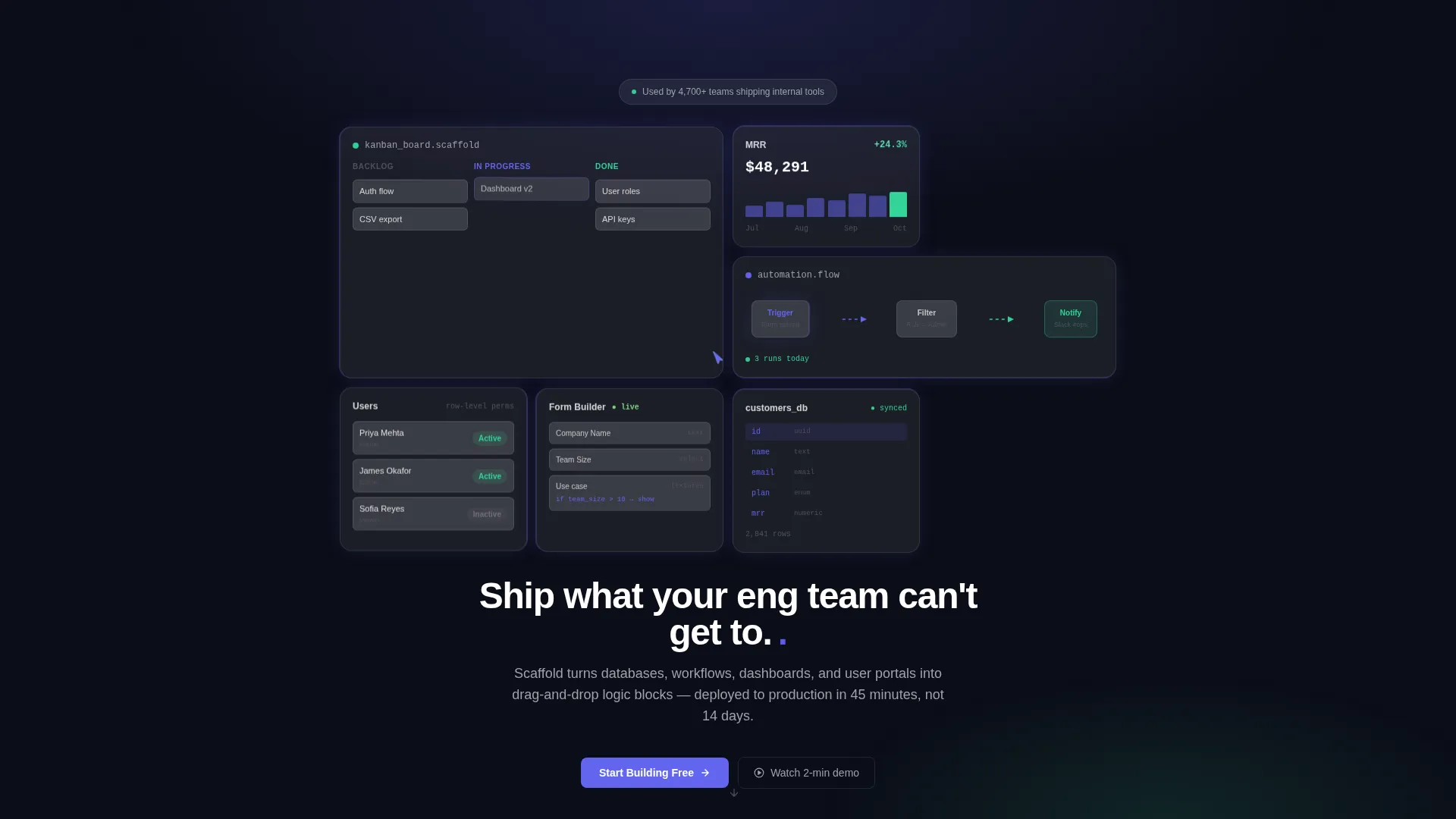
- Visitors land inside a working-looking interface before they read a single headline
- Comparison modules replace persuasion copy with direct, quantified proof
- The path from curiosity to action is shortened by removing every unnecessary friction layer
What you get with this template
You get a fully structured bento grid landing page with a clear visual hierarchy and a conversion architecture built around showing proof before making claims.
- A viewport-filling bento header with six to eight frosted glass panels showing live-looking user interface fragments
- Four scroll-triggered stat cards, a mid-page interactive versus calculator, and a floating glass navigation bar
- A complete glassmorphic design system including color tokens, card styles, micro-animation cues, and call to action states
Feature list
This template ships with a tightly designed set of layout sections and interaction patterns. Each one is grounded in the comparison-first conversion strategy described in the brief.
Dark Glass Bento Header
Six to eight frosted bento cards of varying sizes fill the viewport. Each card displays a live-looking user interface fragment: a Kanban board mid-drag, a real-time revenue chart, a workflow automation canvas, or a form builder with conditional logic. A single typed headline appears across the center gap after a brief beat.
Scroll-Triggered Stat Row
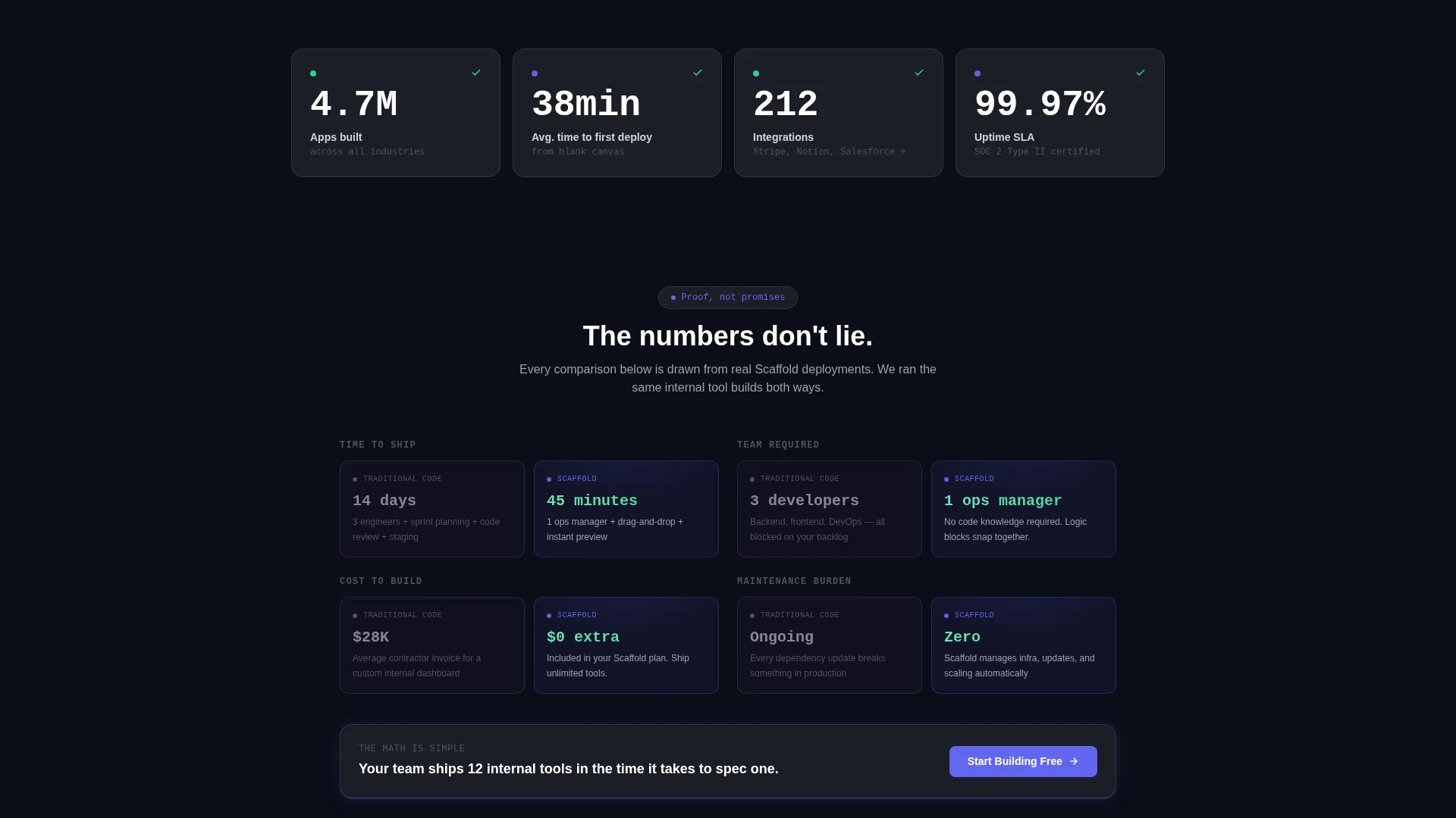
Four full-width glass-panel stat cards sit immediately below the header. Each number counts up on scroll entry and finishes with a soft mint accent flash. The stat row leads with proof before the first persuasion section begins.
Comparison and Versus Modules
Side-by-side comparison theaters alternate with bento feature grids throughout the scroll. Each module places a gray, static code view on the left against an indigo-lit, animated no-code equivalent on the right. Embedded stats like time saved and cost difference appear inside every comparison.
Inline Versus Calculator
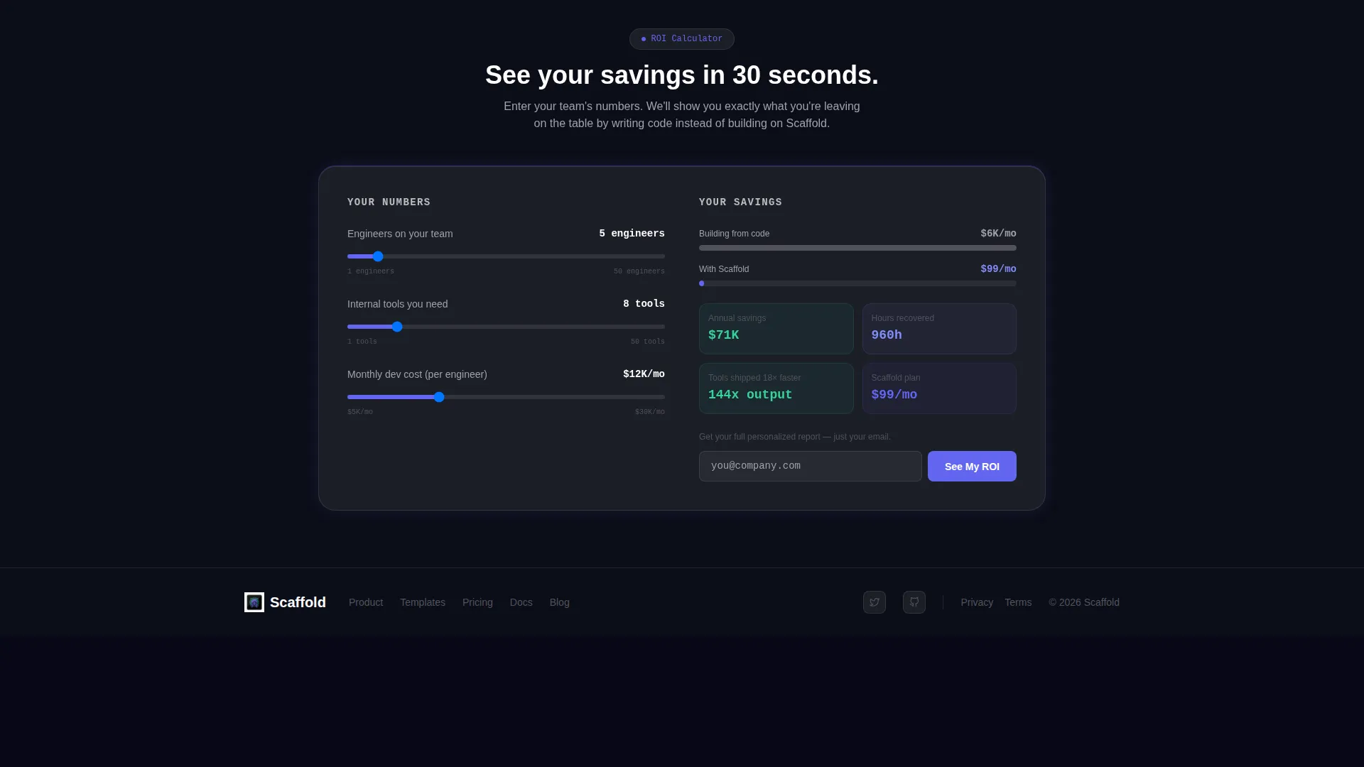
A mid-page interactive calculator lets visitors input their team size, number of internal tools, and current monthly development cost. The page renders a personalized glass-panel savings breakdown instantly. The section ends with a gated "See Your ROI" call to action that collects only an email address.
Floating Glass Navigation Bar
A pinned navigation bar appears after the first scroll. It carries the primary "Start Building Free" call to action in indigo with a mint hover state. The button bypasses any form and drops the visitor directly into a sandboxed builder environment with a sample project pre-loaded.
Glassmorphic Card System
Every card in the layout uses a 20-pixel blur backdrop, a 1-pixel luminous border, and a frosted panel fill at 12 percent opacity. Hover states wash an indigo underlay beneath the card surface. Cards grow subtly brighter as the visitor scrolls deeper, creating a sense of the interface waking up.
Page sections overview
| Section | Purpose |
|---|---|
| Bento Header Panels | Open with live-looking user interface fragments before any headline appears |
| Typed Hero Line | Deliver the core product message after the panels establish context |
| Stat Proof Row | Lead the scroll with four quantified platform metrics |
| Versus Module One | Compare traditional code workflow against no-code equivalent |
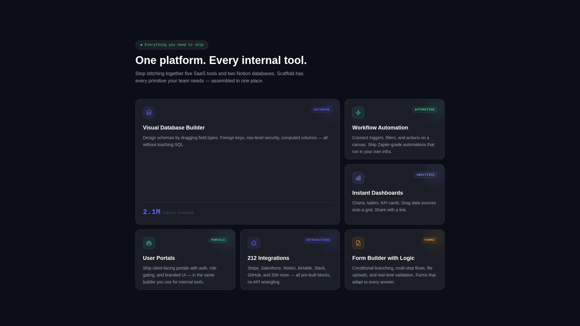
| Bento Feature Grid | Display platform capabilities in scannable glass card tiles |
| Versus Module Two | Show developer headcount and sprint timeline comparisons |
| Inline ROI Calculator | Let visitors personalize savings before the conversion ask |
| Floating Nav Bar | Keep the primary call to action visible throughout the full scroll |
| Final call to action Section | Close with a direct invite to start building for free |
Design & branding system
The visual identity follows a Dashboard Pro theme built entirely on a glassmorphic color system. The palette evokes a cockpit at night: dark ambient surfaces with luminous data glowing through translucent layers.
- Core colors: deep void black (#0B0D17) for backgrounds, frosted white at 12 percent opacity (#FFFFFF1F) for card fills, electric indigo (#6366F1) for interactive elements and live-state accents, and soft mint (#34D399) pulsing on success states and metric completions
- Body text sits in cool gray (#A1A1AA) with pure white reserved for stats and headlines; radial gradients and 1-pixel glowing borders keep the dark surfaces from feeling flat
Mobile & speed optimization
The bento grid layout uses variable card sizing designed to reflow cleanly across screen widths. The template is structured to stay readable and scannable on smaller viewports without losing the glassmorphic atmosphere.
- Glass panel cards and comparison modules are designed to stack vertically on mobile without losing visual hierarchy
- Micro-animations including number countups, status badge flips, and cursor ghost elements are scoped to scroll-enter triggers to keep interactions purposeful across all devices
How this template helps you convert
The conversion architecture is built around removing hesitation at every step. The template earns the click by showing the product in action before asking for anything.
- The bento header immerses visitors in a working-looking interface immediately, establishing credibility before a single line of persuasion copy appears.
- The relentless claim-prove-compare rhythm across every scroll section builds cumulative conviction, so the "Start Building Free" call to action arrives after the visitor has already been shown the outcome.
- The versus calculator makes the value personal by reflecting each visitor's own team size and costs back to them, then gates only an email address to see the full savings breakdown.
Other information about this template
This template is designed for the no-code and low-code platform category within the broader Software and SaaS technology space. It is suited for product launches, rebrand campaigns, and competitive positioning pages where proof-over-persuasion is the right strategy.
- The bento grid template style makes it straightforward to rearrange or extend card sections without breaking the overall visual rhythm
- The Stats-First Impact creative direction and Comparison/Versus landing page direction are baked into the layout structure, not applied as a visual skin on top of a generic template
- This template works well alongside drag-and-drop no-code builders where the design system tokens can be mapped directly to the platform's own component library
Theme
Dashboard Pro
Creative direction
Stats-First Impact
Color system
Glassmorphic
Style
Bento Grid
Direction
Comparison/Versus
Page Sections
Dark Glass Bento Header
Scroll-triggered Stat Cards
Comparison and Versus Modules
Inline ROI Calculator
Floating Glass Navigation Bar
Glassmorphic Card Design System
Related questions
Who is this landing page template designed for?
Can I customize the stats and comparison numbers?
Do I need coding skills to edit this template?
What makes this template different from a standard SaaS landing page?
Is the versus calculator section functional out of the box?



