Platform Engineering Newsletter Landing Page Template
Scaffold is a split-screen landing page template built for platform engineering newsletters and communities. It pairs a terminal-dark visual identity with a clinical two-panel layout, guiding readers from a free newsletter subscription to a paid community upgrade. The design earns trust with density, opinionated copy, and tiered conversion paths built for technical audiences.
by Rocket studio
Quick summary
Scaffold is a 50/50 split-screen landing page template designed for a platform engineering newsletter and community. It uses a Midnight Blue color system and a Data Command visual theme to feel like a live terminal. Two conversion tiers move readers from a free subscription to a paid community plan with minimal friction.
Who this template is for
This template is built for technical newsletter creators and community operators who write for practitioners, not executives. If your audience lives in terminals, reads request for comments (RFC) documents for fun, and distrusts anything that feels like marketing, this layout speaks their language.
- Platform engineering newsletter authors targeting staff engineers and DevOps leads
- Community builders running tiered membership models for SREs and infrastructure teams
- Operators migrating technical audiences from informal channels into a structured paid community
What problem this template solves
Most newsletter landing pages feel generic. A clinical, high-density layout built around a freemium funnel solves that mismatch for technical audiences who need proof before they subscribe.
- Generic templates lack the visual credibility needed to convert skeptical engineers
- Soft, image-heavy layouts create friction for readers who expect signal over decoration
- Freemium-to-paid conversion is hard when the value gap between tiers is not clearly shown
What you get with this template
You get a fully structured single-page layout with two distinct conversion paths and a design system built around a dark terminal aesthetic. Every section is a self-contained specification block, not a filler panel.
- A Dark Glass Panels header with a two-column frosted card layout and a pulsing vertical divider
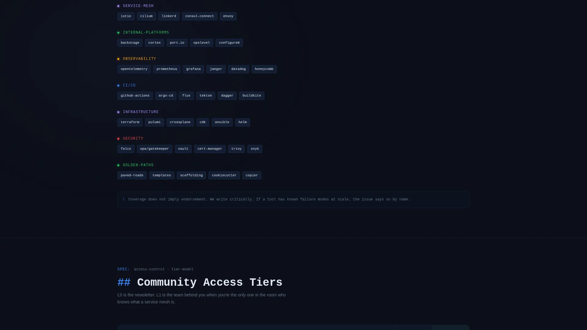
- A Spec Sheet scroll structure covering "What Ships," "Signal-to-Noise Ratio," "Community Access Tiers," and "Stack We Cover"
- A freemium comparison table (L0 versus L1) and a card-entry form for the paid community upgrade path
Feature list
This section covers the core capabilities built into the Scaffold template as described in the source brief.
Split-Screen Header with Dark Glass Panels
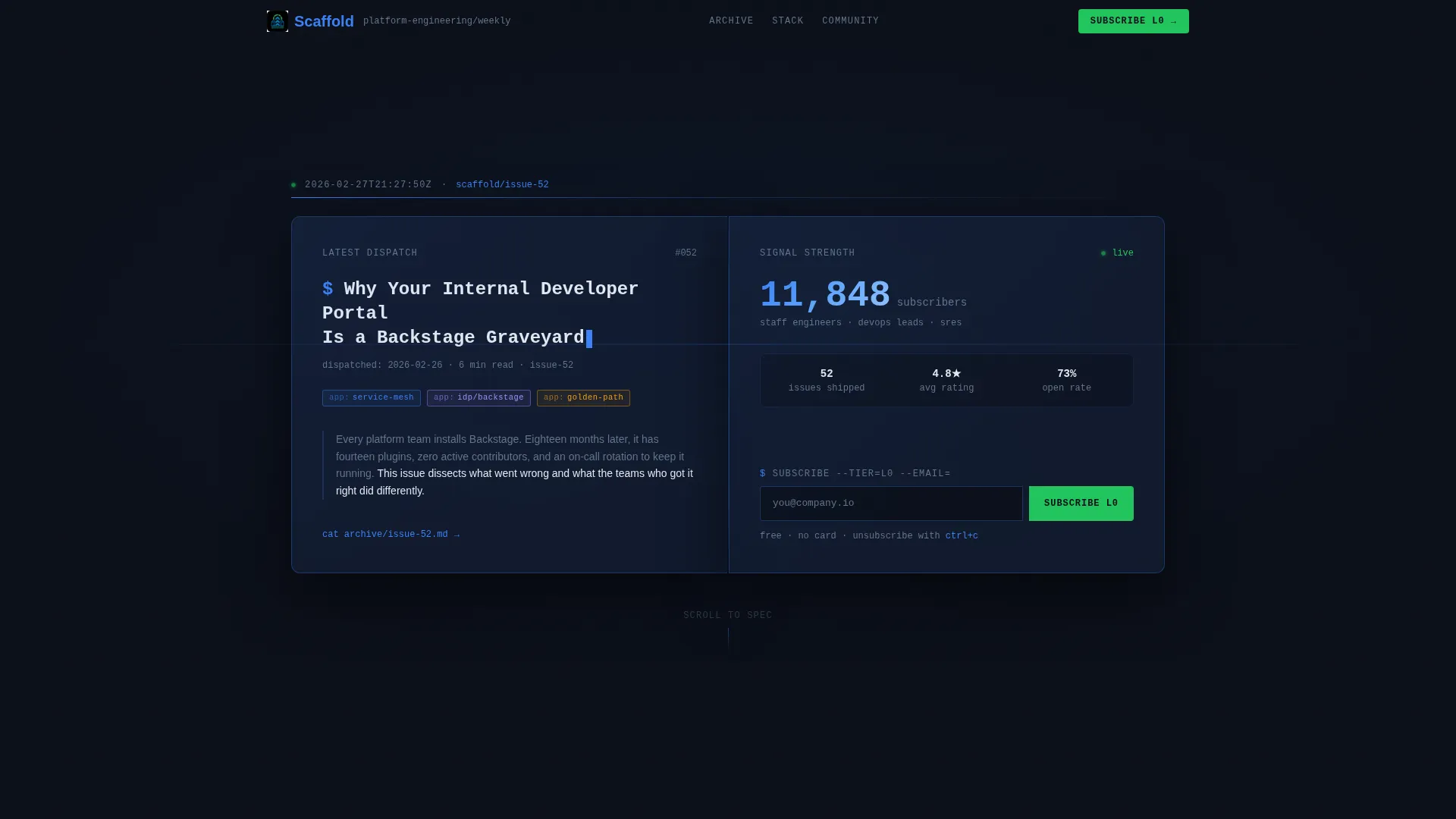
The header uses two frosted semi-transparent cards floating over a void-black background. The left panel shows the latest issue title, date stamp, and three topic tags styled as Kubernetes-label badges. The right panel displays a live subscriber count and a single glowing email input field.
Pulsing Vertical Divider
A thin vertical divider sits between the two header panels and pulses once in cathode-blue, mimicking a blinking terminal cursor. This detail reinforces the terminal aesthetic and signals interactivity without adding visual clutter.
Spec Sheet Scroll Structure
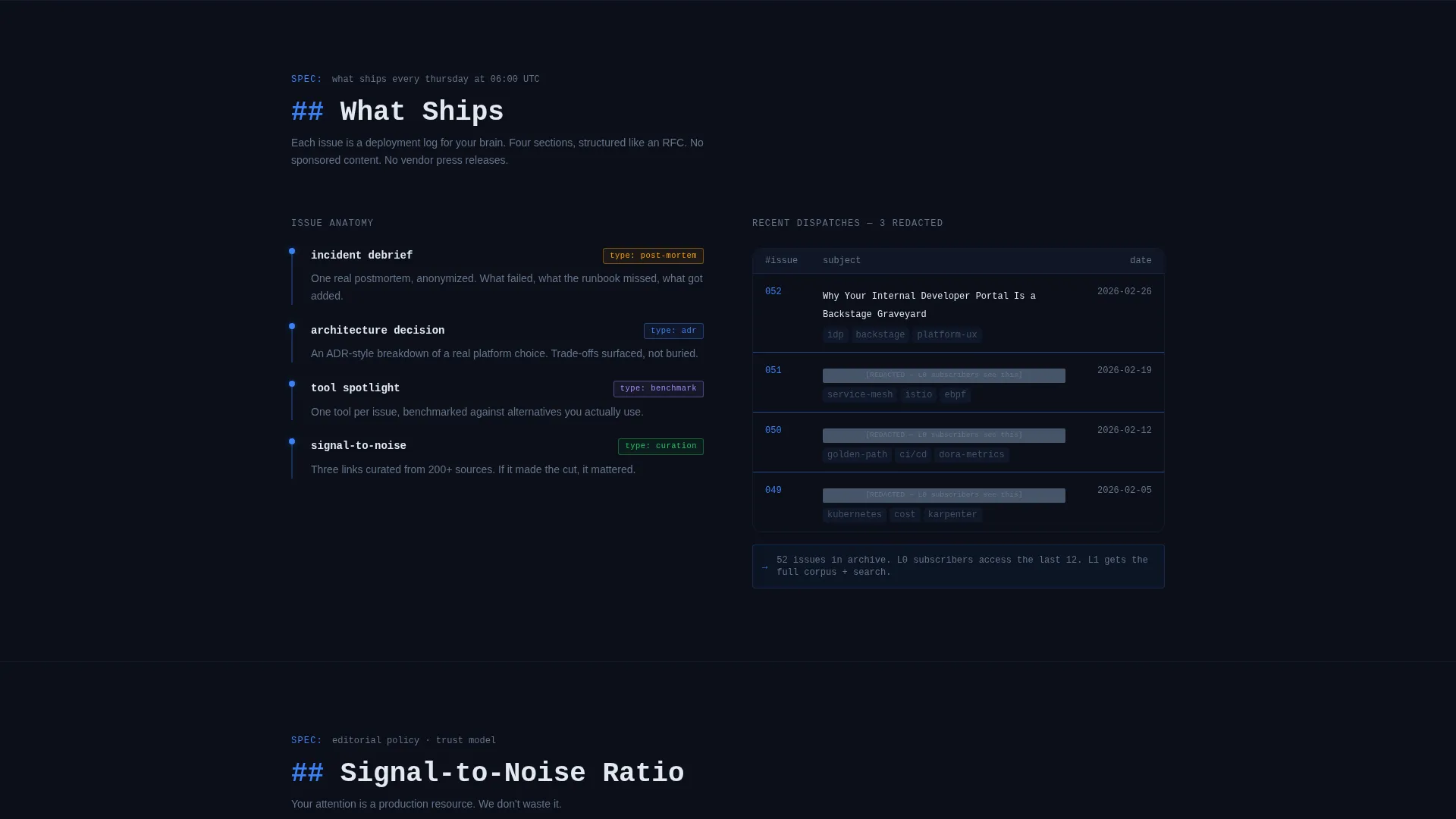
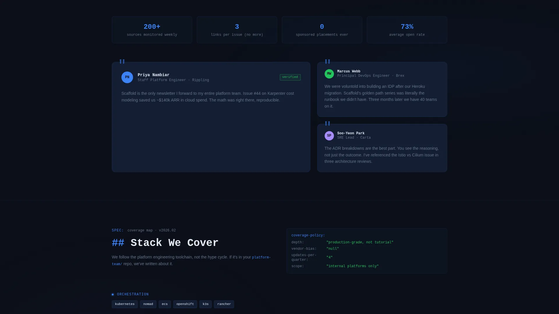
Each scroll section is a self-contained specification block with monospaced headers. Short value statements appear on the left panel while supporting evidence, including pull-quote testimonials from named engineers and issue archive counts, appears on the right.
Redacted Issue Preview Blocks
Three redacted issue subject lines are displayed to create information gaps that motivate subscription. The headlines are visible enough to communicate value but obscured enough to require the reader to subscribe for the full content.
L0 and L1 Conversion Tier Layout
The page presents two conversion paths. The primary call to action is "Subscribe at L0" requiring only an email address. A secondary path below the fold introduces "Upgrade to L1," which unlocks a private Slack community, architecture review threads, and a monthly ask-me-anything (AMA) session.
Inline Tier Comparison Table
Before the paid conversion form appears, an inline comparison table sets out the differences between L0 and L1. This layout earns the upgrade click by making the value gap concrete rather than implied.
Page sections overview
| Section | Purpose |
|---|---|
| Dark Glass Header | Capture email at first glance |
| What Ships | Define newsletter content scope |
| Signal-to-Noise Ratio | Build credibility with density |
| Community Access Tiers | Introduce L0 and L1 tiers |
| Stack We Cover | Show technical topic coverage |
| Redacted Issue Previews | Create information gaps to drive subscriptions |
| L0 versus L1 Table | Clarify paid tier value before conversion |
| Upgrade call to action Block | Present card-entry form for L1 signup |
Design & branding system
The template uses a Midnight Blue color system with a Data Command theme. Every color choice has a functional role, creating a palette that feels like the ambient glow of a monitoring dashboard in a darkened operations center.
- Void-black (#0B0F19) as the primary background, deep operations blue (#141E33) for card surfaces and panel dividers, cold cathode (#3B82F6) for interactive highlights, and status-green (#22C55E) reserved exclusively for the subscribe button and confirmation states
- Monospaced typography for section headers to reinforce the RFC and terminal reading experience
- Frosted glass card surfaces with subtle depth-of-field blur behind header panels, replacing hero images with user interface as content
Mobile & speed optimization
The split-screen 50/50 layout is structured to reflow cleanly on smaller viewports. The clinical, content-dense design relies on text and structured components rather than heavy images, which supports faster load behavior on mobile connections.
- The two-panel header collapses into a stacked single-column layout on narrow screens
- Spec Sheet section blocks are independently contained, making them easy to reorder or stack for mobile viewing
- No decorative hero images means the page loads its primary content-first without waiting for large media assets
How this template helps you convert
The Scaffold template is designed to move a skeptical technical reader from first impression to email submission and then toward a paid upgrade, using earned trust rather than persuasion pressure.
- The Dark Glass Panels header places the subscribe input above the fold with a live subscriber count as social proof, reducing the decision cost for the L0 free tier to a single email field.
- The Spec Sheet scroll rhythm and redacted issue previews build compounding curiosity, giving the reader enough signal to want more before the paid conversion path appears.
- The inline L0 versus L1 comparison table and anonymized Slack thread screenshot demonstrate concrete community value before asking for a payment commitment.
Other information about this template
Scaffold is designed as a standalone landing page for platform engineering content creators who need a focused, high-trust entry point for their audience. It does not assume any specific publishing platform or community tool, making it adaptable across deployment contexts.
- The template suits newsletters covering topics such as service meshes, internal developer portals, and golden paths in the platform engineering space
- The tiering language (L0 and L1) is built into the layout and can be relabeled to match your own community naming conventions
- The visual identity is self-contained and does not depend on external icon libraries or third-party font services beyond what is described in the brief
Theme
Data Command
Creative direction
Spec Sheet
Color system
Midnight Blue
Style
Split Screen (50/50)
Direction
Freemium/Trial
Page Sections
Split-screen Dark Glass Header
Pulsing Cathode-blue Divider
Spec Sheet Scroll Sections
Redacted Issue Preview Blocks
Freemium Tier Conversion Layout
Inline L0 Versus L1 Comparison Table
Related questions
Can I use this template for a newsletter on a different technical topic?
Does this template include the actual live subscriber count functionality?
What are the L0 and L1 tiers included in this template?
Is the tier comparison table editable?
Who is this landing page template designed to attract?



