Advanced Cloud & DevOps Professional Website Template
Optimize is a bold brutalist cloud cost optimization landing page template built for FinOps teams and engineering leaders who need to show real waste, fast. Dark glass metric panels, hard-border data grids, and a scroll-linked savings bar create a command-center feel that earns the click to "Run a Free Audit" without a single form field on the page.
by Rocket studio
Quick summary
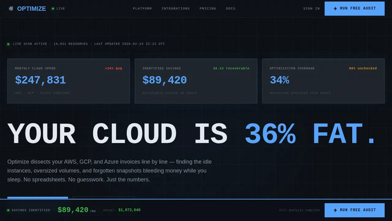
Optimize is a single-page brutalist landing template designed for cloud cost optimization platforms. It opens with three dark glass metric panels floating against a pure black background, escalates through numbered spec-sheet data grids, and closes with a floating savings bar that locks a primary call-to-action at the bottom of every scroll. No hero image. No decorative filler. Just numbers that make visitors feel the weight of their own waste.
Who this template is for
This template is built for technical founders, FinOps practitioners, and cloud infrastructure software teams who need landing pages that speak directly to an engineering audience. The aesthetic direction is intentional: raw, clinical, and credible.
- VP Engineering and FinOps analysts who need to present cloud waste data without softening it
- CTOs and platform leads launching a cloud cost optimization product or audit service
- Developers and software teams who want professional, high-converting landing pages without a bloated design process
What problem this template solves
Most SaaS landing pages rely on lifestyle imagery and vague benefit statements. That approach collapses when your target audience is a VP Engineering who just watched their AWS bill triple. This template solves the credibility gap between a marketing page and a tool that actually surfaces data.
- Generic landing pages fail technical buyers who expect to see real numbers, not promises
- Soft visual design undermines trust with FinOps analysts and engineering decision-makers
- Teams spend weeks building professional landing pages that still do not convert visitors from a technical audience
What you get with this template
You get a complete, ready-to-customize single-page layout built on a dark glass aesthetic with every section mapped to a specific conversion role. The template supports both immediate deployment and deeper customization for teams who want to adapt the brand, copy, or grid structure.
- A hero section with three live-formatted dark glass metric panels and a brutalist uppercase headline
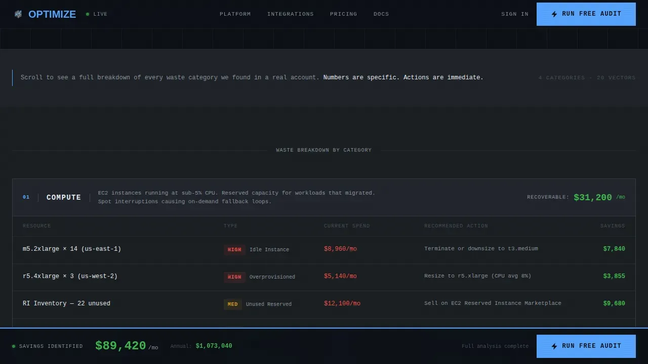
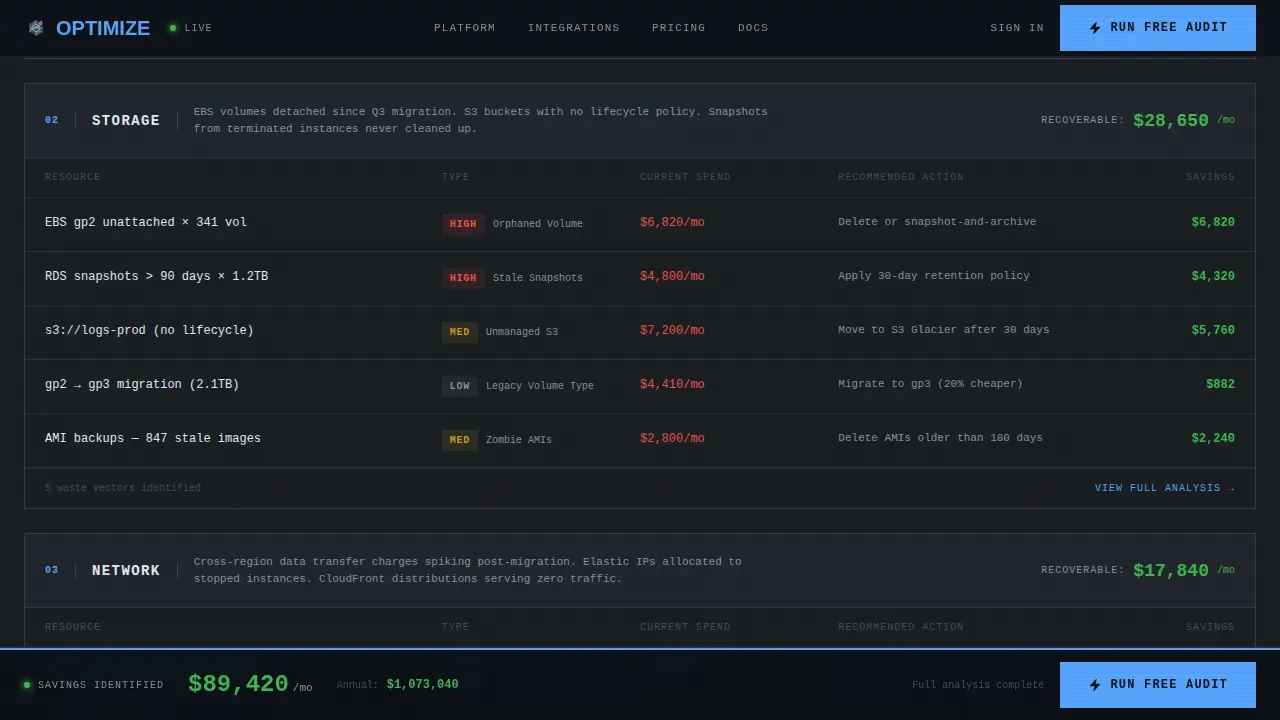
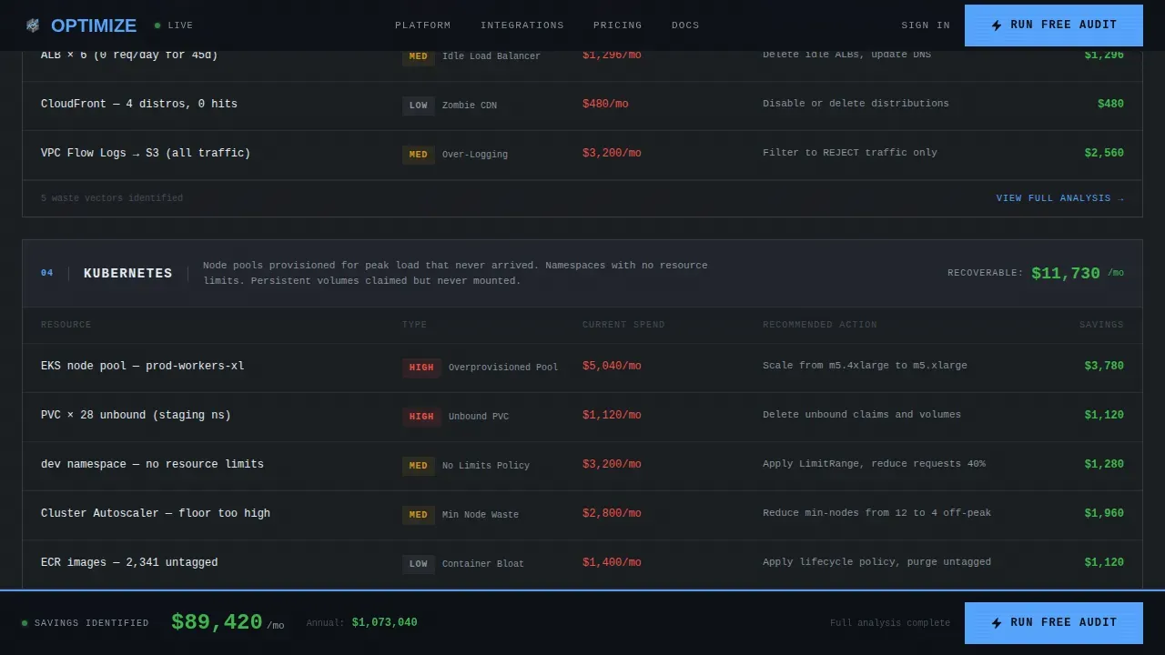
- Four numbered spec-sheet data grid modules covering Compute, Storage, Network, and Kubernetes waste categories
- A persistent floating savings bar with a locked call-to-action, a stats and testimonial section, and a sample report modal trigger
Feature list
This template is built around a clear set of structural and visual features, each grounded in the source brief and the brutalist design system it uses.
Dark Glass Hero Metric Panels
The hero section opens with three translucent frosted-glass cards arranged in a staggered grid against a pure black background. Each panel displays a large, monospaced sky-blue metric: monthly spend, identified savings, and optimization coverage. There is no illustration or hero image. The above-the-fold content is raw data, which immediately establishes credibility with a technical target audience.
Numbered Spec-Sheet Data Grid Modules
Four hard-border grid modules labeled 01 COMPUTE, 02 STORAGE, 03 NETWORK, and 04 KUBERNETES form the main scroll body. Each module is a discrete panel with aligned columns showing resource description, current spend, recommended action, and projected savings. High-contrast typography and exposed grid lines replace decorative graphics, keeping the layout honest and scannable. This structure lets visitors run a quick mental before-and-after cost comparison as they read.
Scroll-Linked Floating Savings Bar
A persistent bar anchored to the bottom of the viewport accumulates a running total savings figure as the visitor scrolls through each waste category. The bar also holds the primary "Run a Free Audit" call-to-action, ensuring the conversion trigger is always visible without interrupting the data reading experience. This is the template's most interactive layout element and the mechanism that drives final click-through.
Sample Report Modal
A secondary text link labeled "See Sample Report" opens a modal overlay displaying a redacted but detailed PDF-style audit breakdown. This gives visitors proof of the product's output before any commitment. The modal is designed to reduce hesitation and lower the bounce rate by answering the implicit question: what does an audit actually look like?
Stats and Social Proof Section
Between the data grids and the footer, the template includes a dedicated section for FinOps market statistics and an interactive customer testimonial block. Social proof in a brutalist layout does not rely on headshots or branded quote cards. It uses stark typography, bold numbers, and a direct quote format that matches the clinical aesthetic direction of the rest of the page.
Minimal Developer Footer
The footer follows a single-row GitHub-developer-minimal pattern: copyright on the left, navigation links in the center, and social icons on the right. It is intentionally light, keeping the focus on the conversion path above rather than on secondary navigation. The full-width footer row sits flush against the dark background without rounding or decorative separation.
Page sections overview
| Section | Purpose |
|---|---|
| Dark Glass Hero | Display live-formatted spend, savings, and coverage metrics above the fold |
| Brutalist Headline | Deliver the core value statement in heavy uppercase type |
| Primary call to action Block | Place the first "Run a Free Audit" button directly beneath the hero panels |
| 01 Compute Grid | Surface idle instance waste with spend and action columns |
| 02 Storage Grid | Expose oversized volumes and forgotten snapshot costs |
| 03 Network Grid | Identify unused transfer and egress spend by resource |
| 04 Kubernetes Grid | Break down over-provisioned cluster and node waste |
| Stats + Testimonial | Reinforce credibility with market numbers and a FinOps analyst quote |
| Sample Report Modal | Show a redacted audit PDF to prove output before signup |
| Floating Savings Bar | Accumulate total savings and lock the secondary call to action at the bottom |
| Minimal Footer Row | Close the page with copyright, links, and social icons |
Design & branding system
The design system is built around a Slate and Sky color palette that treats color as a signal rather than decoration. Every blue element on the page means something clickable or critical. This is not a soft SaaS aesthetic. It is a command-center aesthetic.
- Deep gunmetal (#1B1F23) background, polished slate (#2D333B) card surfaces, cold sky blue (#58A6FF) accent for all actionable elements, and exposed white (#E6EDF3) for data text rendered in monospace
- JetBrains Mono handles all numerical data and grid content, conveying an engineering-first terminal feel; DM Sans handles headlines and body text with clean sans serif weight and generous line height
- Stark typography replaces decorative graphics throughout; letter spacing on uppercase headings is wide and deliberate, creating massive typography impact without requiring any imagery
Mobile & speed optimization
The page is built desktop-first to match the workstation context of VP Engineering and FinOps analysts, with responsive support across screen sizes for mobile access. The brutalist design approach naturally supports fast load performance because it eliminates heavy gradients, high resolution images used purely for decoration, and unnecessary scripts.
- Tailwind CSS utility classes handle the responsive grid layout, spacing, and typography scaling across all screen sizes without custom stylesheet overhead
- Scroll triggered animations use an Intersection Observer pattern to fire panel reveals and the savings counter only when sections enter the viewport, keeping initial load fast and core web vitals scores clean
- Because brutalist design avoids heavy imagery and relies on raw grid structure and stark typography, pages built on this template load fast by default
How this template helps you convert
Brutalism's function-over-form philosophy is a direct match for cloud cost optimization tools. Visitors do not need to be persuaded by lifestyle imagery. They need to see their own waste reflected back at them in a format they trust.
- The hero section opens with real metrics and a high-contrast call-to-action, establishing credibility before visitors scroll a single pixel. Above-the-fold content includes a clear value proposition and a bold primary button that drives the first conversion opportunity.
- The spec-sheet grid escalates urgency category by category, stacking the cumulative savings figure in the floating bar. By the time visitors reach the bottom, the total is undeniable, and the locked call to action in the savings bar provides a final call-to-action for second-chance conversion.
- The sample report modal handles the last objection: proof. Visitors can see the output of the audit before clicking through to sign up, which reduces drop-off and keeps the click-through path frictionless.
Other information about this template
This template is fully customizable for teams that want to adapt the layout, copy, or brand identity to fit their specific cloud cost product. The component structure is modular, making it straightforward for developers to swap data, adjust the grid, or extend the page with additional waste categories. The aesthetic direction stays consistent regardless of how much content changes.
- The template is built with Tailwind CSS, using utility-first CSS classes throughout the codebase. Developers can customize every panel, grid row, and footer element directly in the markup without writing separate CSS files. The code follows a clean component structure that supports both rapid iteration and longer-term maintenance.
- Fonts are loaded via Google Fonts for easy brand customization. The default pairing is JetBrains Mono for data and DM Sans for headlines. Teams can swap to Cabinet Grotesk or any other sans serif choice to match their brand identity, adjusting system fonts if a zero-dependency setup is preferred.
- Interactive elements including the sample report modal, hover states on data grid rows, the scroll-linked savings counter, and the Intersection Observer-based panel reveals are all handled through Framer Motion animation hooks and purpose-built client components. This keeps the code clean and the interactive layer easy to extend.
- The template supports connection to Google Analytics by adding a standard script tag to the document head, making it straightforward to track page events, scroll depth, and call to action clicks without modifying the component structure.
- Asymmetric layouts, unconventional layouts, and a brutalist landing aesthetic differentiate this template from generic SaaS product pages. The neo brutalism landing page style makes it instantly recognizable and reinforces the brand's positioning as a tool that values transparency over polish.
- Portfolio builders, software founders, and development agencies looking to create professional landing pages for technical products will find this template a strong foundation. The neo brutalism aesthetic works equally well for product pages, portfolio showcases, and pre-launch campaign pages.
- Rounded corners are intentionally absent from panel borders. Every card edge is hard and square, consistent with the industrial aesthetic direction of the brutalist design system. This is a deliberate code and CSS decision, not a default Tailwind behavior.
- Animated icons are used sparingly. The template includes a single animated icon in the floating savings bar to draw attention to the accumulating total without breaking the clinical visual tone of the page.
Theme
Bold Brutalist
Creative direction
Spec Sheet
Color system
Slate & Sky
Style
Dashboard/Data Grid
Direction
Click-Through
Page Sections
Dark Glass Metric Hero Panels
Numbered Spec-sheet Data Grids
Scroll-linked Floating Savings Bar
Sample Report Modal Overlay
Stats and Social Proof Block
Related questions
Can I customize the data grid columns and metric values?
Does this template include the signup flow after the call to action click?
What technology stack does this template use?
Is this template suitable for a non-cloud product?
How does the sample report modal work?



