Architecture Firm Professional Website Template
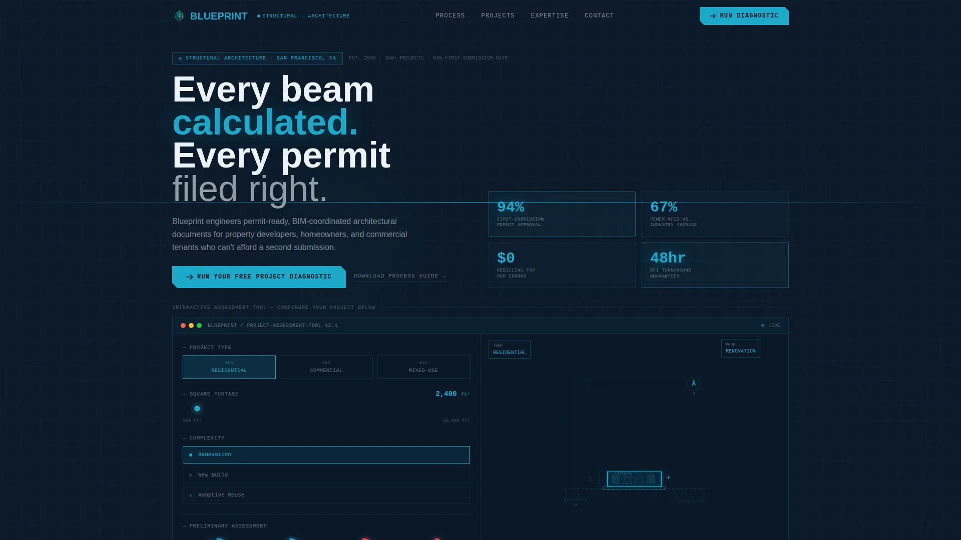
Blueprint is a single-page architecture firm landing page template built around a Data Command visual theme in Midnight Blue. It features an interactive project assessment tool in the header, a structured comparison table that contrasts industry norms with this firm's precision approach, and a three-step lead capture form tied to a free project diagnostic offer.
by Rocket studio
Quick summary
Blueprint is a comparison table landing page template designed for architecture firms. The header hosts a live wireframe assessment tool. The scroll follows a Problem-to-Solution arc, moving through a high-contrast comparison table to a free diagnostic offer. The palette is Midnight Blue: deep navy, cyan, graphite, and precision white.
Who this template is for
This template is built for architecture firms that need to convert informed, project-ready visitors into qualified leads. It works best when the firm has a clear process advantage and wants to demonstrate it before the first meeting.
- Architecture firms targeting property developers, homeowners planning structural changes, and commercial tenants with lease-limited timelines
- Studios that want to replace passive portfolio pages with an active, lead-generating landing page
- Practices ready to offer a free preliminary diagnostic as their primary conversion offer
What problem this template solves
Most architecture firm pages fail to communicate process confidence. Visitors arrive with a real project need, encounter a gallery of completed buildings, and leave without understanding what working with the firm actually looks like. The gap between "we do great work" and "here is exactly what happens from brief to permit" costs firms qualified leads every week.
- Vague timelines, opaque pricing structures, and drawings that contractors misread all erode client trust before a meeting is booked
- Competitors look identical because their pages show outcomes without explaining process
- Prospective clients cannot self-qualify, so enquiries arrive poorly matched or not at all
What you get with this template
This template delivers a complete single-page lead capture experience. Every section is purpose-built to move a visitor from curiosity to commitment, using structured information rather than visual decoration.
- An interactive header tool that lets visitors configure project type, square footage, and complexity before they read a single word of copy
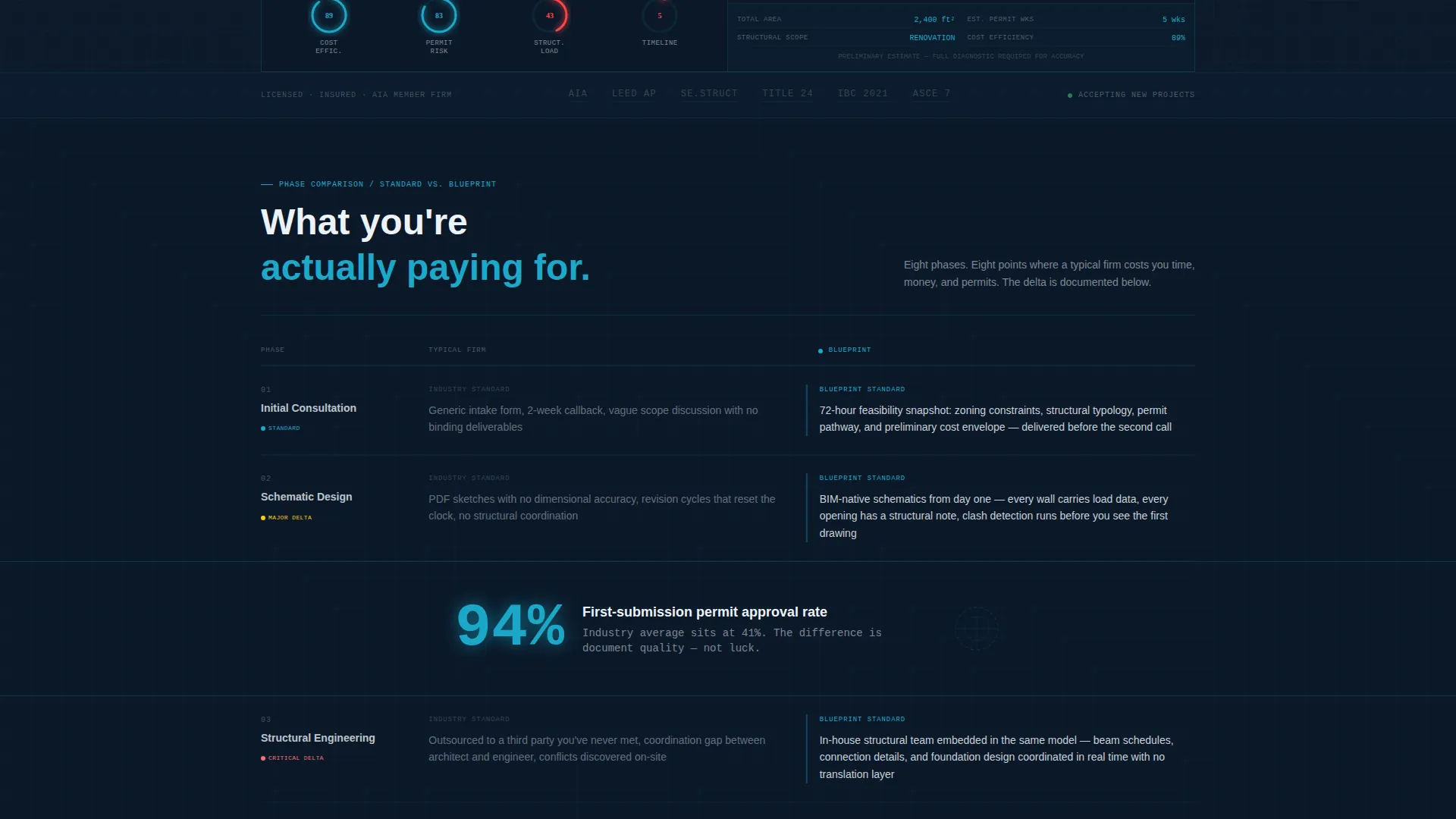
- A full comparison table layout contrasting typical industry delivery against the firm's phase-locked, transparent, BIM-coordinated (Building Information Modelling) approach
- A three-step progressive lead capture form connected to a free project diagnostic offer, plus a secondary email-only path for lighter-intent visitors
Feature list
This template is structured around functional components that each serve a specific role in the conversion arc. The design avoids decorative filler and keeps every element tied to a decision point.
Interactive Wireframe Assessment Header
The header embeds a simplified building footprint rendered in cyan wireframe on a navy background. Visitors toggle project type (residential, commercial, or mixed-use), adjust a square footage slider, and set a complexity dial across renovation, new build, and adaptive reuse. The wireframe responds in real time: floors stack, walls shift, and a cost-efficiency score pulses in the corner. The tool is the first impression, and it already captures project intent before the visitor scrolls.
Problem-to-Solution Comparison Table
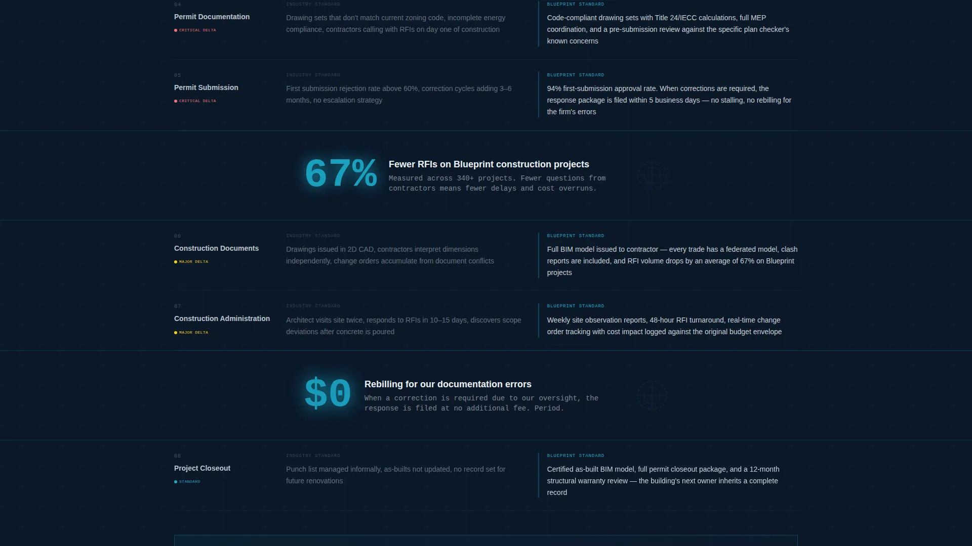
The comparison table runs the full length of the page's argument. The left column lists what architecture firms typically deliver: vague timelines, opaque pricing, and drawings that generate contractor confusion. The right column shows what this firm delivers: phase-locked schedules, line-item cost transparency, and BIM-coordinated documents with clash detection. Each row escalates from initial consultation through permitting to construction administration, tightening the case row by row.
Pulsing Single-Stat Callouts
Between comparison table sections, full-width callout blocks display a single data point in cyan. These callouts interrupt the scroll with a specific, credible claim rather than a generic testimonial. The pulse animation draws the eye without breaking the reading flow, reinforcing the firm's precision positioning at each stage of the arc.
Three-Step Progressive Lead Form
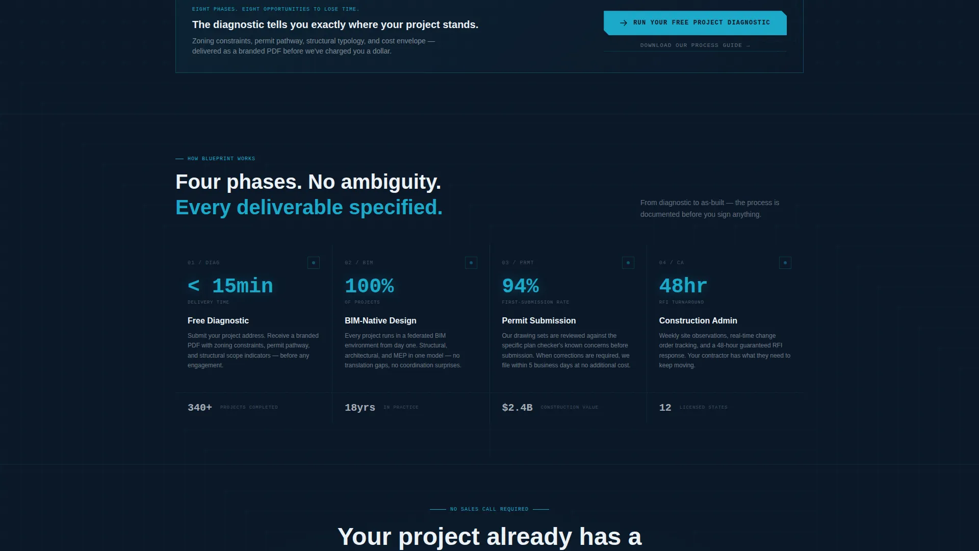
The primary call to action, "Run Your Free Project Diagnostic," triggers a three-step form. Step one captures project address and type. Step two asks for budget range and timeline urgency. Step three collects email and phone. The phased structure reduces perceived friction at entry and gathers richer project context than a single contact form would.
Dual Conversion Path Design
The template supports two distinct visitor journeys simultaneously. High-intent visitors follow the diagnostic path and receive an automated preliminary feasibility snapshot as a branded PDF. Lower-intent visitors can take the secondary path, "Download Our Process Guide," which requires email only. Both paths are visible and accessible without competing visually.
Sticky Bottom Call-to-Action Bar
The primary call-to-action button is locked to the bottom of the viewport throughout the scroll. It stays visible whether the visitor is reading the comparison table, reviewing a stat callout, or considering the form. A second instance of the same button appears immediately after the comparison table's final row, catching visitors at the moment of highest persuasive momentum.
Page sections overview
| Section | Purpose |
|---|---|
| Interactive Assessment Header | Captures project intent via live wireframe tool before visitor reads copy |
| Comparison Table Top | Contrasts vague industry norms with firm's consultation process |
| Stat Callout Block | Reinforces credibility with a single pulsing data point between table sections |
| Comparison Table Mid | Escalates contrast through permitting phase with phase-locked scheduling claims |
| Stat Callout Block | Delivers a second data-point interruption to sustain persuasive momentum |
| Comparison Table Bottom | Closes arc through construction administration with BIM document accuracy claims |
| Primary call to action Section | Presents "Run Your Free Project Diagnostic" with three-step progressive form |
| Secondary Lead Path | Offers "Download Our Process Guide" for email-only lighter-intent capture |
| Sticky call to action Bar | Keeps primary action visible and accessible throughout the entire scroll |
Design & branding system
The visual identity follows a Data Command theme. The palette is built for information density and clinical contrast, not atmosphere or decoration. Every colour has a defined role, and none carry cosmetic intent.
- Deep command-centre navy (#0B1929) dominates backgrounds; blueprint-line cyan (#1CA9C9) activates borders, data rows, and hover states; structural graphite (#2C3E50) anchors secondary text; precision white (#EDF2F7) fills table cells where decisions are made
- Typography and layout carry the spatial language of a construction document: structured grids, deliberate whitespace, and nothing placed without a functional reason
- No stock photography appears anywhere on the page; the interactive wireframe header replaces the hero image entirely, making the tool the visual anchor
Mobile & speed optimization
The template is designed so that its information hierarchy reads cleanly at any screen width. The comparison table, interactive header, and sticky call-to-action bar are all structured to function on smaller viewports without losing their persuasive logic.
- The interactive wireframe tool and its parameter controls are laid out to remain usable on touch screens, with slider and toggle inputs sized for finger interaction
- The comparison table columns reflow for narrow screens so that the left-versus-right contrast remains readable without horizontal scrolling
- The sticky call-to-action bar adjusts its footprint on mobile to stay present without covering critical content
How this template helps you convert
This template is built around a single strategic insight: the visitor who reaches an architecture firm's page already has a project. The template's job is to make the firm's process legible and the next step frictionless.
- The interactive header immediately involves the visitor in their own project brief, making the page feel personally relevant before any copy is read. This reduces the bounce impulse that kills most passive portfolio pages.
- The comparison table builds a cumulative case across every project phase. Each row adds evidence, and each stat callout adds a specific, credible data point. By the final row, the cost of not engaging feels concrete rather than implied.
- The dual conversion path means no visitor leaves without a clear, low-resistance next step. High-intent prospects follow the diagnostic. Lower-intent prospects take the guide. Both paths capture contact information and move the relationship forward.
Other information about this template
This template is categorised under architecture firm website templates and is specifically designed for architecture firm lead capture landing pages. It is a strong fit for practices that compete on process rigour, document quality, and client transparency rather than visual portfolio volume.
- The free project diagnostic mechanic is designed so that the firm generates a branded preliminary feasibility snapshot covering zoning constraints, estimated permit timeline, and ballpark structural considerations, delivered as a PDF within minutes of form submission
- The template style is a comparison table layout, making it well suited to firms whose value proposition is directly comparable to a less rigorous industry standard
- The page works for multiple client types within a single scroll: developers with expired permits, homeowners planning structural alterations, and commercial tenants working within a fixed lease window
Theme
Data Command
Creative direction
Problem→Solution Arc
Color system
Midnight Blue
Style
Comparison Table
Direction
Freemium/Trial
Page Sections
Interactive Wireframe Assessment Header
Problem-to-solution Comparison Table
Pulsing Stat Callout Blocks
Three-step Progressive Lead Form
Dual Conversion Path Layout
Sticky Viewport Call-to-action Bar
Related questions
What kind of architecture firm is this template designed for?
Can the interactive wireframe header be adjusted for different project types?
How does the free project diagnostic work from the visitor's perspective?
What if a visitor is not ready to request a full diagnostic?
Does the template use photography or a traditional hero image?



