Micro-SaaS & Developer Tools Professional Website Template
Scan is a hub-and-spoke landing page template built for receipt scanner apps. It guides visitors through five focused feature sections using a sticky anchor nav, a live dashboard hero, and a lead-generation flow that earns the signup before it asks for one. The design runs on void black, electric lime, and scanner cyan for a fast, synthetic feel.
by Rocket studio
Quick summary
Scan is a single-page landing page template designed for receipt scanner and expense management apps. It uses a hub-and-spoke anchor navigation layout to walk visitors through five feature spokes: Capture, Extract, Categorize, Export, and Integrate. Every spoke opens with a hard metric, closes with a micro-interaction, and feeds into a lead-generation form that converts through demonstration first.
Who this template is for
This template is built for founders and product teams launching a receipt scanner or expense-tracking app. It works best when the product needs to prove its value visually before asking for a signup.
- Freelance consultants who manage their own expense records and need a credible, fast way to present their tool
- Startup founders building micro-SaaS products in the expense management or receipt capture space
- Sales teams and road-warrior professionals who need a landing page that speaks directly to high-volume, on-the-go receipt workflows
What problem this template solves
Receipt scanner apps face a trust problem. Visitors arrive skeptical that the product actually works as described. A static features list does nothing to close that gap. This template solves that by making the product the hero from the first scroll.
- Visitors watch receipts transform into clean line items before they ever reach a form, so the value is felt rather than described
- The sticky anchor nav keeps the primary call to action visible at all times, removing friction from the decision to sign up
- The interactive demo path captures email only after the live optical character recognition moment lands, so the lead is already warm
What you get with this template
This is a complete, ready-to-customize landing page layout. Every section is purpose-built for the receipt scanner use case, with no filler sections or generic placeholders.
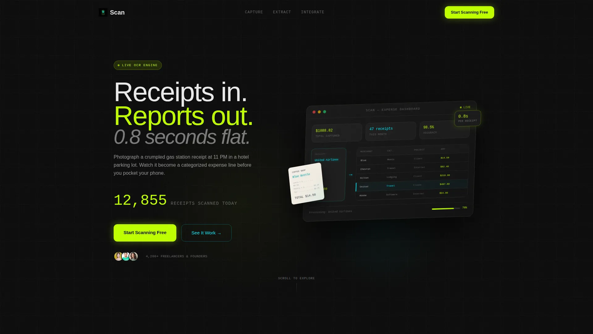
- A living dashboard hero with an isometric app mockup, a receipt-to-data animation, and a ticking "Total Captured" counter
- A five-spoke feature matrix with individual section screens, opening metrics, and animated micro-interactions on every spoke
- A dual conversion path: a two-field primary signup form and an interactive demo that collects email after the optical character recognition reveal
Feature list
This template ships with a tightly integrated set of components. Each one is designed around a specific moment in the visitor's journey from awareness to conversion.
Sticky Anchor Navigation with Live call to action
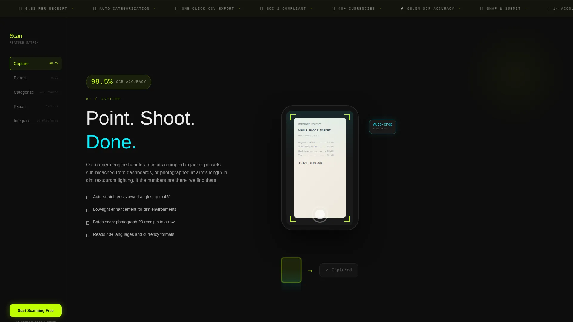
A left-rail anchor nav stays fixed as visitors scroll through all five feature spokes. The active state fires in electric lime so visitors always know where they are. The "Start Scanning Free" call to action is pinned directly inside the nav and travels with it through every section.
Dashboard Preview Hero
The header is a pixel-perfect isometric mockup of the app's expense dashboard. Receipts feed in from the left edge and dissolve into categorized line items in real time. A photographed crumpled receipt sits in the foreground, partially digitized, with merchant name and total highlighted in scanner cyan where optical character recognition has fired.
Five-Spoke Feature Matrix
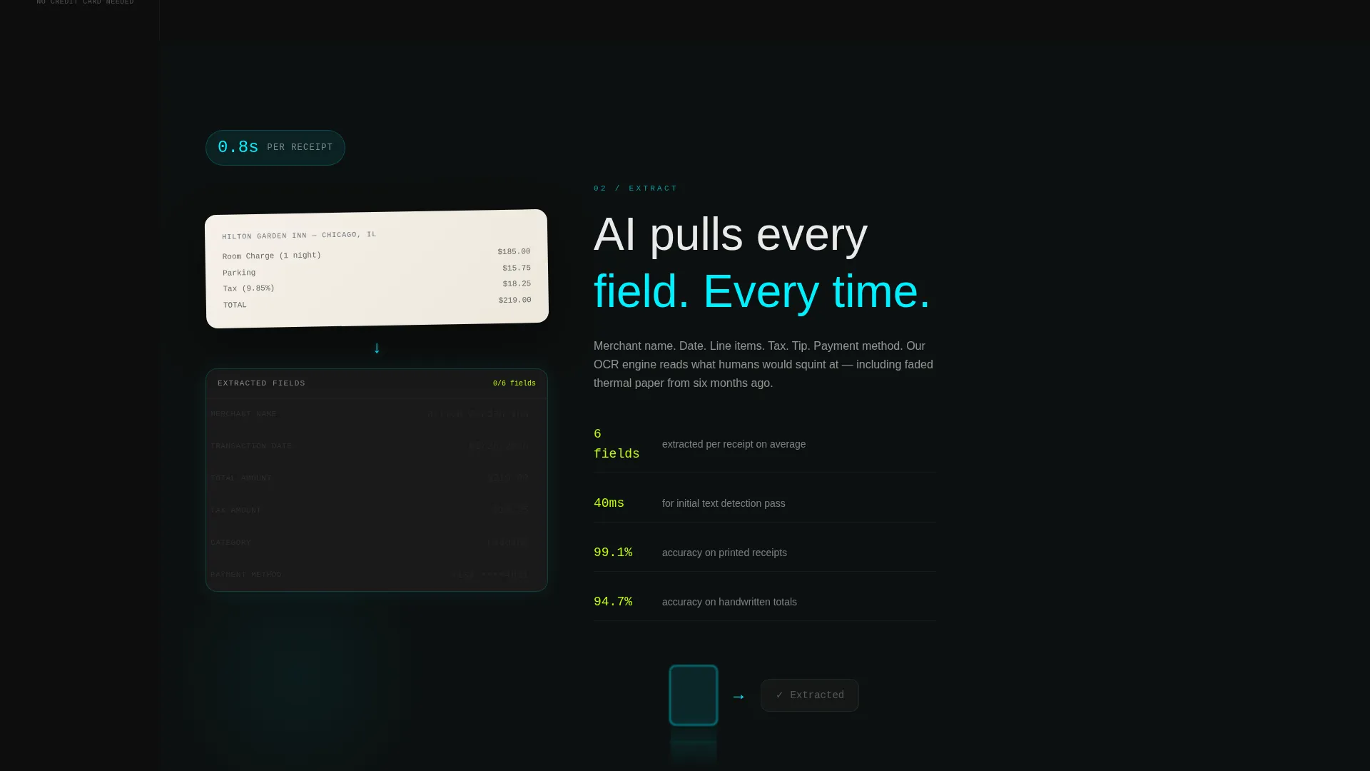
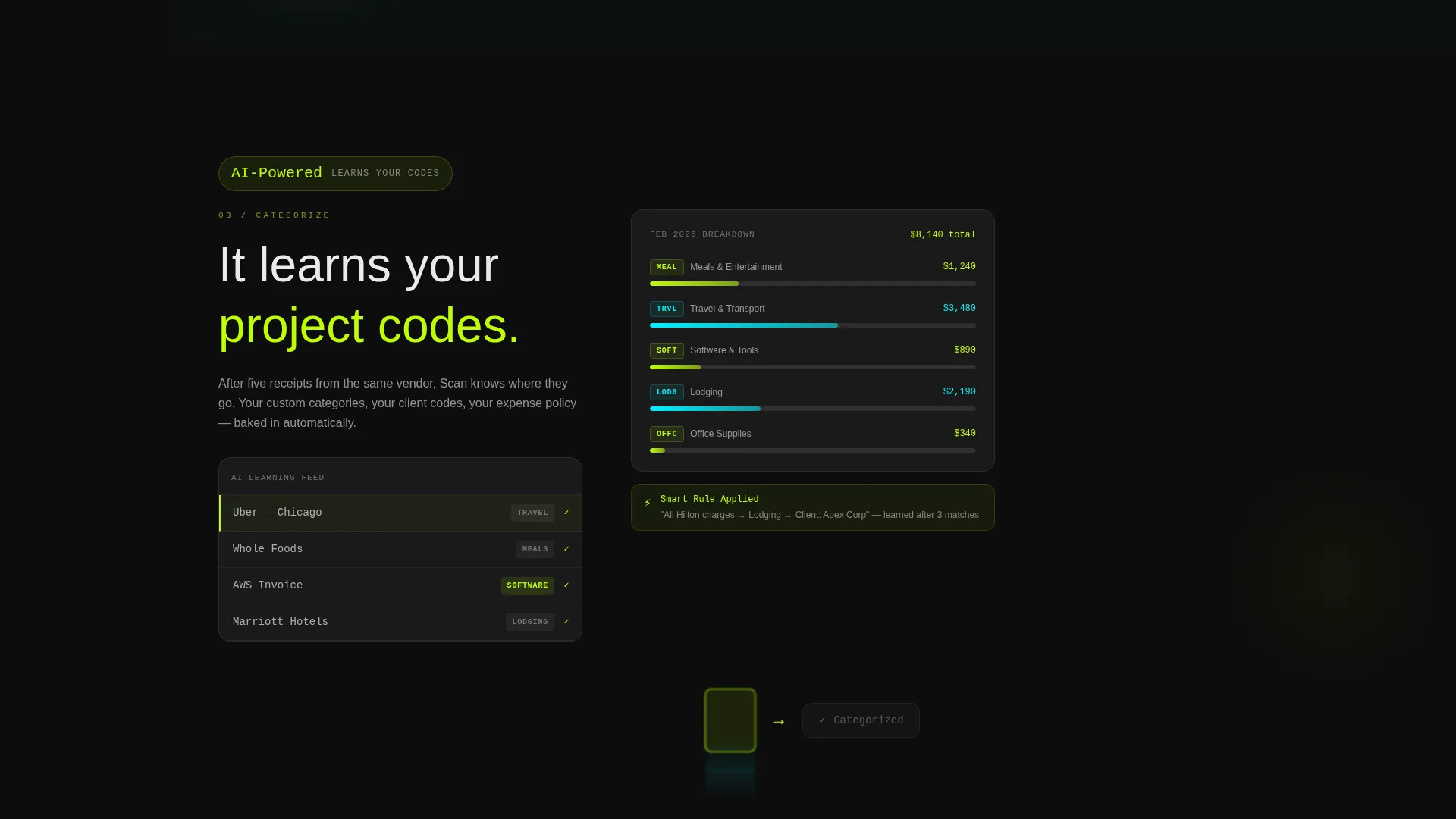
Each spoke is a self-contained screen covering one stage of the receipt-to-report workflow: Capture, Extract, Categorize, Export, and Integrate. Every spoke opens with a single hard metric before unpacking the feature detail beneath it. The escalation moves from a camera snapping a receipt all the way to accounting platform logos locking into place.
Receipt-to-Data Micro-Interactions
Every feature spoke ends with a short animation showing a physical receipt transforming into a clean data row. These micro-interactions keep the visitor engaged and continuously reinforce the core product promise without requiring them to read a single marketing claim.
Interactive Demo Path
A secondary conversion path labeled "See It Scan Your Receipt" invites visitors to upload a photo and watch the optical character recognition extract data live on screen. The email capture appears only after this moment, so the lead arrives already convinced.
Two-Field Lead Generation Form
The primary form asks only for a work email and a monthly receipt volume selection from a short dropdown. The minimal field count reduces form abandonment while the volume dropdown qualifies each lead before it reaches the team.
Page sections overview
| Section | Purpose |
|---|---|
| Dashboard Hero Header | Opens with an animated isometric app preview to establish instant product credibility |
| Sticky Anchor Nav | Keeps five-spoke navigation and primary call to action visible throughout the full scroll |
| Capture Spoke | Showcases the camera-based receipt input with an opening accuracy metric |
| Extract Spoke | Demonstrates optical character recognition pulling line items with a speed metric |
| Categorize Spoke | Shows auto-categorization learning expense codes over time |
| Export Spoke | Presents one-click CSV and PDF export functionality |
| Integrate Spoke | Displays accounting platform logos connecting to the product |
| Interactive Demo | Lets visitors upload a receipt and watch live data extraction |
| Lead Gen Form | Collects work email and monthly volume to qualify and convert visitors |
Design & branding system
The visual identity follows the Startup Velocity theme using an Acid Digital color system. The palette is built to feel synthetic, fast, and purpose-driven, like a barcode beam cutting across a dark room.
- Void black (#0D0D0D) covers every background surface; electric lime (#BFFF00) fires on calls to action, progress indicators, and the anchor nav active state; scanner cyan (#00F0FF) marks data-extraction highlights and hover states
- Interface white (#EAEAEA) handles all body text and structural typographic elements on dark backgrounds, keeping legibility high without softening the edge of the dark theme
- No stock photography appears anywhere; the dashboard mockup and receipt animations serve as the sole visual content, keeping every pixel product-focused
Mobile & speed optimization
The layout is designed to translate cleanly across screen sizes. The hub-and-spoke structure and sticky nav adapt so mobile visitors can still move through each feature spoke without losing orientation.
- The anchor navigation collapses gracefully on smaller screens so the "Start Scanning Free" call to action remains accessible without crowding the content area
- Micro-interactions and the dashboard hero are built to load progressively, keeping the visual impact high even before heavier animation assets complete
How this template helps you convert
This template is structured around a single principle: earn the click before you ask for it. Every layout decision supports that goal.
- The dashboard hero puts a working product mockup at full attention before the visitor reads a single word of copy, creating immediate proof of concept and reducing the instinct to bounce
- Each feature spoke opens with a hard metric and closes with a receipt-to-data animation, so by the time a visitor reaches the form they have already watched five receipts disappear into clean expense data
- The interactive demo path captures email at the moment of maximum engagement, after the visitor has uploaded their own receipt and seen the optical character recognition fire live
Other information about this template
This template is categorized under Technology, specifically within the Micro-SaaS and Developer Tools subcategory, with a receipt scanner niche focus. It is built as a hub-and-spoke anchor navigation landing page following the Startup Velocity theme and Acid Digital color system.
- The feature matrix layout and escalating spoke structure make this template well suited for products that benefit from a show-don't-tell demo approach, including tools comparable to receipt scanning workflows found in platforms like QuickBooks, Xero, FreshBooks, and Expensify
- The dual conversion path (direct form plus interactive demo) allows teams to test which entry point produces better-qualified leads from their specific audience
- The template's creative direction is classified as Feature Matrix with a Dashboard Preview header concept, and its primary purpose is Lead Generation
Theme
Startup Velocity
Creative direction
Feature Matrix
Color system
Acid Digital
Style
Hub & Spoke (Anchor Nav)
Direction
Lead Generation
Page Sections
Sticky Anchor Nav with Pinned Call to Action
Isometric Dashboard Hero
Five-spoke Feature Matrix
Receipt-to-data Micro-interactions
Interactive Demo Conversion Path
Two-field Qualifying Lead Form
Related questions
Can I customize the spoke labels and metrics inside the feature matrix?
Does the template include the interactive demo functionality?
How does the sticky anchor nav behave on smaller screens?
Is this template only suitable for receipt scanner apps?
What information does the lead generation form collect?



