Schedule — Agile Booking Landing Page Template
Roster is a bento grid landing page template built for school district scheduling software. It features a live-style dashboard hero with tab-switching views, spec-sheet capability cards, and a freemium sign-up flow. The design uses a Monochrome Steel palette to communicate precision and authority, making it ideal for vertical SaaS products targeting district operations teams.
by Rocket studio
Quick summary
Roster is a single-page bento grid template designed for school district booking and scheduling platforms. It opens with a feature tab switcher that mimics a live operations dashboard, then guides visitors through a series of tightly formatted spec cards. The freemium conversion flow is woven directly into the layout, earning the sign-up click through credibility before the form appears.
Who this template is for
This template is built for SaaS founders, product teams, and marketers who are launching or relaunching a school district scheduling tool. It speaks directly to the people who will evaluate and buy such software.
- Operations coordinators managing multiple building calendars across a district
- Athletic directors and facilities managers dealing with double-bookings and conflicts
- District superintendents who need a real-time snapshot of resources before board meetings
What problem this template solves
Scheduling software for school districts is powerful, but landing pages for these tools often fail to communicate that power quickly. Buyers arrive skeptical, scan for relevance, and leave before reaching the sign-up form.
- Generic hero sections do not show what the product actually does
- Walls of marketing copy slow decision-makers who want to assess capability fast
- Freemium offers get buried rather than introduced at the right moment
What you get with this template
You get a complete, single-page layout designed from the ground up for a school district booking system. Every section is purposeful, and nothing is decorative filler.
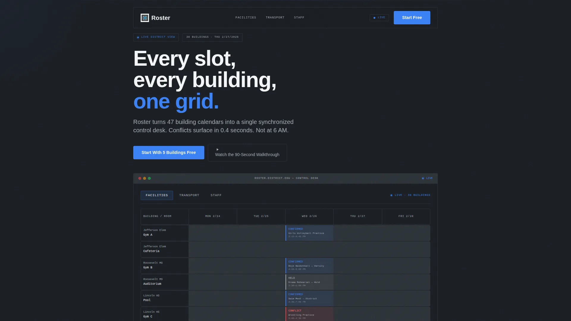
- A tab-switching dashboard hero showing Facilities, Transport, and Staff views with realistic data
- Bento grid capability cards styled as technical specification panels
- A progressive three-field sign-up form with a soft upsell trigger and a secondary video path
Feature list
This section covers the core capabilities built into the Roster template layout.
Feature Tab Switcher Hero
The header hosts three tabs labeled "Facilities," "Transport," and "Staff." Each tab swaps the entire dashboard dataset with a smooth crossfade. The default view renders a week-view building grid with color-coded booking statuses. Transport reveals bus route timelines with driver assignments. Staff surfaces a substitute coverage matrix with gap alerts flagged in amber.
Conflict Detection Card
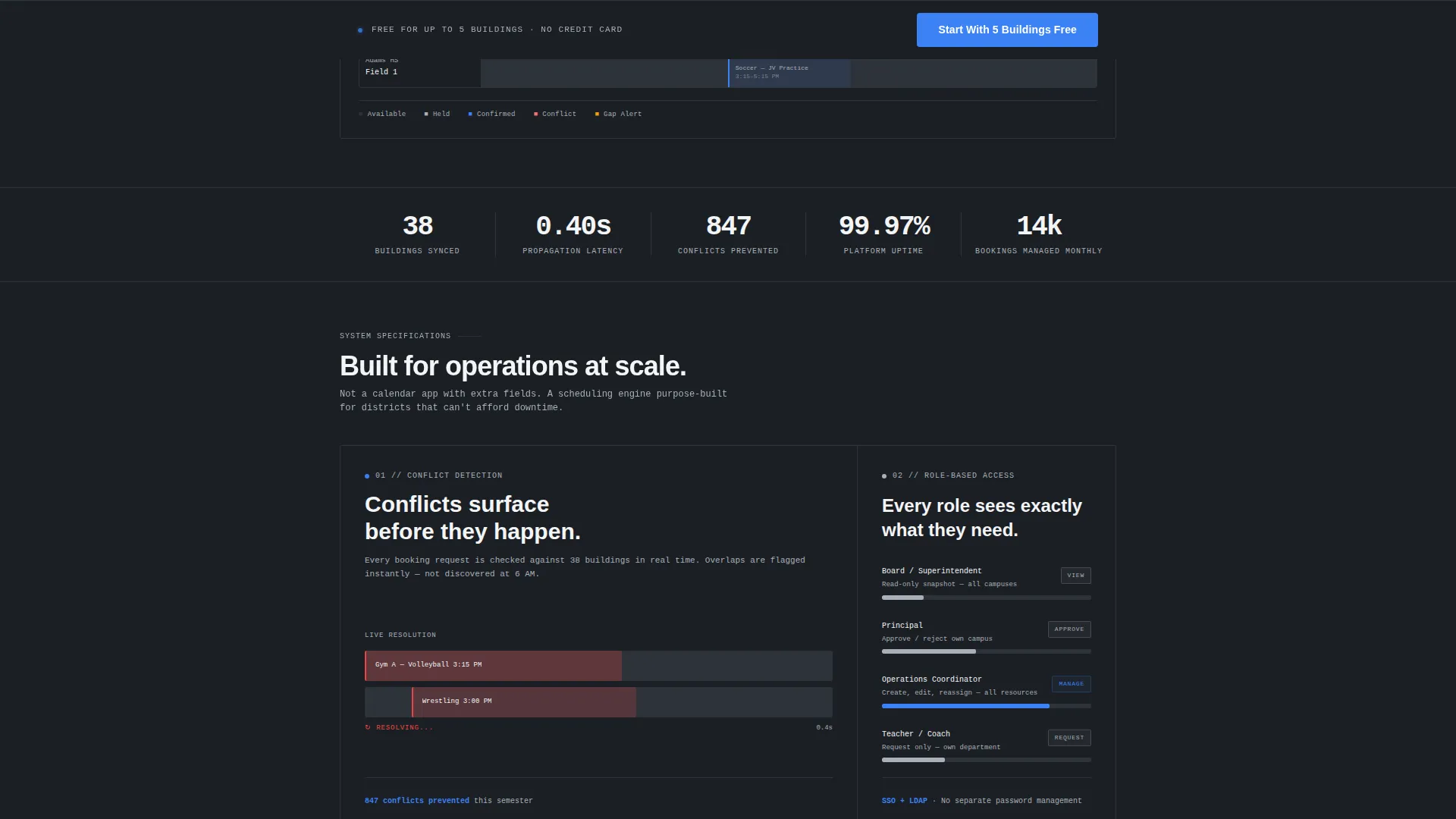
A dedicated bento cell demonstrates conflict detection using a micro-animation. Two overlapping bookings turn red, then one slides into an open slot. This single visual communicates the product's core value without a single paragraph of copy.
Role-Based Permissions Diagram
A tall bento cell presents a tiered access diagram showing board, principal, coordinator, and teacher permission levels. The visual is clean and scannable, giving evaluators a fast read on governance and access control.
Real-Time Sync Indicator
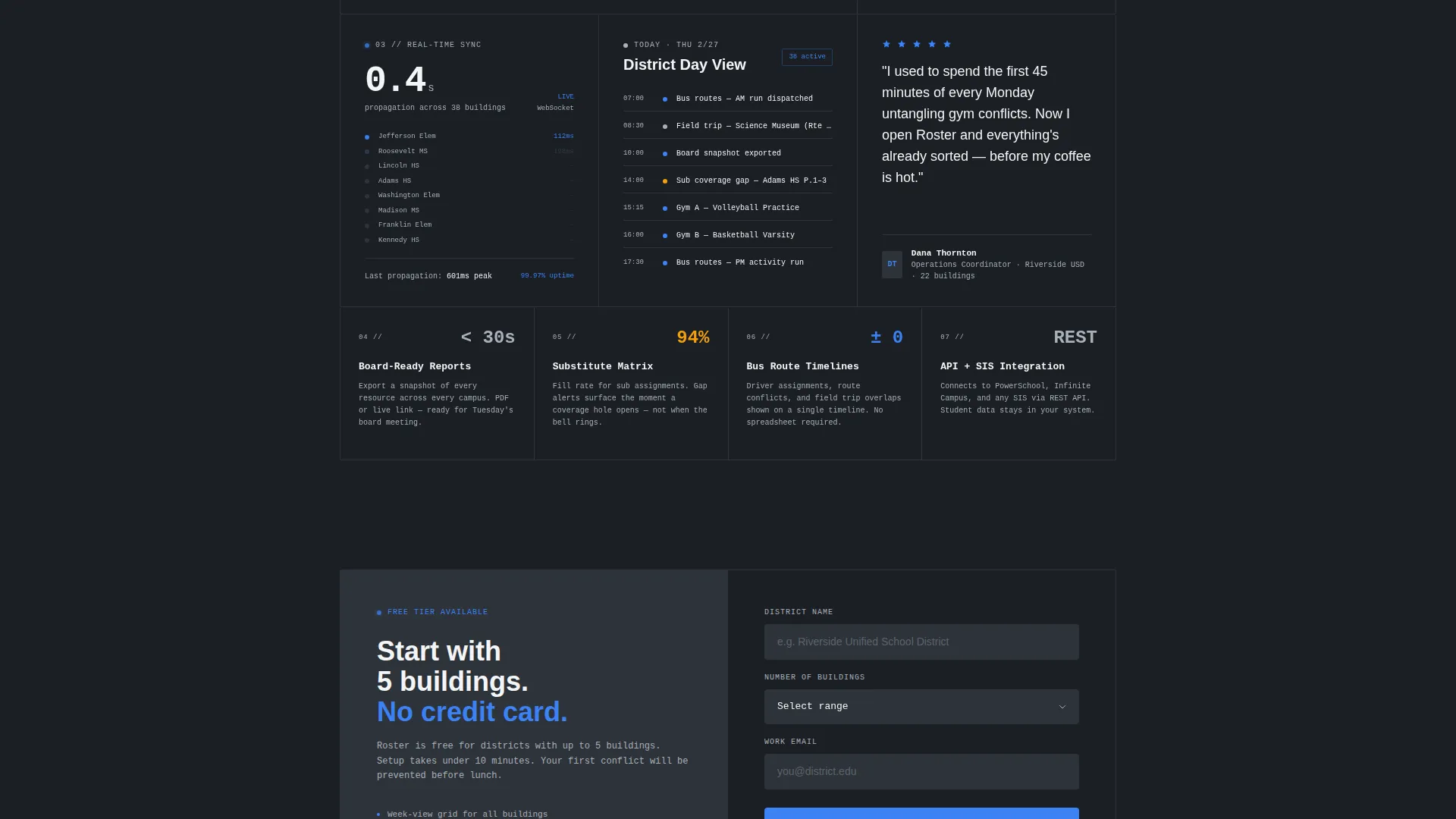
A wide bottom cell displays a latency counter styled to show 0.4-second propagation across 38 buildings. The stat is specific, the visual is minimal, and the message is immediate: updates travel fast across the entire district.
Progressive Sign-Up Form
The conversion form runs a three-field sequence: district name, building count, and work email. Selecting more than five buildings triggers a soft upsell message and swaps the button text from "Start With 5 Buildings Free" to "Request a Pilot." This keeps the freemium path clear without losing larger prospects.
Sticky Conversion Bar
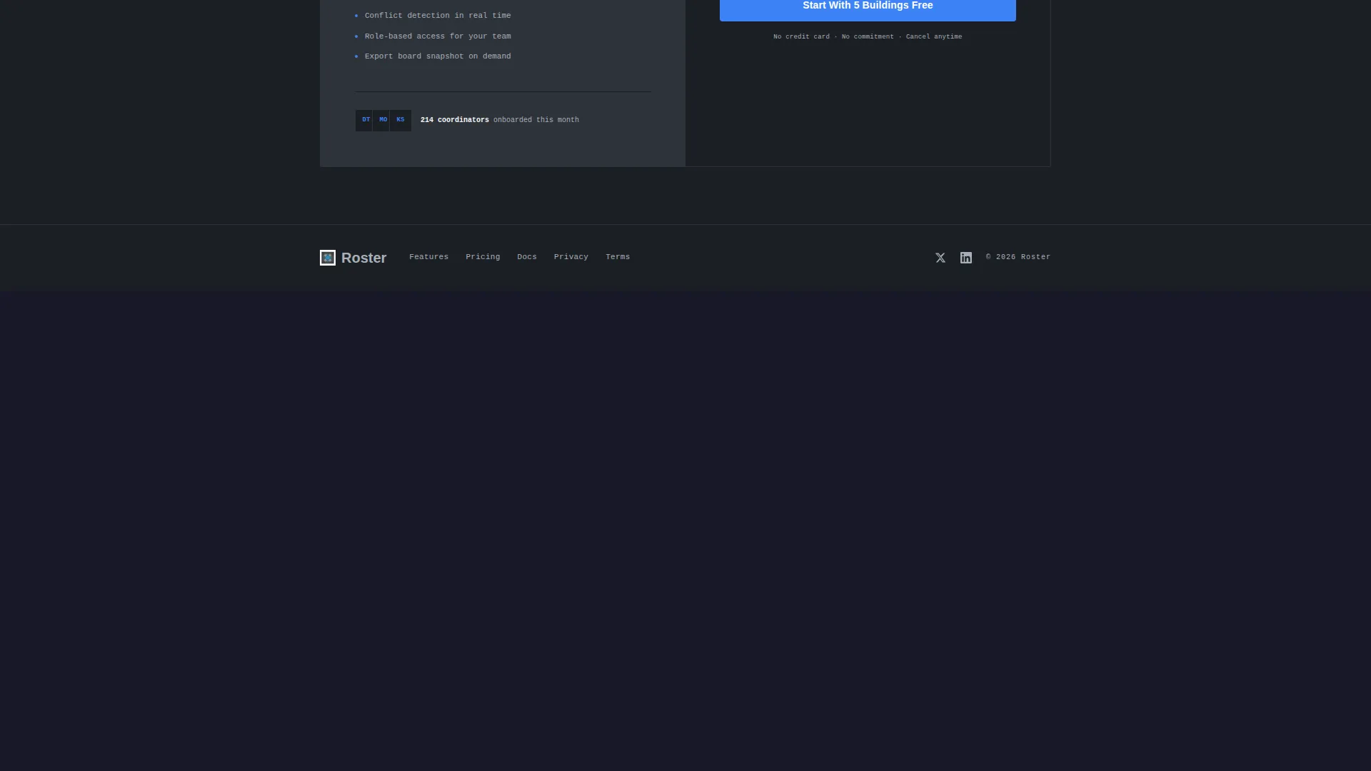
A sticky bottom bar appears after the third scroll section. It repeats the primary call to action so the sign-up prompt stays visible as visitors explore the spec cards. A ghost-button secondary path opens an inline video for visitors not yet ready to commit.
Page sections overview
| Section | Purpose |
|---|---|
| Tab Switcher Header | Showcases Facilities, Transport, and Staff scheduling views in one dashboard mockup |
| Conflict Detection Cell | Demonstrates automated booking conflict resolution with a micro-animation |
| Role Permissions Cell | Visualizes tiered access levels across board, principal, coordinator, and teacher roles |
| Real-Time Sync Cell | Communicates live update speed with a specific latency stat |
| Progressive Sign-Up Form | Captures district details and routes prospects to freemium or pilot paths |
| Sticky call to action Bar | Keeps the primary conversion action visible during the full scroll |
| Inline Video Trigger | Provides a low-commitment path for visitors via a 90-second product walkthrough |
Design & branding system
The visual identity follows a Data Command theme executed through a Monochrome Steel color system. The palette is intentionally cool and restrained, evoking a server environment where every element earns its place.
- Core colors: deep gunmetal (#1B1F24) for backgrounds, panel divider charcoal (#2E3339) for cell borders, brushed aluminum (#A8B0B9) for secondary text, and bright operational white (#F4F5F7) for primary text
- Signal-blue (#3B82F6) is used exclusively for interactive states, live indicators, and primary buttons, ensuring maximum visual contrast when it appears
- Every bento cell carries a 1-pixel charcoal border that reinforces the tiled monitoring panel aesthetic throughout the layout
Mobile & speed optimization
The bento grid layout is structured to reflow cleanly across screen sizes. The spec card density that works on a wide desktop monitor stays navigable and readable on smaller viewports.
- Bento cells stack vertically on narrow screens, preserving the card-by-card scan pattern
- The sticky conversion bar remains pinned at the bottom of the viewport on all device sizes, keeping the call to action accessible
How this template helps you convert
The layout is built around a freemium acquisition model. Every design and copy decision points visitors toward a low-friction first step.
- The dashboard hero lets visitors mentally place their own district's data into the grid before they see a sign-up form, reducing resistance at the conversion point.
- The spec card layout builds confidence through density and specificity, so buyers arrive at the form already persuaded rather than still evaluating.
- The building-count dropdown segments prospects automatically, routing smaller districts to the free tier and larger ones to a pilot request, keeping both paths warm.
Other information about this template
Roster is designed as a focused, single-page layout optimized for the school district vertical SaaS market. It suits teams that want a credible, data-forward presence without building a multi-page site from scratch.
- The template style is a bento grid, a layout pattern that groups related information into bordered cells for fast scanning
- The creative direction follows a Spec Sheet approach, meaning each cell presents one stat, one visual, and one idea with no padding copy
- The amber alert color (#F59E0B) appears in the Staff tab view to flag substitute coverage gaps, adding a third functional signal color without breaking the steel palette
- This template is well-suited for use with website builders that support component-level animation and tab-switching interactions
Theme
Data Command
Creative direction
Spec Sheet
Color system
Monochrome Steel
Style
Bento Grid
Direction
Freemium/Trial
Page Sections
Tab-switching Dashboard Hero
Bento Grid Spec Cards
Conflict Detection Animation
Role-based Permissions Visual
Progressive Freemium Form
Sticky Bottom Conversion Bar
Related questions
Who is the Roster template designed for?
What makes the hero section different from a standard banner?
How does the sign-up form handle larger districts?
Can I customize the color system for my own brand?
Is there a path for visitors who are not ready to sign up?



