Complete Dental Software Comparison Website Template
The Dispatch dental field service management comparison table landing page template is built for B2B SaaS platforms targeting dental service organizations and mobile equipment companies. It stacks Dispatch against spreadsheets and generic field service management software in a scroll-reveal comparison table, using a dark Void and Violet visual system to turn every feature row into a clear, confident argument for switching.
by Rocket studio
Quick summary
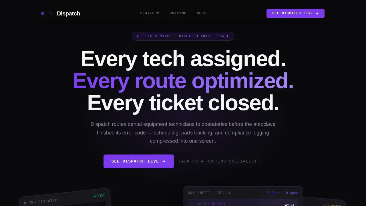
This is a single-page, click-through landing page template designed for a dental field service management platform called Dispatch. It leads with three dark glass user interface panels floating on void black, then flows into a feature-by-feature comparison table that pits Dispatch against spreadsheets and generic field service management software. The page ends with a primary call to action routing visitors to an interactive demo.
Who this template is for
This landing page template is built for B2B SaaS founders, product marketers, and growth teams promoting field service management software in the dental equipment and service sector. If your platform compresses scheduling, parts tracking, and compliance logging into a single dispatch board, this template was designed with your sales conversation in mind. It is equally useful for teams migrating potential customers away from manual workflows toward a dedicated field service management platform.
- Regional dental service organization operations managers running fleets of fifteen to fifty field technicians
- Service company owners currently coordinating jobs through group texts, shared spreadsheets, or other tools that fragment the entire service operation
- Office managers at multi-location practices who need faster, more reliable scheduling tools for emergency equipment repairs
What problem this template solves
Dental equipment service teams face a specific and costly problem. Technicians leave for job sites without confirmed parts, routes are pieced together by phone call, and compliance logs fall behind. Generic field service management software was not built for the dental niche. Spreadsheets have no route optimization, no real-time parts inventory, and no automated compliance logging. The real cost of these gaps shows up as windshield hours wasted, chairs left idle, and patient-care delays. This template makes that cost visible row by row, turning the comparison page itself into the sales argument.
- No side by side comparison tool exists in most manual workflows, so service managers cannot quickly identify where time and revenue are leaking
- Generic fsm software often lacks dental-specific compliance logging and parts tracking, leaving the entire workflow exposed to documentation gaps
- Spreadsheet-based dispatch boards cannot assign the right technicians with the right technician skills to the right job without significant manual effort
What you get with this template
This template delivers a complete, production-ready landing page structured as a click-through funnel. There are no form fields on the page. Every section is purpose-built to encourage visitors to click through to a pre-recorded interactive product demo. The layout is desktop-first, reflecting the reality that dispatch board operators work on large screens, but it is also built for solid performance on smaller viewports.
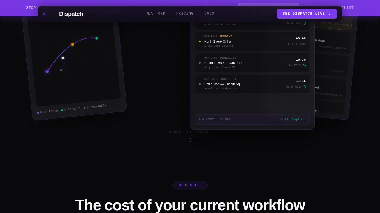
- A hero section featuring three translucent dark glass user interface panels: a live dispatch map, a technician day sheet with five jobs and compliance checkmarks, and an alert feed with amber and violet status dots
- A persistent violet sticky bar carrying the primary call to action after the first scroll, keeping the demo link visible throughout the entire comparison table
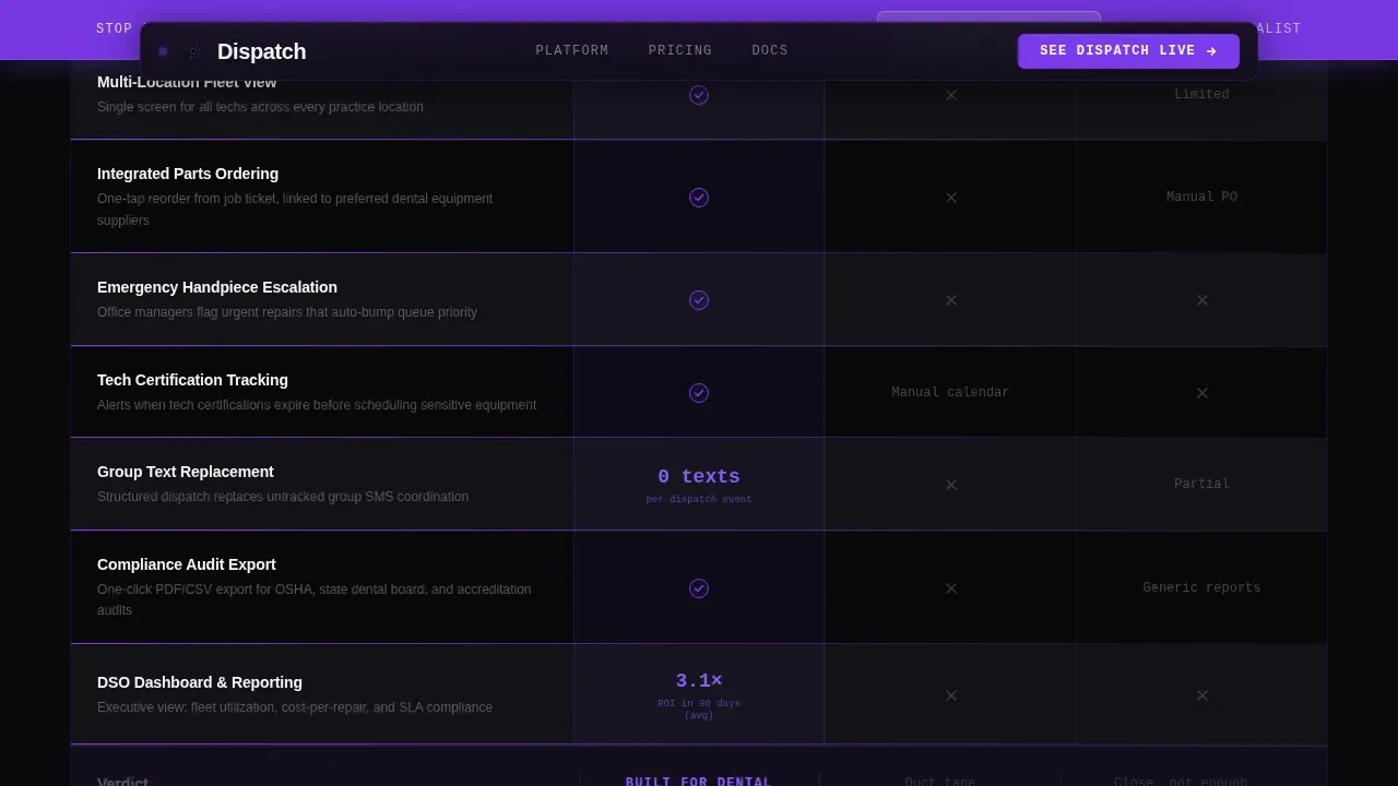
- A full-feature comparison table with scroll-reveal row animations, a violet underline sweep effect on each row, and embedded stat callouts that surface the real cost of the current workflow
Feature list
This template includes the following built-in capabilities drawn directly from the Dispatch product brief and the Startup Velocity design system.
Scroll-Reveal Comparison Table
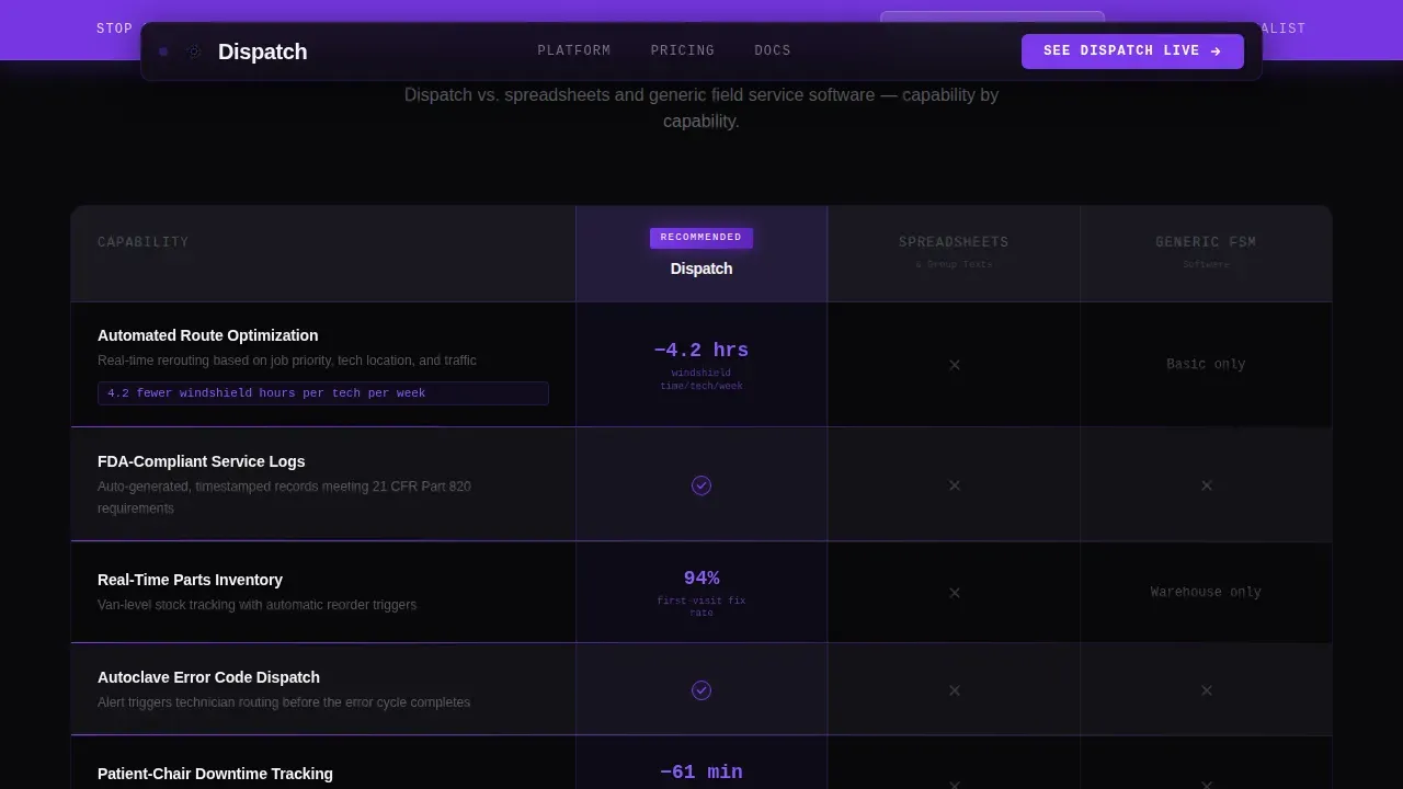
The core of this landing page is a two-or-three-column comparison table. It runs Dispatch against "Spreadsheets and Calls" and a grayed-out "Generic FSM Software" column. Each row isolates a single capability: automated route optimization, FDA-compliant service logs, real-time parts inventory, and integrated patient-chair downtime tracking. As visitors scroll, each row reveals with a violet underline sweep animation, turning the table into a sequential argument. The side by side comparison format makes it easy for potential customers to process and absorb each feature difference without cognitive overload. Tables are the preferred display format for comparison pages precisely because they reduce friction in the decision making process.
Dark Glass Panel Hero Section
The header section renders three translucent, frosted-glass user interface cards floating on a void-black field, each angled slightly like a fanned hand of cards. The left panel shows a live dispatch map with violet route lines. The center panel displays a technician's day sheet: five jobs, estimated arrival times, part numbers, and compliance checkmarks. The right panel surfaces an alert feed with amber and violet status dots. There are no stock photos and no handshake imagery. The design features show the product doing the work, which builds immediate credibility with technically minded service managers.
Sticky Call to Action Bar
A slim violet bar pins to the viewport after the first scroll and persists throughout the comparison table. It carries the primary call to action label "See Dispatch Live" and routes visitors directly to a pre-recorded interactive product demo. A secondary text link, "Talk to a Routing Specialist," sits below the primary button for high-intent visitors ready to skip the demo entirely. This dual call to action structure keeps the booking process frictionless and guides users toward conversion at every stage of the scroll.
Embedded Stat Callouts
Individual comparison table rows carry terse, data-driven stat callouts embedded directly in the cells. An example callout reads "4.2 fewer windshield hours per tech per week." These callouts function as inline customer testimonials translated into operational metrics. They make the value of improved route optimization and an efficient schedule immediately tangible, without requiring visitors to read a separate testimonials section. The integration of data points directly inside the comparison table is one of the key differentiators of this template's persuasion architecture.
Void and Violet Design System
The entire visual identity follows a Startup Velocity theme using the Void and Violet color system. Void black (#09090B) dominates backgrounds and table cells. Deep ultraviolet (#7C3AED) pulses through active states, toggle highlights, and the "recommended" column badge. Phantom gray (#1C1C22) separates rows and sections. Clinical white (#F4F4F5) is used for table text and data points. Typography is set in DM Sans for headings, JetBrains Mono for table data, and Manrope for body copy. The result feels like a server room lit by a single violet LED strip: technical, precise, and immediately credible to a target audience that works with equipment all day.
Final Call to Action Block
Below the last comparison row sits a dedicated final call to action block. It repeats the primary "See Dispatch Live" button and the secondary "Talk to a Routing Specialist" text link. By the time visitors scroll to this block, the comparison table has already rendered the verdict. The final call to action block exists to capture the click at the moment of maximum intent. A clear and concise summary statement at this position reinforces the value proposition and removes any remaining hesitation in the decision making process.
Page sections overview
| Section | Purpose |
|---|---|
| Dark Glass Hero | Introduce the platform visually with three frosted user interface panels showing the dispatch map, tech day sheet, and alert feed |
| Sticky call to action Bar | Keep the primary call to action pinned and visible throughout the full scroll journey |
| Comparison Table | Deliver the row-by-row feature argument comparing Dispatch to spreadsheets and generic field service management software |
| Final call to action Block | Capture conversion intent at maximum scroll depth with primary demo link and specialist contact option |
| Linear Footer | Close the page with a single-row footer pattern |
Design & branding system
This template uses a deliberately technical visual identity that earns trust from operations managers and service company owners who work with complex systems every day. The Void and Violet palette is not decorative. It is functional. Every color choice reduces distraction and directs attention to the comparison data. The typography stack reinforces this precision: monospace data fonts for table cells, clean sans-serif for body copy. The design features a server-room aesthetic that communicates seriousness without sacrificing usability.
- Color system: Void black (#09090B) for backgrounds, deep ultraviolet (#7C3AED) for accents and active states, phantom gray (#1C1C22) for row separators, clinical white (#F4F4F5) for text and data points
- Typography: DM Sans for headings, JetBrains Mono for table and data content, Manrope for body paragraphs
- Animation and interactivity: scroll-reveal row animations with violet underline sweep, floating card depth on hero panels, sticky bar behavior, counter animations on stat callouts, and toggle column highlight on the recommended column
Mobile & speed optimization
This template is desktop-first by deliberate intent. Dispatch board operators work on large screens. The primary layout is optimized for wide viewports where the full side by side comparison table is readable at a glance. That said, the template is built to render cleanly on smaller screens without breaking the comparison structure. Mobile access to the landing page is preserved through responsive layout rules. Performance architecture uses server components for static content sections and client components only for scroll-triggered animations, keeping load times efficient even with high animation complexity.
- Desktop-first layout designed for dispatch board operators and operations managers working on large-screen workstations
- Server components power static content for fast initial load; client components handle scroll reveal animations and sticky bar behavior
- Mobile access is maintained through responsive layout scaling, ensuring the comparison page remains functional and readable on smaller viewports
How this template helps you convert
This landing page is built specifically around a click-through conversion funnel. There are no form fields. The entire page structure is designed to encourage visitors to click through to the demo. Every design and copy decision is made to reduce friction and increase confidence in that single action.
- The comparison table does the persuasion work row by row. As visitors scroll, each revealed row makes the real cost of their current workflow more visible. By the final row, clicking the call to action feels like relief, not a decision. The comparison page earns the click before the button even appears.
- The sticky call to action bar and the final call to action block create two reinforcing conversion moments. The sticky bar captures mid-scroll intent from visitors who are already convinced. The final block captures deep-scroll intent from visitors who needed to see the full comparison. Both points encourage visitors to take a single, frictionless action with no form to fill out.
Other information about this template
This is the dispatch dental field service management comparison table landing page template built on the Startup Velocity theme. It is part of a broader library of high converting landing pages designed for B2B SaaS platforms in technical verticals. Several additional context points are worth knowing before you build or customize this template.
- The global fsm market is projected to grow from $2.37 billion in 2024 to $5.81 billion by 2033, reflecting rising demand for dedicated field service management solutions. This template positions Dispatch squarely in that growth narrative.
- The dental field service management landscape in 2026 is dominated by cloud-based, all-in-one platforms. The template is structured to highlight key differentiators that separate a purpose-built fsm platform from generic alternatives.
- Cloud-based dental field service management software can reduce overhead by 40%, automate scheduling, and manage records from any device. The template's comparison rows can be populated with claims like this when they are accurate for your platform.
- Mobile access and offline functionality are increasingly expected by field technicians who need to access job details and customer data at the job site, sometimes without reliable connectivity. These capabilities can be surfaced as comparison rows in the table.
- The integration of machine learning into field service management software enhances scheduling and dispatching capabilities. If your platform uses machine learning for route optimization or the most efficient schedule generation, the comparison table rows are the right place to surface those advanced features.
- A quality comparison page should include customer testimonials and social proof. This template embeds stat-based social proof directly in the comparison table rows. Full-format customer testimonials can be added as an optional section between the comparison table and the final call to action block.
- For service businesses evaluating Total Cost of Ownership, the comparison table structure makes it easy to add a pricing page link or a cost-per-tech row that surfaces the cash flow impact of switching versus staying on spreadsheets.
- Service fusion is one of the field service management platforms often considered by growing service companies. Dental-specific platforms like Dispatch offer focused scheduling tools and compliance logging that general-purpose fsm software typically does not include.
- The template supports user stories and user ratings as optional trust-signal additions. Past users' feedback and online reviews can be incorporated into the comparison table's social proof rows or added as a standalone trust block.
- For small businesses and trade professionals managing fewer technicians, the template's comparison structure works equally well. The layout scales from small businesses running five technicians to regional organizations coordinating fifty.
- Choosing the right fsm software is a high-stakes decision for service businesses. This landing page is structured to support the full decision making process from first impression through final click, with laser focus on a single conversion action.
- The landing page structure is designed to convert traffic by directly addressing the pain points of dental practice owners and mobile dental service units. Modern dentistry requires 24/7 access, automated engagement, and fast response to equipment failures.
- The template's design is built for high marketing roi. By making the real cost of current workflows visible in every comparison row, potential customers arrive at the call to action already persuaded. The design earns the click so the demo can close the sale.
- Build customer loyalty starts with a reliable service experience. This template helps communicate that Dispatch delivers customer satisfaction through faster technician dispatch, fewer chair-down hours, and a better overall customer experience for dental practices.
- A new landing page built from this template can be live and publishing-ready quickly. The template includes all essential tools: hero section, comparison table, sticky call to action bar, and a final conversion block. No placeholder content or generic filler sections are included.
Theme
Startup Velocity
Creative direction
Spec Sheet
Color system
Void & Violet
Style
Comparison Table
Direction
Click-Through
Page Sections
Scroll-reveal Comparison Table
Dark Glass Panel Hero Section
Sticky Call to Action Bar
Embedded Stat Callout Rows
Void and Violet Design System
Final Call to Action Block
Related questions
Who is this landing page template designed for?
Does this template include any form fields?
Can I customize the comparison table rows for my platform?
How does this template handle social proof without a testimonials section?
Is this template suitable for a growing business with a smaller technician fleet?



