Schedule - Effortless Education Landing Page Template
Schedule is a hub-and-spoke education appointment scheduling landing page built for schools, colleges, and counseling programs. It puts a live interactive calendar widget front and center, lets visitors click real time slots, and moves them directly into a free demo. Parents, students, and admissions teams all get a dedicated spoke section with tailored benefit copy and animated statistics.
by Rocket studio
Quick summary
Schedule is a single-page education appointment scheduling template built around an interactive calendar header and a hub-and-spoke anchor navigation layout. It targets three distinct audiences: students, parents, and school administrators. Every section leads with a live statistic and a clear benefit. The only goal is to get visitors clicking into a free demo without filling out a single form.
Who this template is for
This template was designed for organizations that coordinate appointment-heavy education workflows. If your team loses time to scheduling back-and-forth, this page speaks directly to your audience.
- School admissions coordinators managing campus tours and advising queues
- High school counselors and college advisors booking sessions with juniors and seniors
- Parent-teacher conference organizers at K-12 schools handling multi-child households
What problem this template solves
Booking an advising session or a campus tour should not require a phone call, three emails, and a calendar screenshot. Yet that is exactly the experience most education offices still offer. This template replaces that friction with a page that feels immediate and self-service from the very first scroll.
- No-shows and double-bookings drain coordinator time every single week
- Students booking late at night cannot reach anyone and abandon the process
- Parents managing multiple children need a fast, clear path to available slots
What you get with this template
You get a fully structured, single-page layout built around one strong conversion action: trying a live demo. Every design and copy decision on this page points toward that moment. The layout is honest about what it offers and fast to navigate.
- An interactive full-viewport calendar header with pre-populated appointment types and animated slot selection
- Four anchor-linked spoke sections covering parents, students, schools, and integrations
- Persistent floating call-to-action button that appears after the second spoke section
Feature list
This template packages several distinct design and interaction systems into one cohesive layout. Each feature below is directly described in the source brief.
Interactive Calendar Header Widget
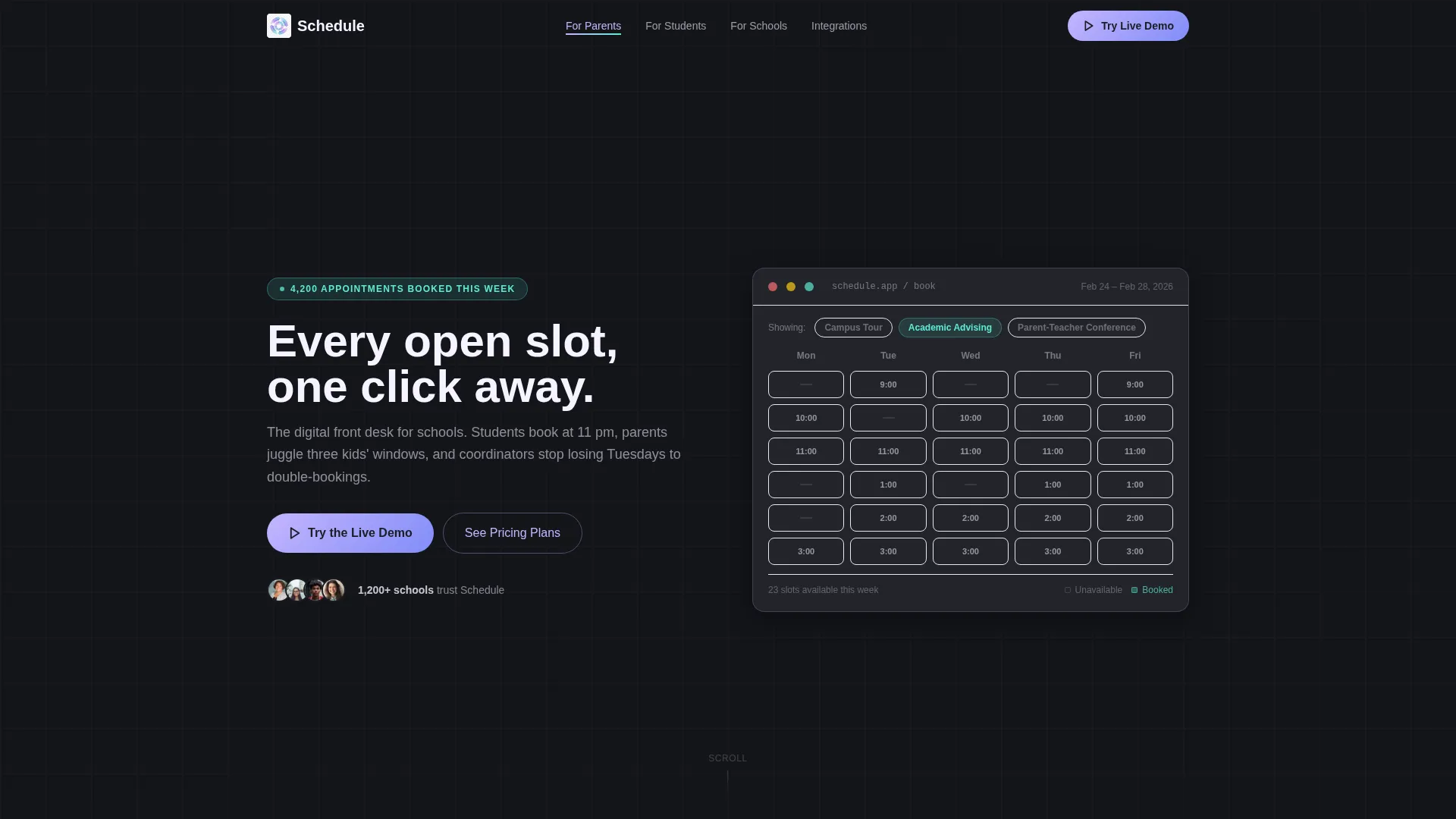
A full-viewport-width calendar widget sits at the top of the page, pre-populated with three fictional appointment types: Campus Tour, Academic Advising, and Parent-Teacher Conference. Visitors can click any time block and watch it animate open with an iridescent lilac-to-teal gradient ripple. Selecting a slot triggers a confirmation pulse and reveals the primary call-to-action button inline.
Self-Typing Headline Animation
The headline "Every open slot, one click away" types itself into view above the calendar widget as the page loads. This animation creates immediate momentum and signals that the product is interactive before the visitor has scrolled at all.
Hub-and-Spoke Anchor Navigation
A sticky navigation bar anchors the four spoke sections: For Parents, For Students, For Schools, and Integrations. Visitors can jump directly to the audience section most relevant to them. Active navigation states use holographic lilac to signal position clearly.
Animated Entry Statistics
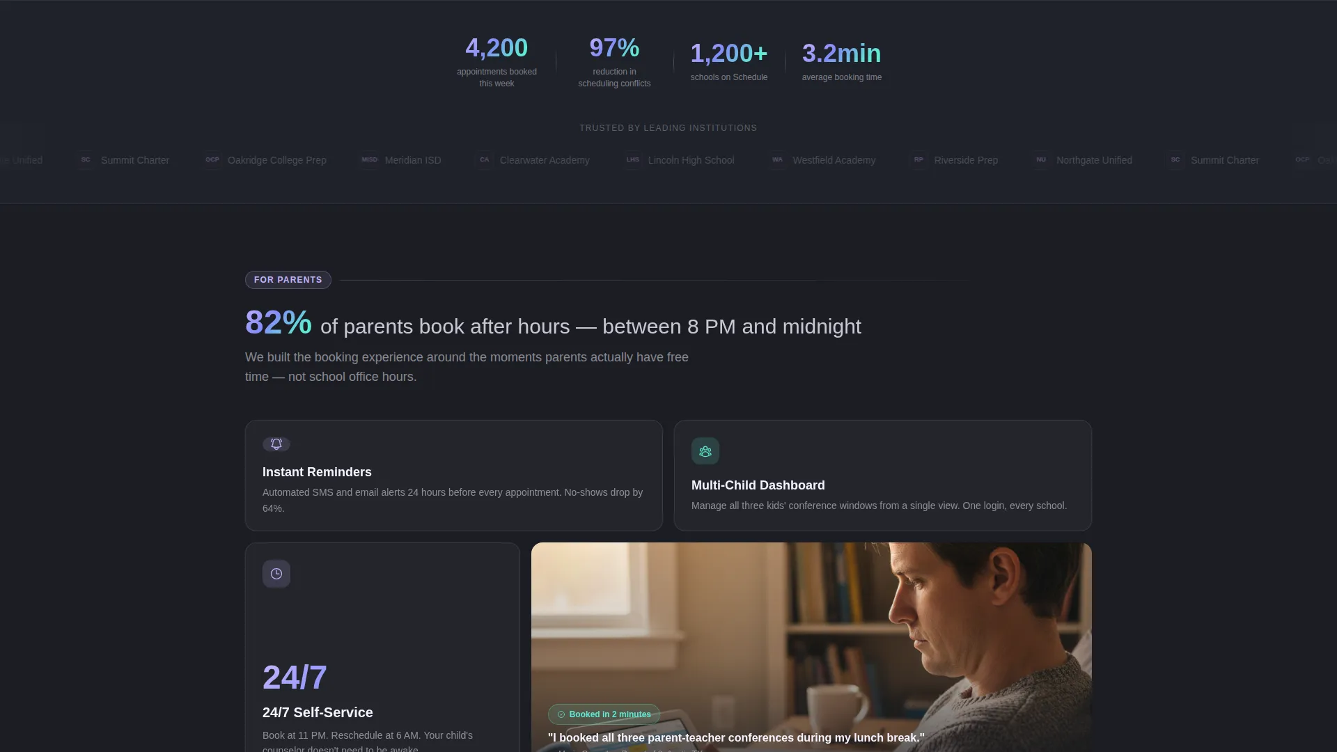
Each spoke section opens with a counting statistic that increments as the section scrolls into the viewport. The example used in the brief is "4,200 appointments booked this week." This rhythm of stat, screenshot, and single-sentence benefit repeats across every spoke to build proof quickly.
Dual Call-to-Action Architecture
The primary call-to-action, "Try the Live Demo," appears first inside the header widget after a slot is selected, then reappears as a floating persistent button after the second spoke section. A secondary path, "See Pricing Plans," is reserved for the final spoke only. There are no form fields anywhere on the page.
Persona-Contextualized Demo Entry
When a visitor selects a sample appointment type and clicks the demo button, the click carries the selected persona and appointment type as context into the demo environment. This removes the cold-start barrier and makes the first demo interaction feel personalized from the start.
Page sections overview
| Section | Purpose |
|---|---|
| Interactive Calendar Header | Full-width widget with clickable time slots and inline primary call to action |
| Sticky Anchor Nav | Persistent hub navigation linking to all four spoke sections |
| For Parents spoke | Benefit copy and animated stat targeting multi-child scheduling needs |
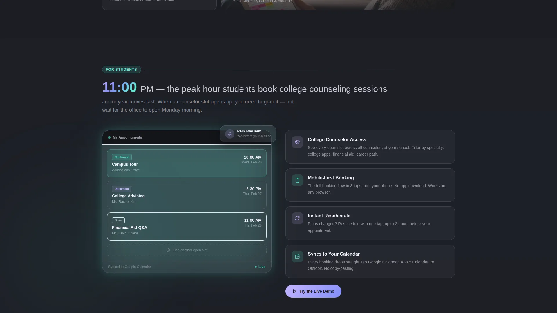
| For Students spoke | Benefit copy and stat for late-night self-service booking journeys |
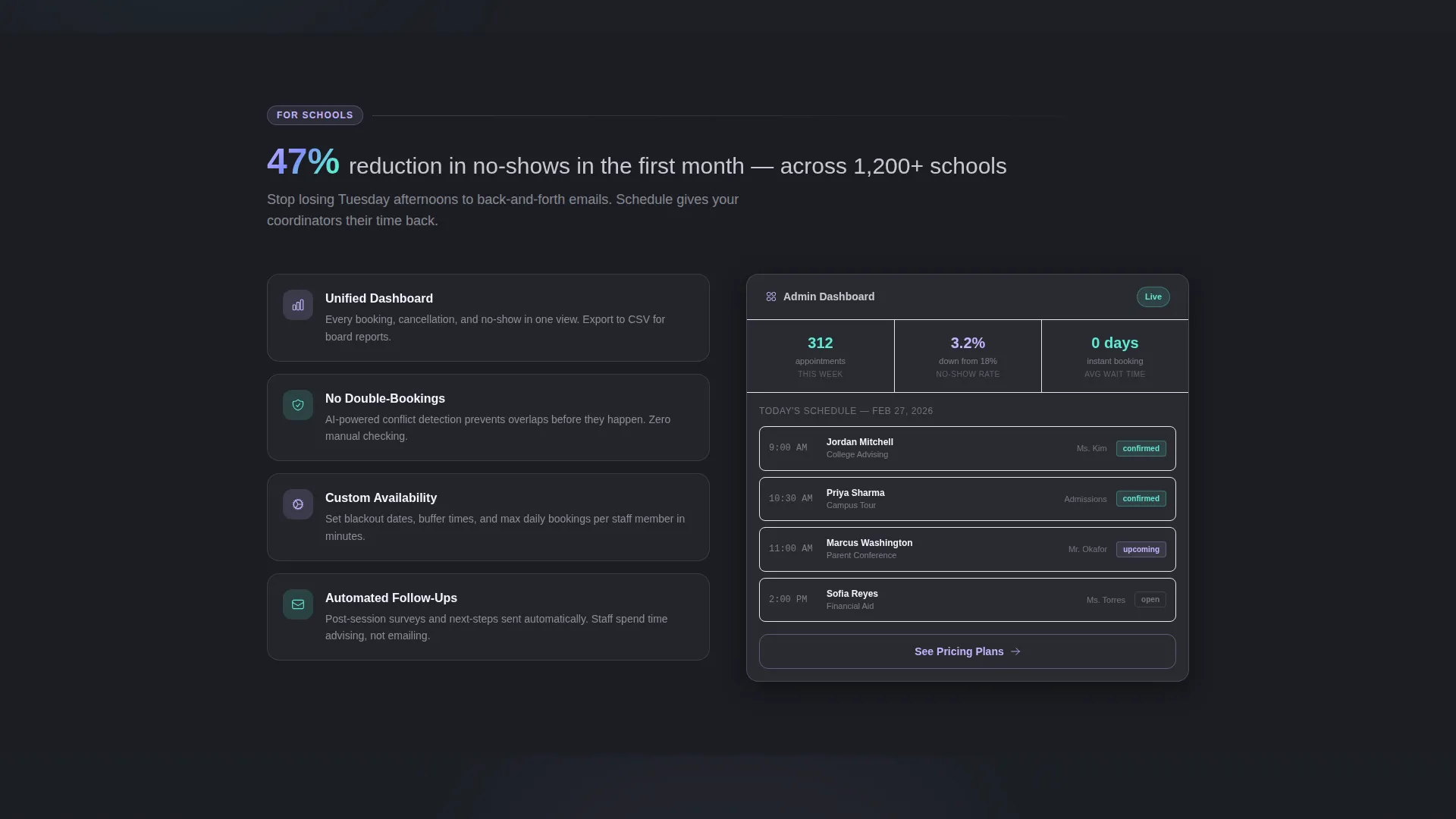
| For Schools spoke | Feature proof for coordinators reducing no-shows and double-bookings |
| Integrations spoke | Overview of connection capabilities with a secondary pricing call to action |
| Floating Demo Button | Persistent call to action that appears after second spoke and stays on scroll |
Design & branding system
The visual identity follows a Directory and Discovery theme powered by an AI Iridescent color palette. The result feels futuristic but immediately approachable, equally trusted by a thirteen-year-old student and a fifty-year-old dean.
- Deep graphite (#1B1D23) forms the primary surface, holographic lilac (#C4B5FD) handles active navigation states, and prismatic teal (#5EEAD4) marks confirmation badges and success moments
- Warm pearl white (#F5F3FF) card backgrounds keep content areas light and readable against the dark primary surface
- Time block hover states use a lilac-to-teal gradient ripple, and slot selection triggers a confirmation pulse that reinforces the action just completed
Mobile & speed optimization
The template is designed around a Launch Energy creative direction, which means the page opens at peak momentum and sustains it across every scroll increment. The layout treats each viewport reveal like a product keynote moment.
- Spoke sections snap into view as they enter the viewport, keeping the reveal rhythm intact on smaller screens
- The floating call-to-action button and sticky anchor navigation are both built to remain usable at mobile viewport widths
- Animated statistics count up on entry, so the proof-building rhythm works whether a visitor is on a desktop browser or a phone at 11 p.m.
How this template helps you convert
This page is a Click-Through template, meaning every design decision removes barriers between curiosity and action rather than asking visitors to fill out a form.
- The interactive calendar header lets visitors complete a micro-action before they have even read a headline, creating an early commitment that makes clicking the demo button feel like a natural next step.
- The floating "Try the Live Demo" button reappears after the second spoke section, catching visitors who scrolled past the header without clicking and giving them a frictionless second opportunity.
- Persona-aware demo entry means visitors arrive in the demo already matched to their context, making the first experience immediately relevant rather than generic.
Other information about this template
This template sits within the Technology and Education Software category and is specifically scoped to the education appointment scheduling niche. It is a good starting point for any team building a dedicated scheduling product page.
- The hub-and-spoke layout makes it straightforward to add or remove spoke sections if your audience mix differs from the default four
- The iridescent color system is defined with exact hex values in the brief, making it easy to apply consistently across additional pages or marketing materials
- The template style is classified as Hub and Spoke with Anchor Navigation, which suits platforms that serve multiple distinct user personas from a single landing page
- This layout pairs naturally with tools like Calendly, but the brief describes the scheduling interaction as a built-in widget rather than an embedded third-party calendar
Theme
Directory & Discovery
Creative direction
Launch Energy
Color system
AI Iridescent
Style
Hub & Spoke (Anchor Nav)
Direction
Click-Through
Page Sections
Interactive Full-viewport Calendar Widget
Self-typing Headline on Load
Sticky Hub-and-spoke Anchor Nav
Animated Counting Statistics
Persistent Floating Demo Button
Persona-contextualized Demo Entry
Related questions
Can I change the appointment types shown in the calendar widget?
Does this template require visitors to fill out a form before accessing the demo?
Can I add more spoke sections for different audience types?
When does the floating call-to-action button appear?
Who is this landing page template best suited for?



