Senior Care Software & SaaS Booking Website Template
Schedule is a hub-and-spoke landing page template built for senior care staff scheduling platforms. It uses an Industry Report creative direction to build a data-driven case against legacy staffing methods, guiding directors of nursing, operations managers, and HR coordinators toward a demo or lead capture with a sticky savings calculator and gated report download.
by Rocket studio
Quick summary
Schedule is a single-page, anchor-nav landing page template designed for intelligent senior care staff scheduling platforms. It presents an operational, data-led argument for modern shift-filling technology, targeting nursing home and assisted living decision-makers who need to close open shifts fast, avoid compliance violations, and cut agency spend.
Who this template is for
This template is built for SaaS platforms and software vendors serving the senior care staffing market. It speaks directly to the people who carry the weight of open shifts every day.
- Directors of nursing managing state-mandated staffing ratios at all hours
- Regional operations managers overseeing multiple facilities with competing staffing crises
- HR coordinators spending weekends chasing agency temps to cover memory care units
What problem this template solves
Senior care facilities still rely on phone trees, group texts, paper binders, and agency calls to fill open shifts. That process is slow, expensive, and legally risky. This template gives a scheduling platform the right language and layout to make that case clearly.
- Open shifts create compliance exposure when floors fall below required staffing ratios
- Traditional agency-dependent fill processes cost more and take far longer than automated matching
- Decision-makers need to justify new software to administrators with real cost and time data
What you get with this template
You get a fully structured, single-page landing page with a hub-and-spoke anchor navigation system. Every section is built to advance a prosecutorial argument for modern scheduling technology, not just list features.
- A dark full-bleed hero section with an animated scheduling grid and a bold headline
- Five anchor-nav spokes covering staffing gaps, compliance risk, speed benchmarks, cost analysis, and facility results
- A persistent sticky call-to-action leading to an interactive savings calculator and a gated lead-capture report download
Feature list
This template includes purpose-built components that serve both the reader's decision process and the platform's conversion goals.
Anchor Navigation Hub and Spoke Layout
A sticky anchor nav pins to the top of the page with five spoke labels. Each label scrolls the reader to a dedicated section that opens with a hard statistic and contextualizes it against platform performance.
Animated Hero Scheduling Grid
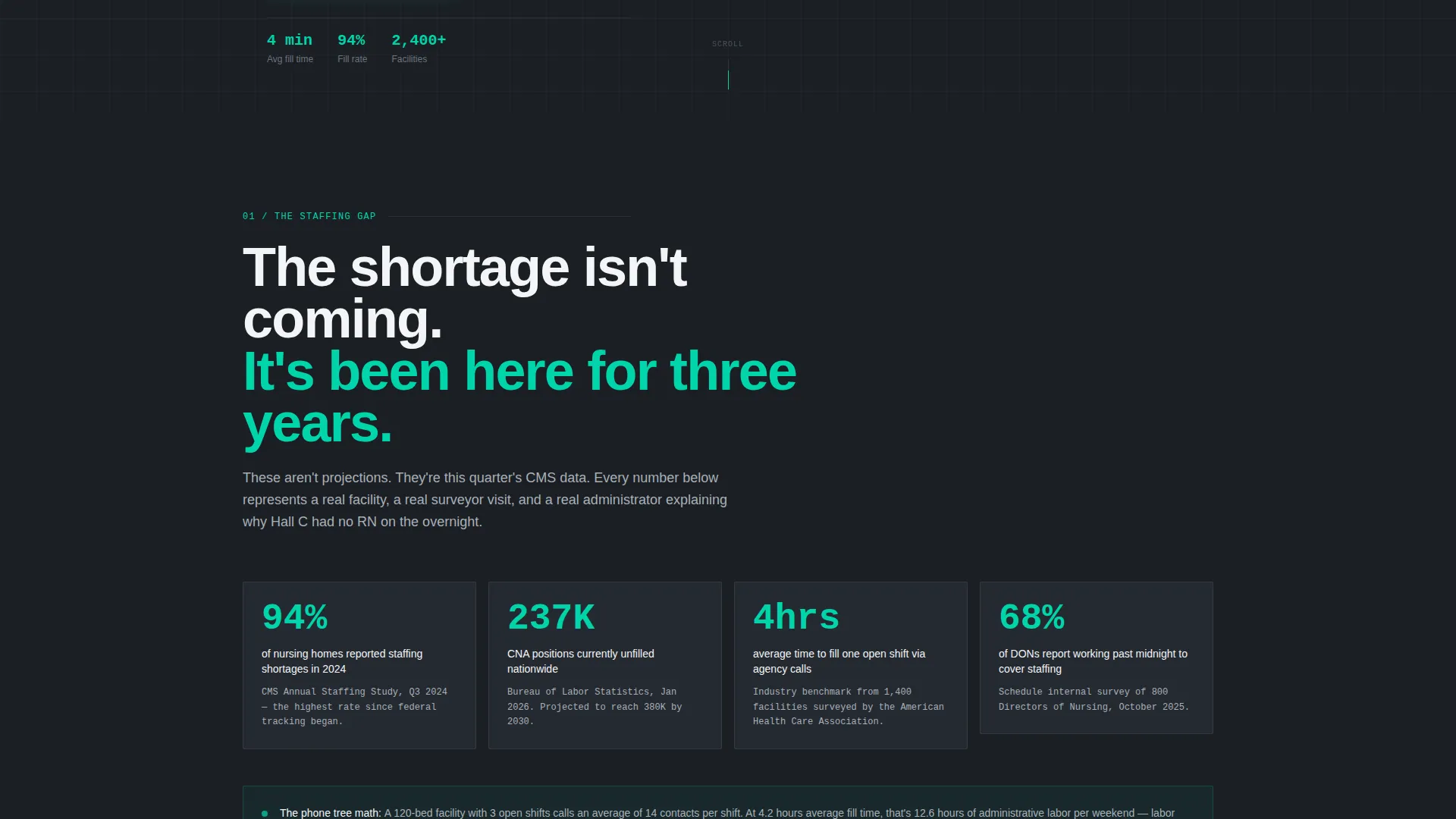
The header renders a near-black full-bleed viewport. A softly glowing seven-day facility scheduling grid materializes like a mission-control display, with shift blocks lighting up in electric teal one by one as they fill. Thin light traces connect staff names to time slots.
Industry Report Section Structure
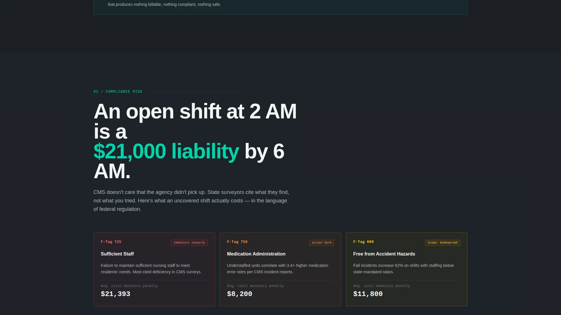
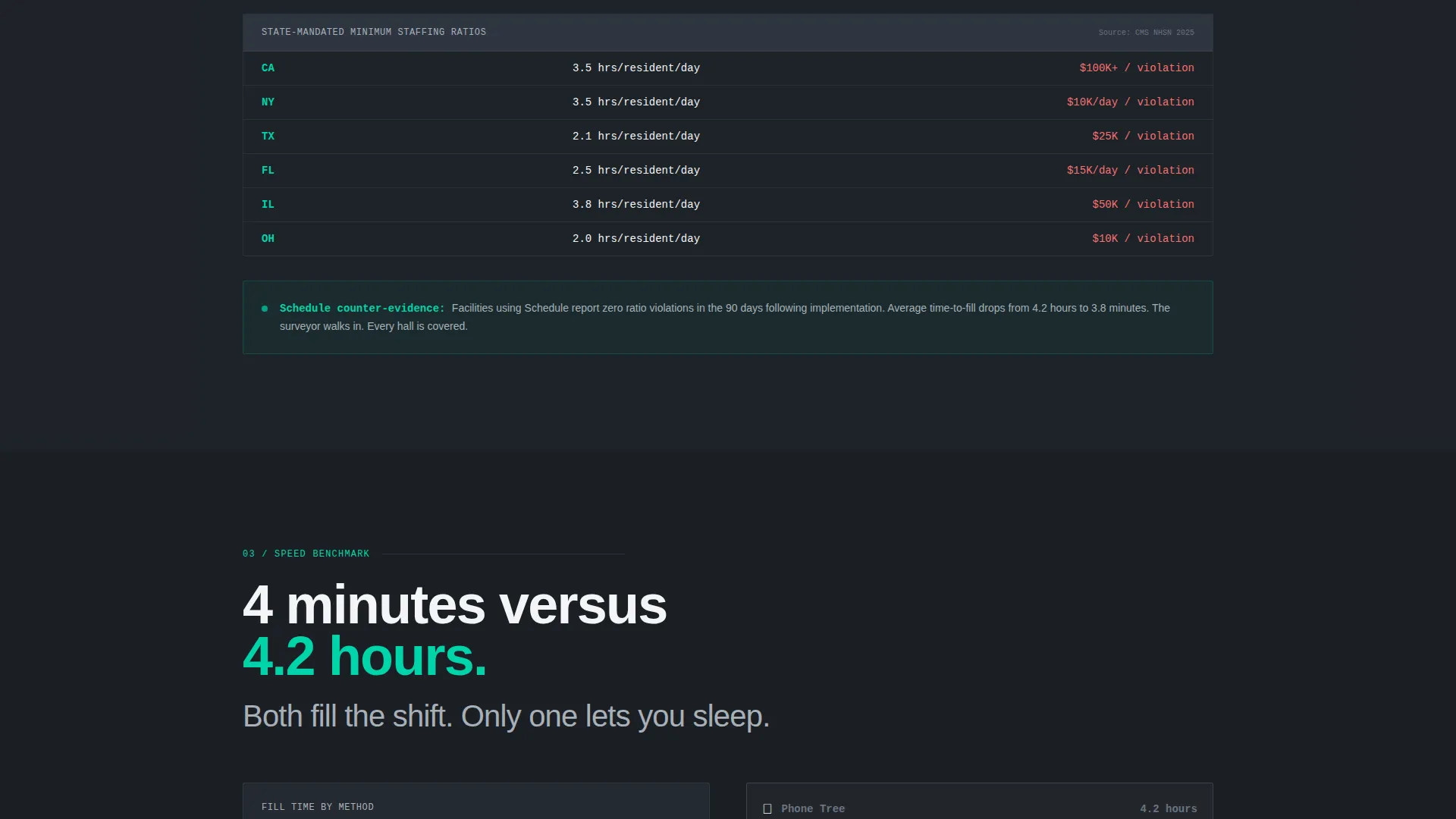
Each content section opens with a data point drawn from industry sources such as CMS data or Bureau of Labor projections. The data is rendered as an animated counter or chart before the platform's performance is set alongside it as the counter-evidence.
Interactive Savings Calculator
A persistent sticky call-to-action reads "See Your Facility's Savings" and leads to a calculator. The tool asks for facility size in beds, current agency spend per month, and average open shifts per week, then generates an instant side-by-side comparison against industry benchmarks.
Gated Lead Capture Report
A secondary conversion path offers a downloadable full staffing report. It is gated behind name, facility name, and email fields, capturing leads who are not yet ready to request a demo but are building an internal business case for their administrator.
Comparison and Versus Content Flow
The scroll flow is built as a Comparison/Versus conversion pattern. It does not pitch features in isolation. Instead, it layers measurable proof that legacy staffing methods are slower, more expensive, and legally riskier than the platform being presented.
Page sections overview
| Section | Purpose |
|---|---|
| Dark Hero Header | Introduce the platform with an animated grid and bold headline |
| Anchor Nav Bar | Pin spoke labels and enable fast section navigation |
| The Staffing Gap | Open with industry data on unfilled shifts and ratio risk |
| Compliance Risk | Connect open shifts to state-mandated ratio violations |
| Speed Benchmark | Compare phone-tree fill times against platform fill speed |
| Cost Analysis | Show agency spend versus platform cost with benchmark data |
| Facility Results | Present platform performance as measurable counter-evidence |
| Savings Calculator | Let visitors calculate their own cost and fill-time savings |
| Report Download | Capture leads with a gated full staffing report form |
Design & branding system
The visual identity follows a Tech Glass theme using a Monochrome Steel color system. Every design choice reinforces the feeling of medical-grade operational infrastructure, not a consumer wellness product.
- Core palette: deep charcoal (#1B1F24), brushed aluminum (#A8B0B8), and surgical white (#F4F5F7)
- Electric teal (#00D4AA) is reserved exclusively for interactive states, live data pulses, and call-to-action elements
- Typography uses bold sans-serif for headlines, with thin light traces and glowing grid elements replacing decorative photography
Mobile & speed optimization
The template is structured for clean performance across device sizes. The hub-and-spoke anchor nav collapses gracefully, and the sticky call-to-action remains accessible on smaller screens without blocking content.
- Sticky calculator call to action and anchor nav are designed to remain visible and usable on mobile viewports
- Animated grid and counter elements are contained components that do not depend on heavy media files
- Section-by-section scroll structure keeps content modular and fast to load independently
How this template helps you convert
This template is engineered around two conversion paths that serve different buyer stages at the same time.
- The sticky "See Your Facility's Savings" calculator creates immediate, personalized value for high-intent visitors who are ready to evaluate the platform against their current agency spend.
- The gated staffing report download captures name, facility name, and email from lower-intent visitors who need internal justification material before they can request a demo.
Other information about this template
This template is a strong fit for senior care software and SaaS vendors positioning against legacy staffing workflows. It is also well-suited for platforms that serve skilled nursing facilities, assisted living operators, and multi-site regional healthcare groups.
- The template supports credentialed staff matching workflows for CNAs (Certified Nursing Assistants), LPNs (Licensed Practical Nurses), and RNs (Registered Nurses)
- The Industry Report creative direction makes this template adaptable for conference leave-behinds, investor decks, or administrator pitch materials with minimal content swaps
- The Tech Glass visual theme and Monochrome Steel palette align with operational software aesthetics common in healthcare technology platforms

Theme
Tech Glass
Creative direction
Industry Report
Color system
Monochrome Steel
Style
Hub & Spoke (Anchor Nav)
Direction
Comparison/Versus
Page Sections
Anchor Navigation Hub and Spoke
Animated Dark Hero Grid
Industry Report Section Flow
Interactive Savings Calculator
Gated Report Lead Capture
Comparison and Versus Content Architecture
Related questions
Who is this landing page template designed for?
What conversion paths does this template include?
Can I adapt the data sections to my platform's real numbers?
What does the savings calculator collect from visitors?
Is this template suitable for a multi-facility or enterprise buyer?



