Schedule - Intelligent Government Landing Page Template
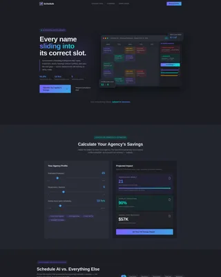
Schedule is a modular card-grid landing page template built for government AI scheduling assistants. It features a live dashboard preview header, an interactive complexity estimator tool, and comparison card rows that contrast AI-powered scheduling against manual and legacy methods. Designed for city clerks, county operations managers, and state agency directors who need to eliminate scheduling chaos fast.
by Rocket studio
Quick summary
Schedule is a single-page, card-grid landing page template for government AI scheduling tools. It opens with a rendered municipal dashboard preview, immediately follows with an interactive savings estimator, and cascades into comparison card rows. The layout is built around a Data Command visual theme using the AI Iridescent color system, making complex scheduling value instantly readable.
Who this template is for
This template is built for teams and vendors bringing intelligent scheduling tools to the public sector. It speaks directly to the buyers and decision-makers who feel scheduling pain every single day.
- City clerks managing stacks of meeting-request emails and public hearing calendars
- County operations managers overseeing multi-facility shift rosters with 200 or more staff
- State agency directors losing full-time staff hours to manual scheduling labor
What problem this template solves
Government scheduling is still running on spreadsheets, sticky notes, and tribal knowledge. The real cost is invisible until someone tries to quantify it. This template makes that cost visible and positions an AI scheduling assistant as the fix.
- No clean way to show buyers how many hours and dollars manual scheduling wastes
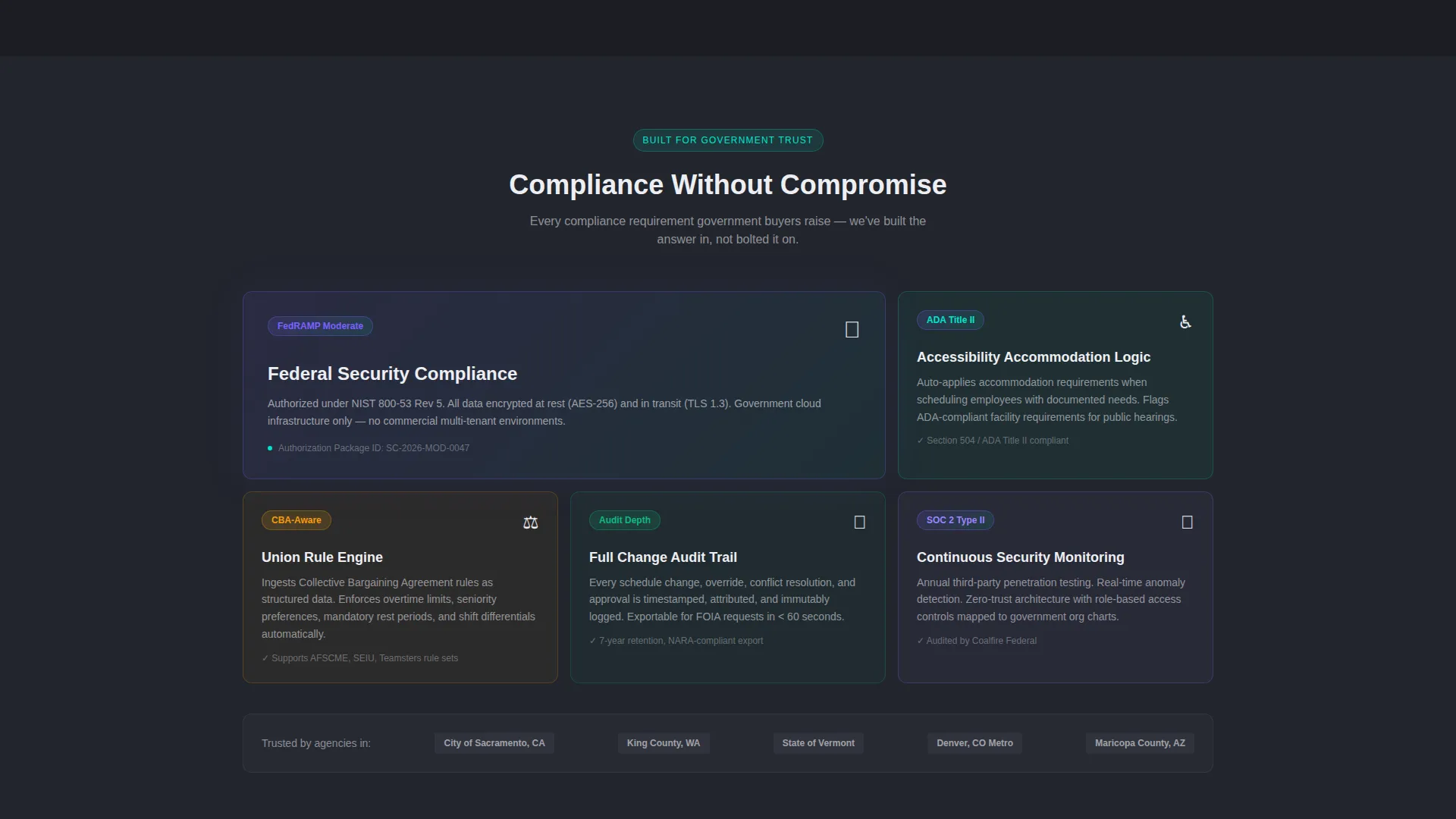
- Generic software landing pages fail to address government-specific concerns like union rules, audit trails, and public hearing compliance
- Visitors leave before converting because there is no interactive proof of value early in the page
What you get with this template
You get a fully structured, modular landing page ready to represent a government AI scheduling product. Every section is purpose-built to earn attention, build credibility, and capture leads from serious public-sector buyers.
- A header dashboard preview showing a realistic municipal week view with department color-coding and an AI conflict-resolution sidebar
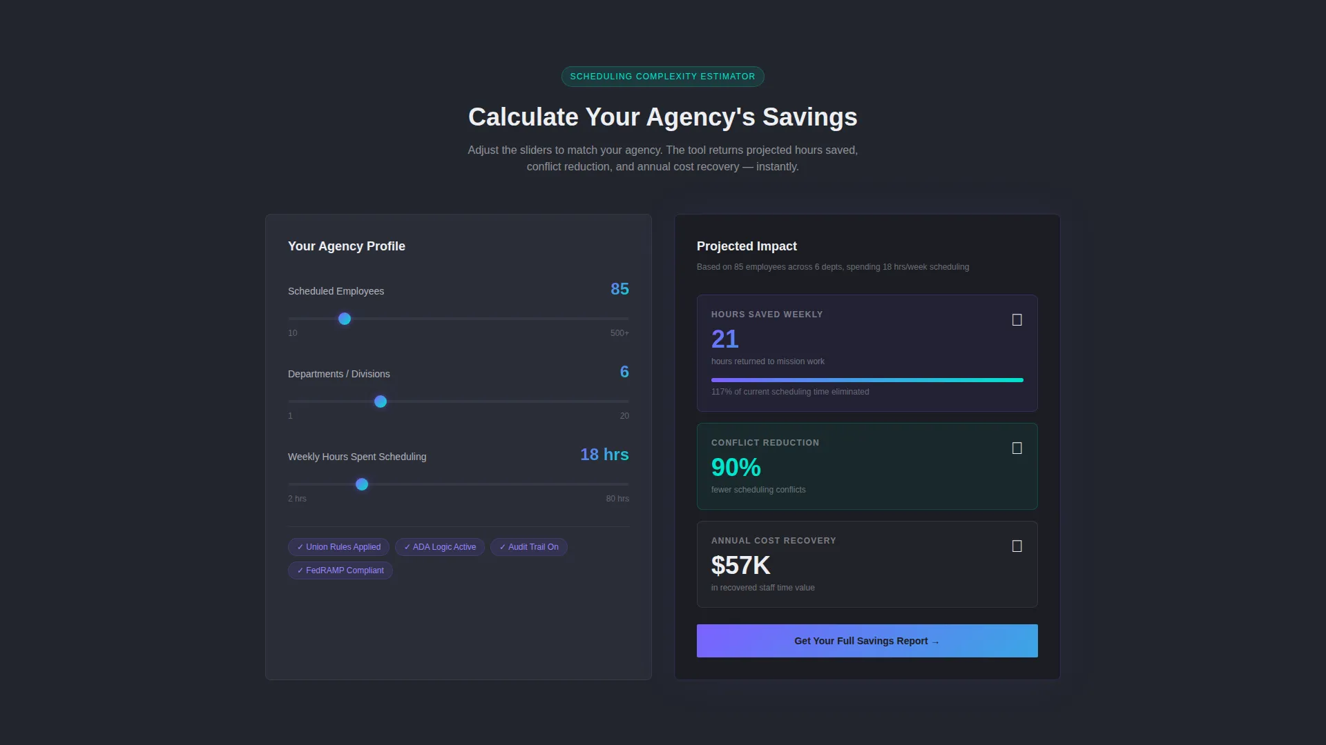
- An interactive scheduling complexity estimator that returns projected hours saved, conflict reduction, and annual cost recovery
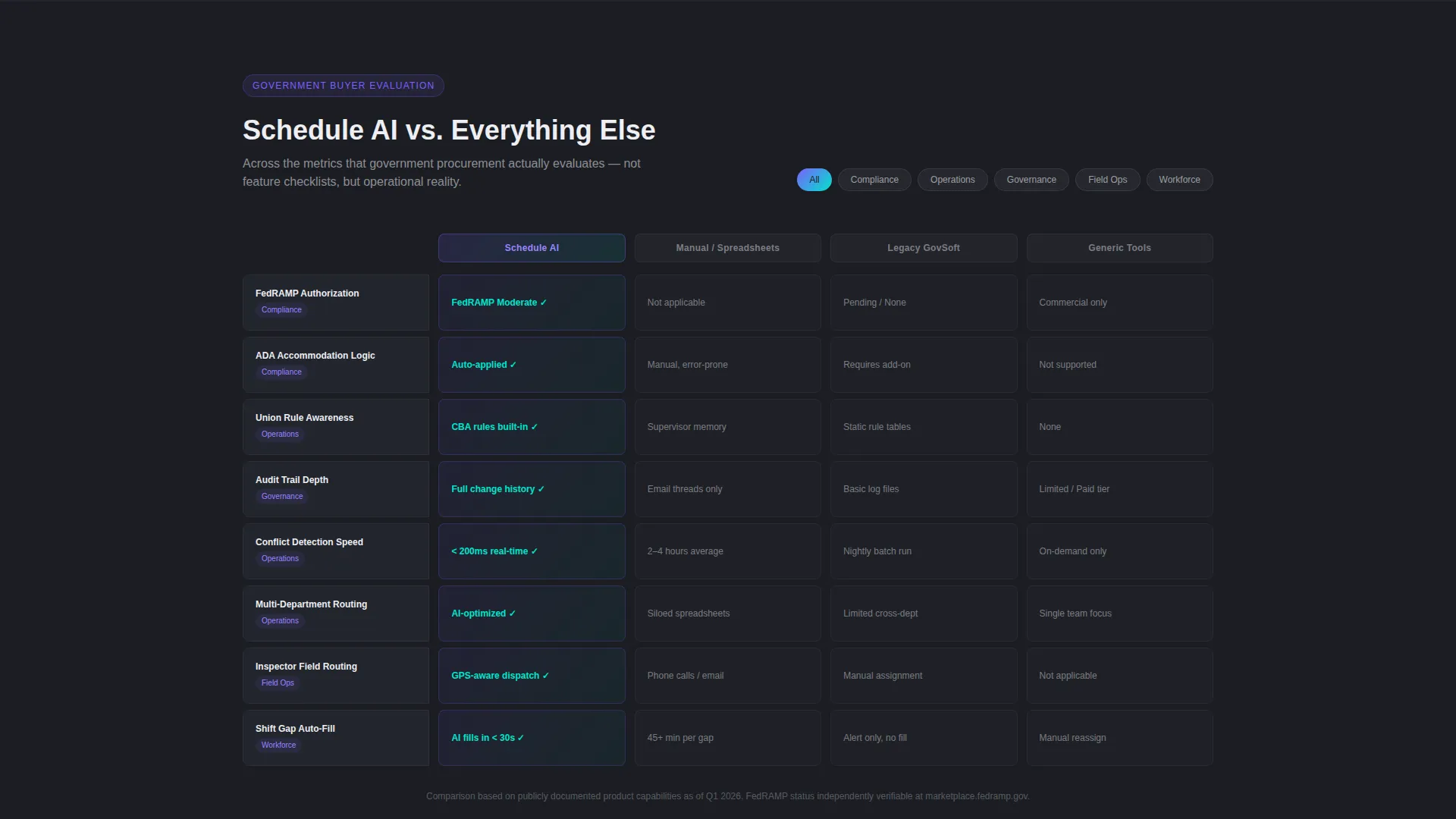
- Modular comparison card grid rows contrasting AI scheduling against manual processes, legacy software, and generic commercial tools
- A bottom conversion card capturing qualified leads with only a government email address and agency name
Feature list
This template ships with a focused set of components, each earning its place in the government buyer journey.
Live Dashboard Preview Header
The header renders a fully composed municipal scheduling interface. It shows a week view with color-coded department blocks, an AI conflict-resolution sidebar flagging overlapping inspections, and a real-time optimization score. The data feels specific and credible, not decorative.
Interactive Complexity Estimator
Positioned directly below the header, this tool accepts three inputs: number of employees, number of departments, and weekly scheduling hours. It instantly returns projected hours saved, a conflict reduction percentage, and an annual cost recovery figure. This is the primary conversion engine on the page.
Comparison Card Grid
Modular card rows let visitors compare the AI scheduling assistant against manual scheduling, legacy software, and generic commercial tools. Each card addresses metrics that government procurement teams actually evaluate, including audit-trail depth, union-rule awareness, and accommodation logic.
Data Command Visual Theme
The page uses a deep charcoal body with signal-white card surfaces that appear to float as interface panels. Holographic violet and shimmer cyan appear as gradients on active states and progress indicators, giving the layout the feel of a live satellite operations room.
Primary and Secondary calls to action
The primary call to action, "Calculate Your Agency's Savings," anchors the estimator tool. A secondary conversion card at the bottom, "Request a Compliance Brief," requires only a government email and agency name, keeping the barrier low for qualified leads.
Modular Card Layout
Every section of the page is built as a discrete, stackable card module. This structure keeps the layout flexible for future edits and ensures each value claim stands on its own without depending on surrounding copy.
Page sections overview
| Section | Purpose |
|---|---|
| Dashboard Preview Header | Anchors credibility with a rendered municipal scheduling interface and optimization score |
| Scheduling Complexity Estimator | Converts visitors by showing personalized hours-saved and cost-recovery projections |
| Versus Comparison Cards | Positions the AI assistant against manual, legacy, and commercial scheduling alternatives |
| Government Metrics Row | Addresses procurement concerns around audit trails, union rules, and accommodation logic |
| Primary call to action Block | Drives engagement with the "Calculate Your Agency's Savings" call to action |
| Compliance Brief Form | Captures qualified leads using only a government email and agency name |
Design & branding system
The visual identity follows a Data Command theme built on the AI Iridescent color system. The palette is inspired by a satellite operations room at 2 AM: dark, purposeful, and alive with luminous data.
- Core palette: deep command-center charcoal (#1B1D23) for the body, signal white (#EDEEF2) for card surfaces, holographic violet (#7B61FF) and shimmer cyan (#00E5CC) for gradients on active states and progress indicators
- Violet and cyan never appear flat; they shift as gradients that suggest light refracting through a prism, used on interactive elements and status indicators
- Card surfaces in signal white sit against the charcoal background, creating the visual effect of floating interface panels inside a command center
Mobile & speed optimization
The modular card grid structure keeps the layout clean and stackable across screen sizes. Each card is a self-contained unit, which naturally supports responsive reflow on smaller devices.
- Card modules reflow vertically on mobile, preserving readability without breaking the visual hierarchy
- The dark charcoal base and signal-white cards maintain contrast and legibility on all display types
- The interactive estimator is positioned early in the page flow so mobile visitors reach it quickly without excessive scrolling
How this template helps you convert
The page is engineered around a Calculator/Tool First creative direction, meaning conversion starts before a visitor reads a single comparison card.
- The interactive estimator delivers personalized, numbers-based proof of value immediately after the header, earning the scroll before any marketing copy asks for trust
- Comparison card rows use government-specific evaluation criteria, making the AI assistant feel purpose-built for public-sector buyers rather than adapted from a commercial product
- The bottom compliance brief form removes friction by asking for only two inputs, catching the visitors the estimator already convinced
Other information about this template
This template sits at the intersection of government technology procurement and AI-powered workforce tools. It is purpose-built for the public-sector niche where buyer skepticism is high and proof-of-value requirements are specific.
- The template style is Card Grid (Modular), making it straightforward to rearrange, replace, or extend individual sections without redesigning the full page
- The header concept is Dashboard Preview, a design pattern that uses realistic interface data to establish credibility before any claims are made in body copy
- The landing page direction is Comparison/Versus, a format well suited to government procurement contexts where buyers need to justify a switch from their current process
- Creative direction is Calculator/Tool First, prioritizing interactive proof over passive reading, which is particularly effective for operations-focused government buyers
Theme
Data Command
Creative direction
Calculator/Tool First
Color system
AI Iridescent
Style
Card Grid (Modular)
Direction
Comparison/Versus
Page Sections
Live Municipal Dashboard Preview
Interactive Scheduling Complexity Estimator
Versus Comparison Card Grid
Data Command Color System
Dual Conversion Architecture
Related questions
Who is this landing page template built for?
What does the interactive estimator tool show visitors?
Why is the comparison card grid relevant to government buyers?
How does the template handle lead capture without a long sign-up form?
Is this template flexible enough to modify for a related use case?



