Higher Education Digital Presence Booking Website Template
Schedule is a split-screen landing page template built for higher education booking and scheduling platforms. It combines a stats-driven header, live-style dashboard visuals, and a freemium conversion flow to help registrars, department coordinators, and campus IT directors see immediate value. The Dashboard Pro theme and AI Iridescent color system make every section feel like a next-generation mission control interface.
by Rocket studio
Quick summary
Schedule is a single-page, split-screen landing page template designed for campus scheduling and room booking platforms. It leads with hard numbers, walks visitors through a before-and-after story, and closes with a low-friction free trial form. The visual identity is dark, luminous, and data-forward, built to make legacy workflows feel instantly outdated.
Who this template is for
This template speaks directly to the people who manage institutional scheduling at scale. It is built for teams who already feel the pain of broken tools and conflicting systems.
- Registrars and department coordinators managing room and time slot conflicts across a full campus
- Campus IT directors responsible for connecting older student information systems to modern scheduling tools
- Higher education platform teams launching a booking product with a freemium or guided-demo conversion model
What problem this template solves
Campus scheduling is still handled by a tangle of spreadsheets, legacy systems, and email threads that create constant conflicts. This template gives a scheduling platform a landing page that makes the old way look embarrassing by comparison.
- Visitors arrive and immediately see real proof, specific numbers, conflict resolution rates, and time savings, before they read a single marketing claim
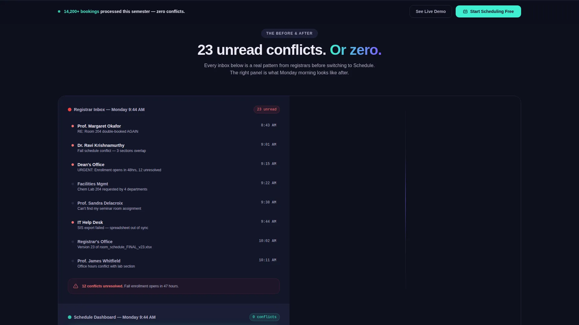
- The side-by-side "before and after" layout makes the contrast between a flooded inbox and a clean, zero-alert dashboard impossible to ignore
- The freemium conversion path removes commitment anxiety by letting prospects experience the dashboard before filling out any form
What you get with this template
You get a fully structured, single-page layout designed to convert skeptical institutional buyers. Every section is pre-built around a specific argument, and the visual system is consistent from header to sticky call-to-action bar.
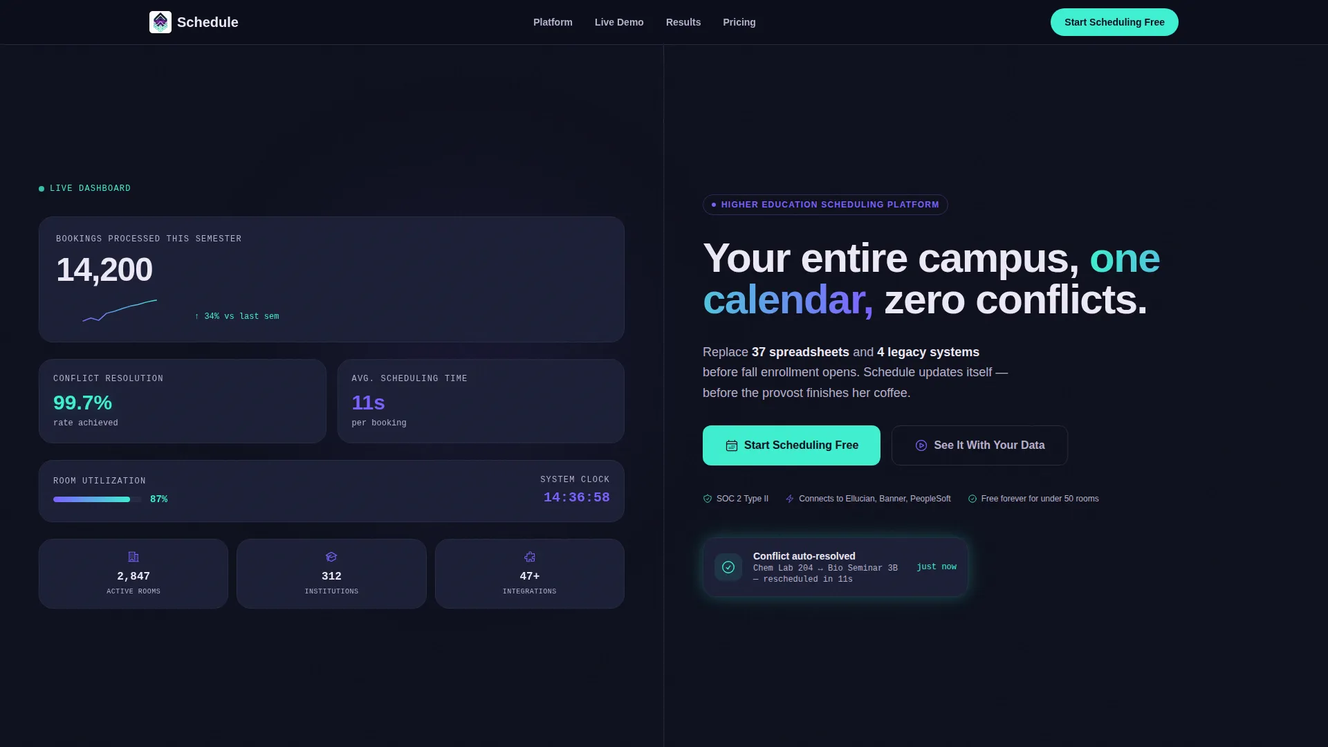
- A stats wall header split 50/50 between live-style metrics on the left and a direct headline with primary call-to-action on the right
- Four content sections: metrics header, before-and-after inbox comparison, animated campus map, and a named testimonial card with specific institutional results
- A sticky bottom bar that appears after the first scroll, plus a secondary "See It With Your Data" demo path for prospects who need more evidence before committing
Feature list
This section highlights the specific built-in components and design decisions that make the Schedule template work as a conversion tool.
Stats Wall Header
The left panel of the header displays four live-style metrics: total bookings processed, conflict resolution rate, a sparkline of weekly room utilization, and average scheduling time. These numbers do the selling before the visitor reads the headline.
Split-Screen Before and After
Section two divides the screen between a simulated inbox showing 23 unread conflict emails on the left and a clean dashboard with zero alerts and a teal confirmation checkmark on the right. The contrast is immediate and visceral.
Real-Time Campus Map Section
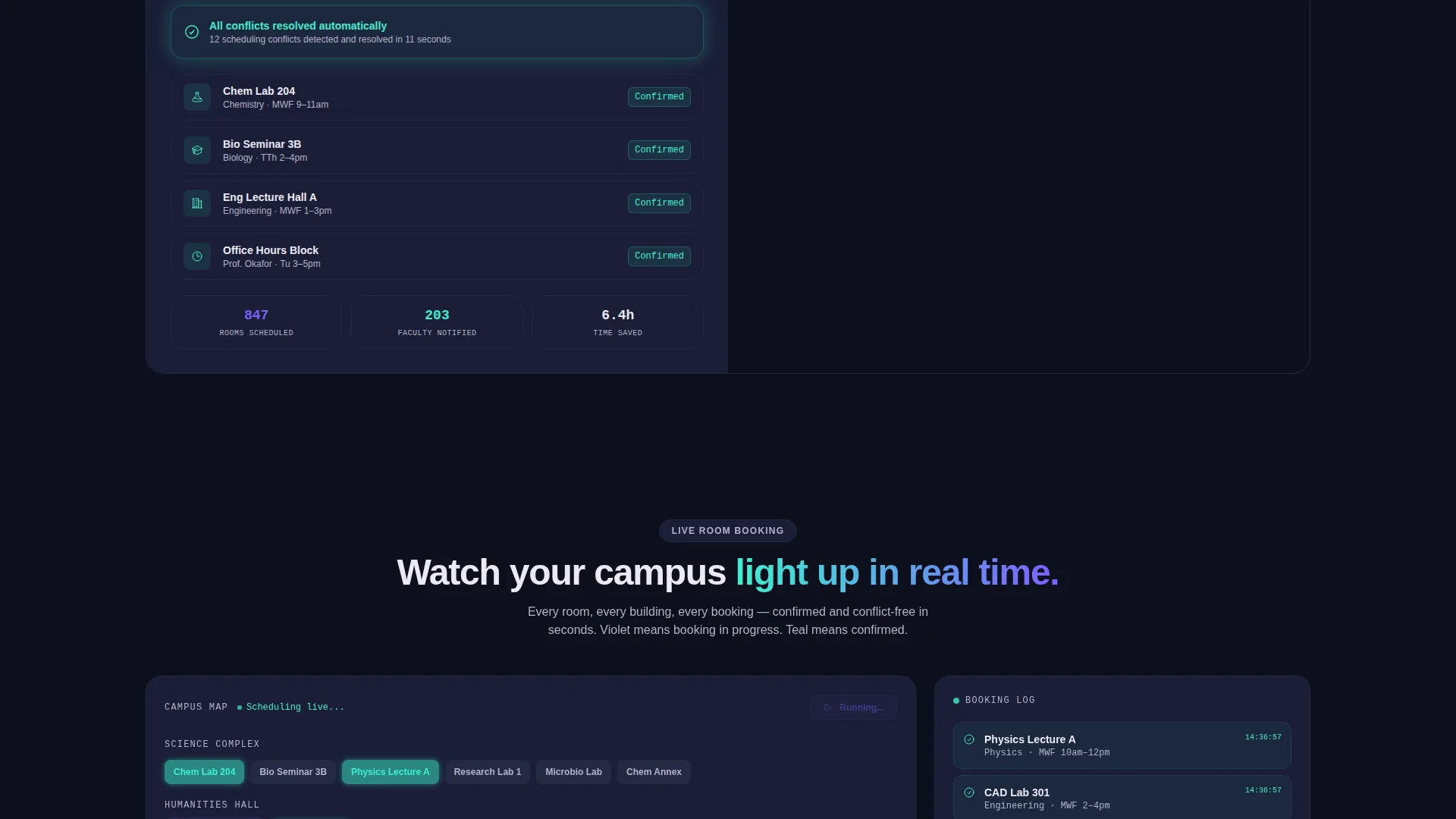
Section three features an animated campus map where rooms light up in shifting violet as they are booked in real time. This visual communicates platform capability without requiring a word of explanation.
Named Testimonial with Metrics
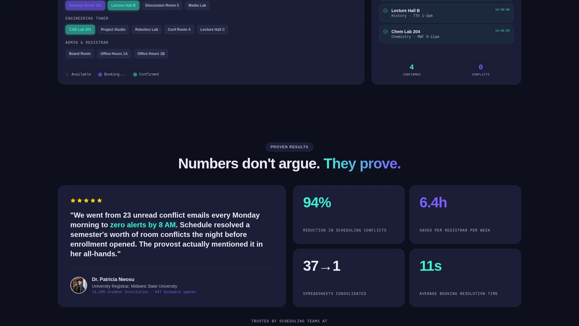
Section four presents a registrar testimonial card alongside the specific numbers that institution achieved. Named, specific social proof carries more weight than generic quotes on a scheduling platform landing page.
Freemium Conversion Form
The primary call-to-action form collects institution name, work email, and a slider input for estimated bookable spaces ranging from 10 to 500 or more. The lightweight form reduces friction for institutional sign-ups.
Secondary Demo Path
A "See It With Your Data" option lets prospects upload their existing room list as a CSV file. This guided demo path targets buyers who need to see the platform working with their own data before they commit.
Page sections overview
| Section | Purpose |
|---|---|
| Stats Metrics Header | Lead with hard proof numbers and headline call to action |
| Before After Split | Show inbox chaos versus zero-alert dashboard |
| Campus Map Animation | Visualize live room booking in real time |
| Testimonial Metrics Card | Build trust with named, specific social proof |
| Sticky call to action Bar | Capture scroll-triggered sign-up intent |
Design & branding system
The visual identity follows a Dashboard Pro theme using an AI Iridescent color system. The palette feels like a next-generation mission control interface: dark, luminous, and subtly alive.
- Deep obsidian (#0D0F1C) dominates the canvas as the primary background; shifting violet (#7B5FFF) pulses through charts and interactive states; cool holographic teal (#3EEFD0) appears only for confirmation signals and success metrics; soft pearl (#EDE8F5) lifts typography and card surfaces off the darkness with clinical clarity
- The primary call-to-action button uses holographic teal to signal action and confirmation, making it visually distinct from every other element on the page
- Typography is set in pearl on obsidian throughout, keeping contrast high and the hierarchy clear even across dense data sections
Mobile & speed optimization
The split-screen layout is structured to reflow cleanly on smaller screens without losing the visual impact of the stats wall or the before-and-after comparison.
- Each 50/50 split section stacks vertically on mobile so both panels remain fully readable without horizontal scrolling
- The sticky bottom call-to-action bar is designed to remain visible during scroll on both desktop and mobile viewports
- The campus map and sparkline animations are contained components that do not interfere with the overall page scroll experience
How this template helps you convert
The Schedule landing page is built around a specific conversion logic: prove value visually before asking for anything, then make the free tier feel like the obvious next step.
- The stats wall header opens with four specific, credible numbers that establish platform authority in the first three seconds of a visit, reducing bounce before the visitor reaches the headline
- The layered evidence structure, metrics, then inbox contrast, then live map, then named testimonial, stacks proof progressively so that by the time the visitor reaches the form, their current workflow already feels inadequate
- The two-path conversion model (free sign-up form plus CSV demo upload) gives both ready-to-act buyers and still-evaluating decision-makers a next step that fits exactly where they are
Other information about this template
This template is category-matched to the Technology vertical with a specific focus on the Higher Education Digital Presence subcategory. It is designed for the higher education booking and scheduling site niche and carries an intersection match score of 13, reflecting a strong alignment between the template style and the target use case.
- The template style is Split Screen (50/50), the theme is Dashboard Pro, and the creative direction is Stats-First Impact, all of which are pre-applied in the layout
- The header concept is a Stats and Metrics wall, and the landing page direction is Freemium and Trial, meaning the entire conversion architecture is already oriented toward low-commitment sign-up flows
- This template is well suited for teams launching a campus scheduling product who want to lead with data credibility rather than feature lists
Theme
Dashboard Pro
Creative direction
Stats-First Impact
Color system
AI Iridescent
Style
Split Screen (50/50)
Direction
Freemium/Trial
Page Sections
Stats Wall Header with Live Metrics
Before and After Inbox Comparison
Animated Campus Map Visualization
Named Testimonial with Specific Results
Freemium Sign-up Form with Slider Input
Sticky Bottom Call-to-action Bar
Related questions
Who is this landing page template built for?
Can I customize the metrics shown in the stats wall header?
What does the secondary demo path involve?
Does the template include the animated campus map as a ready-to-use component?
Is this template designed for a single department or a full campus platform?



