Church & Religious Software Booking Website Template
Schedule is a hub-and-spoke church appointment scheduling landing page built for ministry teams drowning in calendar chaos. It presents a single living dashboard where every sacramental appointment, room booking, and minister assignment is visible at once. The page uses a Data Command visual theme to make the offer feel urgent, credible, and immediately useful to parish administrators and church executives alike.
by Rocket studio
Quick summary
Schedule is a lead-generation landing page for a church and religious appointment scheduling platform. It uses a hub-and-spoke anchor navigation layout to walk ministry leaders through a clear problem-and-solution story. Five spoke sections peel back the chaos of overlapping sacramental calendars and reveal a unified scheduling dashboard, section by section, until the full picture clicks.
Who this template is for
This template is built for teams and individuals who manage complex ministry calendars on a daily basis. If your week involves juggling sacramental appointments, coordinating rooms across multiple campuses, or untangling double-booked ministers, this landing page speaks directly to your situation.
- Parish administrators managing fifty or more weekly sacramental appointments
- Executive pastors coordinating schedules across multiple church campuses
- Small-town clergy who handle scheduling, counseling, and officiating all at once
What problem this template solves
Church scheduling is genuinely hard. Baptism prep sessions overlap with marriage counseling. Three deacons end up booked for the same Saturday. The fix usually lives inside a patchwork of spreadsheets and email threads that no single ministry leader can fully trust. This template frames that pain vividly, then resolves it spoke by spoke.
- No single shared view of which ministers, rooms, or time slots are actually available
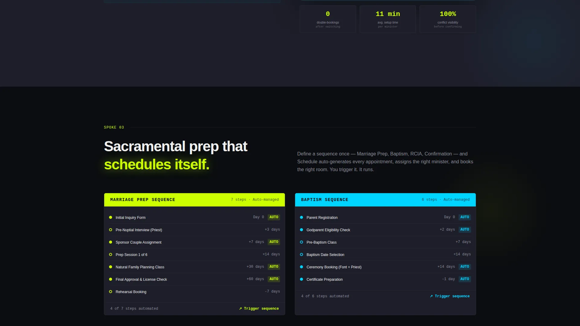
- Sacramental prep sequences that fall through the cracks without automated reminders
- Congregation members with no self-service way to book their own appointments
What you get with this template
You get a fully structured, single-page layout designed to turn a frustrated ministry administrator into a ready-to-convert lead. Every section has a clear job, and every design decision reinforces the core message: one calendar, zero conflicts.
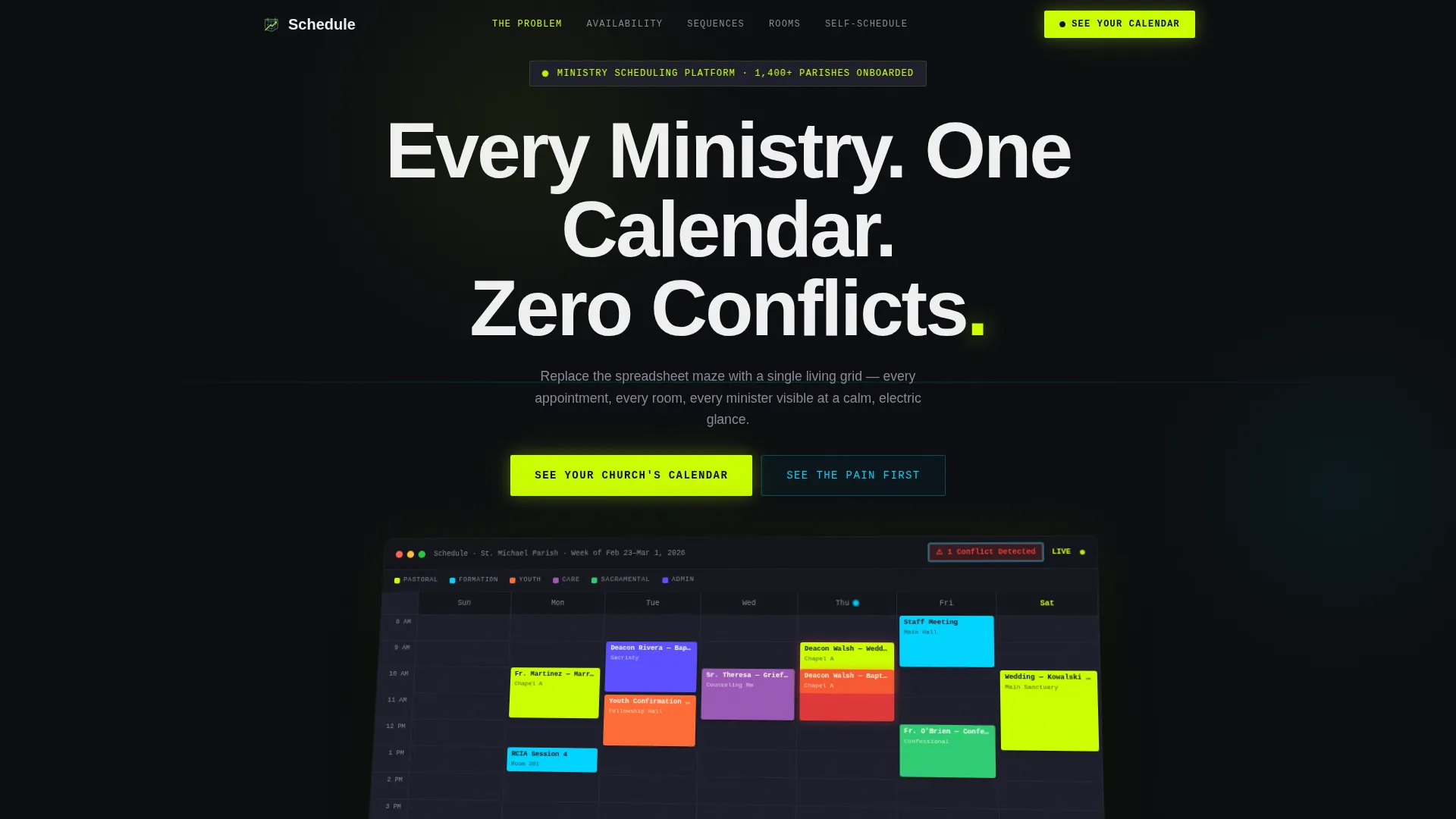
- A full-width product screenshot header with a live-week dashboard render and headline
- Five anchor-navigated spoke sections that each resolve one layer of scheduling chaos
- A lead capture form asking for church name, congregation size, and administrator email
- A secondary self-guided interactive demo path requiring no form submission
Feature list
This section describes the core built-in capabilities of the Schedule landing page template.
Full-Width Dashboard Screenshot Header
The header opens with a high-fidelity product screenshot tilted slightly in 3D against a void black background. It shows a real scheduling week: color-coded ministry lanes, named appointments like "Fr. Martinez - Marriage Prep 2:00 PM," and a pulsing conflict badge. The headline "Every Ministry. One Calendar. Zero Conflicts." sits above it in a clean sans-serif, with the final period rendered in electric chartreuse.
Hub-and-Spoke Anchor Navigation
A central hub nav links to five distinct spoke sections. Each spoke addresses one specific scheduling pain point: shared availability, automated sacramental prep sequences, room and resource booking, and congregation self-scheduling. Visitors can jump directly to the section most relevant to their role or scroll through the full arc.
Problem-to-Solution Scroll Arc
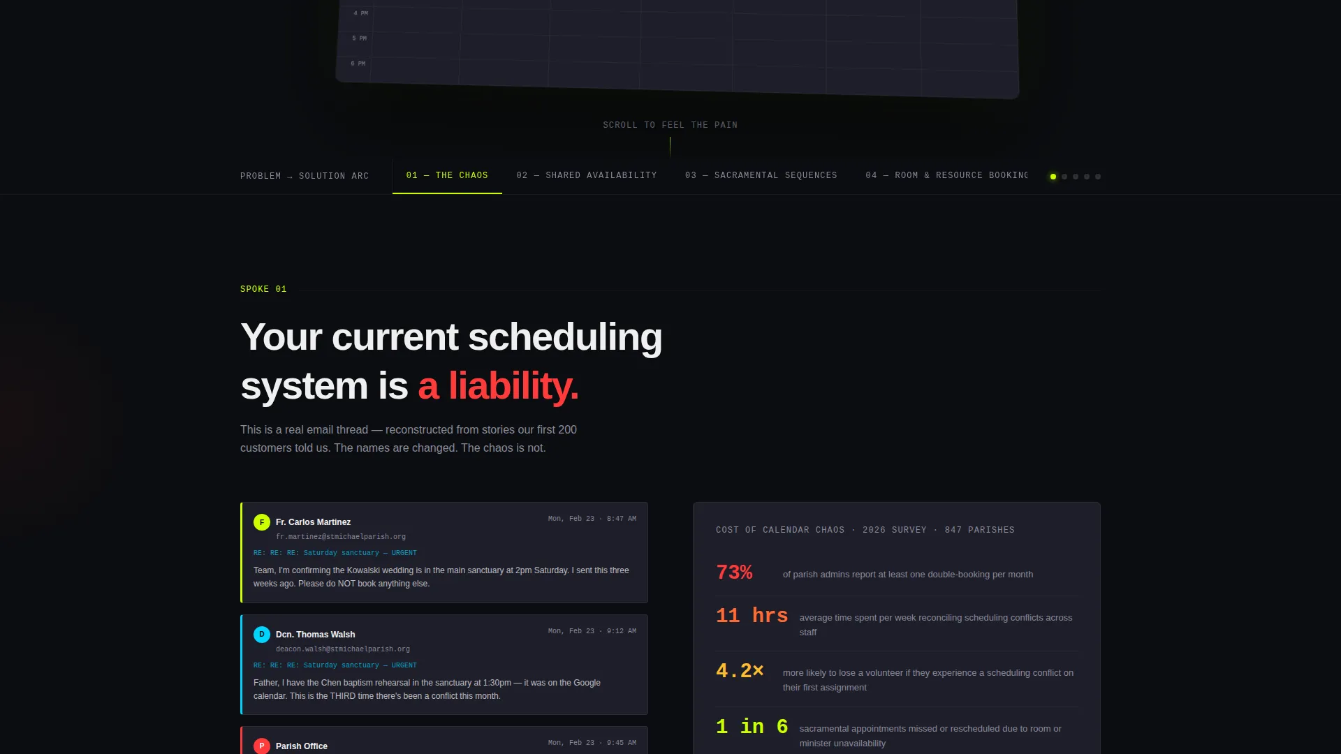
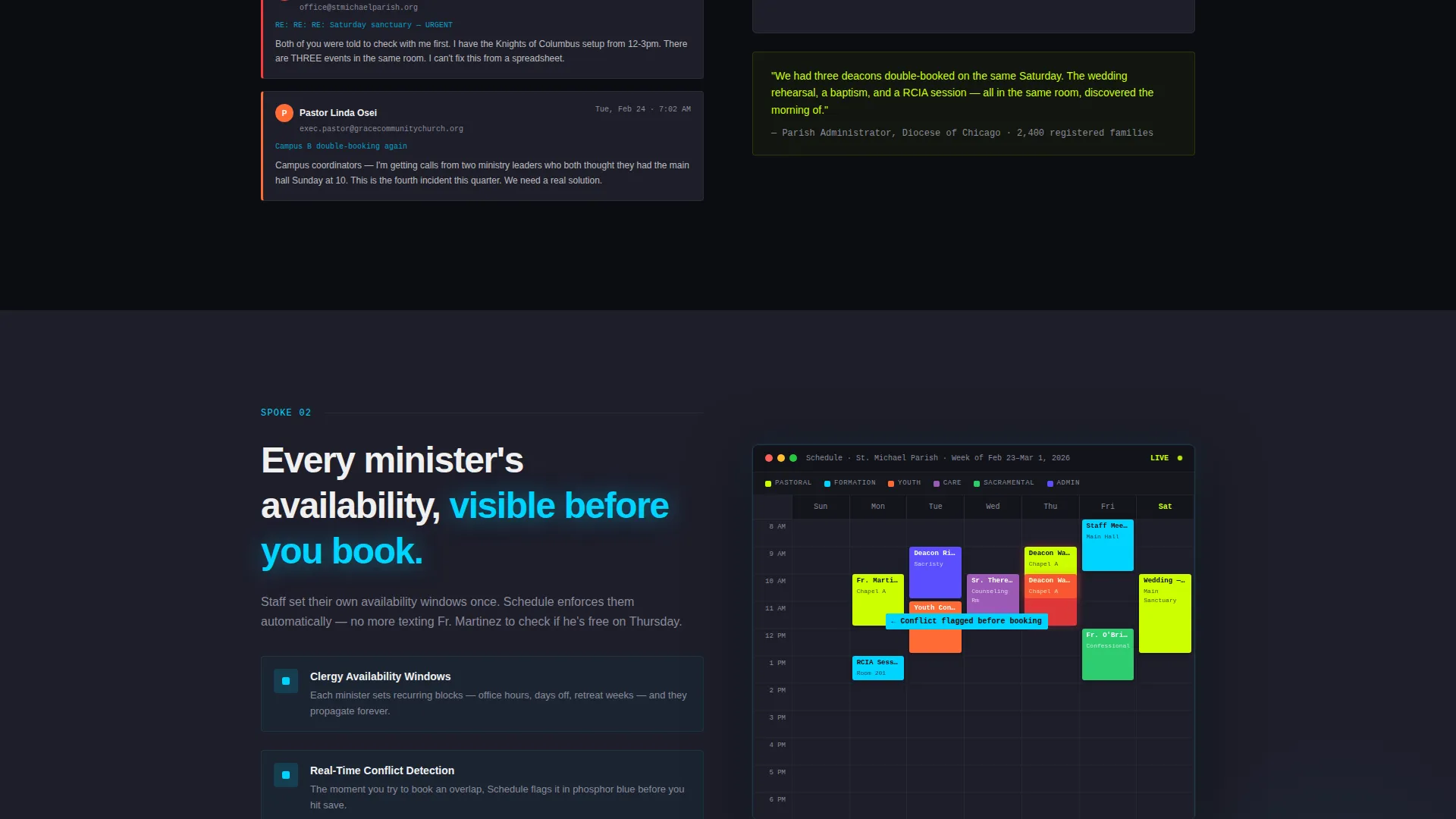
The page opens on a simulated chaotic email thread about a double-booked sanctuary, rendered as a realistic user interface artifact. Each spoke section then reveals a zoomed, annotated piece of the scheduling dashboard. The tension builds and releases in rhythm, so that by the final spoke, the visitor has seen the full dashboard and understood every part of it.
Stepped Lead Capture Form
The primary call to action, "See Your Church's Calendar," is placed in the header and repeated at the hub center after the final spoke. The form collects church name first, then congregation size via a slider set at three ranges (50 / 500 / 2,000+), then the administrator's email. This sequence builds identity commitment before asking for contact details.
Interactive Demo Secondary Path
A no-form-required self-guided demo gives visitors a second conversion route. It captures intent through usage behavior rather than a form fill. This path serves visitors who are not yet ready to share their details but are actively exploring the product.
Acid Digital Color System
The template uses a four-color palette built for contrast and urgency: void black (#0B0D10) as the base, electric chartreuse (#CCFF00) for calls to action and live-data accents, phosphor blue (#00D4FF) for navigation lines and calendar highlights, and liturgical ash (#1E1E2A) for card surfaces that separate content blocks.
Page sections overview
| Section | Purpose |
|---|---|
| Dashboard Screenshot Header | Opens with a real week of appointments and the core headline |
| Hub Navigation Bar | Anchors the five spoke sections for quick access |
| Problem Email Thread | Shows a simulated double-booked sanctuary thread as a user interface artifact |
| Shared Availability Spoke | Resolves the pain of no unified minister and room view |
| Sacramental Prep Spoke | Shows how automated prep sequences prevent follow-up failures |
| Room and Resource Spoke | Covers room booking and resource assignment in one view |
| Self-Scheduling Spoke | Lets congregation members book their own appointments |
| Full Dashboard Reveal | Reunites all annotated pieces into the complete calendar view |
| Primary call to action Hub Center | Repeats the "See Your Church's Calendar" form after the final spoke |
| Interactive Demo Path | Offers a no-form self-guided product exploration route |
Design & branding system
The visual identity follows a Data Command theme. The aesthetic is meant to feel like a mission control console: screens humming in a dark room, every element purposeful and charged. The color choices reinforce authority and precision without feeling cold or corporate.
- Void black (#0B0D10) grounds the layout, electric chartreuse (#CCFF00) fires on calls to action and live-data accents, phosphor blue (#00D4FF) traces navigation lines and calendar highlights, and liturgical ash (#1E1E2A) surfaces card blocks
- Typography uses a clean sans-serif with the headline set large and confident, chartreuse punctuation adding visual emphasis at key moments
- The 3D-tilted product screenshot in the header creates depth and draws the eye immediately to the dashboard content
Mobile & speed optimization
The layout is structured to adapt cleanly across screen sizes without losing the visual impact of the dashboard screenshot or the hub navigation flow. Ministry leaders checking the page on a phone between services should still feel the full weight of the design.
- The hub-and-spoke anchor navigation collapses gracefully so spoke sections remain reachable on smaller screens
- The congregation size slider and form fields are sized for comfortable touch interaction on mobile devices
How this template helps you convert
The entire page is engineered to make visitors feel the scheduling problem before they see the solution. By the time the call to action appears, the emotional case has already been made.
- The chaotic email thread in the first spoke creates immediate recognition for any administrator who has lived that experience, making the rest of the page feel personally relevant
- The stepped reveal of the dashboard across five spokes builds familiarity and trust, so the lead form feels like a natural next step rather than a cold ask
- The two-path conversion structure, a form for ready leads and a demo for browsers, captures intent at both ends of the buying journey
Other information about this template
This template is built specifically for the church and religious software category, targeting the appointment scheduling niche within ministry technology. It is designed as a single-page, section-led hub-and-spoke layout, making it a focused lead-generation asset rather than a multi-page product site.
- The template style is Hub and Spoke with Anchor Navigation, matching common SaaS product landing page conventions adapted for a religious software context
- The creative direction follows a Problem to Solution Arc, a proven structure for converting skeptical or overwhelmed buyers
- The header concept is a Product Screenshot, which grounds the page in a real product view rather than abstract marketing promises
- This template fits platforms looking to serve parish administrators, megachurch operations teams, and independent clergy who need a professional scheduling tool
Theme
Data Command
Creative direction
Problem→Solution Arc
Color system
Acid Digital
Style
Hub & Spoke (Anchor Nav)
Direction
Lead Generation
Page Sections
Full-width Dashboard Screenshot Header
Hub-and-spoke Anchor Navigation
Problem-to-solution Scroll Arc
Stepped Lead Capture Form
Interactive Demo Secondary Path
Acid Digital Color System
Related questions
Who is the primary audience for this landing page template?
What does the hub-and-spoke layout mean for page navigation?
Does the template include a lead capture form?
Can this template be adapted for different church sizes?
What makes the visual design different from a standard church website template?



