Daycare Booking & Scheduling Landing Page Template
Schedule is a modular card-grid landing page built for daycare booking and scheduling. It presents a premium dark-glass visual identity, interactive feature cards with micro-animations, and a clear app-download conversion flow. Parents, directors, and nannies each find the tools they need at a glance, from waitlist management to real-time attendance tracking.
by Rocket studio
Quick summary
Schedule is a single-page daycare booking and scheduling landing page. It uses a modular card-grid layout to present booking mechanics, parent-facing tools, and director features in three scannable rows. The dark iridescent visual theme and animated feature cards give the page a premium, app-like feel that builds confidence before the first download tap.
Who this template is for
This template speaks directly to every adult keeping a daycare schedule running. It serves people who need clarity fast and trust built quickly.
- Dual-income parents juggling rotating shifts who need to reserve spots, swap days, and track their child's daily timeline
- Daycare directors managing waitlists across multiple rooms and overseeing staff ratios and billing
- Nannies and caregivers confirming drop-off windows on the go from a mobile screen
What problem this template solves
Morning chaos at drop-off time is a real coordination problem. Parents, directors, and caregivers all need the same information at the same moment, and scattered tools make that harder than it should be.
- No single screen shows bookings, attendance, and parent notifications together in one clear view
- Directors lack a fast way to communicate waitlist status, room ratios, and billing to parents and staff
- Parents and caregivers cannot quickly confirm schedule changes or allergy flags without calling ahead
What you get with this template
You get a fully designed, conversion-focused landing page built around a feature card grid. Every section is laid out to move a visitor naturally from first impression to app download.
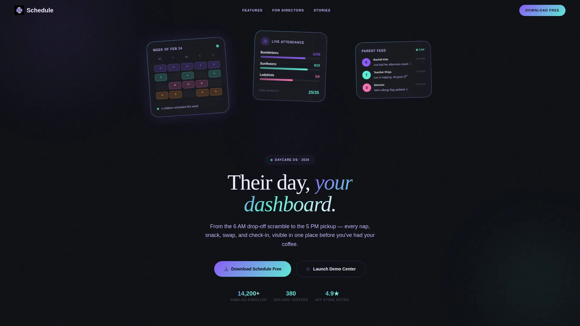
- A Dark Glass Panels header with three floating frosted-glass user interface cards showing a live calendar, attendance ticker, and notification thread
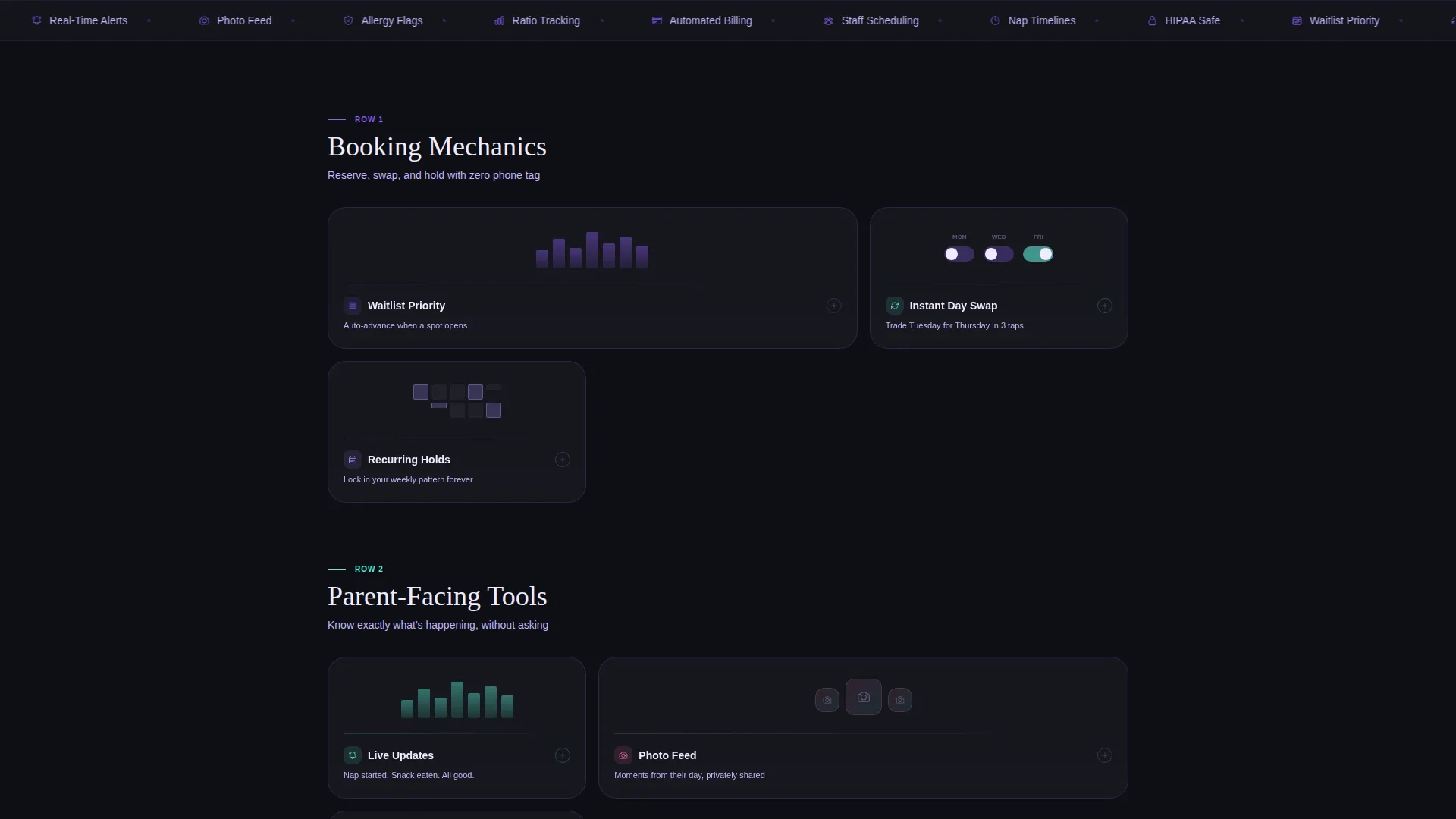
- A three-row Feature Matrix with animated modular cards covering booking tools, parent tools, and director tools
- A pinned mobile bottom bar with auto-detecting app store badges and a secondary director demo entry form
Feature list
This template packages every visual and interactive element a daycare scheduling app needs to earn a confident download.
Dark Glass Header with Live user interface Cards
Three frosted-glass cards float at subtle angles against a pure black field. Each card previews a different live feature: a color-coded weekly calendar, a real-time attendance ticker, and a timestamped parent notification thread.
Modular Feature Card Grid
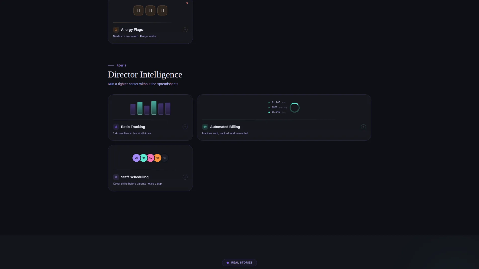
The feature section is organized into three rows of scannable cards. Row one covers booking mechanics. Row two presents parent-facing tools. Row three shows director-level features. Each row escalates in stakes, moving from convenience to safety to business intelligence.
Micro-Animated Card Interactions
Each feature card carries a small animation tied to its function. A calendar flips, a notification pulses, and a toggle switches. Visitors can tap or click to expand card details, making the app feel familiar before they ever download it.
Waitlist and Booking Mechanics
The booking row highlights waitlist priority, instant day swaps, and recurring holds. These are the core scheduling actions that parents and directors need most, presented as clear, visual card elements.
Parent-Facing Communication Tools
The parent row shows live updates, a photo feed, and allergy flag indicators. Each card is designed to communicate care and safety at a glance, building the emotional trust that drives a download decision.
Director Tools and Business Controls
The director row surfaces ratio tracking, billing visibility, and staff scheduling. These cards speak to center owners and administrators who need operational confidence before committing to a platform.
Page sections overview
| Section | Purpose |
|---|---|
| Dark Glass Header | Introduces the app with three live frosted-glass user interface preview cards and a headline |
| Headline Fade-In | Delivers the primary message "Their day, your dashboard" below the header |
| Booking Mechanics Row | Card grid showcasing waitlist priority, instant swap, and recurring hold features |
| Parent Tools Row | Card grid showing live updates, photo feed, and allergy flag capabilities |
| Director Tools Row | Card grid covering ratio tracking, billing, and staff scheduling features |
| App Download Bar | Pinned floating mobile bar with auto-detecting App Store and Google Play badges |
| Demo Center Form | Secondary conversion path for directors to enter center name and email |
Design & branding system
The visual identity is built on the Dashboard Pro theme using an AI Iridescent color palette. The result feels like a premium app screen at midnight, dark and luminous, with every interactive element confirming a quiet shimmer of response.
- Core colors: deep obsidian glass (#0D0F14), holographic violet (#8B5CF6), soft iridescent teal (#5EEAD4), and shifting pearl white (#F0EAFF) for card surfaces
- Interactive states use a violet-to-teal accent gradient across hover and tap transitions
- Card surfaces use a frosted-glass treatment with iridescent light refracting along edges, creating depth without heavy shadows
Mobile & speed optimization
The mobile experience is a first-class priority in this template. The layout is built so the most important actions are reachable with one thumb.
- The app-download call to action is pinned as a floating bottom bar on mobile, always visible as the visitor scrolls
- The auto-detecting badge logic surfaces the correct App Store or Google Play link based on the visitor's device
- The modular card grid stacks cleanly on smaller screens, keeping each feature readable without horizontal scrolling
How this template helps you convert
Every design and layout decision in this template is aimed at reducing hesitation and moving visitors toward the download.
- The interactive feature cards let visitors explore capabilities before committing, so the app already feels known and familiar by the time they reach the call to action
- The three-row feature escalation builds trust progressively, starting with everyday convenience and ending with director-level business controls, covering every visitor type in one scroll
- The dual conversion paths serve two different decision-makers at once: parents tap to download, while directors enter their details to launch a demo center with pre-loaded sample data
Other information about this template
This template is built for the daycare digital presence space within the broader technology category. It is designed to serve a niche where trust and clarity directly influence whether a family signs up or moves on.
- The template style is Card Grid (Modular), making it straightforward to scan and visually navigate on any screen size
- The creative direction follows a Feature Matrix structure, which organizes capabilities into logical rows that guide the visitor from simple to complex
- The header concept is Dark Glass Panels, a user interface-forward approach that uses the product interface as the visual hero instead of photography
- The landing page direction is App Download, with both primary and secondary conversion paths built into the layout
Theme
Dashboard Pro
Creative direction
Feature Matrix
Color system
AI Iridescent
Style
Card Grid (Modular)
Direction
App Download
Page Sections
Dark Glass Panel Header
Three-row Feature Card Matrix
Micro-animated Feature Cards
Pinned App Download Bar
Director Demo Entry Form
AI Iridescent Visual System
Related questions
Who is this landing page designed for?
Does this template include real booking or scheduling functionality?
Can daycare directors use this page to collect leads?
How does the mobile call to action work in this template?
Can I update the colors and branding in this template?



