Specialist Dental Software Appointment Booking Website Template
Schedule is a dental appointment scheduling landing page template built for software teams targeting dental practices. It combines a live-typed API code snippet header, a modular feature card grid organized by audience, and a dual conversion path: an app download call to action with App Store and Google Play badges, plus a practice management system integration form. The design runs on an Electric Indigo palette against deep navy.
by Rocket studio
Quick summary
Schedule is a single-page landing page template for a dental appointment scheduling platform. It opens with a syntax-highlighted API code snippet that animates live, then rolls into a modular feature card grid sorted by audience role. Two conversion paths close the page: an instant app download with paired store badges and a personalized integration walkthrough form for practice managers.
Who this template is for
This template is built for dental software teams, product marketers, and founders promoting an appointment scheduling platform to dental practices. It speaks directly to three distinct user types within the same page.
- Office managers overseeing multiple hygienists and chair assignments across a busy practice
- Associate dentists who need a fast read of tomorrow's block schedule between patients
- Patients, such as a parent rebooking a child's cleaning from a mobile device in a few taps
What problem this template solves
Dental practices lose time and revenue to phone tag, manual appointment books, and clunky recall workflows. This template positions a scheduling platform as the precise, engineered fix.
- Front desks struggle with sticky-note systems, last-minute cancellations, and no real-time chair visibility
- Patients face friction when trying to confirm, cancel, or rebook appointments without calling the office
- Software teams need a landing page that earns downloads by proving product value before the call to action appears
What you get with this template
You get a complete, ready-to-customize dental scheduling landing page template with a strong visual identity and purpose-built sections for every audience segment.
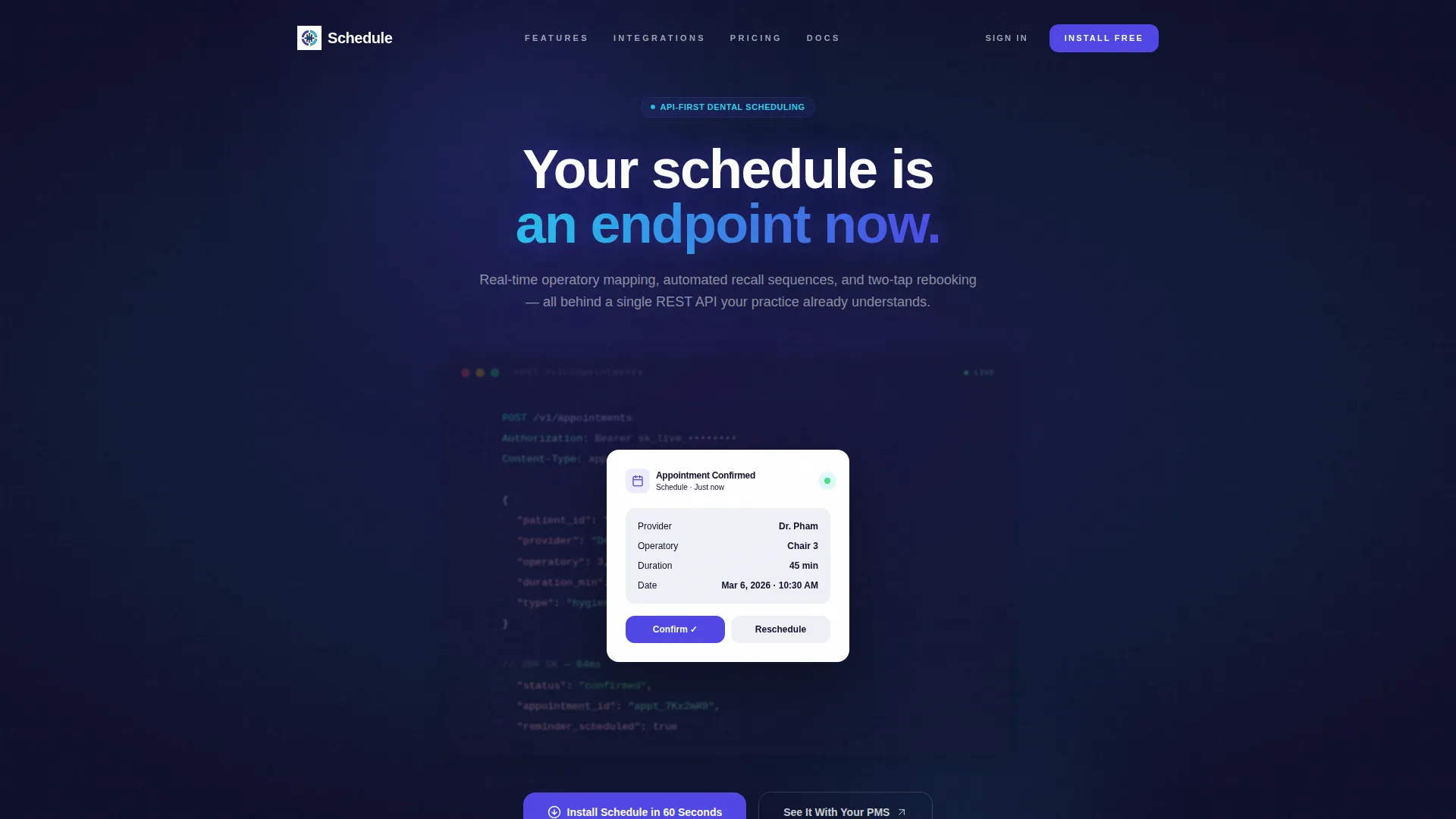
- A header featuring an animated, syntax-highlighted API code snippet showing a live POST /appointments call, followed by a card-style patient confirmation user interface that slides over it
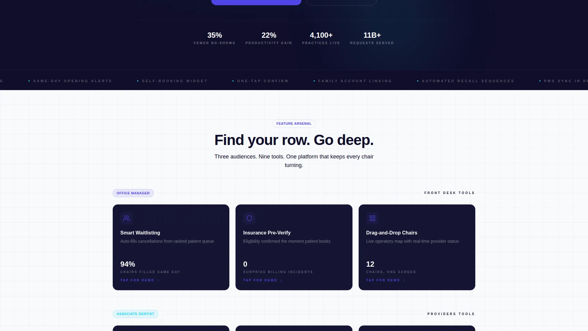
- A three-row feature card grid organized by role: front desk tools, provider tools, and patient-facing tools, with cards that flip or expand to show micro-demos and before/after metrics
- Two conversion paths: a primary app download section with App Store badge, Google Play badge, and an SMS download link field, plus a secondary form capturing practice management system and operatory count to trigger a personalized integration walkthrough
Feature list
This template showcases the platform's capabilities through focused, audience-specific feature sections. Each card is built to let the right visitor find their row and go deep.
Animated API Code Snippet Header
The header renders a syntax-highlighted POST /appointments API response in a monospaced font against a near-black background. It animates line by line as if being typed live, displaying confirmed booking data including provider name, operatory number, session duration, and status. A card-style patient confirmation user interface then slides over the snippet to bridge the technical and end-user views.
Audience-Segmented Feature Card Grid
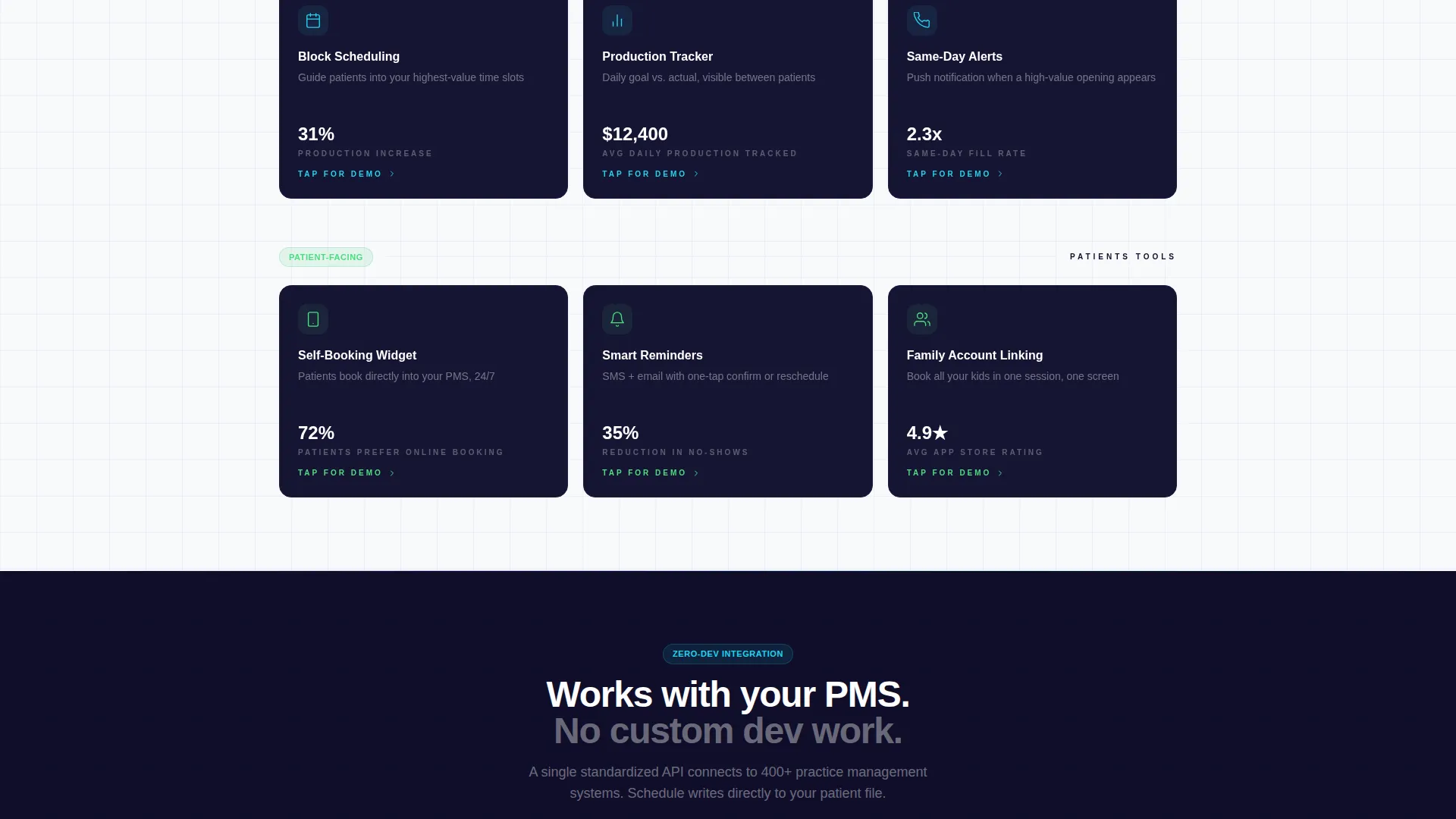
The core of the page is a three-row modular grid that separates features by audience. Front desk tools cover smart waitlisting, insurance pre-verification, and drag-and-drop chair assignment. Provider tools include block scheduling, production goal tracking, and same-day opening alerts. Patient-facing tools show the self-booking widget, appointment reminders with one-tap confirm, and family account linking.
Interactive Card Flip and Expand
Each feature card supports a flip or expand interaction that reveals a micro-demo and before/after performance metrics. Visitors can explore the depth of each feature without leaving the section, making the grid feel like a product tour rather than a feature checklist.
Dual Conversion Path call to action Section
The primary call to action is "Install Schedule in 60 Seconds," paired with App Store and Google Play badges and a field to text a download link to a mobile number. A secondary path, "See It With Your PMS," presents a short form asking for the practice management system and number of operatories, then triggers a personalized integration walkthrough.
Real-Time Operatory Mapping Cards
Feature cards in the front desk row communicate the concept of real-time operatory mapping, showing chair status at a glance. The visual treatment uses the reactive cyan highlight on active toggles and confirmation pulses to make live data feel immediate and trustworthy.
Automated Recall and Rebooking user experience
Patient-facing cards demonstrate automated recall sequences and two-tap rebooking directly from the patient's lock screen. The layout shows what the reminder and rebooking flow looks like in practice, building confidence in the product's ease of use before the download prompt.
Page sections overview
| Section | Purpose |
|---|---|
| Animated API Header | Opens with live-typed code snippet and sliding patient confirmation card |
| Headline Statement | Frames the platform value: "Your schedule is an endpoint now." |
| Front Desk Cards | Showcases waitlisting, insurance pre-verification, chair assignment tools |
| Provider Tools Row | Displays block scheduling, production tracking, and same-day alert cards |
| Patient Tools Row | Presents self-booking, reminder confirm, and family account linking cards |
| App Download call to action | Drives installs via App Store, Google Play badges, and SMS link field |
| Integration Form | Captures PMS and operatory count to trigger personalized walkthrough |
Design & branding system
The template uses a Startup Velocity theme with an Electric Indigo color system. Every visual decision is precise and high-contrast, designed to make dental scheduling data feel live and trustworthy.
- Primary action color is deep product indigo (#4F46E5), used for buttons, active states, and key user interface elements; card backgrounds and headers use near-black interface navy (#0F0E2A) for contrast
- Clinical white (#F8F9FC) covers the page canvas to maintain readability; reactive cyan (#22D3EE) fires on hover states, active toggles, and confirmation pulses to signal live interactivity
- Typography uses a monospaced font in the code snippet header to reinforce the developer-grade product identity, while the broader layout feels engineered and precise
Mobile & speed optimization
The template is structured as a card grid (modular) layout, which translates naturally to mobile screen sizes. The patient-facing conversion path is specifically designed for on-the-go use cases.
- The SMS download link field lets mobile visitors text themselves the app link instantly, removing friction for users arriving on a phone
- Modular card rows reflow cleanly at smaller breakpoints, so each audience segment remains readable without horizontal scrolling
- The app download section with paired store badges is placed after the feature grid, meaning visitors have already seen the product value before they hit the conversion prompt
How this template helps you convert
This template builds trust before asking for anything. The conversion flow is structured so visitors earn confidence at each scroll step before reaching the download or form.
- The animated code snippet opens with a credibility signal aimed at technical evaluators, while the sliding patient user interface card immediately bridges to the end-user experience, so both audiences feel seen within the first viewport.
- The feature card grid lets each visitor find their relevant row, go deep on that audience's tools, and see real before/after metrics, which replaces generic product claims with specific, interactive evidence.
- By the time a visitor reaches "Install Schedule in 60 Seconds," the dual call to action path offers a frictionless next step for any intent: download now, or learn how it fits your specific practice setup first.
Other information about this template
This template is part of a dental software category and sits within the dental appointment scheduling niche. It is built to serve teams launching or relaunching a scheduling platform to dental practices of varying sizes.
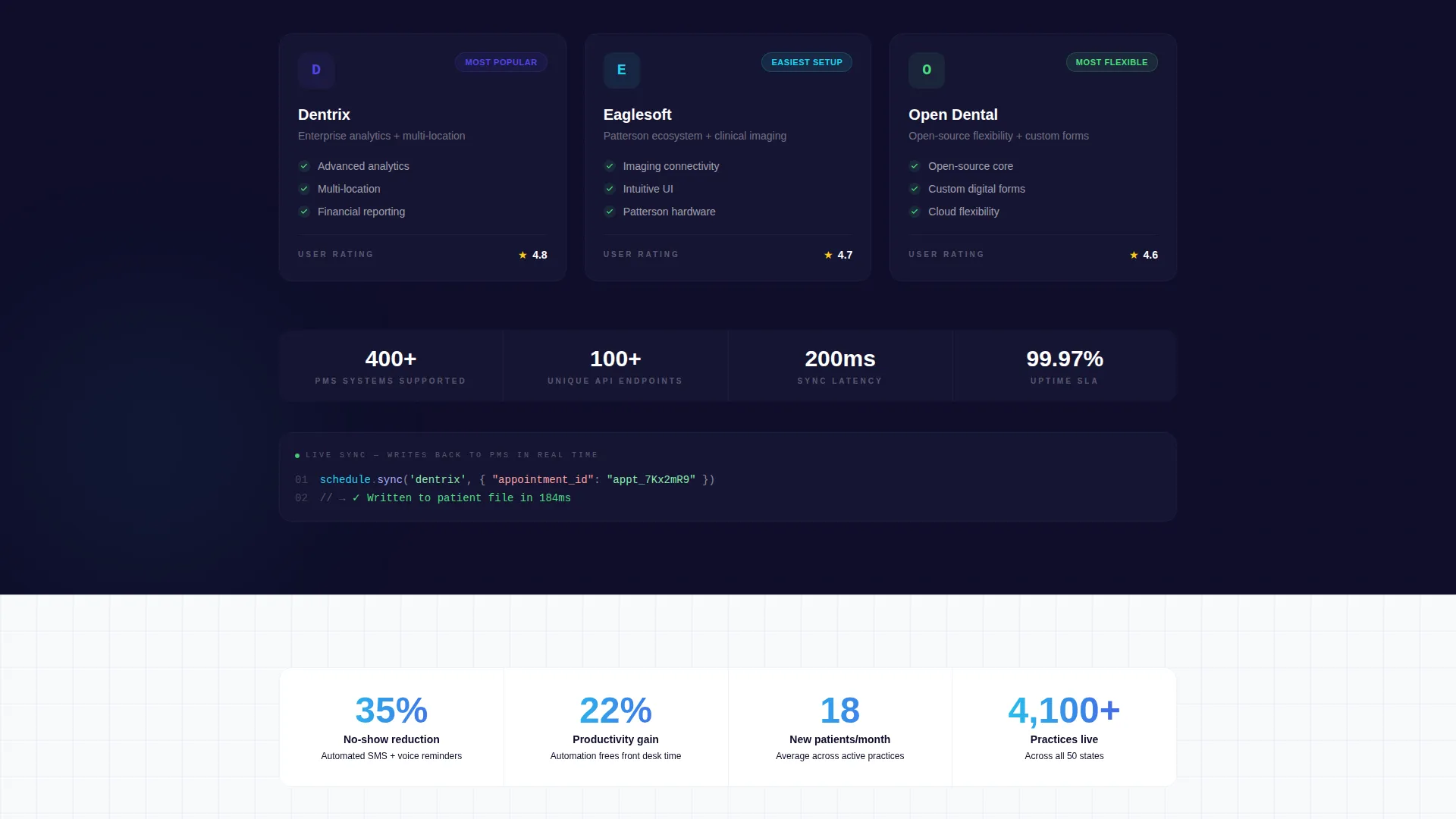
- The secondary conversion form references practice management system compatibility, including common systems used in dental offices such as Dentrix, Eaglesoft, and Open Dental, making it relevant to practices already running established software
- The template style is Card Grid (Modular), which means sections can be reordered, swapped, or extended without breaking the overall layout structure
- The header concept is Code Snippet, a design choice that immediately differentiates this landing page from generic dental software pages and signals a developer-grade, API-first product
- The creative direction is Feature Matrix, which means the page does not tell a linear story but instead presents a full arsenal of features organized by role, letting visitors self-select their path
Theme
Startup Velocity
Creative direction
Feature Matrix
Color system
Electric Indigo
Style
Card Grid (Modular)
Direction
App Download
Page Sections
Animated API Code Snippet Header
Audience-segmented Feature Card Grid
Interactive Card Flip and Expand
Dual Conversion Path Call to Action
Real-time Operatory Mapping Cards
Automated Recall and Rebooking User Experience Cards
Related questions
Who is this landing page template designed for?
What conversion paths does this template include?
What does the animated code snippet in the header do?
Can this template work for different dental practice sizes?
Is the feature card grid easy to customize?



