Schedule - Powerful Franchise Landing Page Template
Schedule is a split-screen landing page template built for franchise appointment scheduling platforms. It combines an interactive calendar preview, a revenue recovery calculator, and a freemium sign-up flow into one dark, iridescent dashboard design. Multi-unit franchisees running med-spas, oil-change shops, or tutoring centers can see exactly what the platform does before they commit.
by Rocket studio
Quick summary
Schedule is a single-page template designed for franchise appointment scheduling platforms. It opens with a live mini-calendar the visitor can actually use, then walks through a revenue calculator, pain-point sections, and a two-field sign-up form. The Dashboard Pro aesthetic uses deep graphite and violet-to-teal gradients to make every section feel like mission control.
Who this template is for
This template is built for founders, product teams, and marketers who are selling a multi-location appointment scheduling tool to franchise operators. It speaks directly to the person managing ten, twenty, or fifty locations from a single screen.
- Multi-unit franchisees running med-spas, oil-change shops, or tutoring centers
- Franchise software teams launching a freemium or free-trial acquisition funnel
- Growth marketers who need a high-converting, tool-first landing page fast
What problem this template solves
Empty appointment slots across dozens of locations cost franchise owners real money every single day. The problem is visibility: a regional manager cannot physically be in every location, so gaps go unfilled and revenue quietly disappears. This template addresses that pain directly and immediately.
- No clear way to see and fill idle slots across all locations at once
- No-show chaos, timezone mismatches, and staff double-bookings eroding daily revenue
- Prospective customers who need to feel the product before they will commit to signing up
What you get with this template
You get a fully designed, section-led landing page that leads with interaction and proof before it ever asks for a sign-up. Every section is purpose-built to move a franchise operator from skeptical visitor to provisioned trial user within sixty seconds of arriving.
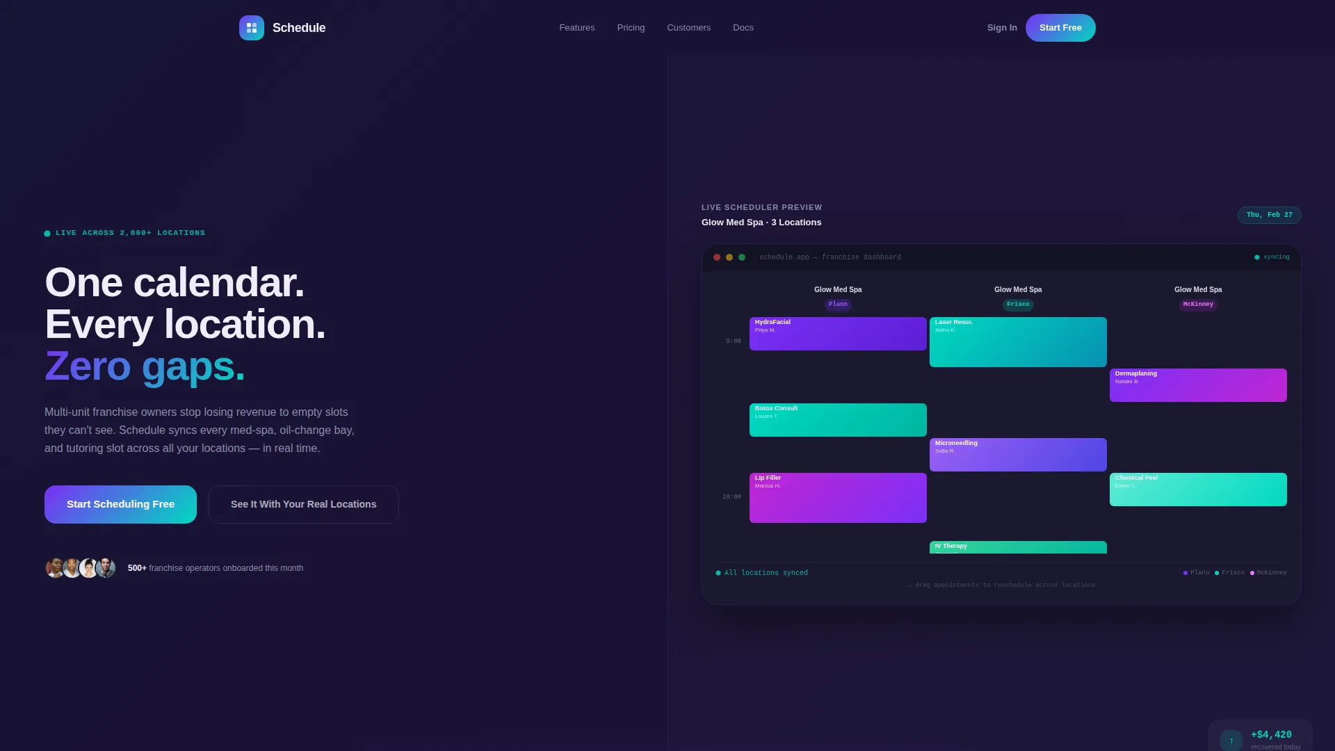
- An interactive split-screen header with a live, draggable mini-scheduler preloaded with three fictional franchise locations
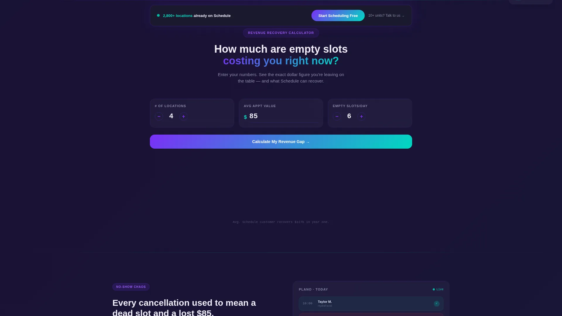
- A Revenue Recovery Calculator that renders a personalized dollar figure based on the visitor's own inputs
- A sticky call-to-action bar, a two-field sign-up form, and a secondary enterprise call to action for operators with ten or more units
Feature list
This template ships with six core components, each designed to demonstrate platform value before asking for commitment.
Interactive Split-Screen Header
The header divides the viewport into two equal halves. The left side carries the headline "One calendar. Every location. Zero gaps." over a deep graphite field. The right side renders a fully functional mini-scheduler with three preloaded fictional franchise locations. Visitors can drag appointment blocks and watch them sync across all three calendars in real time.
Revenue Recovery Calculator
Positioned immediately below the header, this tool asks for three inputs: number of locations, average appointment value, and estimated empty slots per day. It instantly calculates and displays the annual revenue left on the table in a glowing teal counter that ticks upward. The result creates a personalized, visceral reason to act.
Pain-Point Proof Sections
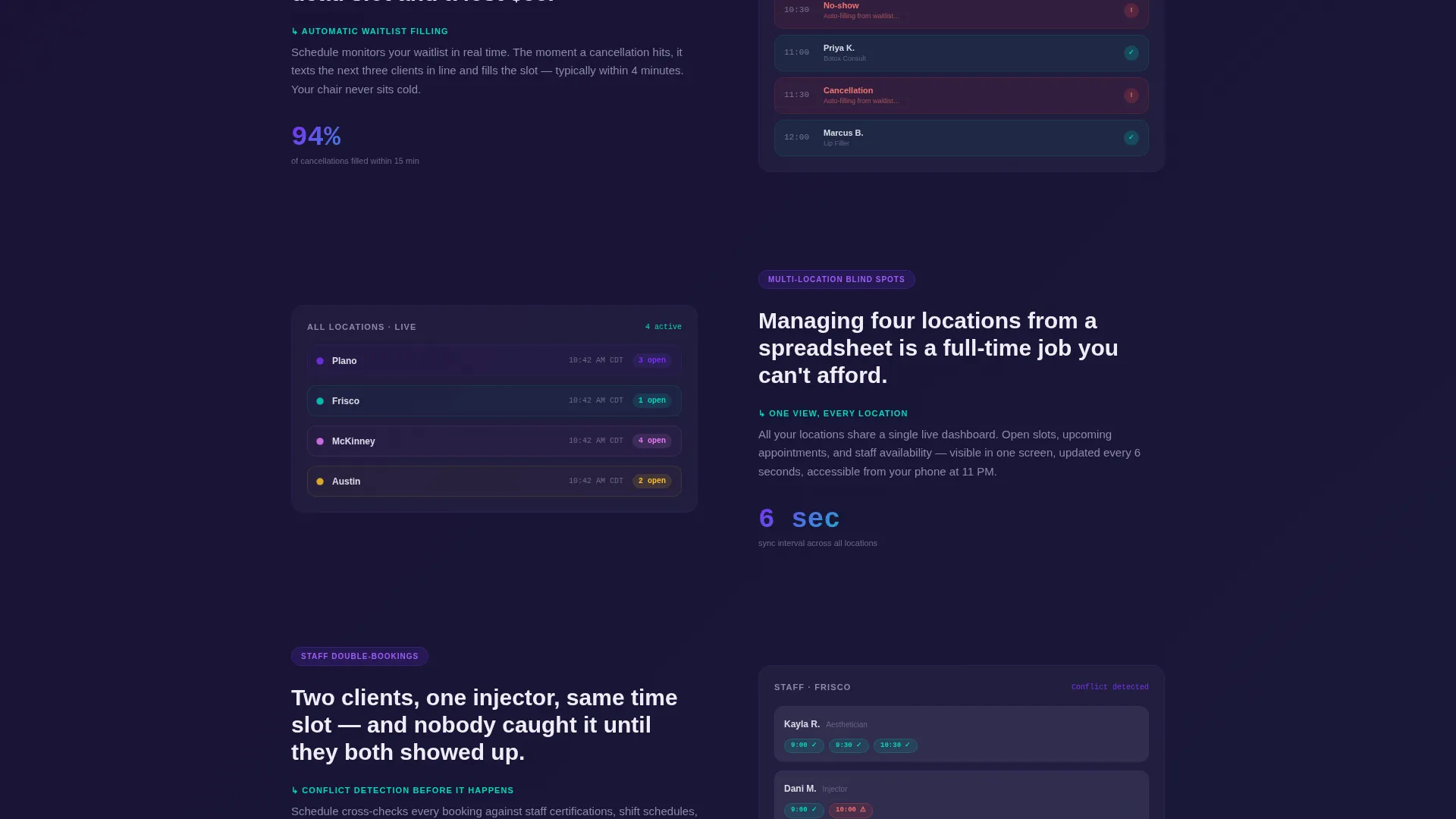
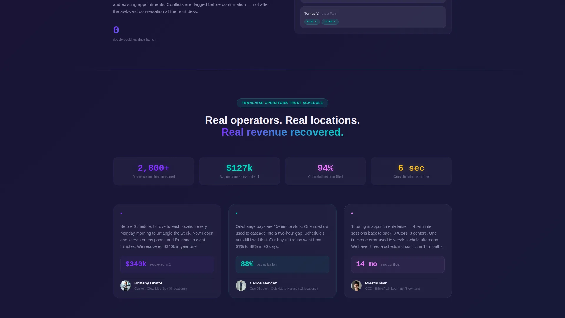
Each section below the calculator pairs a specific franchise problem on the left with an animated dashboard solution on the right. The problems addressed include no-show chaos, timezone mismatches across regions, and staff double-bookings. The tool remains visible and interactive throughout the scroll, building a continuous, evidence-based case.
Freemium Sign-Up Form
The sign-up form asks only for a work email and number of locations. On submission, it instantly provisions a sandbox account pre-filled with dummy data so the franchisee can experience the product within sixty seconds. Low friction and immediate value are built into the form by design.
Sticky Call-to-Action Bar
After the visitor scrolls past the header, a persistent "Start Scheduling Free" bar appears at the top of the viewport. The button uses the violet-to-teal gradient that runs throughout the design. It keeps the primary conversion path visible at every point in the page.
Enterprise Qualification call to action
A secondary call-to-action, "See It With Your Real Locations," targets operators managing ten or more units. It offers a guided onboarding call rather than a self-serve form, qualifying high-value enterprise leads without blocking access to the free tier.
Page sections overview
| Section | Purpose |
|---|---|
| Split-Screen Header | Introduce the platform with an interactive live scheduler |
| Revenue Recovery Calculator | Show each visitor their personal cost of empty slots |
| No-Show Chaos Section | Address appointment no-shows with an animated solution panel |
| Timezone Mismatch Section | Illustrate cross-region scheduling conflicts and the fix |
| Double-Booking Section | Demonstrate staff conflict resolution across locations |
| Freemium Sign-Up Form | Convert visitors with a two-field, low-friction form |
| Sticky call to action Bar | Keep the primary action visible throughout the scroll |
| Enterprise Onboarding call to action | Qualify and route high-volume franchise operators |
Design & branding system
The visual identity follows a Dashboard Pro theme with the AI Iridescent color system. The palette is designed to feel like a premium operations screen at late hours: dark enough to reduce fatigue, vivid enough to make every data point feel intelligent and alive.
- Core colors: deep graphite (#1A1A2E) for backgrounds, holographic violet (#7B2FF7) for primary accents, shimmer teal (#00D9C0) for data highlights and call to action buttons, and soft pearl white (#F0EDF6) for card surfaces
- Interactive elements use violet-to-teal gradients that pulse subtly, confirming user actions with a sense of quiet intelligence
- Iridescent gradient traces animate around dragged appointment blocks, giving each interaction visual confirmation and a premium feel
Mobile & speed optimization
The split-screen layout is structured to reflow cleanly on smaller viewports, keeping the interactive scheduler and calculator accessible without horizontal scrolling. The design prioritizes visual hierarchy so mobile visitors reach the calculator and sign-up form without confusion.
- The 50/50 split stacks vertically on mobile, placing the headline and scheduler in logical reading order
- The sticky call to action bar remains active on mobile, maintaining the conversion path on every screen size
- Form fields are minimal by design: two inputs keep tap targets clean and submission fast on any device
How this template helps you convert
Every design and copy decision in this template is aimed at reducing the distance between "first visit" and "active trial user."
- The interactive header lets visitors use the scheduler before reading a single marketing claim, building trust through direct experience rather than promises.
- The Revenue Recovery Calculator makes the cost of inaction personal and immediate, giving each visitor a specific dollar figure tied to their own business rather than a generic statistic.
- The two-field sign-up form and instant sandbox provisioning remove every barrier between intention and activation, so the franchisee feels the product in under sixty seconds.
Other information about this template
This template is part of a broader set of franchise software landing page designs built around the Dashboard Pro theme and the AI Iridescent color system. It is well suited for teams building in the franchise appointment scheduling space who want a tool-first page that leads with proof.
- The template is categorized under Technology and Franchise Software, making it relevant for SaaS platforms targeting multi-unit operators
- The creative direction is Calculator/Tool First, meaning the interactive components do the selling before any static copy does
- The header concept is Interactive Preview, which means the very first thing a visitor experiences is a working product demonstration, not a hero image
- The landing page direction is Freemium/Trial, optimized for low-friction sign-ups that convert curious visitors into active users
Theme
Dashboard Pro
Creative direction
Calculator/Tool First
Color system
AI Iridescent
Style
Split Screen (50/50)
Direction
Freemium/Trial
Page Sections
Interactive Split-screen Calendar Header
Revenue Recovery Calculator
Pain-point Proof Section Pairs
Two-field Freemium Sign-up Form
Sticky Gradient Call to Action Bar
Enterprise Lead Qualification Call to Action
Related questions
Who is this landing page template designed for?
Can visitors actually interact with the calendar in the header?
What does the Revenue Recovery Calculator do?
What does the sign-up flow ask for?
Is there a separate path for larger franchise operators?



