Government Software Appointment Booking Website Template
Schedule is a government appointment scheduling landing page template built for public agencies ready to replace paper sign-up sheets and hold music with intelligent queue routing. It targets county IT directors, city managers, and state agency heads. The hub and spoke layout, iridescent AI color system, and feature matrix structure make a compelling case for modernizing citizen wait times.
by Rocket studio
Quick summary
Schedule is a single-page government appointment scheduling template built on a hub and spoke anchor navigation structure. It uses a feature matrix creative direction to dismantle every legacy alternative, from paper queues to phone hold systems. The result is a focused, conversion-ready landing page designed to move procurement decision-makers from skeptical to sold.
Who this template is for
This template speaks directly to the people responsible for modernizing public-sector service delivery. It is built for leaders who face real operational pressure, not just theoretical inefficiencies.
- County IT directors managing outdated ticketing systems who need a credible case for procurement
- City managers and state agency heads fielding complaints about citizen wait times at DMV, permit, court, and health offices
- Procurement teams building internal justification decks for a government scheduling platform upgrade
What problem this template solves
Government offices lose public trust one long wait at a time. The problem is not just inconvenience. It escalates to compliance risk and visible budget waste, and most existing tools do nothing to make that argument visible to decision-makers.
- Legacy ticketing systems, paper sign-up sheets, and phone queues have no side-by-side comparison that shows their true cost
- Procurement teams lack a ready-made visual tool that frames the status quo as indefensible
- Agencies need a page that filters serious government leads while converting them efficiently
What you get with this template
You get a fully structured, conversion-focused landing page ready to represent a government appointment scheduling platform. Every section is purpose-built to move a cautious public-sector buyer through the decision journey.
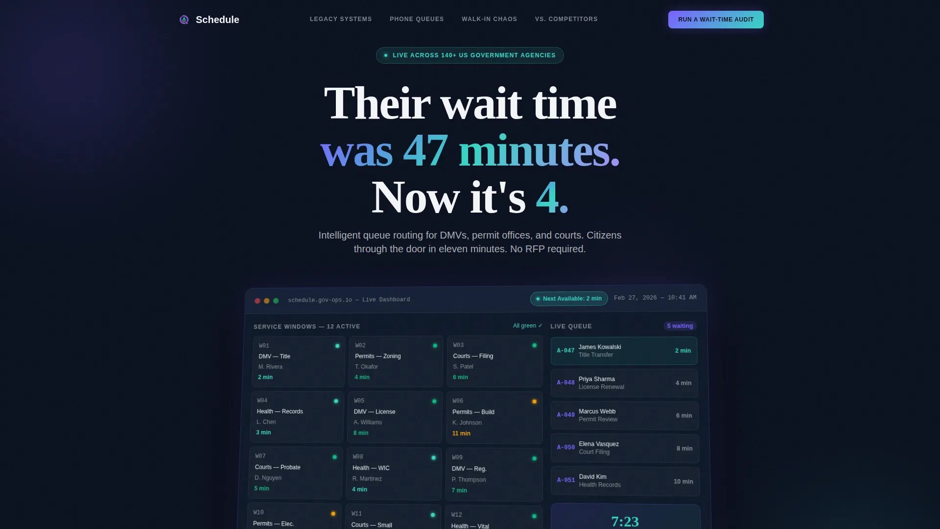
- A hero section with a scaled product screenshot dashboard, live metric counters, and a headline designed to stop the scroll
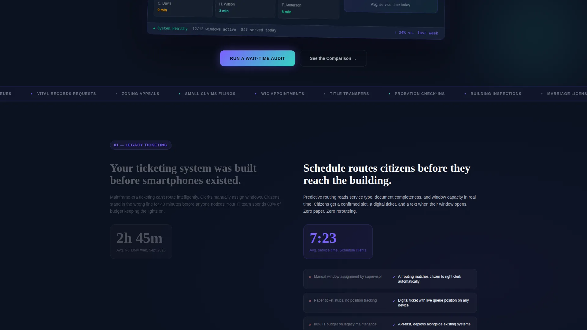
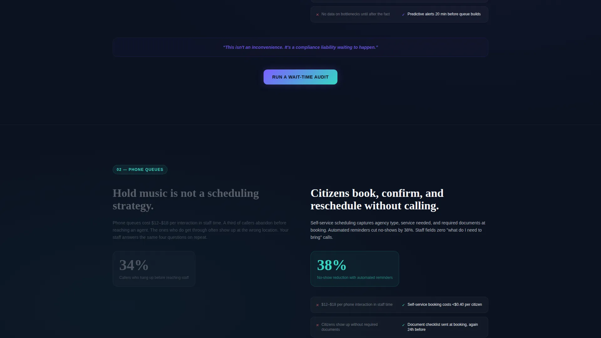
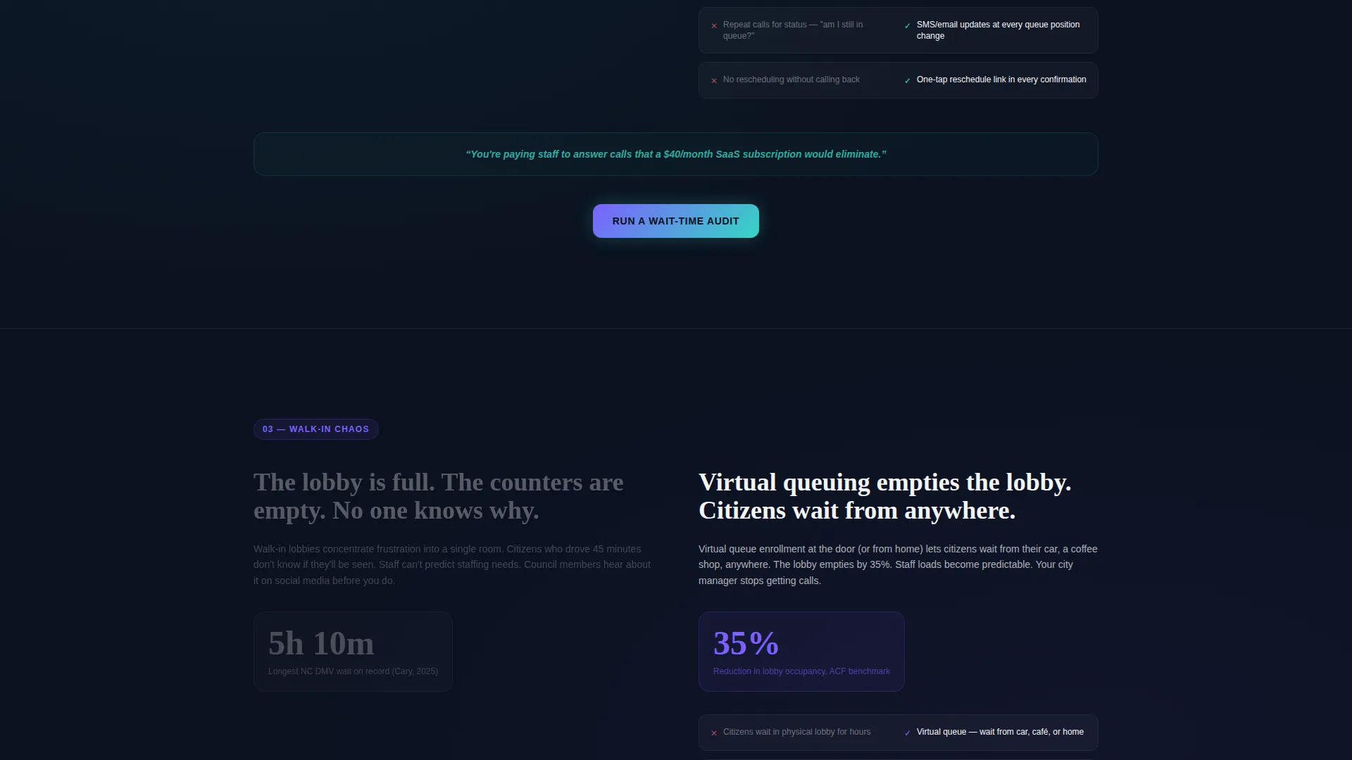
- Four anchor-navigated spoke sections comparing legacy ticketing, phone queues, walk-in chaos, and competitor platforms against Schedule
- A two-path conversion system with a primary "Run a Wait-Time Audit" call to action and a gated PDF download for procurement teams
Feature list
This template comes with a precise set of built-in components, each chosen to serve the government buyer conversion flow.
Hero Dashboard Screenshot at Scale
The header presents a pixel-perfect product screenshot blown up to hero scale. It shows a real-time appointment dashboard with twelve service windows, color-coded wait times dropping from red to green, a draining citizen queue, and a "Next Available: 2 min" badge pulsing in iridescent teal. The screenshot sits on a slight three-dimensional tilt against the deep civic navy background.
Anchor Navigation Hub and Spoke Layout
A sticky anchor navigation bar pins to the top as visitors scroll. Each spoke represents a direct comparison axis: Legacy Ticketing versus. Schedule, Phone Queues versus. Schedule, Walk-In Chaos versus. Schedule, and Competitor Platform versus. Schedule. This structure lets procurement readers jump directly to the comparison most relevant to their current pain point.
Animated Feature Matrix Sections
Each spoke section opens with the pain state displayed on the left in muted gray, then animates the Schedule solution into frame on the right with live metric counters. The scroll progression escalates deliberately from inconvenience to compliance risk to budget waste, making every alternative feel increasingly costly.
Dual Conversion Path System
The primary call to action, "Run a Wait-Time Audit," appears after each spoke section and locks into a floating bar on final scroll. The audit form collects agency type via dropdown, current average wait time via a slider from 5 to 120 minutes, and a dot-gov email address. A secondary path offers a gated full comparison matrix PDF download for procurement teams.
AI Iridescent Visual Identity
The color system uses deep civic navy as the primary background, holographic violet on interactive states and data highlights, iridescent teal for success metrics and confirmation states, and clean bureaucratic white for card surfaces and text fields. The palette communicates institutional credibility while signaling genuine modernization.
Page sections overview
| Section | Purpose |
|---|---|
| Hero Dashboard Header | Anchor the visitor with a dramatic before-and-after wait-time headline and scaled product screenshot |
| Anchor Navigation Bar | Let procurement readers jump directly to the comparison spoke most relevant to their agency type |
| Legacy Ticketing Spoke | Compare paper-based and legacy queue systems against Schedule using animated metric counters |
| Phone Queues Spoke | Show the cost and citizen frustration of hold-music queue systems versus intelligent routing |
| Walk-In Chaos Spoke | Illustrate the compliance and operational risk of unmanaged walk-in traffic against Schedule |
| Competitor Platform Spoke | Position Schedule directly against existing scheduling tools with a side-by-side comparison |
| Wait-Time Audit Form | Capture qualified government leads with agency type, wait-time slider, and dot-gov email field |
| Gated PDF Download | Offer procurement teams a full comparison matrix to support internal justification decks |
| Floating Conversion Bar | Lock the primary call to action in view as visitors reach the bottom of the page |
Design & branding system
The visual identity is built around the AI Iridescent color system layered over a Startup Velocity theme. The result feels like a government lobby after a genuine renovation, luminous and purposeful rather than sterile.
- Core palette: deep civic navy (#0B1120) for backgrounds, holographic violet (#7B61FF) for interactive states, iridescent teal (#36D6C3) for success and confirmation moments, and bureaucratic white (#F4F5F7) for card surfaces and form fields
- The three-dimensional tilted screenshot hero, pulsing teal badge, and animated metric counters work together to create a sense of real-time momentum without overstating the platform's technical detail
Mobile & speed optimization
The template is structured to remain functional and readable across device sizes. The hub and spoke navigation and conversion forms are designed to translate cleanly from desktop to smaller screens.
- The sticky anchor navigation bar and floating conversion bar are built to work within the vertical scroll behavior typical on mobile browsers
- The slider-based wait-time input and dropdown agency selector are form elements suited to touch interaction on mobile devices
How this template helps you convert
The page is engineered as a Comparison/Versus conversion experience. Every design and copy decision pushes a cautious public-sector buyer closer to taking action.
- The animated feature matrix systematically removes every excuse for inaction, escalating from minor inconvenience through compliance risk to measurable budget waste, so the status quo feels indefensible by the time the reader reaches the call to action
- The dual conversion path serves two distinct buyer roles: the operational decision-maker gets the wait-time audit form, while the procurement specialist gets the gated comparison matrix PDF, so neither buyer type hits a dead end
- The dot-gov email requirement on the audit form filters out non-government traffic, improving lead quality and signaling to genuine agency buyers that this platform was built specifically for their context
Other information about this template
This template is part of the Technology category with a Government Software subcategory focus. It is purpose-matched to the government appointment scheduling niche and carries an intersection match score of 13, indicating strong alignment across all five intersection context fields.
- The template style is Hub and Spoke with Anchor Navigation, the creative direction is Feature Matrix, the header concept is Product Screenshot, and the conversion direction is Comparison/Versus
- The Startup Velocity theme and AI Iridescent color system are matched intersection fields, meaning every visual and structural decision reinforces the same positioning signal
- This template is ready to support agencies across DMV, permit offices, courts, and public health services, any context where citizen wait times are a visible operational and political liability
Theme
Startup Velocity
Creative direction
Feature Matrix
Color system
AI Iridescent
Style
Hub & Spoke (Anchor Nav)
Direction
Comparison/Versus
Page Sections
Hero Dashboard Screenshot at Scale
Hub and Spoke Anchor Navigation
Animated Feature Matrix Sections
Dual Conversion Path System
AI Iridescent Color System
Related questions
Who is the primary audience for this landing page template?
What does the 'Run a Wait-Time Audit' form collect?
Can this template represent platforms serving multiple agency types?
What is the gated PDF download designed for?
Does this template include a live scheduling dashboard or functional system?



