AI for Nonprofit Booking Website Template
Schedule is a modular card-grid landing page template built for nonprofit AI scheduling assistants. It leads with a Feature Tab Switcher header, a Stats-First Impact card grid, and a click-through flow that sends visitors to a guided demo. The Data Command visual theme delivers mission-control clarity using a Monochrome Steel palette, oversized proof metrics, and a single primary call to action.
by Rocket studio
Quick summary
Schedule is a single-page, card-grid landing page template designed for nonprofit AI scheduling tools. It combines a Feature Tab Switcher header, a Stats-First Impact metric grid, and a click-through call to action. The Data Command theme and Monochrome Steel color system create a dense, readable interface that front-loads evidence and earns the demo click before visitors reach the bottom.
Who this template is for
This template is built for teams launching or marketing an AI scheduling assistant aimed at the nonprofit sector. The layout speaks directly to the people managing scheduling chaos at under-resourced organizations.
- Executive directors running multiple programs with minimal staff
- Volunteer coordinators managing hundreds of sign-ups across several locations
- Development officers who lose hours to rescheduling donor meetings
What problem this template solves
Nonprofit scheduling tools are often hard to pitch because the pain is invisible until someone experiences it. This template makes that pain visible immediately and then shows the resolution in real time.
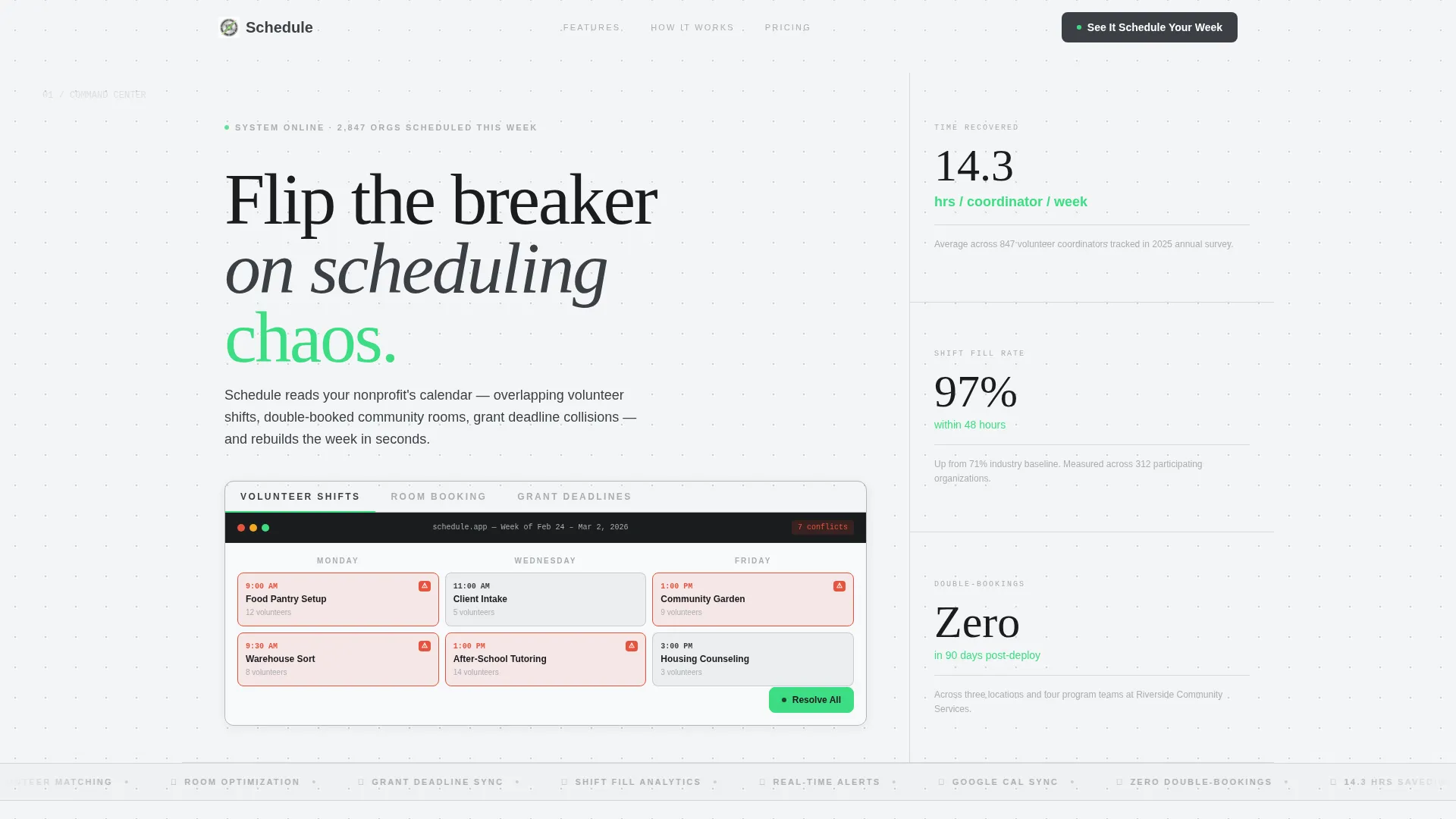
- Visitors arrive and see a live conflict-resolution animation before reading a single word of body copy
- Oversized stats hit before explanations, so skeptical visitors absorb proof before they absorb pitch
- The page removes friction by skipping forms entirely and routing visitors straight to an interactive demo
What you get with this template
You get a fully structured, single-page landing page layout ready to represent a nonprofit AI scheduling product. Every section is purposeful and sequenced to build trust through evidence.
- A Feature Tab Switcher header with three labeled tabs and an animated user interface preview
- A modular card grid grouped into efficiency metrics, reliability metrics, and testimonial cards
- Two call-to-action placements and a secondary decision link for visitors deeper in the funnel
Feature list
This template includes six core design and content features, each grounded in the source brief.
Animated Feature Tab Switcher
The header contains three tabs labeled "Volunteer Shifts," "Room Booking," and "Grant Deadlines." Each tab swaps a contained user interface preview showing a tangled calendar resolving into clean, color-coded blocks. The transition completes in under two seconds, making the product's core value immediately observable.
Stats-First Metric Card Grid
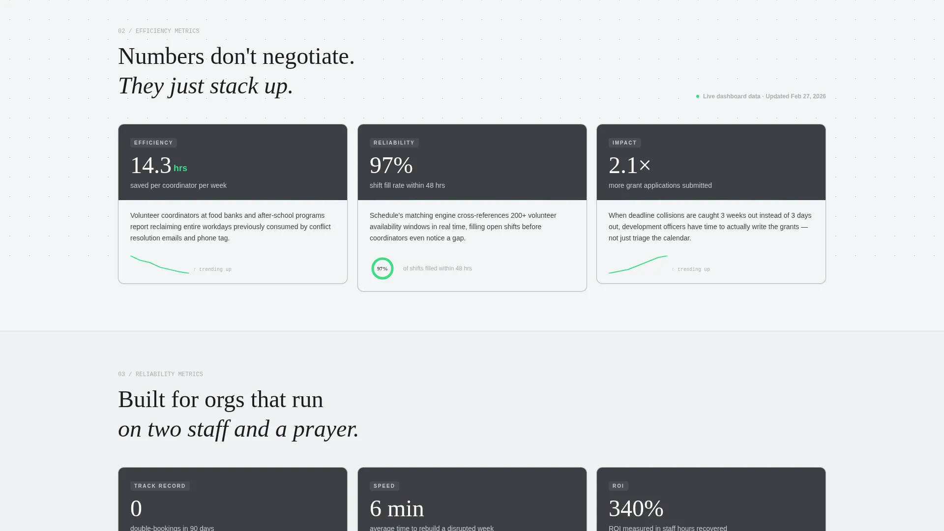
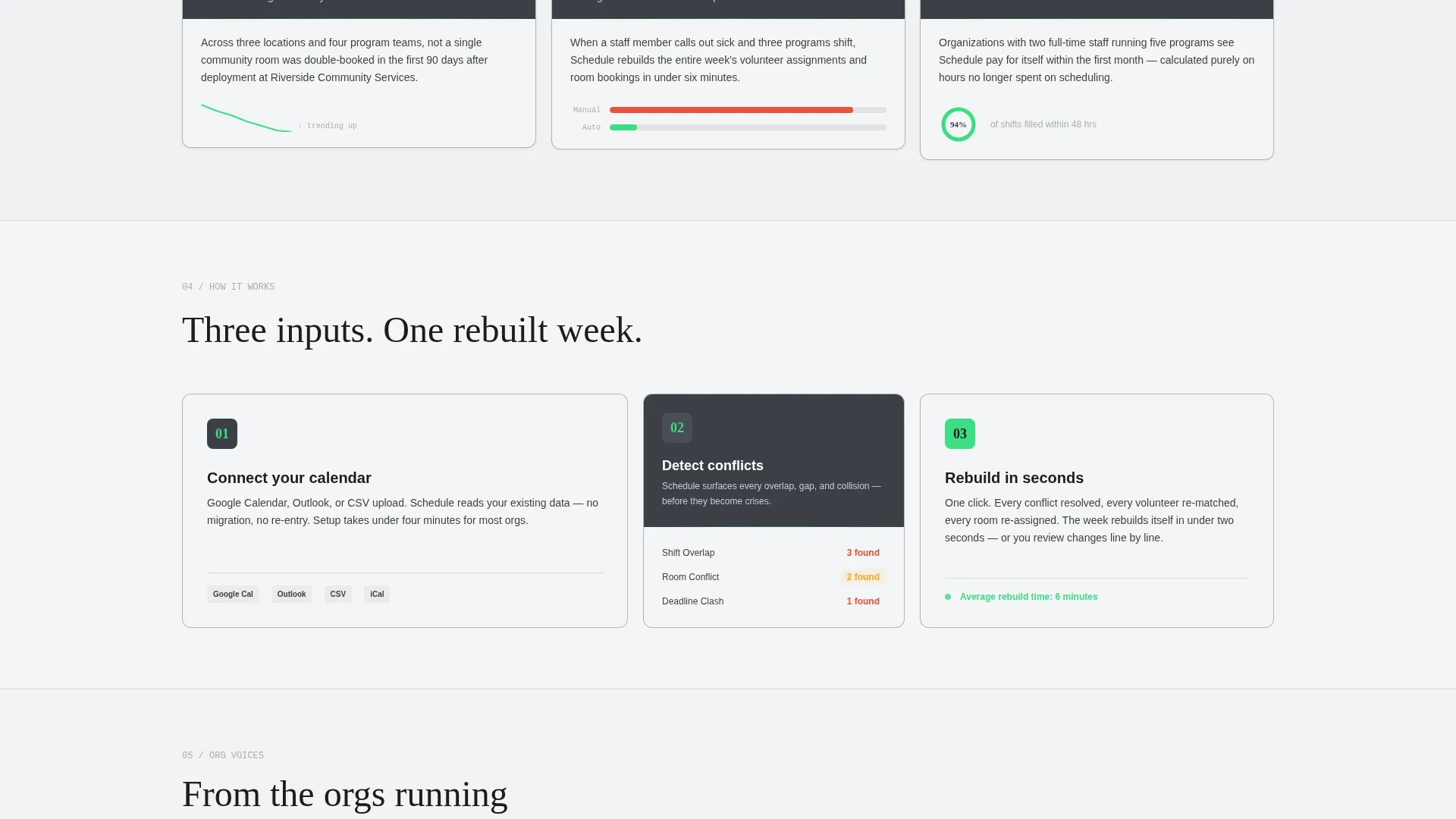
Every card in the modular grid opens with a single oversized metric in white against a gunmetal card header. A one-sentence explanation follows, then a micro-visualization such as a spark line, a before/after bar, or a completing donut chart. Cards are grouped in threes: efficiency metrics, reliability metrics, and then testimonial cards from real nonprofit organization types.
Authentic user interface Preview Design
The tab preview is styled to look like an actual product screen rather than a generic mockup. It includes timestamps, real nonprofit program names, and authentic-looking volunteer counts. This detail builds immediate credibility with visitors who are evaluating whether the tool fits their operational context.
Dual Call-to-Action Placement
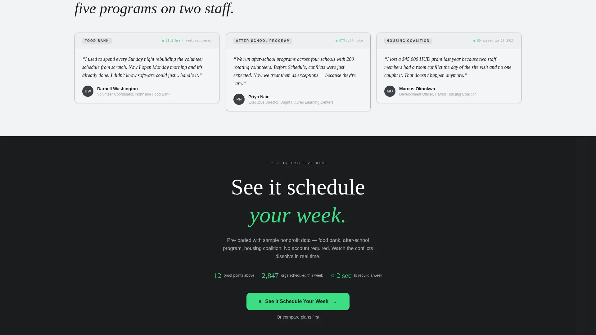
The primary call to action, "See It Schedule Your Week," appears twice. The first placement floats at the bottom of the header after the tab interaction. The second appears as a full-width bar after the final card row.
Secondary Decision Link
A text link reading "Or compare plans first" sits beneath each primary call-to-action placement. This serves visitors who are further along in the decision process and need more detail before committing to the demo.
Testimonial Card Row
The final card group features voice-driven cards attributed to recognizable nonprofit organization types, including a food bank, an after-school program, and a housing coalition. These cards create a rhythm of third-party validation after two rows of quantitative proof.
Page sections overview
| Section | Purpose |
|---|---|
| Feature Tab Switcher | Shows conflict-to-clarity animation across three scheduling scenarios |
| Floating call to action Bar | Captures clicks immediately after the header tab interaction |
| Efficiency Metrics Row | Displays oversized stats on time saved per coordinator |
| Reliability Metrics Row | Shows shift fill rates and double-booking elimination data |
| Testimonial Card Row | Adds voice from food bank, after-school, and housing coalition orgs |
| Full-Width call to action Bar | Final conversion prompt with secondary decision link below |
Design & branding system
The template uses a Data Command theme built on a Monochrome Steel color system. The palette is intentionally cold and information-dense, evoking a mission control console rather than a warm marketing page.
- Base colors are gunmetal (#3B3F45) for card headers, brushed aluminum (#A8ADB3) for secondary labels, and cold-white (#F4F5F6) for panel backgrounds
- Primary figures and oversized metrics use pure white (#FFFFFF) against dark card headers for maximum contrast
- Signal green (#3DDC84) appears exclusively for active states, toggle indicators, and positive-delta markers, never as decoration
Mobile & speed optimization
The modular card grid is designed to reflow naturally across screen sizes. The layout prioritizes clarity at every breakpoint without sacrificing the density that makes the desktop experience compelling.
- Cards are structured in a three-column grid on wider screens and stack cleanly on smaller viewports
- The tab switcher and animated preview are contained components that adapt to narrower widths without breaking the interaction flow
How this template helps you convert
The page is engineered as a click-through funnel. Every design and content decision reduces hesitation and builds the case for the demo before the call to action appears.
- The animated header resolves a recognizable scheduling conflict in real time, creating an immediate "that's my problem" moment for nonprofit visitors
- Twelve discrete proof points in the card grid stack evidence progressively, so by the time the primary call to action appears, the visitor has already formed a strong impression of the product's value
Other information about this template
This template is part of the Technology category under the AI for Nonprofit subcategory. It is built specifically for the nonprofit AI scheduling assistant niche and carries a high intersection match score for that context.
- The template style is Card Grid (Modular), making individual metric and testimonial cards easy to update with real product data
- The landing page direction is Click-Through, meaning no form is present and all conversion energy is directed toward the demo link
- The header concept is a Feature Tab Switcher, a layout pattern well suited to tools that solve multiple related problems under one product umbrella
Theme
Data Command
Creative direction
Stats-First Impact
Color system
Monochrome Steel
Style
Card Grid (Modular)
Direction
Click-Through
Page Sections
Animated Feature Tab Switcher Header
Stats-first Modular Card Grid
Authentic-looking User Interface Previews
Dual Call-to-action Placement
Testimonial Card Row
Monochrome Steel Color System
Related questions
Who is the ideal user for this template?
Does this template include a sign-up form?
Can I update the metric cards with my own numbers?
What makes the header different from a standard hero section?
Is this template suitable for a product still in early development?



