Schedule - Powerful Scheduling Landing Page Template
Schedule is a single-page comparison table landing page template built for e-commerce staff scheduling platforms. It leads with three high-impact stat cards, flows into a feature comparison table, and drives visitors toward an app download. The Tech Glass visual identity uses glassmorphic depth, a live dashboard hero, and a crisp mint-and-periwinkle palette to make the product feel immediate and trustworthy.
by Rocket studio
Quick summary
Schedule is a glassmorphic landing page template designed for e-commerce staff scheduling platforms. It opens with three oversized impact stats, transitions into a head-to-head comparison table, and closes with a focused app download call to action. The design centers the product interface as the hero, making the platform's value visible before a single word is read.
Who this template is for
This template is built for SaaS and software teams who sell scheduling tools to retail and fulfillment operations. It speaks directly to buyers who manage shift coverage at scale and need to see proof fast.
- Shopify warehouse leads managing holiday surge staffing
- Direct-to-consumer fulfillment managers spending hours each week building rosters
- Multi-location retail operations directors who need a single view across dozens of stores
What problem this template solves
Scheduling platform buyers arrive skeptical. They have lived through spreadsheet chaos and legacy workforce management tools that never quite delivered. This template disarms that skepticism with numbers first, a transparent comparison table second, and a frictionless download path third.
- The stat-first layout removes the need to read paragraphs before trusting the product
- The comparison table makes alternatives look exhausting without a single aggressive claim
- The three-step onboarding animation closes the gap between "interested" and "downloaded"
What you get with this template
You get a complete, single-page landing page layout structured to move a visitor from arrival to app download in one scroll. Every section is purposeful and pre-built for the e-commerce staff scheduling niche.
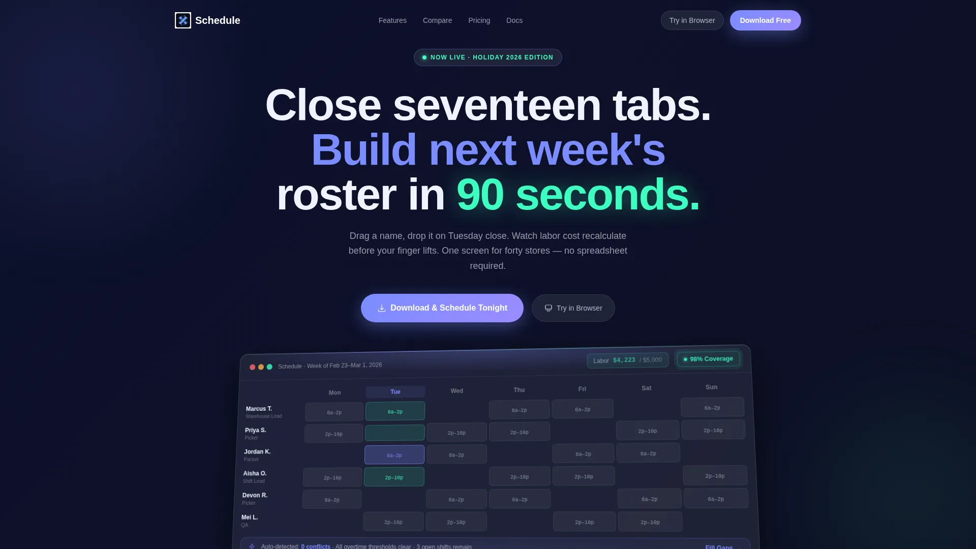
- A live dashboard hero section with a tilted glass-panel product preview showing real scheduling data
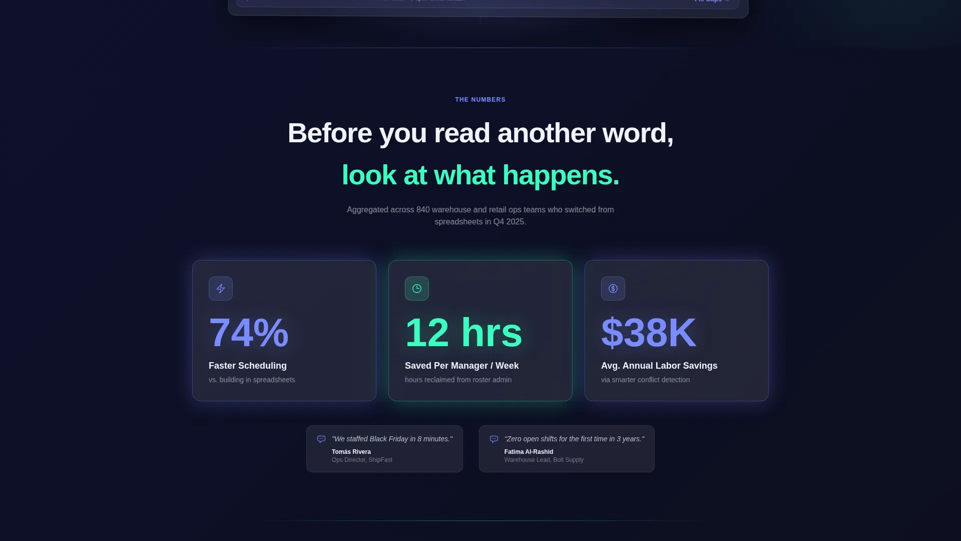
- A Stats-First Impact block with three frosted glass stat cards (74% faster scheduling, 12 hours per week saved per manager, $38K average annual labor savings)
- A head-to-head comparison table, a three-step download animation, and dual call-to-action buttons for App Store and Google Play
Feature list
This template ships with a focused set of sections and components drawn directly from the brief. Each one serves a specific conversion role.
Stats-First Impact Block
Three massive stat cards appear before any paragraph text loads. Each card sharpens into focus on scroll, showing figures like "74% faster scheduling" and "12 hrs/week saved per manager" inside frosted glass containers. The visual weight of real numbers builds trust instantly.
Head-to-Head Comparison Table
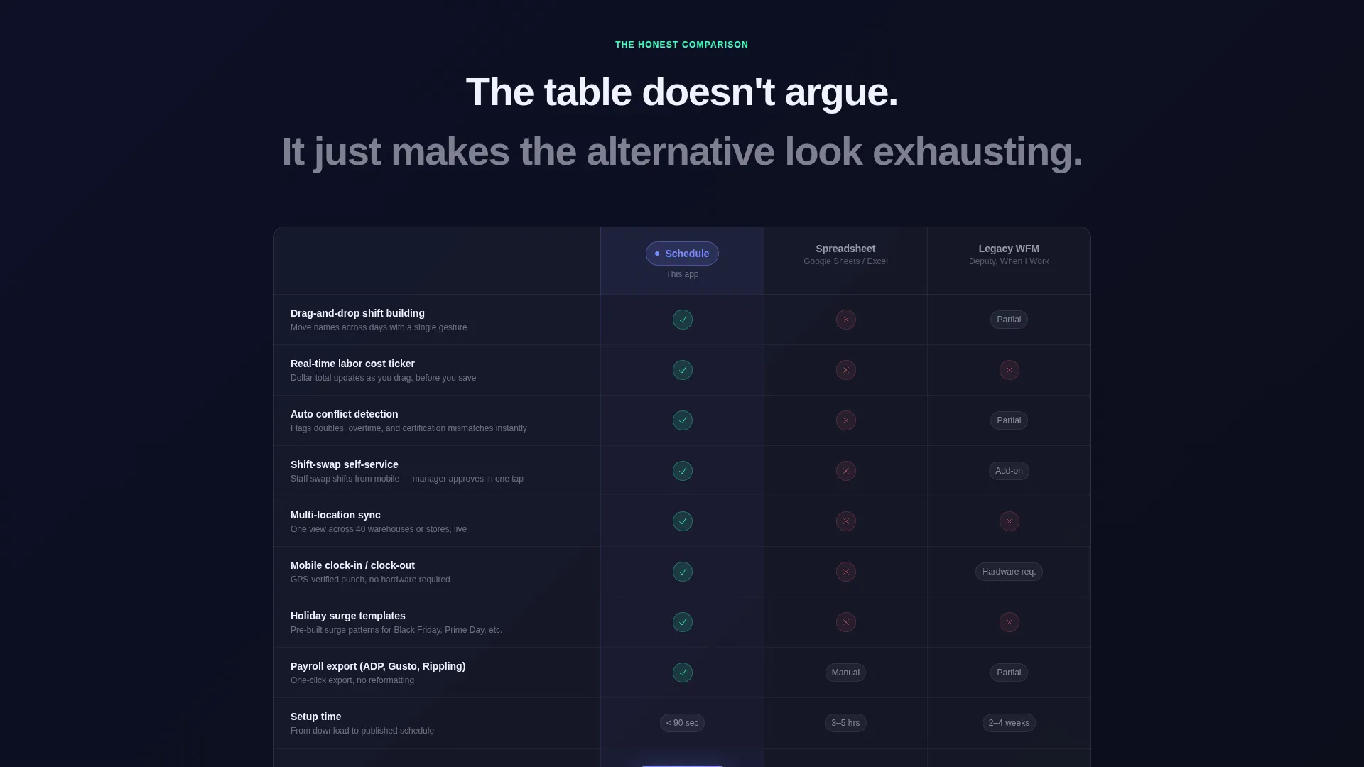
A structured table compares the platform against spreadsheets and legacy workforce management tools. Rows cover auto-conflict detection, real-time labor costing, shift-swap self-service, multi-location sync, and mobile clock-in. Checkmarks glow in soft mint; gaps appear in muted red at reduced opacity, letting the data speak without editorializing.
Live Dashboard Hero Section
The header renders a pixel-accurate product interface mid-use. A labor-cost ticker reads $4,212 of a $5,000 budget. A green badge pulses "98% Coverage" on the week view. The dashboard panel is angled toward the viewer with a soft light bloom on the upper edge, creating depth through perspective rather than illustration.
App Download Call-to-Action
The primary call-to-action button reads "Download and Schedule Tonight." It sits alongside App Store and Google Play badges styled in frosted glass to match the overall theme. A secondary "Try in Browser" option gives desktop visitors an alternative path without distracting from the primary goal.
Three-Step Onboarding Animation
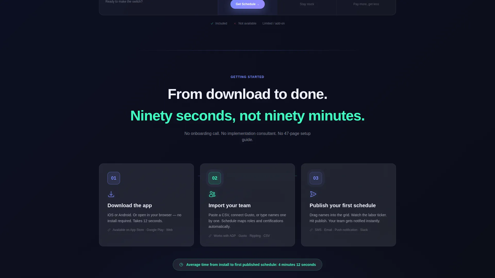
A short animated sequence walks the visitor through three steps: download, import your team, publish your first schedule. The animation is designed to make the distance between arriving on the page and having a live schedule feel like ninety seconds. It handles the final objection before the download tap.
Glassmorphic Card System
Every data surface, stat card, and table cell uses a consistent frosted panel system built on deep void black with layered transparency. Electric periwinkle highlights active states and data points. Soft mint signals positive outcomes. The result is a visual language that feels like a product, not a marketing brochure.
Page sections overview
| Section | Purpose |
|---|---|
| Dashboard Hero | Show the product working live |
| Stats Impact Block | Lead with proof before copy |
| Comparison Table | Dismantle competitor alternatives |
| App Download call to action | Drive the primary conversion action |
| Three-Step Animation | Remove the final download hesitation |
Design & branding system
The template uses a Tech Glass theme built on a glassmorphic color system. Every surface, card, and panel earns its depth through transparency and light rather than heavy shadows.
- Base layer in deep void black (#0B0D17), frosted card surfaces in white at 8% opacity, electric periwinkle (#7B8CFF) for active states and data highlights, and soft mint (#3DFFC0) for positive metric badges
- The dashboard hero uses a physically tilted glass-panel perspective with a soft light bloom on the upper edge, avoiding stock photography entirely in favor of the product interface itself
- Muted red (#FF6B6B at 40% opacity) marks gaps in the comparison table, creating a visual contrast that is readable without being aggressive
Mobile & speed optimization
The layout is built as a single-page flow, which keeps the structure lean and scroll-friendly on any screen size. The glassmorphic card system is designed to render cleanly without heavy asset dependencies.
- Frosted glass cards and stat blocks are sized for thumb-friendly tap targets on mobile viewports
- The app download section surfaces App Store and Google Play badges prominently at a natural resting point in the mobile scroll
- The dashboard hero is rendered as a stylized interface preview rather than a video or heavy image, keeping the visual impact high without unnecessary load weight
How this template helps you convert
Every layout decision in this template is made to reduce the time between landing and downloading. The sequence is deliberate and tested against real scheduling buyer psychology.
- The stat cards arrive before any paragraph, so skeptical visitors see hard numbers within the first viewport and keep scrolling instead of bouncing.
- The comparison table removes objections passively. Visitors compare the platform to their current tools on their own terms, without being pushed by sales language.
- The three-step animation and dual download buttons close the session at full momentum, making the install feel like the obvious next step rather than a commitment.
Other information about this template
This template is part of the Technology category under the E-Commerce Software and SaaS subcategory. It is purpose-built for the e-commerce staff scheduling niche and designed to support app-first go-to-market strategies.
- The comparison table rows are pre-structured around five differentiating capabilities, making it straightforward to adapt for different scheduling platform feature sets
- The template style is Comparison Table, and the creative direction is Stats-First Impact, meaning layout priorities are fixed around data credibility rather than storytelling
- The header concept is Dashboard Preview, which means the hero section is designed to showcase a real product interface rather than a lifestyle or abstract visual
Theme
Tech Glass
Creative direction
Stats-First Impact
Color system
Glassmorphic
Style
Comparison Table
Direction
App Download
Page Sections
Stats-first Impact Block
Head-to-head Comparison Table
Live Dashboard Hero Section
App Download Call-to-action
Three-step Onboarding Animation
Glassmorphic Card System
Related questions
Who is this landing page template designed for?
Can I adapt the comparison table for my platform's specific features?
What does the secondary Try in Browser call to action do?
Is the three-step onboarding animation included in the template?
What visual theme does this template use?



