Advanced Software & SaaS Appointment Booking Website Template
Schedule - Precision Appointment is a modular card grid landing page built for scheduling and appointment software. It uses a dark Data Command visual theme to present booking features with clarity and confidence. The page is structured as a click-through landing page, driving visitors toward a free trial signup through a layered feature matrix and two clear calls to action.
by Rocket studio
Quick summary
This is a single-page, click-through landing page template for scheduling and appointment software. It leads with three frosted Dark Glass Panels in the header, then unfolds a staggered card grid that presents features in four grouped clusters. Every element is built to earn the trial click before the visitor reaches the bottom of the page.
Who this template is for
This template speaks directly to people who manage time-sensitive operations and lose real revenue when bookings go wrong. It is designed for product teams and founders marketing scheduling or appointment software to hands-on business operators.
- Operations managers dealing with double-bookings and fragmented team calendars
- Clinic front-desk staff who track provider availability manually
- Salon and service business owners losing revenue to no-shows and gaps in their schedule
What problem this template solves
Scheduling software is often hard to sell because the pain it solves lives in small daily frustrations rather than one dramatic failure. A landing page needs to surface those frustrations fast and then show the fix with equal speed.
- Visitors arrive skeptical and leave before a feature list convinces them
- Shared calendar workarounds make the software's value hard to communicate
- No-show losses and double-booking chaos are real but invisible until a page makes them tangible
What you get with this template
You get a fully structured, single-page click-through layout ready to present scheduling and appointment software with visual precision. The design is dark and data-forward, built to feel authoritative rather than generic.
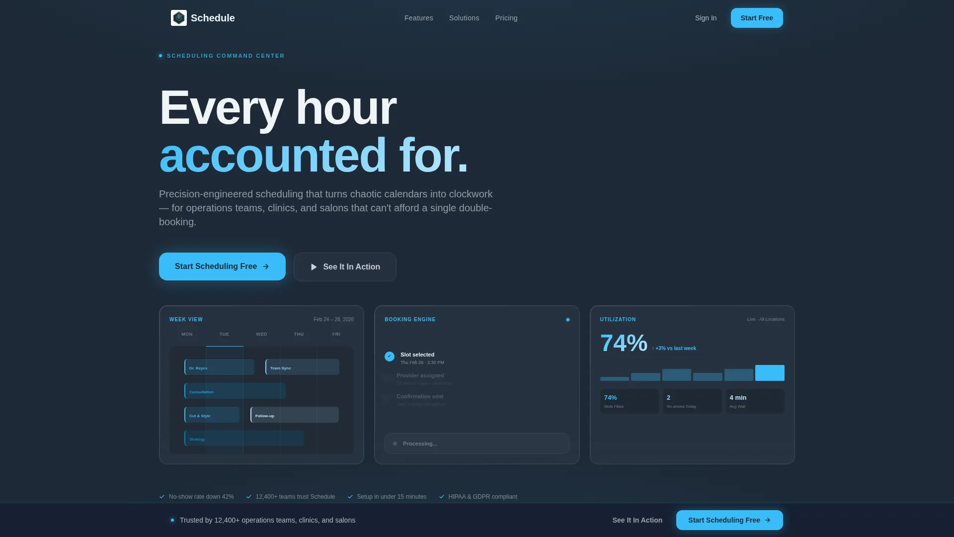
- A three-panel animated header with live-data vignettes showing a calendar grid, a booking confirmation, and a utilization percentage
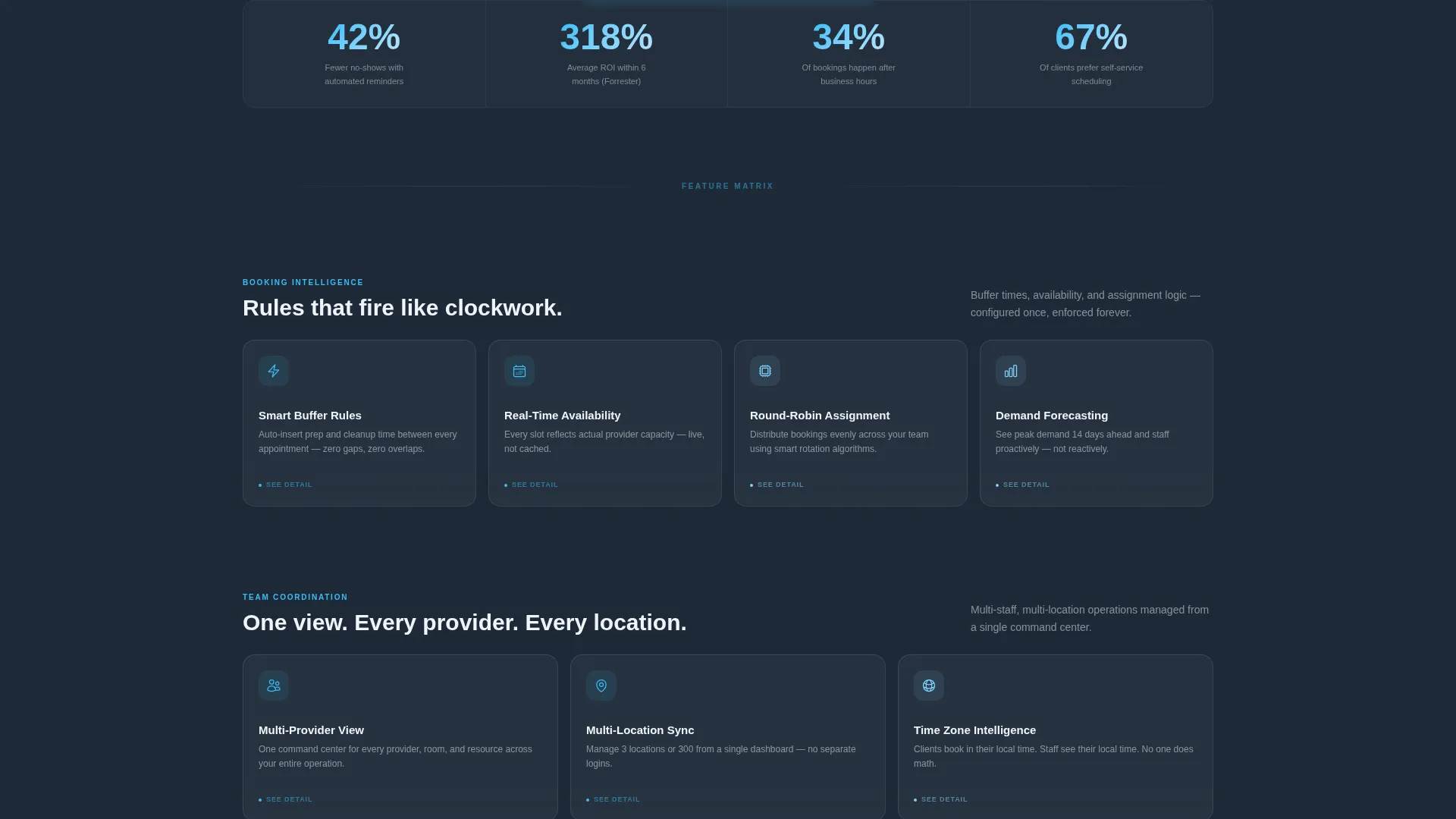
- A modular Feature Matrix card grid organized into four clusters: Booking Intelligence, Team Coordination, Client Experience, and Integrations
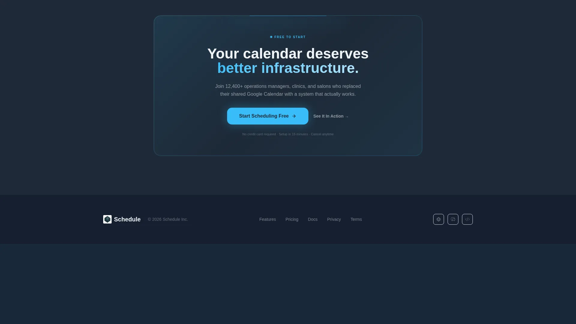
- Two call-to-action touchpoints: a primary button below the header and a persistent bottom bar after the second card cluster
Feature list
This template delivers a set of tightly coordinated design and layout capabilities drawn directly from its brief.
Animated Dark Glass Header Panels
Three frosted, semi-transparent cards float over the deep slate background. Each panel displays a different live-data vignette: a shifting weekly calendar grid, a booking confirmation with a micro-animation, and a utilization percentage ticking upward. A faint directional edge-light gives each panel a smoked glass quality.
Staggered Card Grid Reveal
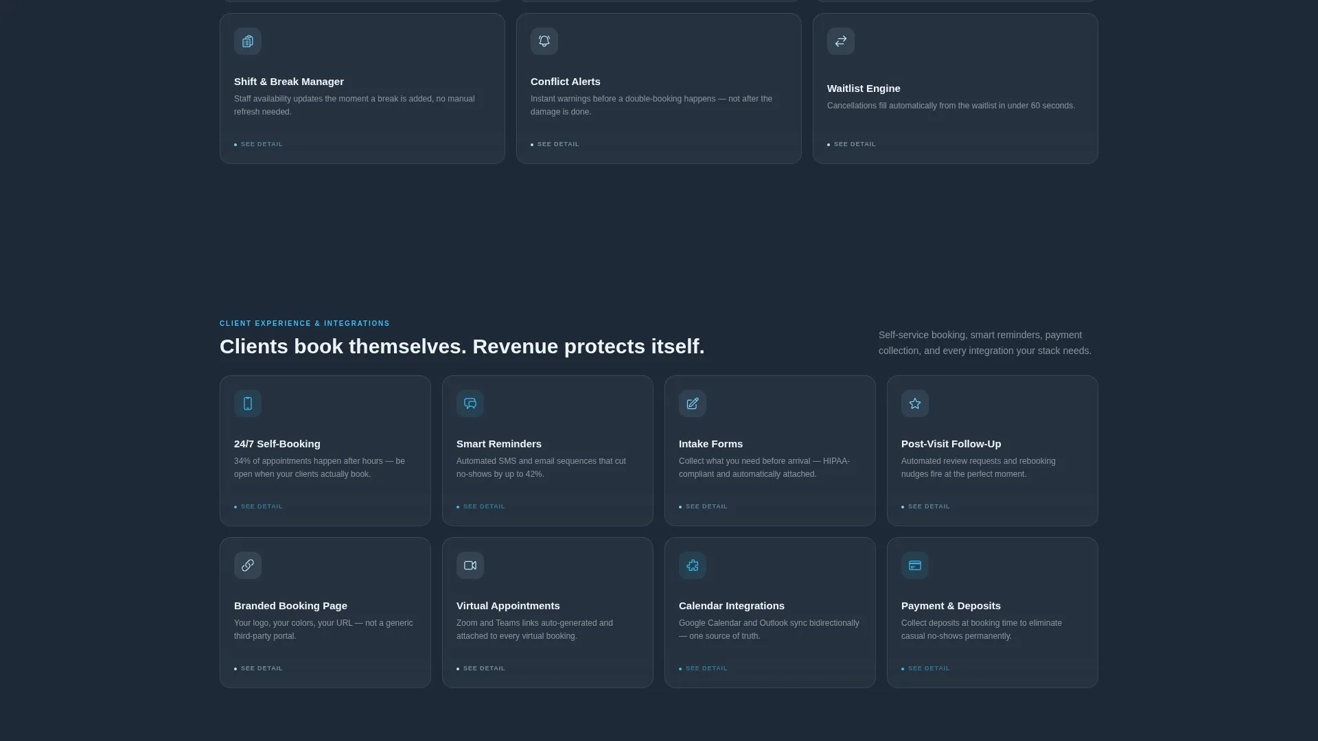
The Feature Matrix loads in clusters as the visitor scrolls. The first cluster contains four cards, the second six, and the third eight. This expanding rhythm creates a sense of growing system depth and keeps the visitor moving through the page.
Flip-on-Hover Card Interaction
Every feature card in the grid flips on hover to reveal a mini-screenshot or animated detail. This interaction lets the template show proof of capability without requiring extra page length or modal overlays.
Four-Cluster Feature Organization
Cards are grouped into four named clusters: Booking Intelligence, Team Coordination, Client Experience, and Integrations. Each cluster is a self-contained story. Each card carries an icon, a three-word label, and one payoff sentence.
Dual Call-to-Action Architecture
The primary call to action, labeled "Start Scheduling Free," appears anchored below the header. It then resurfaces as a persistent bottom bar after the second card cluster. A secondary path labeled "See It In Action" links to an interactive demo. No form fields appear on this page.
Slate and Sky Color System
The visual system uses deep graphite slate for primary backgrounds, mid-tone steel for card surfaces, sharp sky blue for hover states and active indicators, and ice white for all typography and negative space. The palette is strictly functional with nothing decorative.
Page sections overview
| Section | Purpose |
|---|---|
| Dark Glass Header | Anchors the page with animated live-data panels and the headline "Every hour accounted for" |
| Primary call to action Row | Delivers the first "Start Scheduling Free" button directly below the header panels |
| Booking Intelligence Cluster | Introduces the first four feature cards with staggered scroll reveal |
| Team Coordination Cluster | Expands the grid to six cards covering multi-user and location scheduling |
| Client Experience Cluster | Grows the grid to eight cards focused on client-facing booking flows |
| Integrations Cluster | Presents connection and workflow cards to close the feature argument |
| Persistent call to action Bar | Resurfaces the primary call to action as a fixed bottom bar after the second cluster |
Design & branding system
The visual identity follows a Data Command theme built to feel like a pilot's glass cockpit: dark, precise, and immediately readable. Every design decision in this template is functional rather than decorative.
- Color palette: deep graphite slate (#1E2A38) for backgrounds, mid-tone steel (#475569) for card surfaces, sharp sky blue (#38BDF8) for hover states and active indicators, and ice white (#F0F4F8) for text and spacing
- Typography and spacing: ice white copy against dark surfaces keeps contrast high; negative space is used generously to separate clusters and let each card breathe
- Motion and interaction: sky blue fires on hover states and toggles; card flip animations and header micro-animations are the primary motion elements
Mobile & speed optimization
The card grid layout is modular by design, which makes it well-suited for adapting across screen sizes. The staggered reveal structure keeps the page organized even when columns collapse on smaller viewports.
- Modular card blocks reflow cleanly as viewport width changes
- Cluster groupings preserve visual hierarchy on mobile without requiring separate mobile layouts
- The persistent bottom call to action bar remains accessible at all scroll depths on any screen size
How this template helps you convert
This page is a click-through landing page with one goal: route qualified visitors to a free trial signup. It earns that click by letting the feature matrix do the convincing across multiple scroll depths.
- The animated header panels create immediate proof of product activity, establishing credibility before a single word is read in the body
- The staggered card grid deposits one feature proof at a time, building a mental checklist that the visitor satisfies at their own pace
- The persistent bottom call to action bar catches visitors who scroll to the end fully convinced, removing any friction between decision and action
Other information about this template
This template sits in the Technology category under the Software and SaaS subcategory, specifically targeting the scheduling and appointment software niche. It is built as a card grid landing page with a Data Command theme and a Slate and Sky color system.
- The template style is Card Grid (Modular), making individual sections easy to reorder or extend
- The landing page direction is Click-Through, meaning no forms appear on the page itself
- The header concept is Dark Glass Panels, a design pattern suited to software products that want to lead with live data rather than static screenshots
- The intersection match between the creative direction, theme, and niche is high, making this template a strong fit for SaaS scheduling products targeting operations-heavy buyers
Theme
Data Command
Creative direction
Feature Matrix
Color system
Slate & Sky
Style
Card Grid (Modular)
Direction
Click-Through
Page Sections
Animated Dark Glass Header Panels
Staggered Feature Card Grid
Flip-on-hover Card Interaction
Four Named Feature Clusters
Dual Call-to-action Touchpoints
Slate and Sky Visual System
Related questions
Does this template include form fields or a signup flow?
Can I change the feature card clusters or add more cards?
Who is the target audience for this template?
What makes the header different from a standard hero section?
Is the Slate and Sky color system customizable?



