Schedule - Precision Seniorcare Landing Page Template
Precision Seniorcare is a split-screen landing page template built for senior care scheduling businesses. It pairs a command-style product screenshot header with spec-sheet panels that inventory every scheduling capability in sequence. The template is designed for lead generation, using a progressive three-field form and a gated compliance checklist to convert operators, administrators, and family decision-makers.
by Rocket studio
Quick summary
Precision Seniorcare is a single-page, split-screen landing page template for senior care scheduling platforms. It uses a Data Command visual theme and a Monochrome Steel color system to project clinical precision. The layout walks visitors through core scheduling capabilities in a spec-sheet cadence, earning the lead capture form before asking for contact details.
Who this template is for
This template is built for businesses and professionals in the senior care scheduling space. It speaks directly to people who manage caregivers, coordinate family communication, and keep compliance records in high-stakes environments.
- Assisted living administrators managing multiple caregivers across rotating shifts
- Home health agency owners who lose revenue every time a care slot goes unfilled
- Adult children coordinating care for aging parents, often from a different time zone
What problem this template solves
Senior care coordination involves many moving parts happening at the same time. Shift swaps, medication windows, family visit calendars, and compliance logs all compete for attention, and a missed detail has real consequences.
- Visitors arrive skeptical because most scheduling tools look generic and unproven
- Operators need to see the actual product interface before they will trust it enough to submit a form
- The page must speak to three distinct buyer types without losing any of them
What you get with this template
You get a fully structured single-page layout that leads with product proof and closes with a focused lead capture sequence. Every section is purpose-built for the senior care scheduling niche.
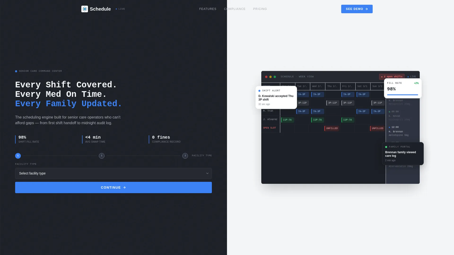
- A split-screen header with a product screenshot on the right and a headline plus primary call-to-action on the left
- Alternating spec-sheet panels, each isolating one scheduling feature with supporting data points and a cropped interface screenshot
- A three-field progressive lead form and a secondary email-gated PDF download for a compliance checklist
Feature list
This template includes carefully structured sections and design choices that reflect real senior care operator needs. Each feature below is built into the layout as described in the template brief.
Split-Screen Product Screenshot Header
The header divides the viewport into two equal halves. The right half displays a pixel-perfect weekly scheduling dashboard with caregiver names, color-coded shift blocks, a medication reminder sidebar, and a notification badge showing open shifts. The left half holds the headline and the primary call-to-action button.
Spec Sheet Panel Cadence
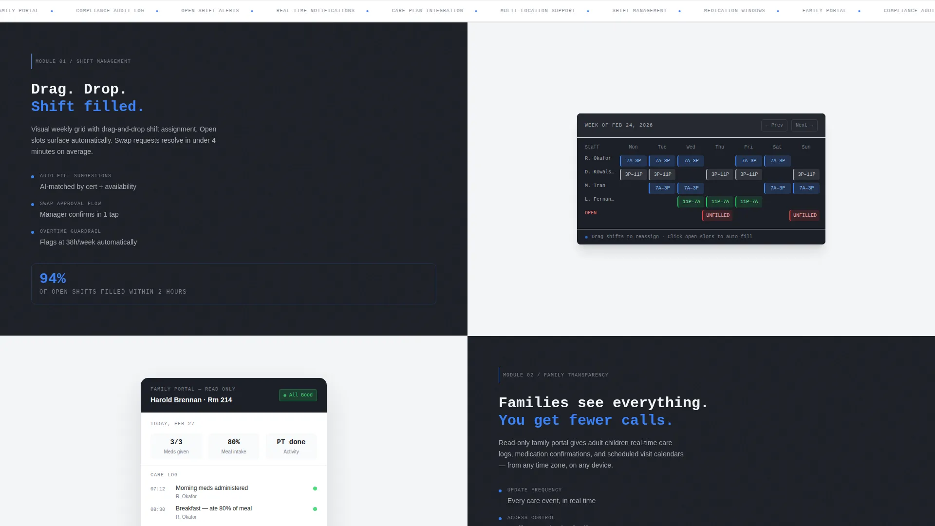
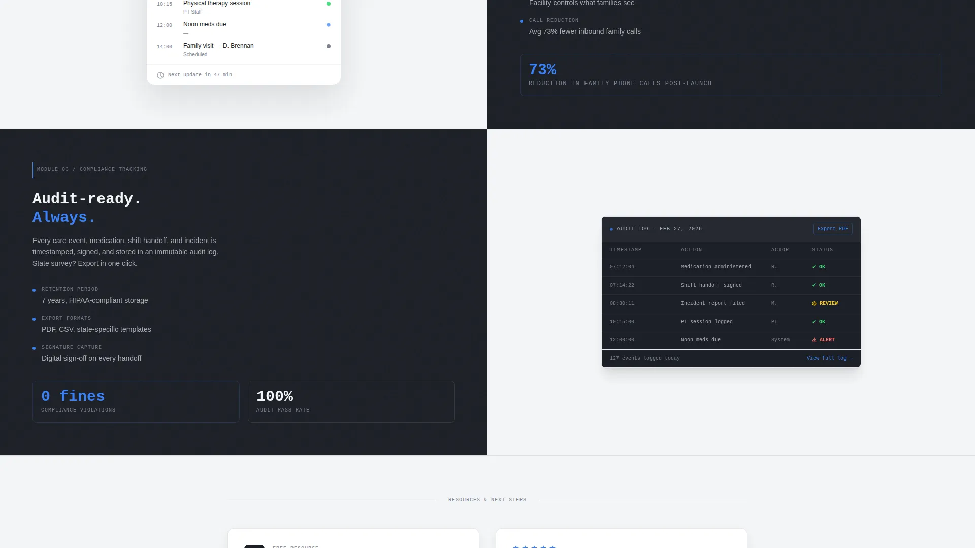
Each section below the header is a hard-split panel. The left side names one system capability and presents three supporting data points plus one metric. The right side shows a cropped interface screenshot of that feature in action, so the visitor sees the product doing the work.
Three-Field Progressive Lead Form
The primary conversion form collects information in sequence. It asks for facility type first, then number of caregivers managed, then a work email address. This order reduces friction by starting with easy, non-personal selections before requesting contact information.
Gated Compliance Checklist Download
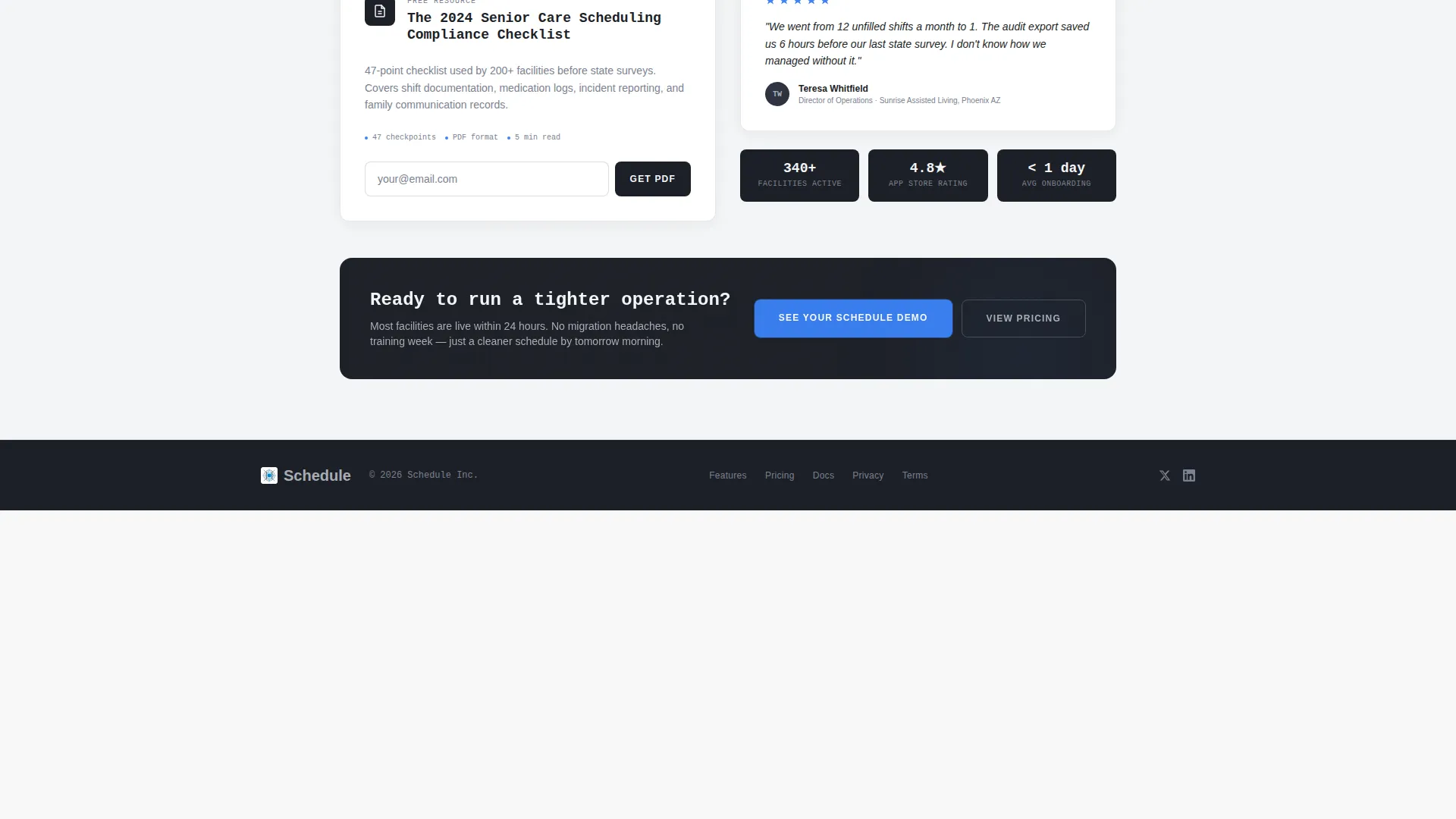
A secondary conversion path offers a downloadable PDF titled "The 2024 Senior Care Scheduling Compliance Checklist." It is gated behind email-only capture, giving visitors a lower-commitment way to enter the funnel while still providing a useful, specific resource.
Fixed Mobile Call-to-Action Bar
On mobile viewports, the primary call-to-action "See Your Schedule Demo" appears as a fixed bottom bar. This keeps the conversion prompt visible as the visitor scrolls through the feature panels without interrupting the reading experience.
Monochrome Steel Color System
The palette uses deep gunmetal for dark backgrounds, brushed aluminum for secondary text, clinical white for light panel backgrounds, and a single signal-blue accent reserved exclusively for buttons, toggles, and active interface states. No decorative colors are used.
Page sections overview
| Section | Purpose |
|---|---|
| Split-Screen Header | Introduces headline, product screenshot, and primary call-to-action |
| Shift Management Panel | Shows drag-and-drop shift calendar with supporting metrics |
| Family Transparency Panel | Displays read-only family portal view and its value proposition |
| Compliance Tracking Panel | Presents auto-generated audit log with compliance data points |
| Lead Capture Form | Collects facility type, caregiver count, and work email in sequence |
| Compliance Checklist Download | Offers gated PDF download via email-only secondary conversion |
Design & branding system
The visual identity follows a Data Command theme that communicates control and clinical precision. Every design choice serves function over decoration, projecting the confidence of a system built for high-stakes environments.
- Colors: deep gunmetal (#1C1F26) for dark panel backgrounds, brushed aluminum (#A8ADB5) for body text on dark panels, clinical white (#F4F5F7) for light sections, and signal blue (#3B82F6) strictly for interactive and live-indicator states
- Typography: the headline is set in a monospaced typeface to reinforce the command-center aesthetic; sublines and body copy use aluminum gray on dark panels and gunmetal on light panels
- Section breaks alternate between gunmetal and white backgrounds to create hard, high-contrast visual separations between each capability panel
Mobile & speed optimization
The template layout is designed to remain functional and conversion-focused on smaller screens. The fixed bottom call-to-action bar is the primary mobile-specific adaptation.
- The fixed "See Your Schedule Demo" bar stays anchored at the bottom of the mobile viewport throughout the scroll
- Split-screen panels are structured to reflow cleanly for single-column mobile display without losing their spec-sheet readability
- The progressive form sequence works on mobile because it presents one question at a time, reducing visual clutter on narrow screens
How this template helps you convert
The layout is built around a product-first philosophy. The visitor sees the scheduling interface in detail before the page ever asks for their contact information. By the time they reach the form, the product has already answered most of their objections.
- The header leads with a real product screenshot and a direct headline, so the visitor immediately understands what the platform does and who it is for
- Each spec-sheet panel adds one more layer of proof, showing a specific feature with a real interface view and concrete metrics, making the case incrementally stronger with every scroll
- The three-field form and the compliance checklist download offer two different entry points at different commitment levels, capturing visitors who are ready to book a demo and those who need one more reason to trust the product first
Other information about this template
This template is built specifically for the senior care booking and scheduling niche within the broader senior care digital presence category. It is categorized under Technology and is optimized for lead generation use cases.
- The template style is a 50/50 split-screen layout, making it well suited for side-by-side product demonstration and feature proof
- The creative direction follows a Spec Sheet approach, which means the page reads like a technical inventory rather than a narrative story
- The theme is Data Command, which prioritizes visual control, clarity, and system confidence over warmth or lifestyle imagery
- The header concept is a Product Screenshot, placing real interface visuals at the very top of the page to establish credibility immediately
Theme
Data Command
Creative direction
Spec Sheet
Color system
Monochrome Steel
Style
Split Screen (50/50)
Direction
Lead Generation
Page Sections
Split-screen Product Screenshot Header
Spec Sheet Capability Panels
Three-field Progressive Lead Form
Gated Compliance Checklist Download
Fixed Mobile Call-to-action Bar
Monochrome Steel Visual System
Related questions
Who is the primary audience for this landing page template?
What does the three-field lead capture form collect?
What is the secondary conversion path on this template?
Can the product screenshots and metrics in the feature panels be replaced?
What visual style does this template use?



