Schedule Pro — Booking System Landing Page Template
Roster is a single-page landing page template built for AI-powered retail scheduling tools. It pairs a dark glass aesthetic with live-metric counters, a three-column comparison table, an embedded industry data story, and an interactive Gantt chart simulation. The layout guides retail operations leaders from problem awareness straight to a free trial signup in one confident scroll.
by Rocket studio
Quick summary
Roster is a high-impact landing page template designed for AI-driven retail scheduling platforms. It opens with animated performance counters, walks visitors through a detailed scheduling comparison, backs every claim with sourced industry data, and closes with a friction-light freemium signup. The result is a page that feels like a live operations dashboard, not a marketing brochure.
Who this template is for
This template is purpose-built for retail technology products that need to win over skeptical, data-literate buyers. If your tool automates scheduling decisions using real operational signals, this page speaks the right language.
- Regional retail directors managing large networks of store managers
- Operations vice presidents at grocery chains tracking overtime spend per pay period
- Franchise owners who suspect their weekend coverage is costing them but lack the data to prove it
What problem this template solves
Retail scheduling decisions still rely on gut feel, group chats, and spreadsheets. The result is preventable overtime, last-minute shift gaps, and a labor cost problem that compounds every week. This template gives your product a page that makes the cost of intuition-based scheduling impossible to ignore.
- Visitors arrive unconvinced that software can outperform an experienced floor manager
- The case for AI scheduling is data-heavy and hard to communicate in a few sentences
- Research-mode buyers need proof before they will start a trial
What you get with this template
The template delivers a complete, single-scroll landing page structured like an industry analyst report. Every section adds a new layer of evidence before asking for anything from the visitor.
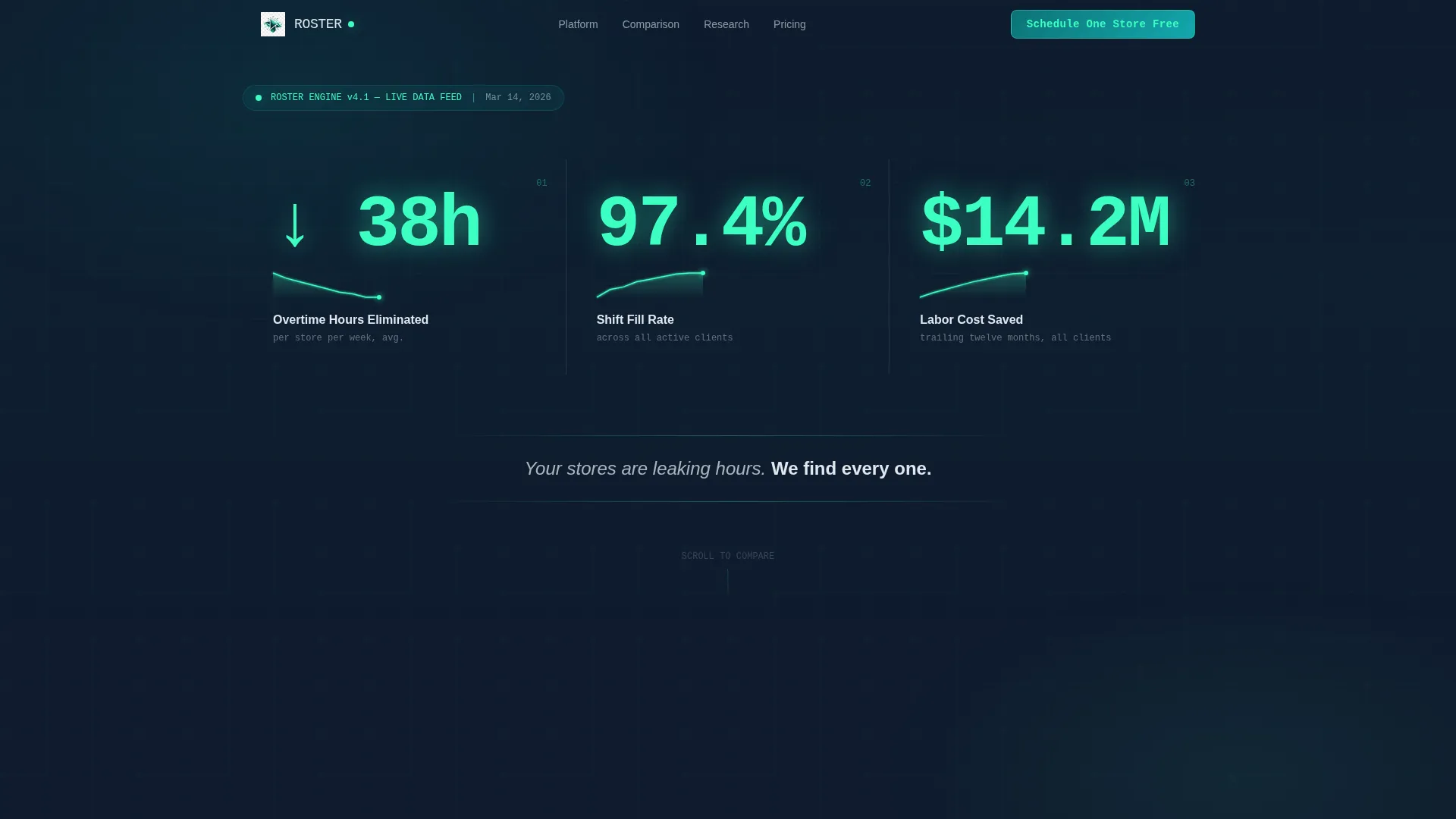
- An animated stats wall with three live performance counters and micro-sparklines on page load
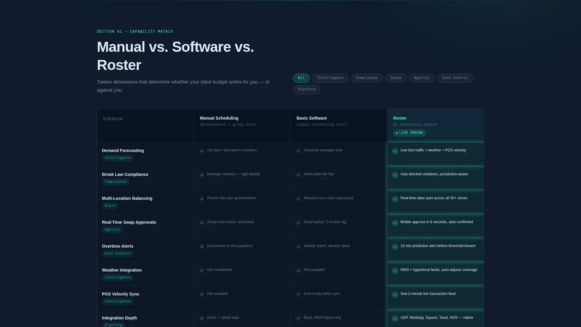
- A twelve-dimension comparison table pitting manual scheduling and basic software against your platform
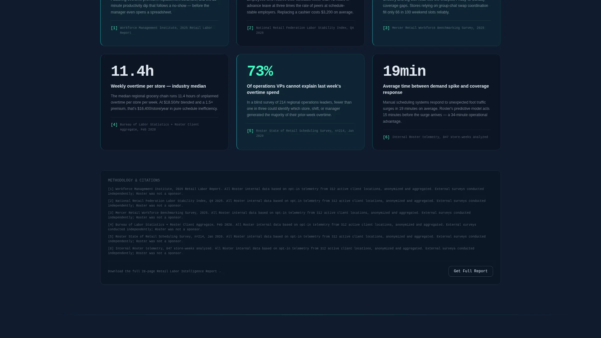
- An embedded industry data story with sourced statistics, a simulated Gantt chart with a toggle interaction, and a dual-path conversion flow for both trial-ready and research-mode visitors
Feature list
This section covers the core built-in components the template delivers, drawn directly from its defined structure.
Animated Metrics Header
Three oversized counters animate on load, showing overtime hours eliminated, shift-fill rate, and total labor cost saved. Each counter trails a micro-sparkline to show trend direction at a glance. The numbers render in reactive mint against a dark glass background, making the headline data impossible to miss.
Three-Column Comparison Table
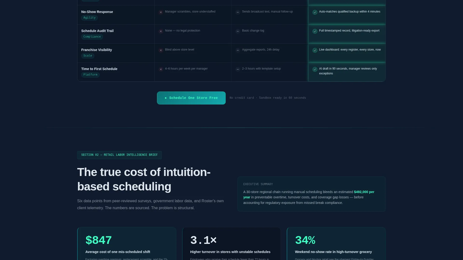
A structured grid compares manual scheduling, basic scheduling software, and the Roster platform across twelve operational dimensions. Dimensions include demand forecasting, break-law compliance, multi-location balancing, real-time swap approvals, overtime alerts, and integration depth. Roster advantage cells glow in reactive mint to create an immediate, visual summary of the gap.
Sourced Industry Data Story
The second content section presents retail labor statistics formatted like a white paper. It covers the average cost of one mis-scheduled shift, the correlation between schedule instability and staff turnover, and weekend no-show rates by sector. Every stat is footnoted, reinforcing credibility with a research-oriented audience.
Interactive Gantt Chart Simulation
A simulated store view renders one location's full work week as a living schedule grid. Visitors can toggle a "Friday storm forecast" switch and watch the schedule rebalance in real time. This single interaction demonstrates the core product promise more clearly than any paragraph of copy could.
Freemium Trial Signup Form
The primary call to action, "Schedule One Store Free," pins to the bottom of the comparison table and reappears after the simulation. The form collects only a work email and number of locations, then provisions a sandbox store pre-loaded with synthetic traffic data. The stated goal is a first AI-generated schedule visible within sixty seconds of signup.
Research-Mode Lead Capture
A secondary conversion path offers a downloadable retail labor report behind an email gate. This captures visitors who are not yet ready to start a trial but are deep in the evaluation process. Two conversion paths mean the page works for buyers at different stages without competing with itself.
Page sections overview
| Section | Purpose |
|---|---|
| Stats Metrics Header | Animate three key performance counters on load to establish immediate credibility |
| Comparison Table | Show a twelve-dimension, three-column grid that highlights platform advantages |
| Industry Data Story | Present sourced retail labor statistics formatted as an analyst-style report |
| Gantt Chart Simulation | Let visitors toggle a storm forecast and watch a live schedule rebalance |
| Trial Signup Form | Convert ready buyers with a two-field form that provisions a sandbox store instantly |
| Report Lead Capture | Offer a downloadable labor report to capture research-mode visitors via email gate |
Design & branding system
The visual identity follows a Tech Glass theme built on the Teal Catalyst color system. The palette is designed to feel like a server room dashboard at 2 a.m., calm, authoritative, and entirely status-green.
- Deep operational teal (#0D7377) anchors primary surfaces, headers, and active states; dark glass panel (#0F1B2D) sits behind every section as the base layer
- Reactive mint (#3DFFC2) fires only on live-data accents, hover states, toggle interactions, and comparison table advantage cells
- Soft register-light gray (#E0E7EE) handles body text, table borders, and secondary labels to keep contrast readable without competing with the accent system
Mobile & speed optimization
The template is structured for clean rendering across screen sizes. Its data-dense sections, including the comparison table and Gantt chart, are built to stay readable on smaller viewports.
- The comparison table adapts its column layout so all twelve dimensions remain accessible on mobile without horizontal scrolling
- Animation triggers and the toggle interaction are designed to function at the scroll positions where they appear, keeping the experience coherent on touch screens
How this template helps you convert
Every structural decision in this template serves a single goal: moving a skeptical retail operations buyer from awareness to action before they leave the page.
- The animated metrics header opens with proof, not promises, so visitors immediately see quantified outcomes rather than marketing language
- The comparison table and industry data story build a layered evidence stack that answers objections before the visitor forms them
- The dual conversion path means both trial-ready buyers and research-mode evaluators leave with a meaningful next step, keeping the lead pipeline active at both ends of the decision cycle
Other information about this template
This template sits at the intersection of the Technology category and the AI for Retail subcategory, making it directly relevant to platforms competing in the retail AI scheduling assistant space.
- The template style is a Comparison Table layout, which is well-suited to products where feature differentiation is the primary buying signal
- The creative direction follows an Industry Report format, lending the page authority that pure product marketing pages rarely achieve
- The header concept is a Stats and Metrics wall, a pattern that performs strongly when the product has quantified outcomes to show
- The freemium and trial landing page direction means the page is optimized for low-friction first contact rather than high-commitment demo requests
- This is a single-page template; all sections load within one continuous scroll flow with no additional pages required
Theme
Tech Glass
Creative direction
Industry Report
Color system
Teal Catalyst
Style
Comparison Table
Direction
Freemium/Trial
Page Sections
Animated Performance Metrics Header
Twelve-dimension Comparison Table
Sourced Industry Data Section
Interactive Schedule Simulation
Friction-light Trial Signup Form
Research-mode Lead Capture Gate
Related questions
Who is this landing page template built for?
What does the comparison table include?
How does the freemium trial conversion flow work?
Does the template include a secondary path for visitors not ready to sign up?
Is this template single-page or multi-page?



