Schedule — Shift Management Landing Page Template
Roster is a bold, scroll-reveal landing page template built for fitness staff scheduling platforms. It combines a self-writing code header, a progressive feature matrix, and a pinned call-to-action rail to move gym owners, studio managers, and franchise operators directly into a free trial. The design runs on a dark, iridescent visual system that feels as sharp as the product itself.
by Rocket studio
Quick summary
Roster is a single-page, scroll-reveal template designed for a fitness staff scheduling platform. It opens with an animated code snippet, builds trust through a stacking feature matrix, and drives visitors toward a free trial with a persistent call-to-action button. The aesthetic is bold brutalist: dark, luminous, and deliberately machine-like.
Who this template is for
This template is built for SaaS founders and product teams in the fitness software space who need a high-conviction landing page that sells the product through demonstration, not decoration.
- Boutique studio managers juggling large rosters of part-time instructors
- Franchise operators who need to sync staff schedules across multiple locations
- Head coaches and gym owners who want to replace manual, chat-based shift swaps with a visual scheduling tool
What problem this template solves
Managing fitness staff scheduling manually is slow, error-prone, and invisible to everyone until something breaks. This template addresses the need to communicate a complex scheduling tool clearly and persuasively on a single page.
- Visitors arrive skeptical and need proof before they click; the inline video and animated header deliver it immediately
- Busy operators have no time for long sales calls; the feature matrix builds the full case as they scroll
- A free trial offer loses impact without a strong, persistent call-to-action; the pinned bottom rail keeps it visible throughout
What you get with this template
You get a complete, production-ready landing page structured around progressive disclosure. Every section is purpose-built to add weight to the one before it, so the page reads as a system, not a checklist.
- An animated code-snippet header that types itself line by line and resolves into a fully populated drag-and-drop calendar view
- A scroll-triggered feature matrix where brutalist cards reveal individual capabilities one at a time, then reorganize into a comparison grid
- A pinned call-to-action rail with a primary button and a secondary inline video trigger, both present from the third feature card onward
Feature list
This template is built around six core functional areas drawn directly from the scheduling platform's capabilities.
Animated Code Snippet Header
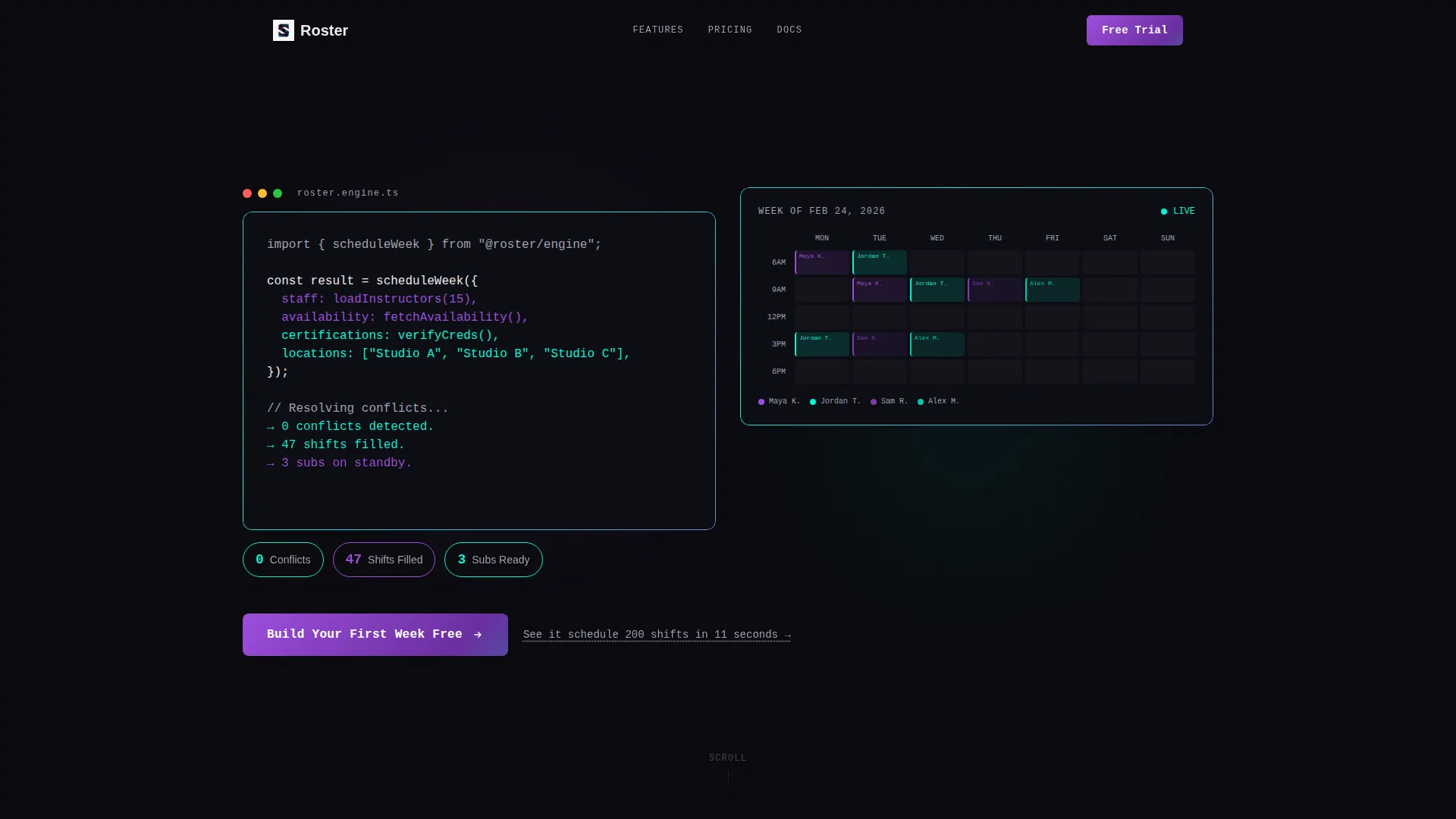
The header opens with monospaced pseudo-code that writes itself line by line. It resolves into a live output line showing conflicts cleared and shifts filled, then splits to reveal a populated drag-and-drop calendar underneath. No photography, no filler imagery.
Scroll-Reveal Feature Matrix
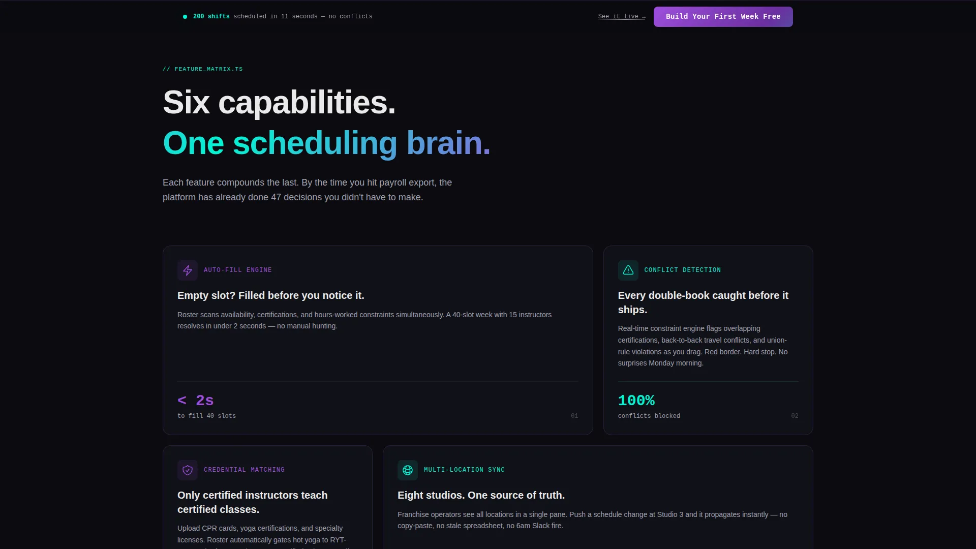
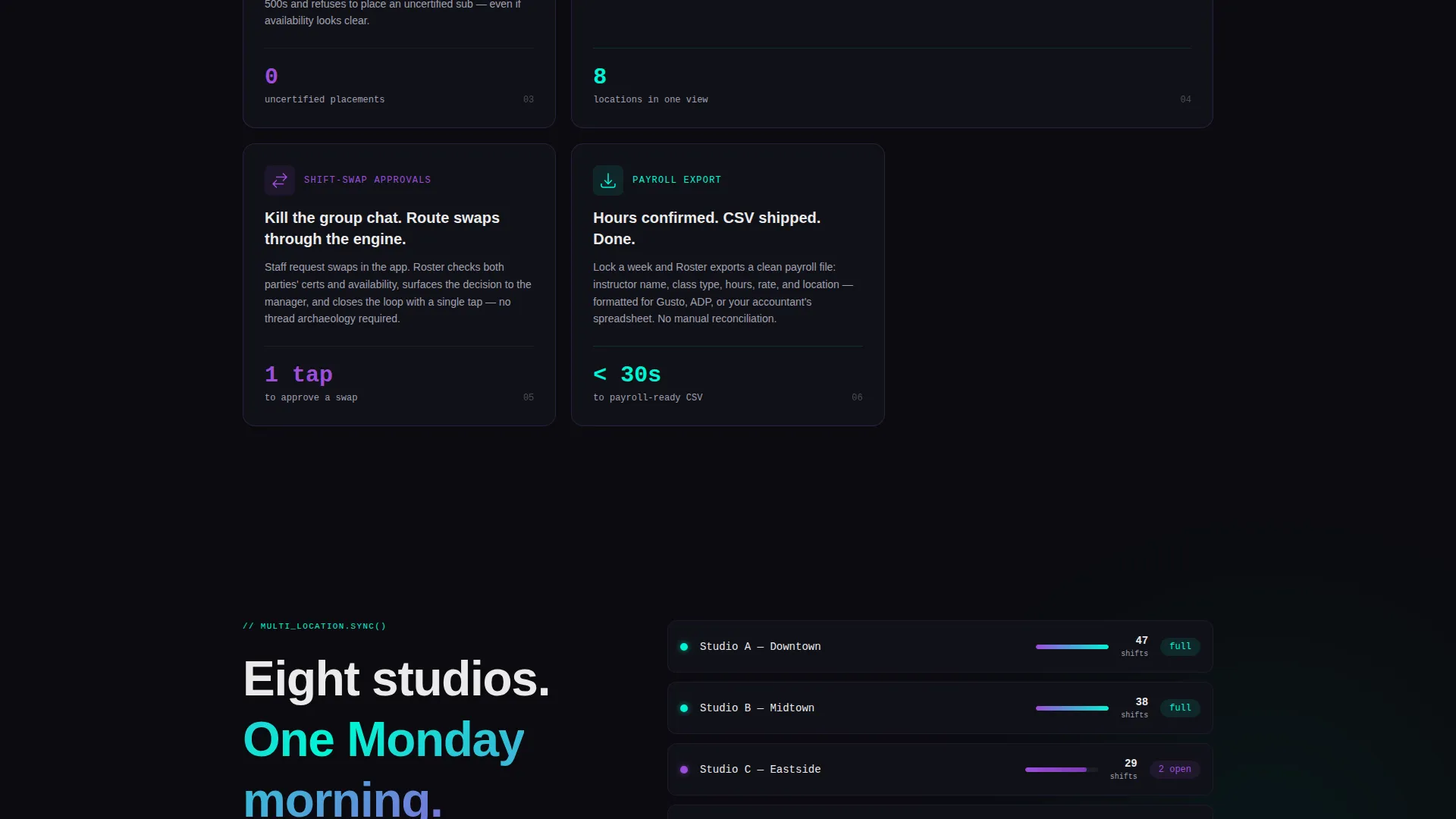
Each scroll step introduces one platform capability as a full-weight brutalist card. Cards for auto-fill, conflict detection, credential matching, multi-location sync, shift-swap approvals, and payroll export appear in sequence. As the visitor scrolls deeper, the cards reorganize into a side-by-side comparison grid.
Persistent Call-to-Action Rail
After the third feature card, a bottom-pinned rail appears and stays. The primary button reads "Build Your First Week Free" and carries UTM context to the demo. It never disappears, so the conversion path stays open regardless of scroll depth.
Inline Proof Video Trigger
A secondary text link reads "See it schedule 200 shifts in 11 seconds." Clicking it opens an inline video without leaving the page. This gives proof-seeking visitors a reason to convert before they reach the bottom.
Brutalist Card Components
Each feature card is designed to slam into the viewport with visual weight on reveal. The cards stack, shift, and compound as the visitor moves through the page, communicating that the platform thinks in systems rather than individual shifts.
Iridescent Hover and Progress States
Holographic violet and electric cyan appear exclusively as gradients on hover states and progress indicators. They are never flat. This keeps the interface feeling dynamic and purposeful without overloading the dark base palette.
Page sections overview
| Section | Purpose |
|---|---|
| Code Snippet Header | Opens with self-writing pseudo-code resolving into shift output and calendar reveal |
| Feature Card One | Introduces auto-fill capability with first brutalist scroll-reveal card |
| Feature Card Two | Reveals conflict detection as second stacking card |
| Feature Card Three | Shows credential matching and triggers appearance of pinned call to action rail |
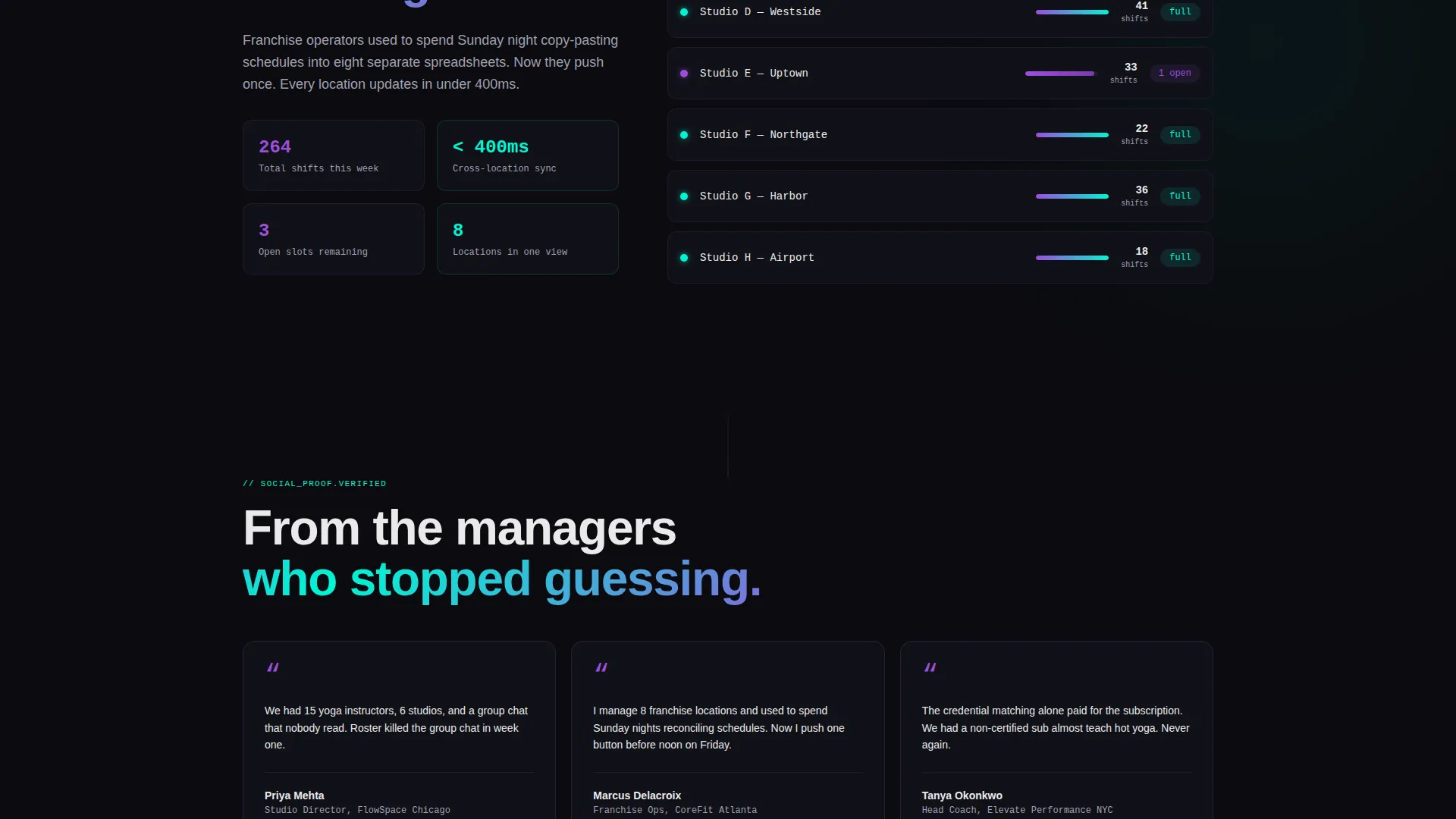
| Feature Card Four | Presents multi-location sync capability |
| Feature Card Five | Covers shift-swap approvals workflow |
| Feature Card Six | Introduces payroll export and completes the feature set |
| Comparison Grid | Reorganized card stack showing how features compound together |
| Pinned call to action Rail | Persistent bottom bar with primary button and inline video trigger |
Design & branding system
The visual identity follows a Bold Brutalist theme built on an AI Iridescent color palette. The result feels like a GPU rendering a shift grid in real time: dark, precise, and slightly alien.
- Base colors are void black (#0B0B0F) for the background, signal white (#EAEAEA) for body text, holographic violet (#9D4EDD), and electric cyan (#00F5D4) for gradient accents
- Typography uses a monospaced typeface in the header section to reinforce the code-terminal aesthetic; violet and cyan gradients appear only on hover states and progress indicators, never as flat fills
- There is no stock photography anywhere on the page; all visual content is interface-driven, keeping the focus on the product's logic and output
Mobile & speed optimization
The scroll-reveal and card-stacking interactions are designed to translate across screen sizes without losing the progressive rhythm of the layout.
- The brutalist card matrix reflows naturally for narrower viewports, preserving the additive reveal sequence on mobile
- The pinned call-to-action rail is built to remain visible and tappable at the bottom of the screen on touch devices
- The inline video trigger loads within the page context so visitors on mobile do not lose their scroll position when engaging with the proof video
How this template helps you convert
Every structural decision in this template is aimed at reducing friction and building confidence before the click.
- The animated header front-loads the core value proposition in seconds, showing the platform resolving conflicts before a visitor reads a single word of body copy.
- The progressive feature matrix adds compounding proof with every scroll step, so visitors who are still undecided keep receiving new reasons to act.
- The persistent call-to-action rail ensures the primary conversion path is always one tap or click away, no matter how deep into the page a visitor explores.
Other information about this template
This template is a strong fit for fitness software and SaaS product teams who want a landing page that reflects the sophistication of their tool without relying on generic marketing visuals.
- The page type is a click-through landing page, meaning there is no form to fill out; the button drops visitors directly into an interactive demo pre-loaded with sample staff and classes
- The template style is Scroll Reveal (Progressive), built so that each new section reinforces the sections before it, creating an additive reading experience
- The creative direction is a Feature Matrix, which means features are not listed in a static grid but revealed, stacked, and compared as the visitor moves through the page
- The header concept is a Code Snippet, which signals technical credibility and product maturity to a software-savvy audience from the very first second on the page
Theme
Bold Brutalist
Creative direction
Feature Matrix
Color system
AI Iridescent
Style
Scroll Reveal (Progressive)
Direction
Click-Through
Page Sections
Self-writing Code Snippet Header
Progressive Scroll-reveal Feature Matrix
Pinned Conversion Rail
Inline Proof Video Trigger
AI Iridescent Gradient Accents
Brutalist Card Reveal Components
Related questions
Does this template include a signup form?
Can I change the feature cards to match my platform's actual capabilities?
Who is the target visitor for a page built on this template?
Does the inline video play inside the page or open a new tab?
Is this template suitable for a multi-location fitness business?



