Schedule — Volunteer Ops Landing Page Template
Roster is an education staff scheduling landing page template built for schools and multi-academy trusts. It leads with a glowing dashboard hero, anchor navigation across five key spoke sections, and a freemium trial conversion flow. The design uses a dark command-centre palette with teal highlights to make the product feel live, trusted, and ready before the school day begins.
by Rocket studio
Quick summary
Roster is a single-page, hub-and-spoke landing page template designed for an intelligent education staff scheduling platform. It opens with a full-bleed dark hero featuring an animated timetable dashboard, moves through five anchor-nav sections, and converts visitors with a six-week free trial offer. The template is built to show the product solving real scheduling pain before asking for anything.
Who this template is for
This template is built for education technology teams who need a high-converting landing page that speaks directly to school operations professionals. It suits platforms targeting busy staff who manage cover, compliance, and workforce planning across one school or many.
- Deputy heads and cover coordinators managing daily absence and cover
- Multi-academy trust (MAT) operations managers overseeing staffing across multiple sites
- Education software teams launching or repositioning a staff scheduling platform
What problem this template solves
Staff scheduling in schools is genuinely painful. Deputy heads spend hours each Sunday rebuilding timetables, and cover coordinators field calls from 6 a.m. when someone rings in sick. A generic software landing page does not convey that urgency or earn the trust of a professional who has tried and abandoned spreadsheets before.
- No clear way to show a live, intelligent scheduling product without stock photography or generic claims
- Visitors leave before they understand the platform's value because the page lacks proof-first structure
- Sign-up friction is too high when busy school staff face long forms and unclear trial terms
What you get with this template
You get a fully structured, single-page layout that leads with dramatic proof and guides every visitor type toward a relevant conversion path. The layout is designed so the product does the persuading before the form ever appears.
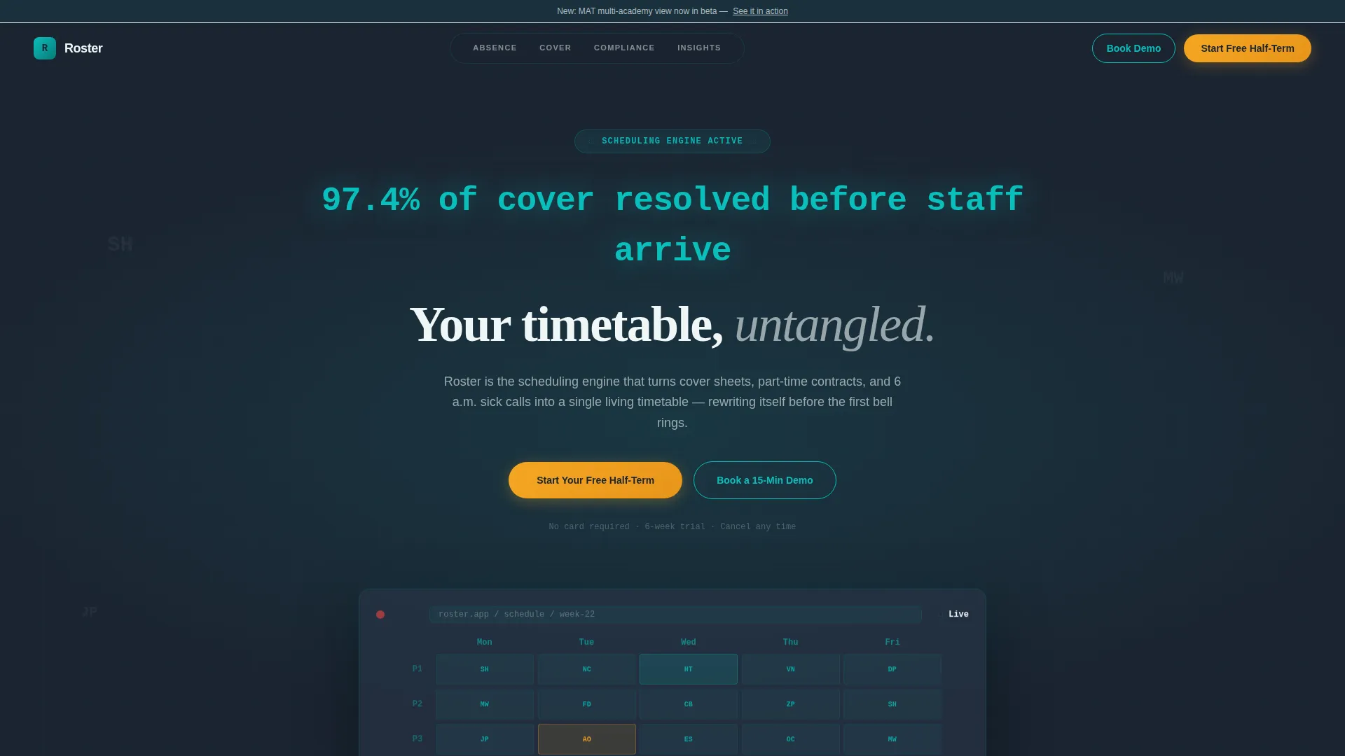
- A dark full-bleed hero with an animated dashboard, a floating headline metric, and a primary trial call to action
- Five anchor-nav spoke sections (Absence, Cover, Compliance, Insights, and a multi-academy trust path) each opening with a bold statistic
- A dual conversion flow: a no-card freemium trial form and a demo booking path gated by a school-count qualifier
Feature list
This template includes a focused set of purpose-built layout components. Each one is designed to communicate platform value at the right moment in the visitor's scroll.
Animated Dashboard Hero
The header section fills edge to edge in deep charcoal (#1B2431) with a realistic scheduling dashboard that fades into view through a soft teal glow. Staff initials and grid cells populate in a staggered animation, simulating the timetable solving itself in real time. A large mono-type metric floats above the dashboard before the headline types in beneath it.
Anchor Navigation with Spoke Sections
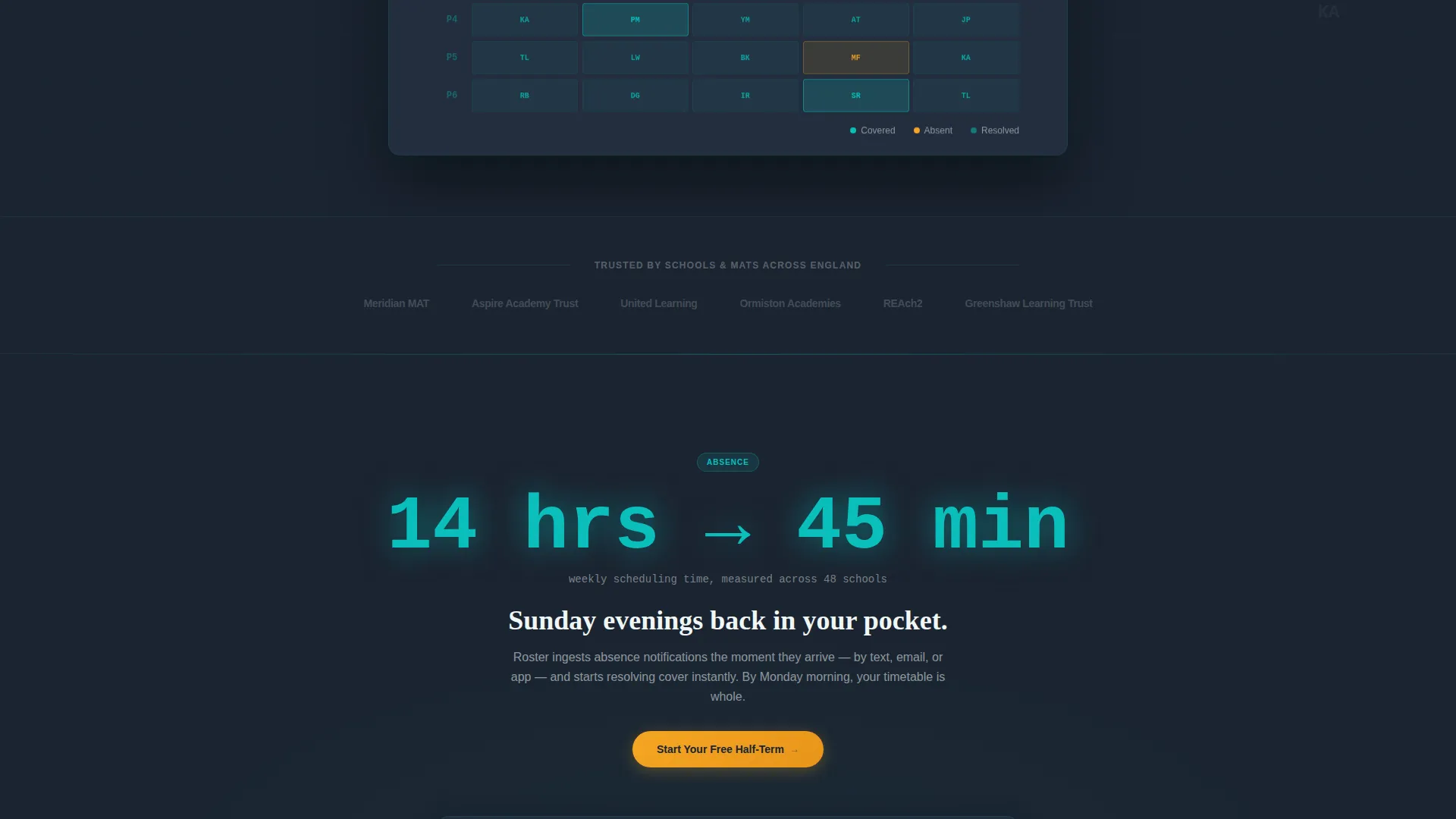
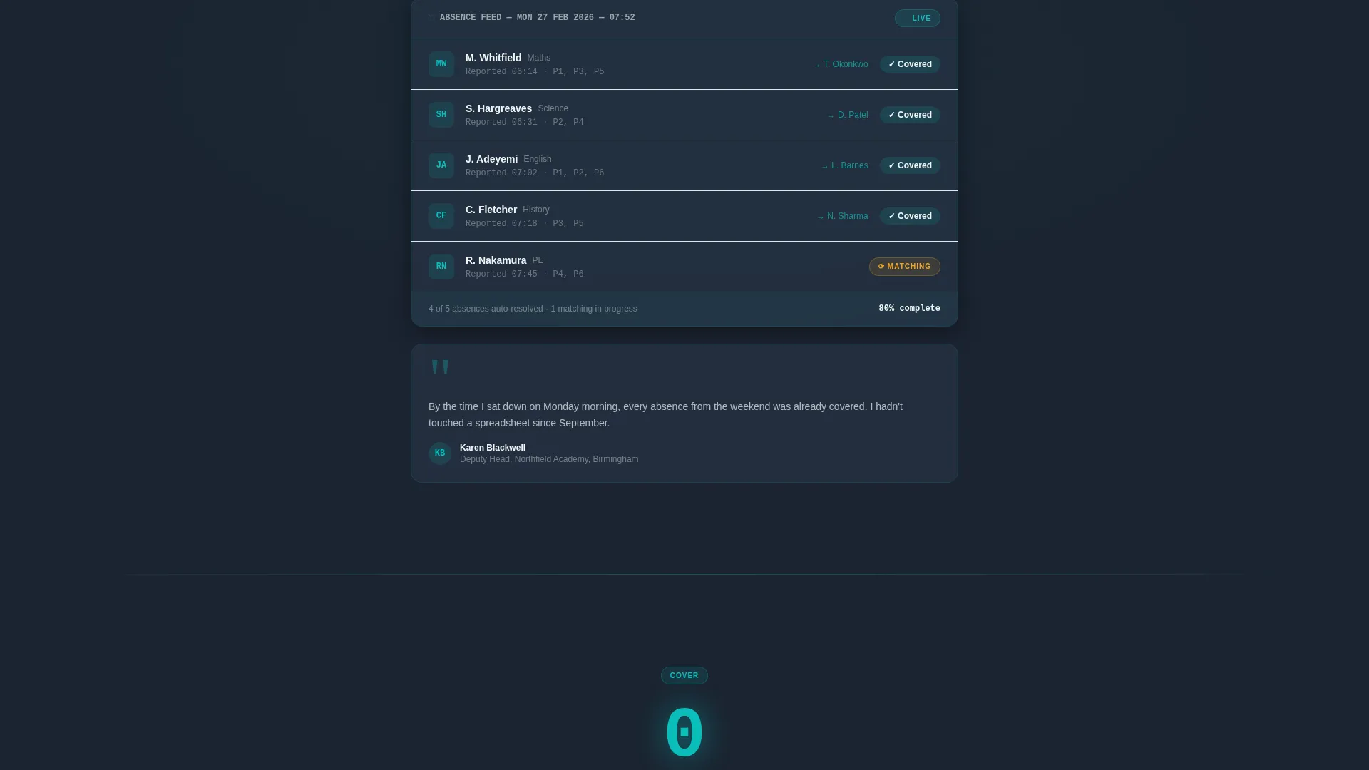
A sticky anchor navigation bar pins to the top of the page with five labelled spokes: Absence, Cover, Compliance, Insights, and a multi-academy trust view. Each spoke section opens with a single oversized statistic in teal numerals, followed by a product screenshot or interactive vignette and a short proof paragraph. The rhythm escalates from daily cover problems to trust-wide workforce analytics.
Stats-First Proof Blocks
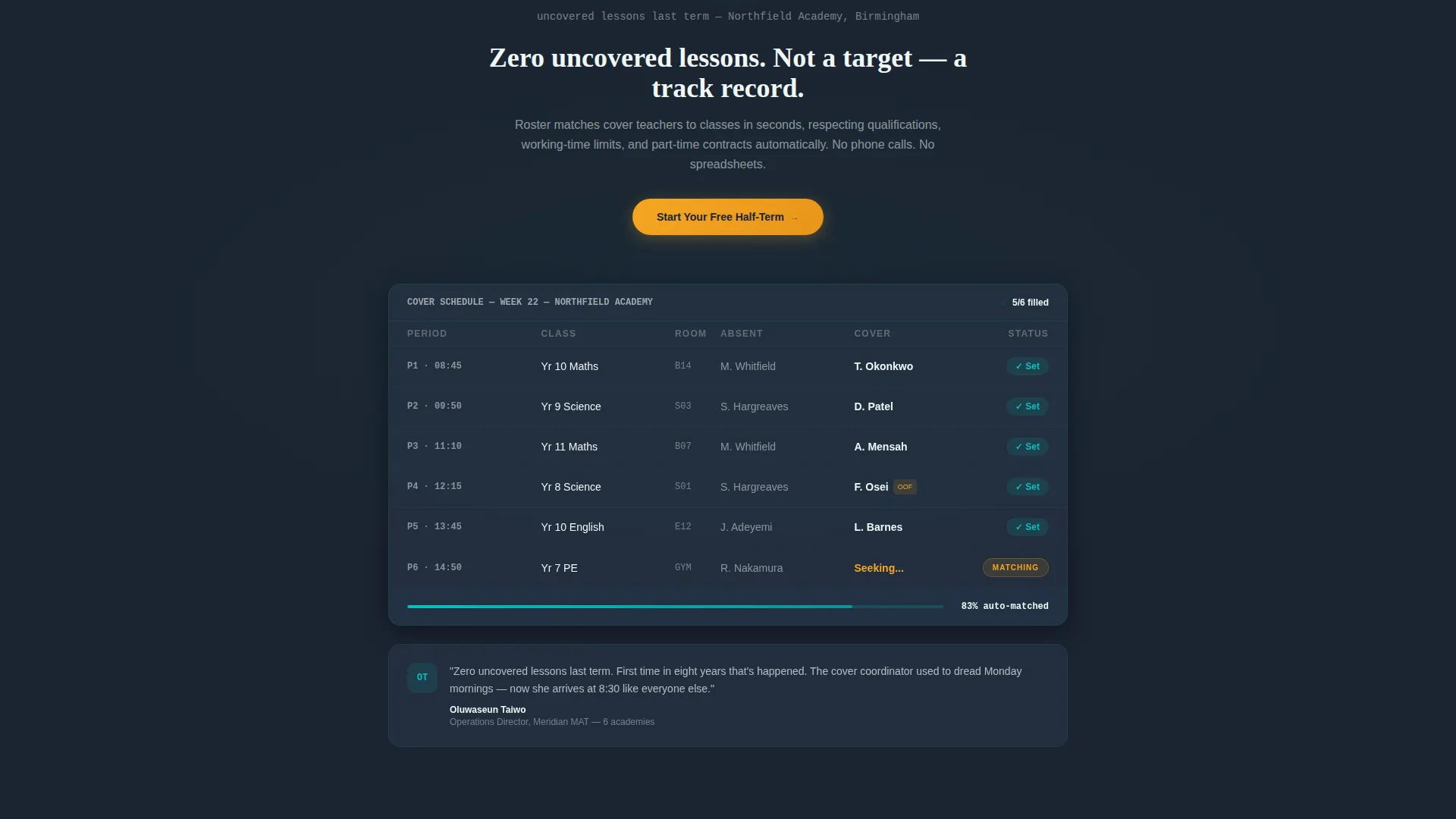
Each spoke section leads with a jaw-dropping number before expanding into context. Examples from the brief include "14 hrs to 45 min" for weekly scheduling time and "Zero uncovered lessons last term" as a customer proof point. This number-hit, screenshot, proof-paragraph pattern repeats across sections so visitors feel the platform growing around their specific needs.
Freemium Trial Conversion Form
The primary sign-up flow asks for school name first, with autocomplete drawing from a Department for Education (DfE) database. It then asks for a work email and a role dropdown covering Senior Leadership Team (SLT), Cover Lead, and MAT Ops. No payment card is required. The form appears in the header, repeats at the close of every spoke section, and anchors in a sticky bottom bar on mobile.
Demo Booking Path for Trusts
A secondary conversion option labelled "Book a 15-Min Demo" is available for multi-academy trusts. It is gated behind a school-count qualifier, ensuring the demo path reaches the right audience without distracting solo-school visitors from the trial flow.
Sticky Mobile call to action Bar
On mobile, the primary "Start Your Free Half-Term" call to action persists in a fixed bottom bar throughout the scroll. This keeps the trial offer visible at every stage of the page without interrupting the content flow above.
Page sections overview
| Section | Purpose |
|---|---|
| Dark Hero Header | Launches the dashboard animation and floating proof metric |
| Anchor Nav Bar | Pins spoke labels and guides visitors to relevant sections |
| Absence Spoke | Opens with a scheduling time stat and daily absence product view |
| Cover Spoke | Shows cover resolution proof point and lesson coverage vignette |
| Compliance Spoke | Surfaces compliance-related scheduling context and proof |
| Insights Spoke | Presents workforce analytics scaled to multi-academy needs |
| Trial Sign-Up Form | Converts visitors with a no-card, six-week freemium trial |
| Demo Booking Path | Routes trust-level buyers to a gated 15-minute demo request |
| Sticky Mobile Bar | Keeps the trial call to action accessible throughout the mobile scroll |
Design & branding system
The visual identity follows the Dashboard Pro theme with a Teal Catalyst color system. The palette is built to feel like a mission-control screen: dark, calm, and purposeful, with just enough glow to signal that the system is live.
- Core colors: deep charcoal (#1B2431) for backgrounds, primary teal (#0ABFBC) for active elements and key numerals, muted slate (#3A4A5C) for secondary panels, and signal white (#EFF6F6) for data surfaces
- Accent color: warm amber (#F5A623) marks alerts and all call-to-action buttons throughout the page
- Typography: oversized monospace numerals for the hero metric and spoke statistics, with clean body type for proof paragraphs and form labels
Mobile & speed optimization
The template is structured to perform on small screens without losing the impact of the data-led design. Key conversion elements are repositioned so mobile visitors always have a clear next step.
- The sticky bottom call to action bar keeps the "Start Your Free Half-Term" trial offer in view throughout the entire mobile scroll
- Spoke sections restack cleanly so each statistic, screenshot, and proof paragraph reads in sequence on narrow viewports
- The anchor navigation condenses for mobile so visitors can still jump directly to the spoke most relevant to their role
How this template helps you convert
The page is structured to earn trust before it asks for anything. Visitors watch the product solve their specific scheduling problem on screen, then arrive at a conversion point that already feels familiar.
- The hero animation and floating proof metric create immediate credibility, giving school staff a reason to keep scrolling before reading a single line of copy
- Each spoke section mirrors a different job role's pain point, so deputy heads, cover coordinators, and MAT operations managers all find their own problem named and resolved before reaching the sign-up form
- The dual conversion flow separates solo-school visitors (six-week free trial, no card) from trust-level buyers (demo booking with school-count qualifier), reducing friction for both audiences at once
Other information about this template
This template is part of the Hub and Spoke landing page family, a layout pattern well suited to platforms with multiple distinct use cases that need to serve different audience segments from a single URL. The Stats-First Impact creative direction is intentional: it prioritises proof over description, which suits buyers in the education sector who are appropriately skeptical of vendor claims.
- The academic calendar framing of the trial (a "half-term" rather than a generic 30-day period) is a deliberate conversion detail that signals the platform understands school life
- The DfE database autocomplete on the school name field reduces form friction and adds an instant credibility signal for UK education buyers
- The template is compatible with the Dashboard Pro theme system, which provides a consistent visual language for data-heavy software products
- This layout works equally well for an initial product launch or a redesign of an existing scheduling software marketing page
Theme
Dashboard Pro
Creative direction
Stats-First Impact
Color system
Teal Catalyst
Style
Hub & Spoke (Anchor Nav)
Direction
Freemium/Trial
Page Sections
Animated Scheduling Dashboard Hero
Sticky Anchor Navigation Bar
Stats-first Spoke Sections
Freemium Trial Sign-up Form
Gated Demo Booking Path
Sticky Mobile Call to Action Bar
Related questions
Who is this landing page template designed for?
Does the template include the animated dashboard in the hero?
What conversion paths does this template support?
Can I adapt the spoke sections to match my platform's features?
Is this template suitable for a multi-academy trust audience?



