Schema - Interactive GraphQL Landing Page Template
Schema is a split-screen GraphQL API documentation landing page template built for teams who need their API structure to feel instantly readable. It combines an interactive schema explorer, scrolling evidence sections, and a single-focus click-through flow to move backend engineers, frontend developers, and DevRel leads from confusion to clarity in one scroll.
by Rocket studio
Quick summary
Schema is a single-page GraphQL API documentation template designed around one idea: make your API architecture comprehensible at a glance. The split-screen layout pairs a live schema explorer with escalating evidence panels, guiding technical visitors from first impression to a live sandbox click without a single form field in the way.
Who this template is for
This template is built for technical teams who document GraphQL APIs and need that documentation to do real work. It speaks directly to people who feel the cost of unclear API docs every day.
- Backend engineers shipping federated GraphQL services who need a reference that keeps pace with schema changes
- Frontend developers tracing fragments through nested resolvers who want a visual map, not raw text
- Developer relations leads who need onboarding documentation that genuinely reduces inbound support questions
What problem this template solves
GraphQL schemas grow fast. Without good documentation, every new team member costs hours in onboarding, and every schema change risks breaking someone's mental model. This template addresses the specific friction points that make API documentation feel like a burden rather than an asset.
- Teams lose time explaining schema relationships that a well-structured visual could answer instantly
- Static documentation drifts out of sync with the actual schema, eroding trust in the docs themselves
- Generic documentation pages fail to show the product working before asking visitors to commit
What you get with this template
You get a complete, single-page landing page layout built around the GraphQL API documentation use case. Every section is purposefully ordered to build confidence and reduce hesitation before the primary call to action.
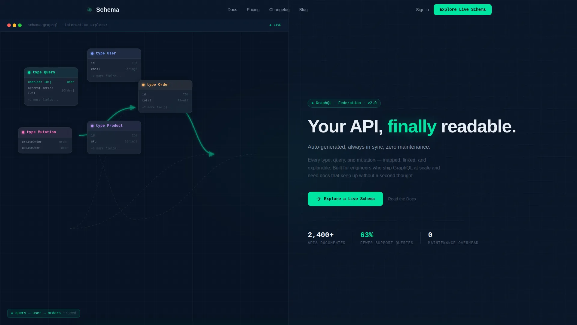
- A 50/50 split-screen header with a schema explorer panel on the left and a headline-plus-call to action panel on the right
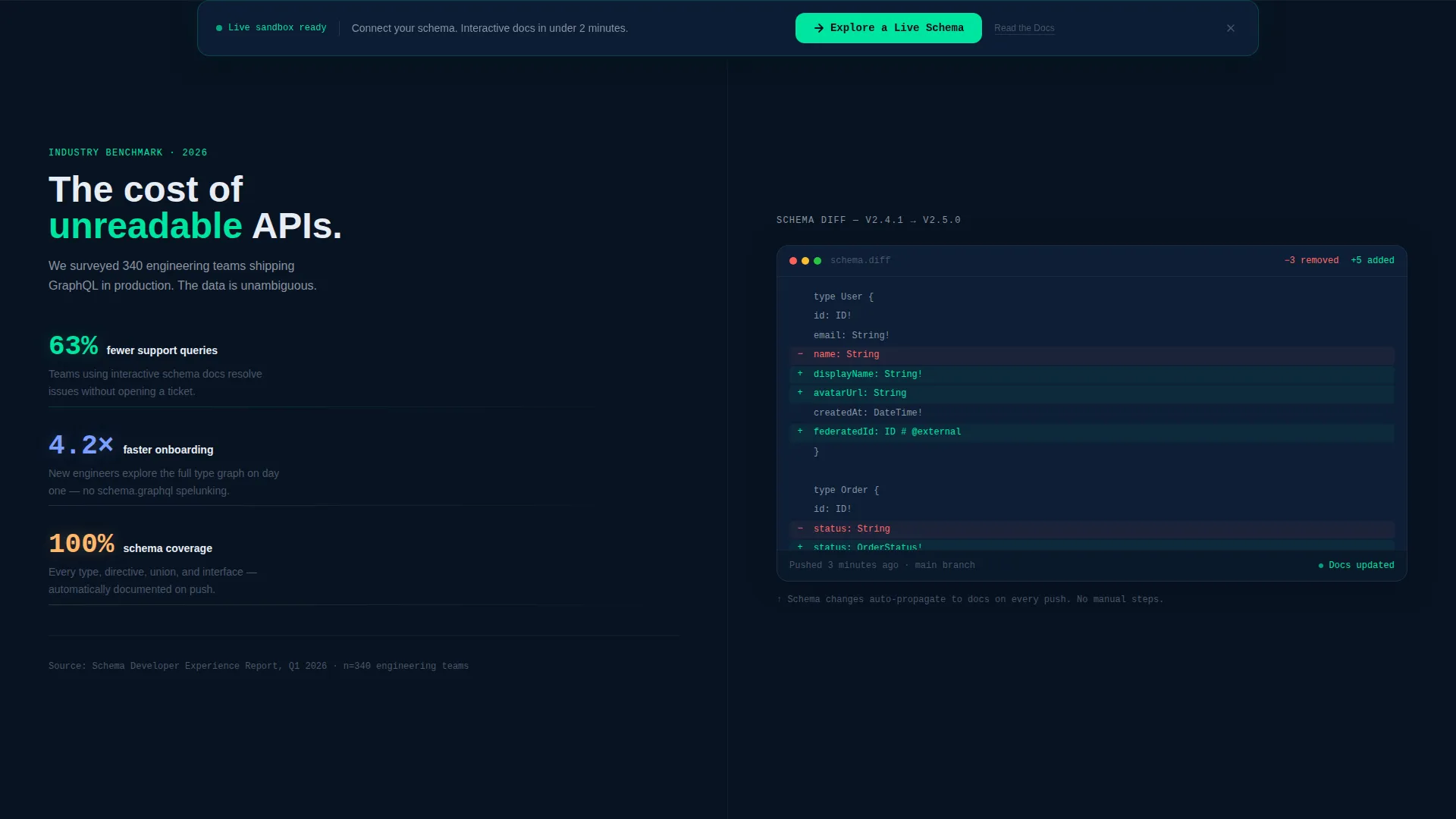
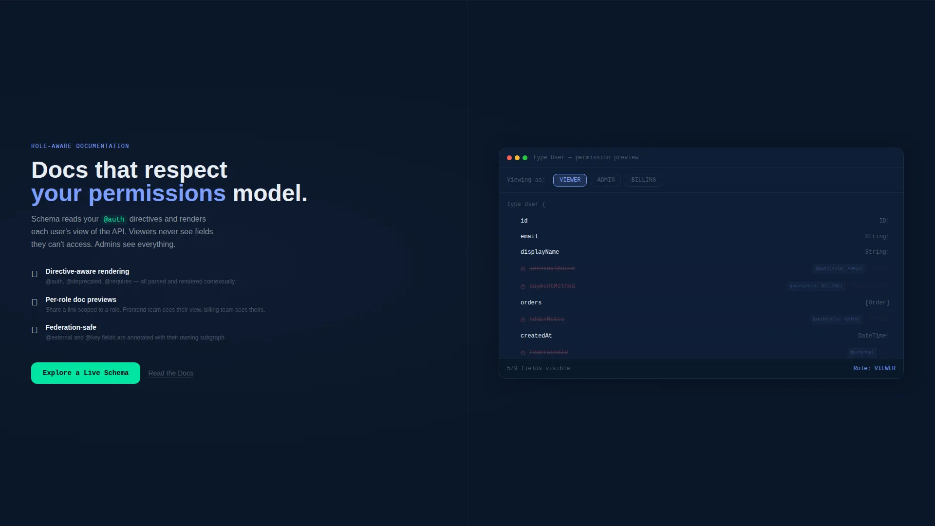
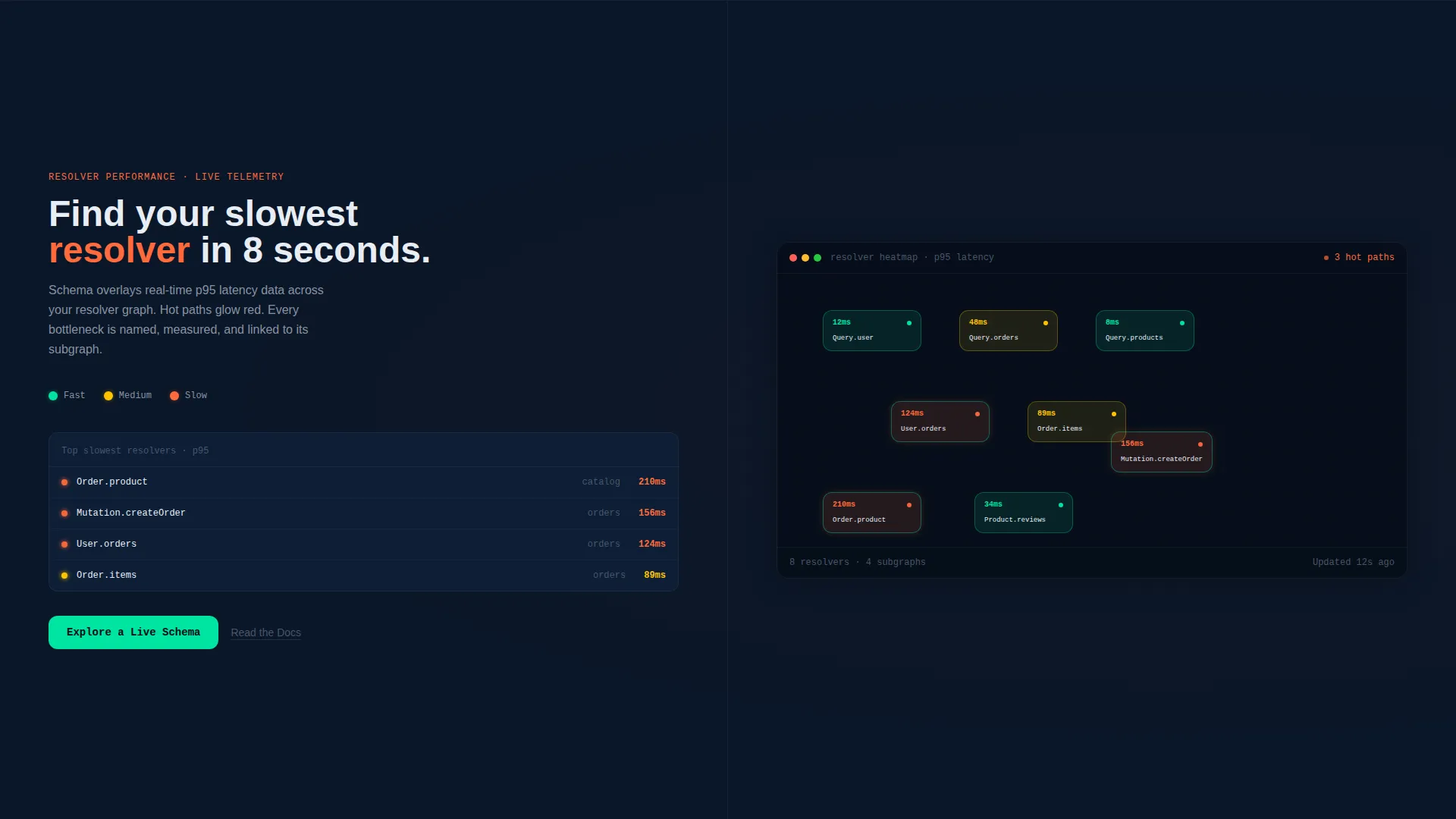
- Scrolling evidence sections that pair benchmark stat blocks with contextual feature previews including schema diff, permissions overlay, and latency heatmap visuals
- A persistent bottom bar call to action and a secondary "Read the Docs" text link path for engineers who want specs before committing
Feature list
This section describes the core capabilities built into the Schema template layout.
Interactive Schema Explorer Header
The left panel of the header displays a living schema explorer. Type nodes like User, Order, and Product appear with expandable fields, connected by relation lines. The electric green accent traces a query path from root to nested resolver, making the product's value visible before a single word is read.
Split-Screen Section Layout
Every scroll section follows the same 50/50 logic. The left side carries stat blocks and benchmark data that name the business case. The right side shows the corresponding feature in context. This pairing means the visitor always sees evidence alongside the claim.
Schema Diff View Section
One dedicated scroll section shows a schema diff panel that highlights version changes between releases. This gives visiting engineers immediate proof that the platform tracks schema evolution, not just the current state.
Permissions Layer Overlay Section
A separate section renders a permissions overlay that visually dims fields the current user role cannot access. This communicates a meaningful capability without requiring a paragraph of explanation.
Latency Heatmap Resolver Section
The final evidence section paints a latency heatmap across resolver nodes in the schema graph. It reads like a live diagnostic tool, reinforcing the sense that this documentation platform understands how the API actually performs.
Click-Through call to action System
The primary call to action, "Explore a Live Schema," appears in the header right panel and again as a persistent bottom bar after the second scroll section. No form, no fields. A secondary "Read the Docs" text link sits beneath each primary call to action for visitors who prefer specs first.
Page sections overview
| Section | Purpose |
|---|---|
| Split-Screen Header | Introduces the schema explorer and primary headline with the first call to action |
| Stat Block Row | Pairs benchmark data with the schema diff feature in context |
| Schema Diff Panel | Shows version-change tracking as a visual proof point |
| Permissions Overlay Section | Demonstrates field-level access control with a dimming visual |
| Latency Heatmap Section | Visualizes resolver performance across the schema graph |
| Persistent Bottom Bar | Reinforces the primary call to action after the second scroll section |
Design & branding system
The visual identity follows a Dashboard Pro theme built on a Midnight Blue color system. The palette is designed to feel like a well-configured code editor, dark and precise, where every highlighted element reads as intentional rather than decorative.
- Deep terminal navy (#0A1628) dominates all backgrounds, muted graphite (#1B2838) structures sidebar panels and cards, and cool schema-line gray (#8892A0) carries body text and secondary labels
- Electric query-green (#00E5A0) fires on hover states, active schema connections, call to action buttons, and any element that signals interactivity or user action
- Typography uses a monospace-influenced sans-serif that reinforces the IDE aesthetic without sacrificing readability for non-technical visitors
Mobile & speed optimization
The template is structured to translate the split-screen desktop layout into a clear, sequenced single-column flow on smaller screens. The visual hierarchy and call to action system remain intact regardless of viewport.
- The schema explorer panel and headline panel stack vertically on mobile so each communicates fully without competing for width
- The persistent bottom bar call to action stays visible on mobile scroll, keeping the conversion path accessible at every point in the page
How this template helps you convert
This template is built around a click-through conversion goal. Every layout decision is in service of one outcome: moving the visitor into the live sandbox before hesitation sets in.
- The header puts the product in motion immediately. The visitor reads documentation inside the schema explorer before they consciously register it as a product demo, reducing the psychological barrier to clicking.
- The escalating evidence structure, stat blocks followed by diff views, permissions overlays, and heatmaps, builds authority with each section so that by the time the persistent call to action reappears, inaction feels like the more expensive choice.
Other information about this template
This template is categorized under Documentation and Support, specifically in the API Documentation subcategory with a focus on the GraphQL API Docs niche. It is designed for teams building or marketing GraphQL documentation platforms and developer tooling products.
- The template style is Split Screen (50/50), the theme is Dashboard Pro, the color system is Midnight Blue, the creative direction follows an Industry Report cadence, and the header concept is a Dashboard Preview
- The landing page direction is Click-Through, optimized for a single primary destination with no form friction
- This layout is well-suited for developer tooling products, GraphQL platform marketing, and internal API portal pages where the audience is technical and skeptical of vague claims
Theme
Dashboard Pro
Creative direction
Industry Report
Color system
Midnight Blue
Style
Split Screen (50/50)
Direction
Click-Through
Page Sections
Interactive Schema Explorer Panel
50/50 Split-screen Layout
Escalating Evidence Scroll Sections
No-form Click-through Call to Action System
Dashboard Pro Dark Theme
Monospace-influenced Typography
Related questions
Who is this template designed for?
Can I adapt the schema explorer visuals for my own API types?
Does the template include a form or sign-up flow?
What makes the split-screen layout effective for a technical audience?
Is the persistent bottom bar call to action included in the template?



