Serverless Enterprise Software Advanced Professional Website Template
Schema is a serverless MDM (Mobile Device Management) landing page template built for enterprise IT and security teams. It uses a Dashboard Pro aesthetic with a Void and Violet color system to present live-style fleet metrics, a modular capability card grid, and a single low-friction call to action. The result feels like mission control, not a brochure.
by Rocket studio
Quick summary
Schema is a single-page landing page template for a serverless MDM platform. It opens with a live-metrics header displaying fleet health data, then flows into a modular card grid showcasing core capabilities. The Void and Violet color system gives every section a clinical, data-forward identity that speaks directly to IT directors, security leads, and DevOps engineers.
Who this template is for
This template is built for technical product teams and growth marketers who need to convert a skeptical, infrastructure-savvy audience. It is designed for people who know their buyers read spec sheets, not sales decks.
- IT directors at mid-market SaaS companies managing hundreds or thousands of scattered endpoints
- Security leads at healthcare networks who need to demonstrate policy compliance at a glance
- DevOps engineers tired of patching together multiple device management tools to get a working workflow
What problem this template solves
Legacy MDM marketing pages ask visitors to fill out a form before they see anything useful. Technical buyers leave immediately. Schema solves this by leading with proof: real fleet metrics come first, interactive capability cards come second, and the call to action only appears after the visitor has already evaluated the product.
- Removes friction by placing live-style metrics before any request for information
- Replaces passive marketing copy with interactive capability cards that let engineers self-select what matters to them
- Presents a persistent comparison row that shows selected features against common legacy MDM pain points
What you get with this template
You get a fully structured, single-page landing page built around a modular card grid layout and a Dashboard Pro visual theme. Every section is purposeful and conversion-oriented, with a sticky header and unified call to action throughout.
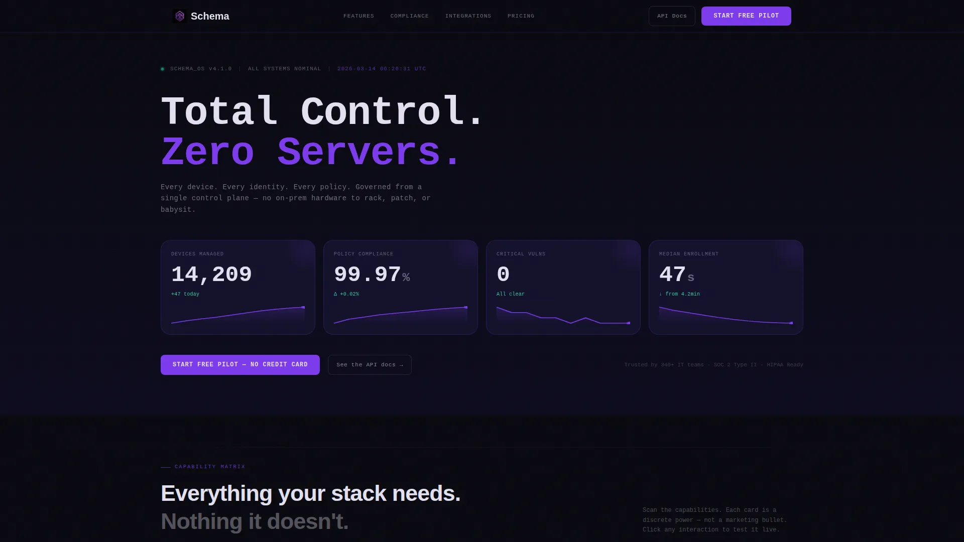
- A live-stats header section with oversized phosphor-white metric numbers and sparkline trails inside individual cards
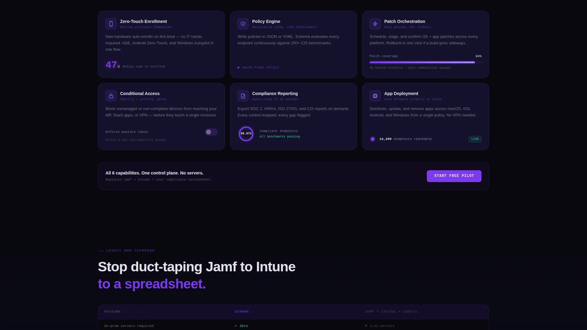
- Six modular capability cards covering Device Enrollment, Policy Engine, Patch Orchestration, Conditional Access, Compliance Reporting, and Zero-Touch Deployment
- A persistent bottom comparison row and two call-to-action variants: a primary "Start Free Pilot" button and a secondary "See the API docs" text link
Feature list
This template ships with purpose-built sections and interactive components designed for a technically demanding audience. Each element earns its place by serving the visitor's evaluation process.
Live Fleet Metrics Header
The header presents four oversized stat cards frozen mid-heartbeat: 14,209 devices managed, 99.97% policy compliance, 0 critical vulnerabilities, and a 47-second median enrollment time. Numbers sit in phosphor white on deep-interstellar card surfaces with subtle sparklines trailing behind each figure. A single violet line of copy reads "Zero servers. Total control." There is no hero illustration; the data carries the full visual weight.
Modular Capability Card Grid
Six uniform-size capability cards form the main content body. Each card isolates a discrete platform power and includes a micro-interaction: a toggle that flips, a policy tree that expands, or a donut chart that fills on interaction. Visitors can scan and compare capabilities the way an engineer reads a spec sheet.
Persistent Comparison Row
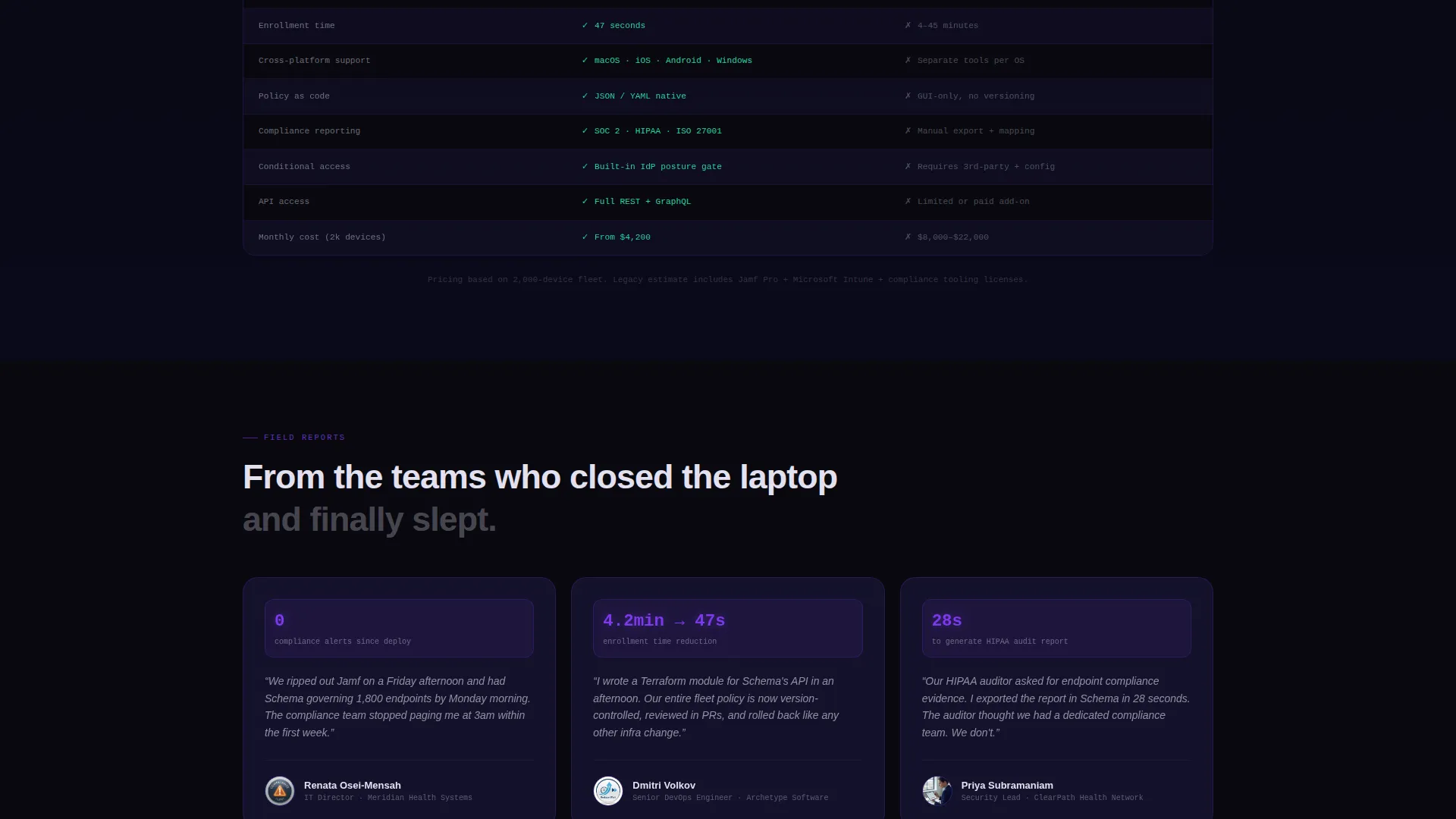
A fixed row at the bottom of the card grid tallies the capabilities a visitor has engaged with and maps them against common legacy MDM pain points. This keeps the value proposition visible without interrupting the scan-and-compare flow.
Sticky Header with Unified Call to Action
The sticky header persists across the full scroll depth and always surfaces the "Start Free Pilot" button. No credit card is required and no form appears on this page, keeping friction close to zero throughout the visit.
Secondary API Docs Link
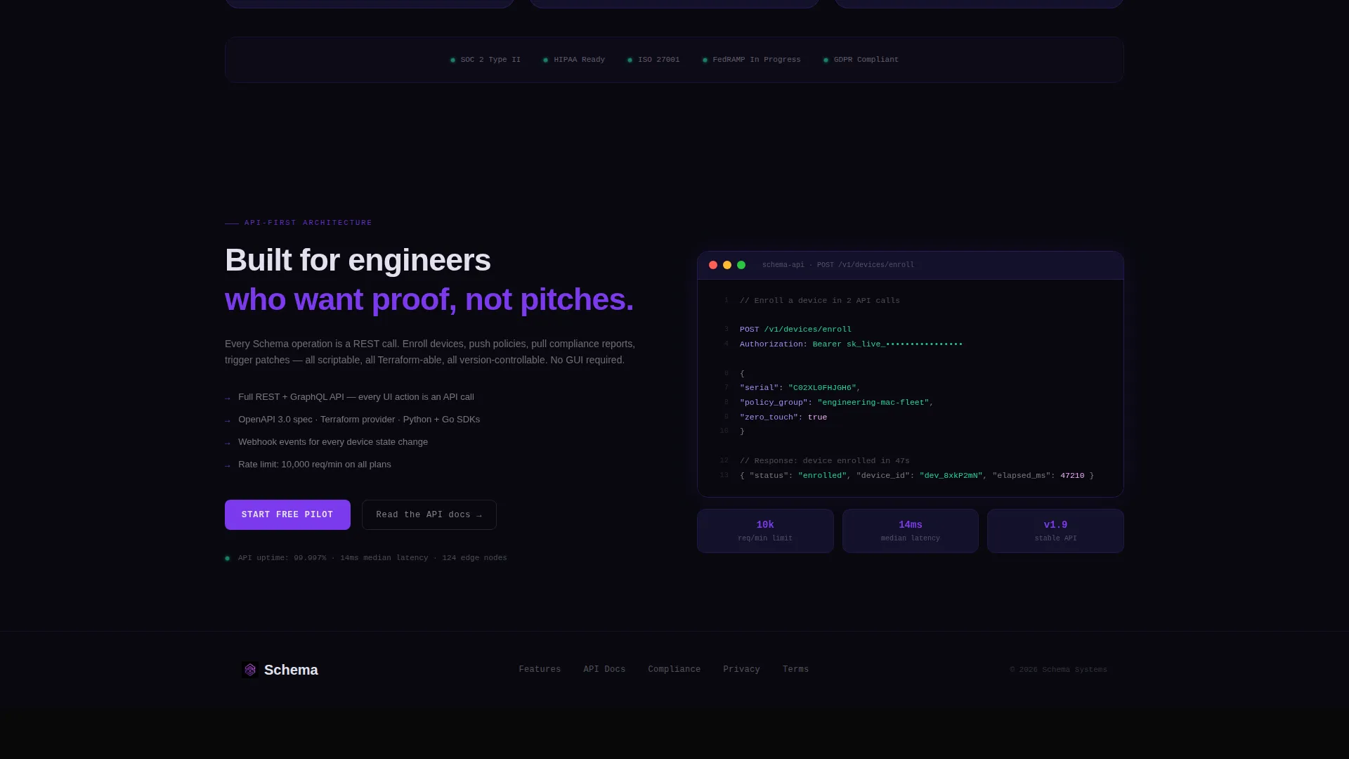
A secondary text link labeled "See the API docs" runs alongside the primary call to action. It catches the engineer who needs technical proof before committing, giving them an exit path that still moves them forward in the evaluation.
Void and Violet Interactive Elements
Toggles, buttons, and progress rings all pulse in electric violet (#7C3AED) against the void-black background (#09090F). Card borders are 1px violet-tinted and brighten on hover. Every clickable surface is visually unmistakable without relying on explanatory labels.
Page sections overview
| Section | Purpose |
|---|---|
| Live Metrics Header | Opens with real fleet health stats to establish trust immediately |
| Capability Card Grid | Lets visitors scan and self-select the features most relevant to them |
| Micro-interaction Cards | Makes each capability tangible through toggles, trees, and charts |
| Persistent Comparison Row | Maps selected features against legacy MDM weaknesses at a glance |
| Sticky call to action Header | Keeps "Start Free Pilot" visible at every scroll depth |
| Secondary Docs Link | Gives technical visitors a proof path before they commit |
Design & branding system
The visual identity follows a Dashboard Pro theme built on the Void and Violet color system. Every color choice reinforces a clinical, data-forward atmosphere that technical buyers associate with production-grade infrastructure tools.
- Core palette: absolute void black (#09090F) for backgrounds, deep interstellar (#13112A) for card surfaces, electric violet (#7C3AED) for interactive elements and accent glows, and cool phosphor white (#E2E0F0) for text and data labels
- Card treatment: 1px violet-tinted borders that brighten on hover, with content appearing to float against the dark background like status indicators on a live rack
- Interactive surfaces: toggles, buttons, and progress rings render in #7C3AED, making every actionable element immediately recognizable without extra visual noise
Mobile & speed optimization
The modular card grid layout is designed to reflow cleanly across viewport sizes. Uniform card dimensions make responsive stacking predictable and consistent without requiring custom breakpoint logic for every component.
- Cards use a uniform grid structure that adapts naturally to narrower screens without losing visual hierarchy
- The sticky call-to-action header remains functional on mobile, keeping the primary conversion action accessible at every scroll position
- Micro-interactions are contained within individual card boundaries, so they degrade gracefully when hover states are unavailable on touch devices
How this template helps you convert
Schema is built around a deliberate sequence: prove value first, reveal capability second, and only then invite action. This order matches how a technical buyer actually evaluates infrastructure software.
- The metrics header establishes credibility in the first viewport without asking for anything in return, so the visitor starts the session already trusting the numbers.
- The interactive capability card grid lets engineers engage with specific features at their own pace, replacing passive reading with active evaluation that builds confidence before the click.
- The zero-friction call to action, "Start Free Pilot" with no credit card and no on-page form, removes the final barrier at the exact moment the visitor has already decided this replaces their current stack.
Other information about this template
Schema is a strong fit for any serverless MDM or cloud-native device management product that needs to speak credibly to a technical enterprise audience. It works equally well for initial product launches and competitive re-positioning campaigns.
- The template style is Card Grid (Modular), which suits products with multiple discrete capabilities that buyers compare side by side
- The header concept is Stats and Metrics, making it suitable for any platform that can surface real or representative operational data
- The creative direction is Feature Matrix, meaning the layout rewards scanners and self-directed evaluators rather than guiding visitors through a linear narrative
- The landing page direction is Click-Through, so the page is optimized to earn a single confident click rather than capture a lead form on the first visit
Theme
Dashboard Pro
Creative direction
Feature Matrix
Color system
Void & Violet
Style
Card Grid (Modular)
Direction
Click-Through
Page Sections
Live Fleet Metrics Header
Modular Capability Card Grid
Persistent Comparison Row
Sticky Zero-friction Call to Action
Secondary API Documentation Link
Void and Violet Interactive System
Related questions
Does this template include a lead capture form?
Can I replace the default metrics with my own product data?
How does the persistent comparison row work?
Is the modular card grid flexible if I have fewer than six capabilities?
Who is the secondary API docs link aimed at?



