Architecture Firm Software Appointment Booking Website Template
Schematic is a split-screen landing page template built for architecture firm appointment scheduling platforms. It pairs a dark, terminal-style visual identity with a Spec Sheet comparison layout, showing the old scheduling chaos against a teal-lit, phase-aware alternative. Studio principals, office managers, and associate architects get a focused, conversion-ready page that earns every click with evidence.
by Rocket studio
Quick summary
Schematic is a single-page, split-screen landing page template designed for architecture firm scheduling software. It uses a Data Command visual theme, a Teal Catalyst color system, and a Comparison/Versus layout to move visitors from recognizing their scheduling pain to signing up. Every section is structured like a technical data sheet, not a marketing brochure.
Who this template is for
This template is built for scheduling platforms targeting architecture and design practices. It speaks directly to the people inside those firms who feel scheduling friction every single day.
- Studio principals managing fifty or more active projects simultaneously
- Office managers coordinating contractors, planning officers, and client calls at once
- Associate architects losing hours each week to email threads just to confirm a crit session
What problem this template solves
Architecture firms do not run on general calendars. They run on phases, site visits, design reviews, and planning authority meetings. Generic scheduling tools ignore that context entirely, and the cost shows up in double-bookings, no-shows, and wasted time.
- No clear way to tie appointments to specific project phases or milestones
- Consultation intake, contractor coordination, and internal reviews all handled separately
- Missed follow-ups and no automated confirmation for site visits
What you get with this template
This template gives you a fully structured, dark-themed landing page ready to present your scheduling platform to architecture professionals. It is built around a single conversion goal with multiple entry points and no layout ambiguity.
- A split-screen 50/50 comparison layout with left-side "old way" panels and right-side platform benefit cards
- A persistent mobile bottom bar repeating the primary call to action after every third comparison row
- A three-field intake form collecting firm size, current scheduling tool, and work email
Feature list
This section covers the core layout and design capabilities delivered inside the Schematic template. Each feature is drawn directly from the template brief.
Split-Screen Comparison Layout
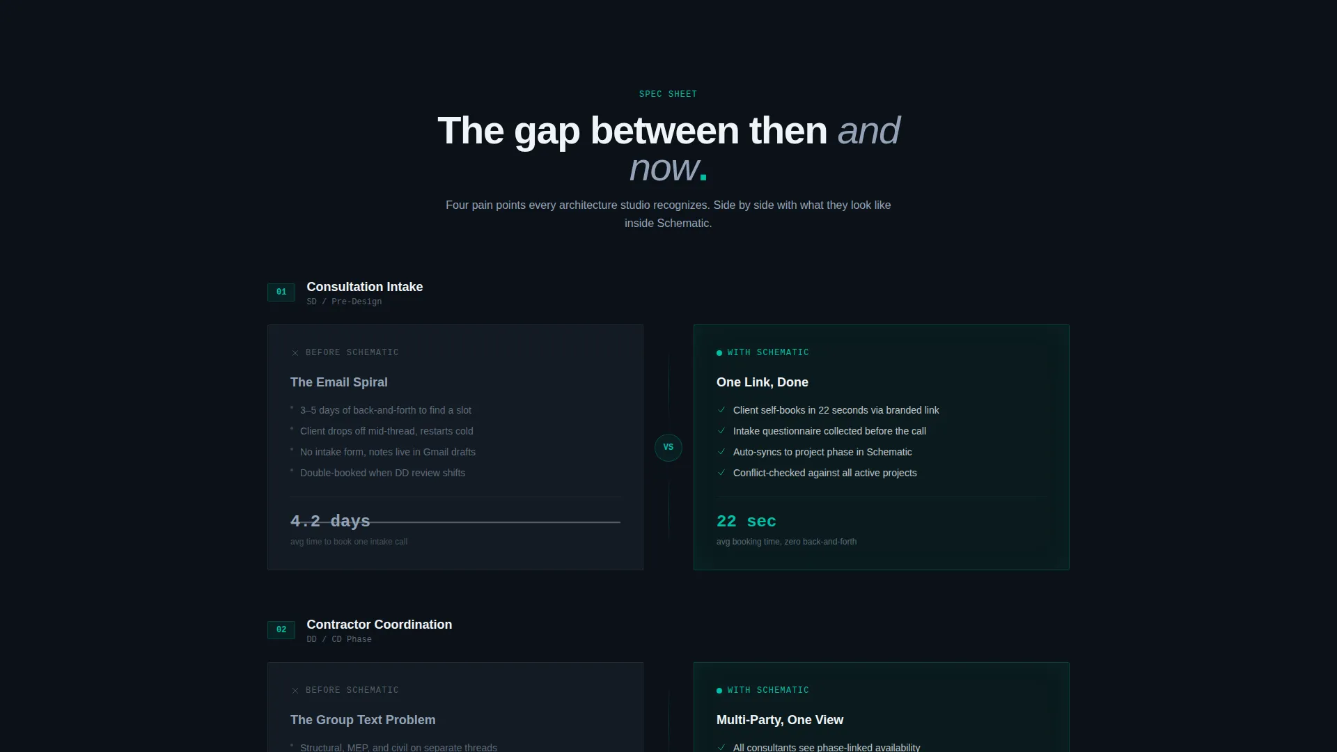
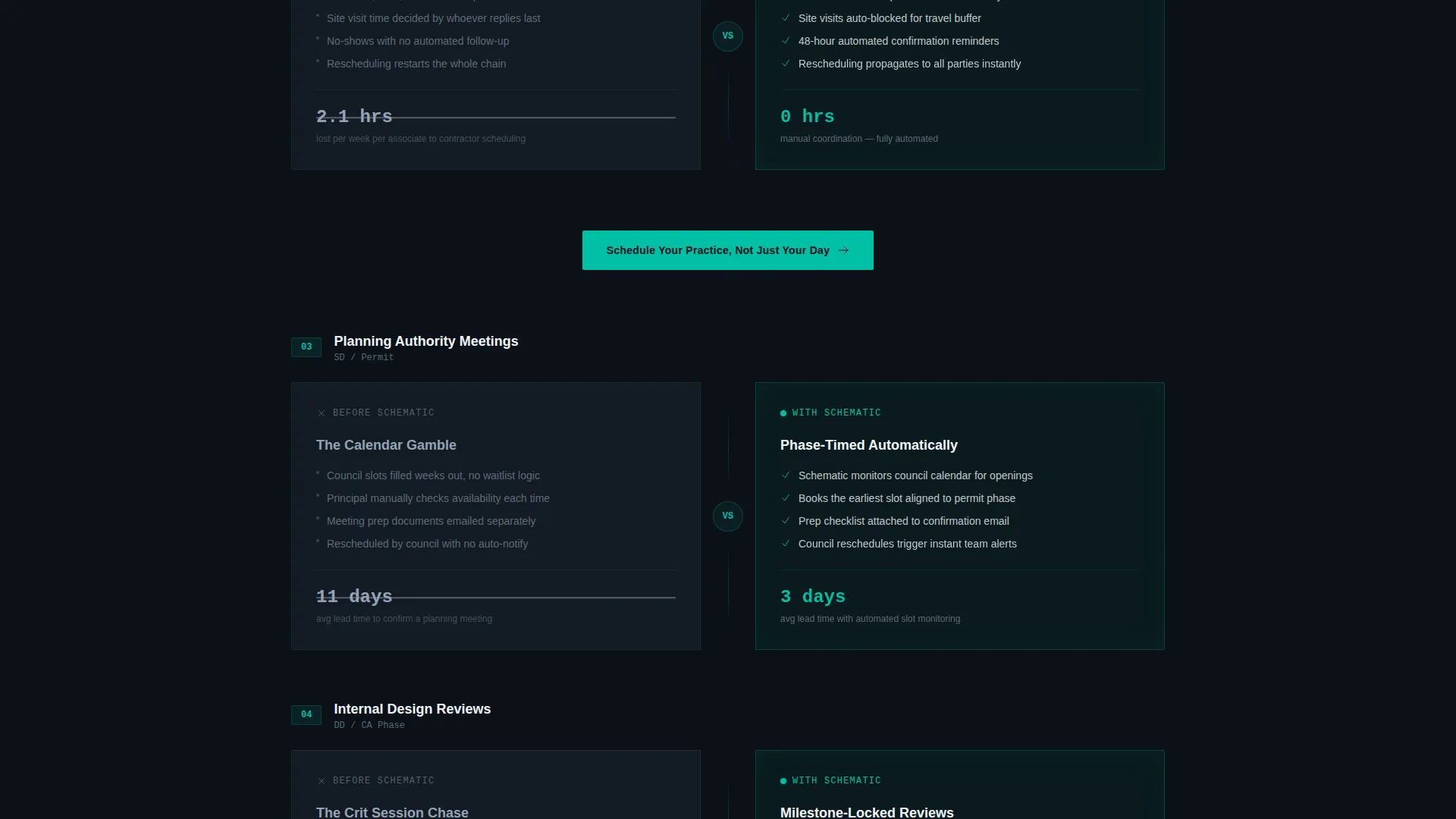
Every scroll section is built as a side-by-side panel. The left column presents the old scheduling approach in muted slate with crossed-out metrics. The right column shows platform-powered results in teal-lit cards with real, specific numbers like "average booking time: 22 seconds."
Dark Full-Bleed Hero Header
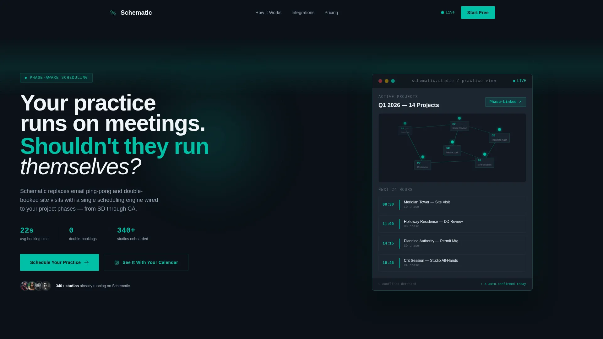
The header stretches edge to edge in deep void black. A single glowing scheduling interface sits centered, with teal nodes connected by faint luminous lines representing appointments linked across project phases. The headline fades in on load for immediate impact.
Phase-Linked Comparison Sections
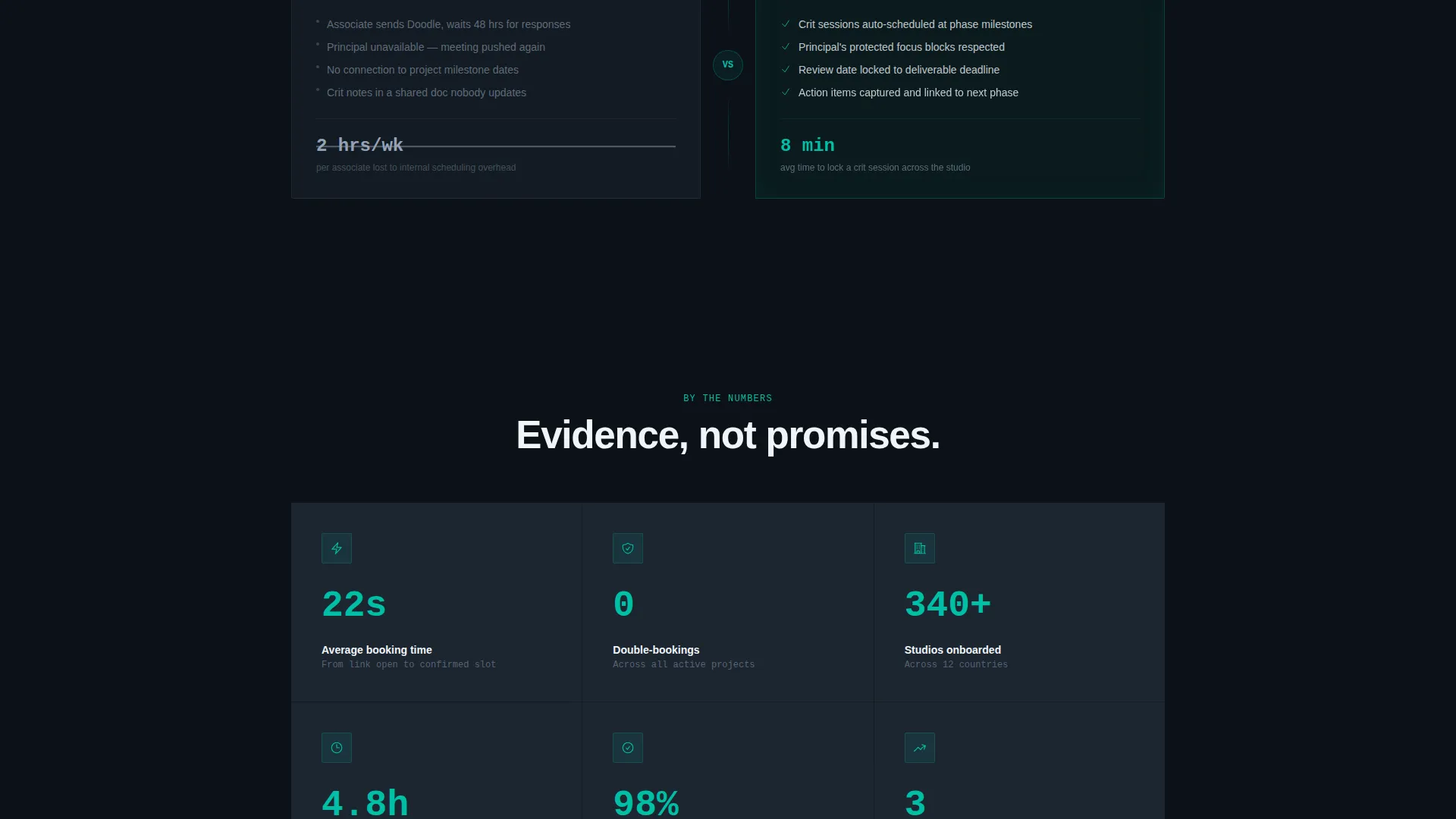
Each scroll row targets a specific architect pain point: consultation intake, contractor coordination, planning authority meetings, and internal design reviews. The comparison format wins with evidence rather than emotional appeals, making the gap between old and new feel concrete.
Dual Call-to-Action Architecture
The primary call to action, "Schedule Your Practice, Not Just Your Day," appears in the header and repeats after every third comparison row. A secondary path, "See It With Your Calendar," prompts a live demo connection. Both paths are clearly placed and never compete visually.
Qualified Three-Field Intake Form
The signup form asks only three things: firm size using a four-tier selector, current scheduling tool, and work email. This keeps friction low while capturing data that qualifies leads by practice scale before they enter the funnel.
Persistent Mobile Bottom Bar
On mobile, the primary call-to-action bar stays fixed at the bottom of the screen throughout the scroll. Visitors never have to hunt for the next step, no matter how deep into the comparison rows they travel.
Page sections overview
| Section | Purpose |
|---|---|
| Dark Hero Header | Introduces the platform with a glowing scheduling interface and a fade-in headline |
| Consultation Intake Row | Compares generic intake chaos against phase-aware booking in 22 seconds |
| Contractor Coordination Row | Shows double-booking problems versus phase-linked rescheduling tools |
| Planning Authority Row | Contrasts missed planning meetings with automated site-visit confirmations |
| Internal Review Row | Highlights email ping-pong costs versus instant crit-session locking |
| Primary call to action Block | Repeats the main call to action after every third comparison section |
| Three-Field Signup Form | Captures firm size, current tool, and work email with minimal friction |
| Mobile Bottom Bar | Keeps the primary call to action persistent throughout the mobile scroll |
Design & branding system
The visual identity follows a Data Command theme built on the Teal Catalyst color system. Every color decision serves a function: backgrounds recede, teal activates, slate supports, and white signals.
- Deep void black (#0B1117) and architectural charcoal (#1C2530) form all backgrounds, keeping the layout dark and focused like a cockpit instrument panel
- Catalyst teal (#00BFA6) drives every interactive element including buttons, toggle states, calendar pins, and hover glows, while cool slate (#94A3B8) handles secondary labels and supporting metrics
- Bright signal white (#F0F4F8) is reserved for primary headlines and body type, ensuring maximum contrast against the dark background range
Mobile & speed optimization
The Schematic template is structured to perform clearly on mobile screens without sacrificing the Spec Sheet layout logic that makes the desktop experience compelling.
- The split-screen comparison panels reflow into a stacked single-column layout on smaller screens, preserving the left-versus-right narrative in a vertical read order
- The persistent bottom bar keeps the primary call to action in reach throughout the entire mobile scroll without interrupting the comparison content
How this template helps you convert
The entire page is engineered as a Comparison/Versus conversion engine. It does not ask visitors to trust a headline. It shows them the cost of their current process and then immediately presents the alternative.
- The left-column "old way" panels use muted slate and crossed-out metrics to make the pain of generic scheduling feel tangible before a single product claim is made
- The right-column teal-lit cards respond with specific, credible data points that contrast sharply against the left side, building a cumulative case row by row until the decision feels obvious
- The three-field form and dual call-to-action structure remove hesitation at the moment of highest intent, offering both a direct signup path and a lower-commitment demo option
Other information about this template
Schematic is part of a broader family of dark-themed, data-forward templates designed for software platforms serving specialized professional audiences. A few additional details worth knowing before you build with it.
- The template is categorized under Technology and the Architecture Firm Software subcategory, making it well-suited for niche scheduling platforms targeting design professionals
- The Spec Sheet creative direction and Data Command theme are consistent with how technical buyers in architecture practices prefer to evaluate tools: evidence first, aesthetics second
- The color system is fully documented in the brief, making it straightforward to apply your own brand teal or substitute palette values while keeping the instrument-panel contrast logic intact
- The page is structured as a single-page landing flow, not a multi-page site, so all conversion paths resolve within one scrollable experience
Theme
Data Command
Creative direction
Spec Sheet
Color system
Teal Catalyst
Style
Split Screen (50/50)
Direction
Comparison/Versus
Page Sections
Split-screen Comparison Layout
Dark Full-bleed Hero Header
Phase-focused Comparison Sections
Dual Call-to-action Structure
Qualified Three-field Intake Form
Persistent Mobile Bottom Bar
Related questions
Who is this landing page template designed for?
Can I customize the color palette in this template?
What information does the three-field signup form collect?
How does the dual call-to-action structure work?
Is this a single-page template or a multi-page site?



