Specialist AI for Fitness Professional Website Template
Score is a bold brutalist fitness AI lead scoring landing page template built for gym sales teams and franchise operators. It delivers a Carbon Fiber industrial design with electric green data pulses, a live-animating code snippet hero, a modular stats-first card grid, and a two-field freemium signup form. Every section leads with a number, not a story.
by Rocket studio
Quick summary
Score is a single-page, card grid landing page template built for a fitness AI lead scoring platform. It follows a Bold Brutalist design system using a Carbon Fiber color palette. The page leads with an animated code snippet hero, floods the middle with oversized metric cards, and closes with a two-field freemium signup form. No stock photography. Every element performs.
Who this template is for
This template is built for operators and teams working inside the boutique fitness market who find unqualified leads eating their time. The target audience skews toward data-driven decision-makers who embrace a no-nonsense visual approach over polished marketing fluff.
- Boutique fitness franchise owners managing twelve or more locations who need faster sales decisions
- Gym CRM managers drowning in unqualified contacts who need AI-scored priorities before the first call
- Fitness marketing agencies that need to deliver measurable ROI proof beyond impressions and clicks
What problem this template solves
Most gym sales pages rely on guesswork. They feature smiling athletes and vague copy. This page strips all of that away. The design reflects the urgency of real sales floors, where every second spent on the wrong lead is a missed close. A brutalist landing page design focused on a single conversion goal removes clutter and distractions, directing every visitor toward one action.
- Sales teams waste time calling cold leads while warm prospects go untouched
- Franchise operators find no clear way to prioritize outreach across multiple locations
- Marketing agencies struggle to create proof of AI performance that skeptical clients can see instantly
What you get with this template
You get a fully structured, section-led landing page built around evidence and conversion. The page is designed to overwhelm visitors with proof from every angle simultaneously, the way a scoreboard does not need narrative. Minimalist data visualization distills insights into clear, actionable takeaways, and each card reflects a single metric that stands on its own.
- An animated hero section with a live-ticking
score_lead()code snippet and a brutalist oversized headline - A modular bento-style stats grid with alternating proof-point cards, platform screenshots, and integration logo hover states
- A two-field freemium signup form paired with a sandbox demo path for skeptical visitors
Feature list
This template is built with a focused set of components. Each one serves a specific role in the page experience.
Live-Animating Code Snippet Hero
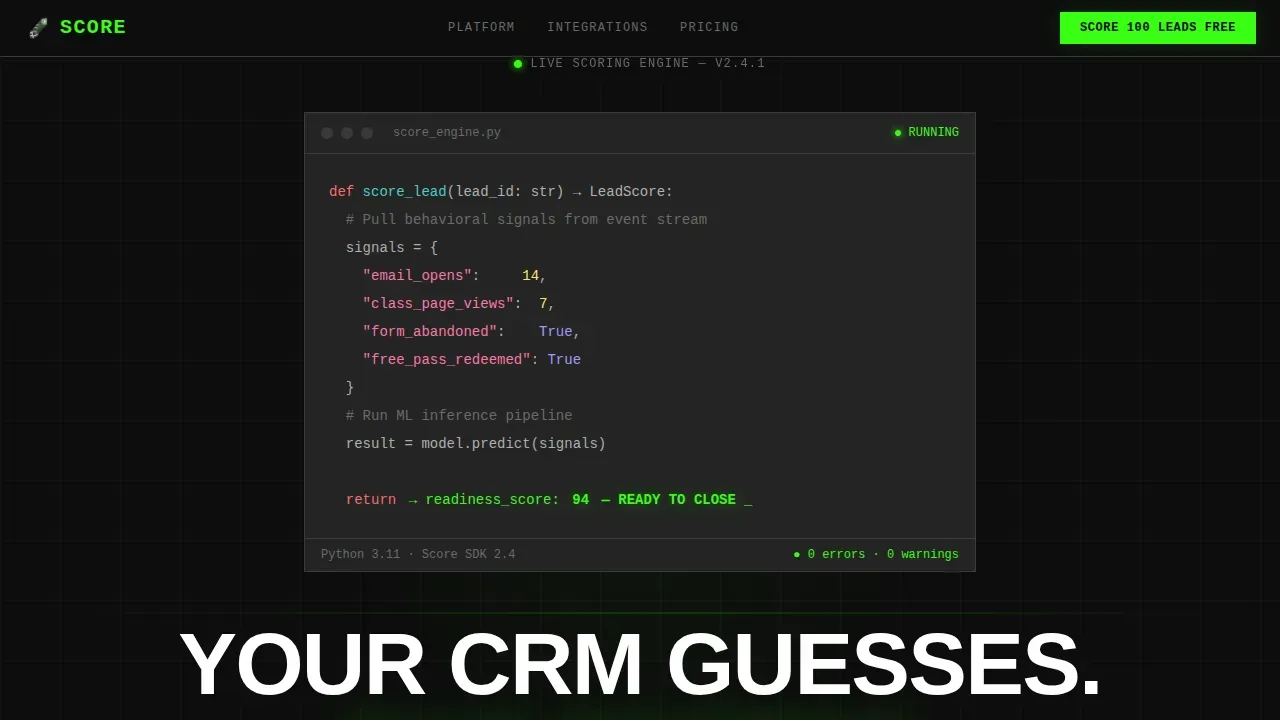
The header opens with a monospaced, syntax-highlighted pseudo-code block floating center-screen. Numbers tick in real time, a readiness score recalculates, and the output line glows electric green. The code is the product, and the interface makes that unmistakable from the first scroll.
Stats-First Modular Card Grid
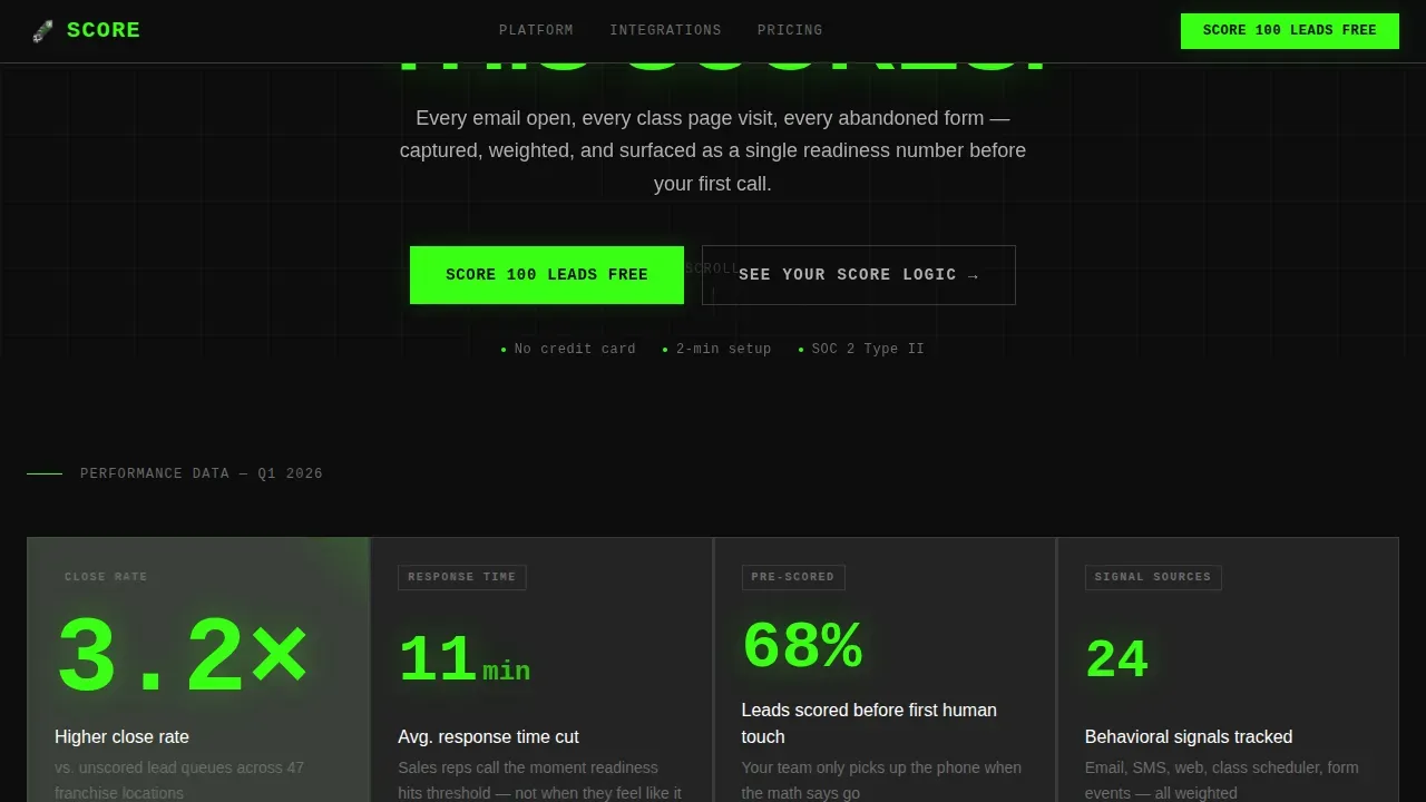
Every card in the bento grid leads with a single oversized metric before any explanation. Cards alternate between customer result figures, redacted platform screenshots, and integration logo tiles. Visual simplicity leads to faster cognition, allowing visitors to find the proof they need without filtering out noise.
Sandbox Score Demo Path
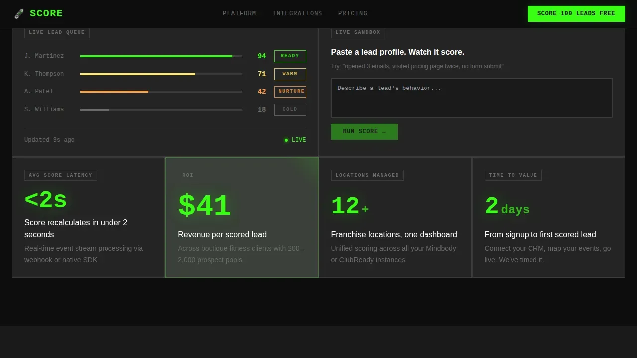
A secondary call-to-action links visitors to a live sandbox where they paste a fake lead profile and watch the AI score it in real time. This path converts skeptics into believers before they ever hand over a work email. Interactive content like this engages users 47% longer than static pages.
Two-Field Freemium Signup Form
The signup card asks only for a work email and a connected CRM platform chosen from a dropdown. Nothing else. A high-contrast form appears starkly against the carbon black background, keeping the design focused and the friction minimal.
Persistent Scroll-Triggered call to action Bar
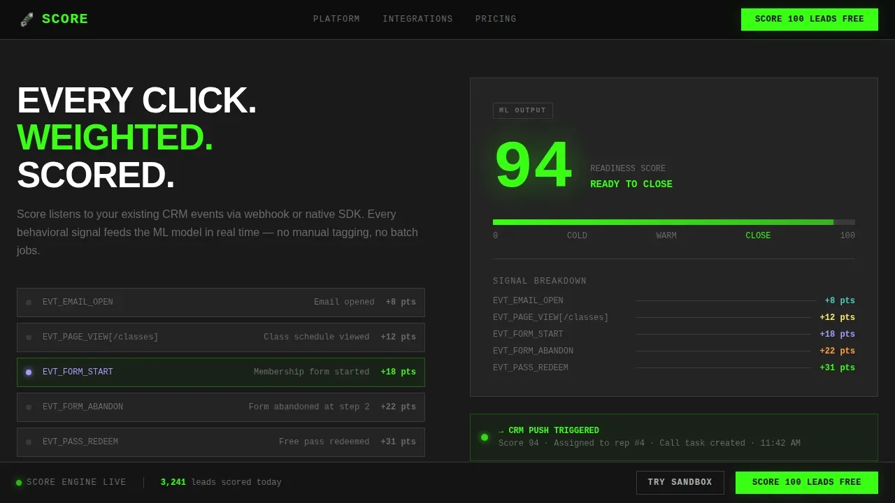
After 40% scroll depth, a bottom bar appears carrying the primary call-to-action in electric green. Scroll-triggered counter animations fire on card entry using Intersection Observer. The page stays working even as visitors move through each section.
Integration Logo Hover States
Platform logos render in grayscale by default and snap to full color on hover. This design choice reflects the brutalist principle that decoration earns its place only when it performs. The hover interaction delivers a clear signal of compatibility without cluttering the background.
Page sections overview
| Section | Purpose |
|---|---|
| Hero Code Snippet | Opens with animated pseudo-code block, brutalist headline, and primary call to action |
| Stats Bento Grid | Delivers oversized metric cards as standalone proof points |
| How It Works | Shows signal capture to ML scoring to CRM push as a visual flow |
| Integrations Row | Displays platform logos in grayscale with color-on-hover interactions |
| Testimonials and Signup | Combines metric-led social proof cards with two-field freemium form |
| Developer Minimal Footer | Closes with a GitHub-style minimal footer pattern |
Design & branding system
The design reflects a Carbon Fiber industrial identity. Bold visual styles and minimalistic aesthetics drastically improve usability and engagement, and this template embraces that fully. The base color scheme consists of deep carbon black punctuated by a single high-contrast electric green reserved for scores, calls-to-action, and live data pulses. Massive, bold, condensed fonts are used for headlines, and JetBrains Mono handles all numbers and code. The page avoids gradients and decorative gradients entirely, focusing instead on raw engineering energy.
- Colors:
#0D0D0Dbackground,#242424card surfaces,#3A3A3Aborders,#B0B0B0body text,#39FF14electric green for active elements - Typography: JetBrains Mono for code and numeric displays, Manrope for headlines and body copy
- No stock photography, no gradients, no decorative illustrations; every surface exists because it performs
Mobile & speed optimization
The template is built desktop-first to match the working environment of CRM and sales teams. It scales to mobile with responsive card stacking. Animations use CSS transforms for GPU acceleration and Intersection Observer for scroll-triggered entry, keeping the experience smooth without heavy asset loads. Pages that load quickly and present content clearly tend to reduce bounce rates and increase conversions.
- Desktop-first layout with responsive card grid that stacks cleanly on smaller screens
- Staggered card reveal animations built with Intersection Observer to keep interactions smooth
- Score pulse and counter animations use CSS transforms, keeping the page fast and the visuals sharp
How this template helps you convert
This template is built around a single conversion goal: getting a qualified visitor to sign up with minimal friction. The page earns trust before it asks for it. Data visualization increases information retention by 80%, and every metric card is designed to land that way.
- The sandbox demo path lets visitors prove the AI scoring logic to themselves before entering an email, turning skeptics into confident signups
- The persistent call to action bar appears after 40% scroll depth, keeping the primary action visible without interrupting the reading experience
- The two-field signup form reduces friction to its absolute minimum, asking only for what is needed to launch the free scoring trial
Other information about this template
This template is part of a broader fitness AI and B2B SaaS design category. It reflects a growing market direction where AI-driven personalization has become a key part of modern web strategies. Companies effectively using AI personalization find 5 to 8 times return on marketing spend, making a clear, performance-first page crucial for communicating that value. The Score bold brutalist fitness AI lead scoring landing page template is the way to put that proof front and center.
The raw, as-is design communicates a no-nonsense approach that builds trust with people who are skeptical of marketing gimmicks. The aesthetic resonates with tech-savvy operators who value authenticity. Customer quotes in testimonials are presented in plain, unstyled boxes, which reflects the brutalist approach throughout. 75% of visitors form their judgment of a company's credibility based on its web design, which means every visual decision in this template carries weight.
- Built for English-language, USD-denominated, US date-format markets
- Localization-ready structure with clearly separated text blocks for easy copy swaps
- Footer follows a GitHub Developer Minimal pattern, keeping the brand signal clean and developer-credible
- Instructions for customizing the card grid and color tokens are straightforward, with no advanced coding required
Theme
Bold Brutalist
Creative direction
Stats-First Impact
Color system
Carbon Fiber
Direction
Freemium/Trial
Page Sections
Live-animating Code Snippet Hero
Stats-first Modular Card Grid
Sandbox Lead Score Demo
Two-field Freemium Signup Form
Persistent Scroll-triggered Call to Action Bar
Integration Logo Hover States
Related questions
Who is the primary target audience for this template?
Does the page include a live demo or sandbox experience?
What integrations are shown in the template?
Can I customize the color scheme or typography?
How many fields does the signup form include?



