Pharma AI Lead Scoring Bento Grid Landing Page
Score is a bold brutalist bento grid landing page built for a pharmaceutical AI lead scoring platform. It combines a live-feel product screenshot header, staggered animation cells, and a pinned app download call to action to show commercial pharma teams exactly which physicians to call next. The AI Iridescent color system makes every data point feel urgent and alive.
by Rocket studio
Quick summary
Score is a single-page bento grid landing page template designed for a pharmaceutical AI lead scoring platform. It opens with a full-bleed product screenshot, moves through animated proof-point cells, and closes with a pinned "Get Score Access" download bar. The template speaks directly to pharma commercial teams who need their field force in the right office at the right time.
Who this template is for
This template is built for pharma commercial teams that move fast and need their technology to move faster. It fits product owners and marketing leads who want a launch-ready page that reflects the intelligence behind the platform.
- Commercial operations directors at mid-cap pharmaceutical companies managing large field territories
- Field force managers overseeing 200-rep territories who need prioritized physician call lists
- Brand leads launching specialty drugs into competitive therapeutic areas
What problem this template solves
Pharma field teams often walk into the wrong offices on the wrong days. They miss prescriber affinity shifts, lag behind formulary changes, and lose ground to competitors who act on better data. A landing page for this platform needs to communicate urgency and precision instantly.
- Reps lack a ranked, real-time view of which physicians to call before the week begins
- Brand teams struggle to show buyers the platform's intelligence before they commit to a download
- Generic software landing pages fail to convey the live, signal-watching nature of an AI scoring engine
What you get with this template
You get a fully structured bento grid landing page that mirrors the energy of a pharma launch war room. Every section is designed to demonstrate the platform's intelligence before the visitor reaches the call to action.
- A large-format product screenshot header with a brutalist headline stamped across the lower third
- Staggered animation bento cells that each fire a distinct proof point as the user scrolls
- A pinned floating download bar with a two-step app access flow and an in-browser demo path
Feature list
This template packs launch-grade visual storytelling into a tight, high-converting bento grid structure. Each feature below is drawn directly from the brief.
Full-Bleed Dashboard Header Cell
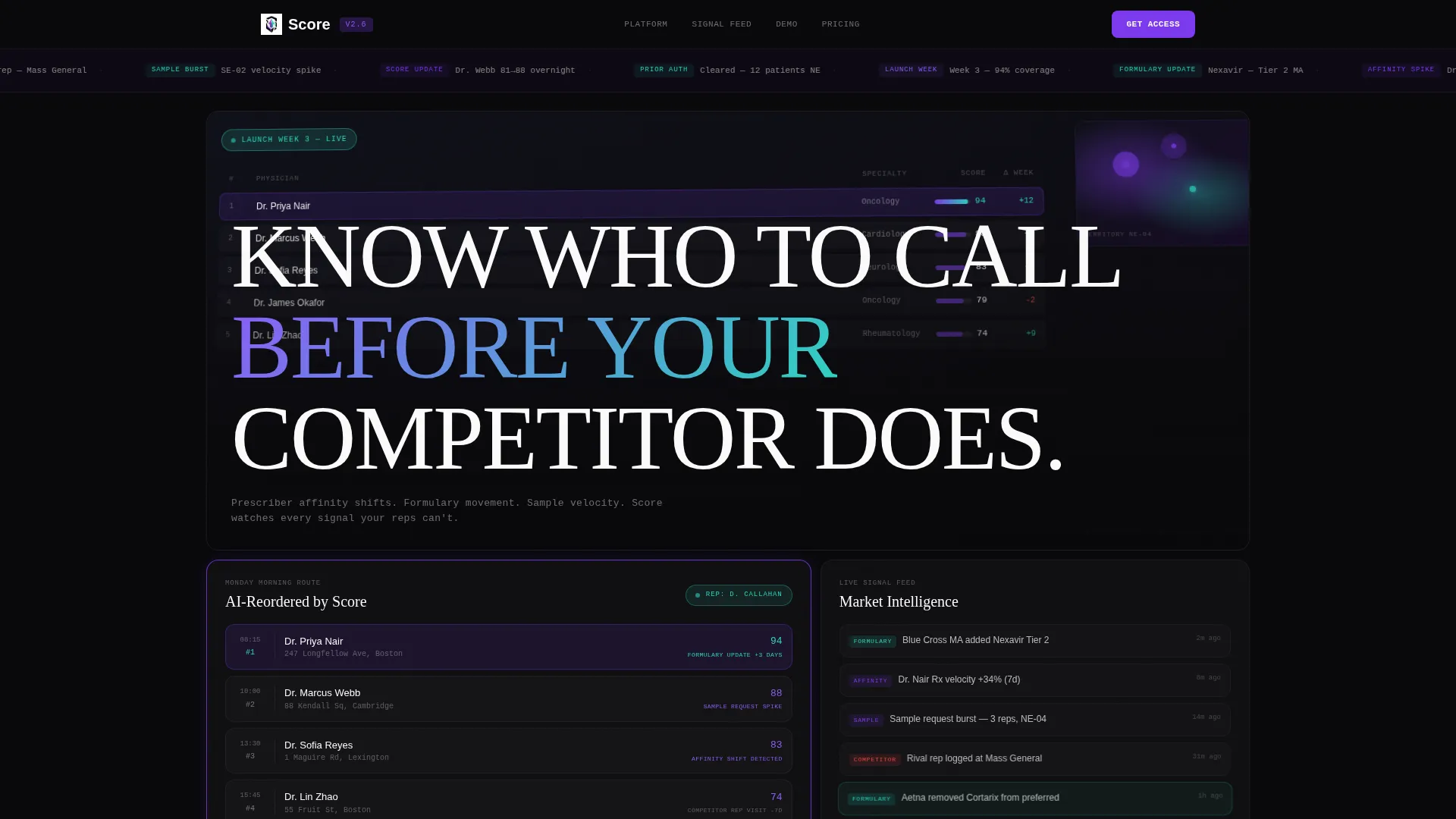
The top bento cell fills entirely with a product screenshot of the scoring dashboard mid-refresh. It shows a ranked physician list with affinity scores, a territory heat map with pulsing hotspots, and a "Launch Week 3" timer badge. The screenshot is cropped tight and rotated slightly on the z-axis for a dimensional, almost three-dimensional feel.
Brutalist Headline Typography
A 120-pixel, weight-900 white headline is stamped across the lower third of the header cell. The type is oversized and unkerned in the bold brutalist tradition, making the core value proposition impossible to miss on any screen size.
Staggered Animation Bento Cells
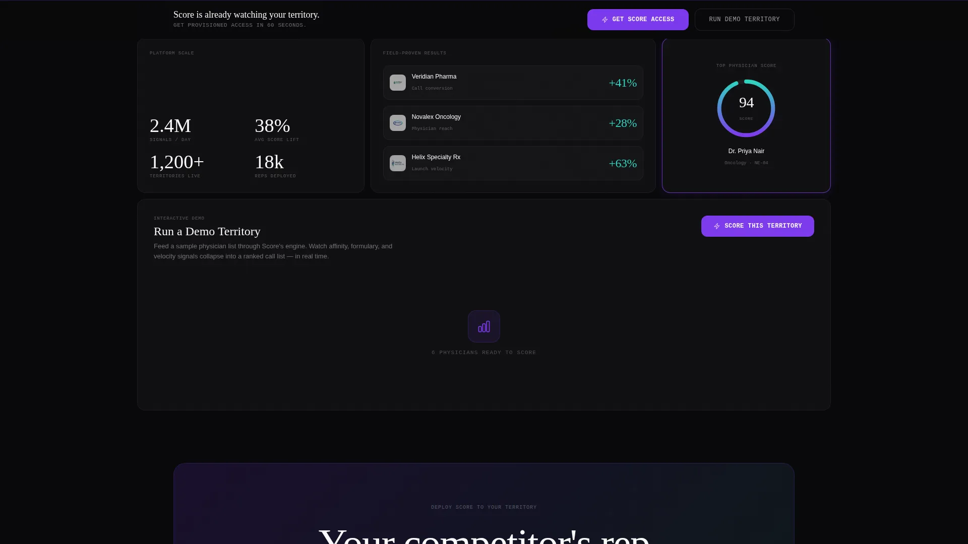
Each cell below the header detonates a different proof point in staggered scroll animation. One cell reorders a rep's morning route by AI priority. Another plays a looping micro-video of scores recalculating as a formulary update drops. A third stacks three customer logos alongside conversion lift percentages in brutalist numerals.
Dynamic Grid Behavior
The bento grid never fully settles. Cells resize, swap visual hierarchy, and pulse with violet borders as the user scrolls. This mimics the restless, always-rescoring tempo of the platform itself and keeps attention moving down the page.
Pinned App Download Bar
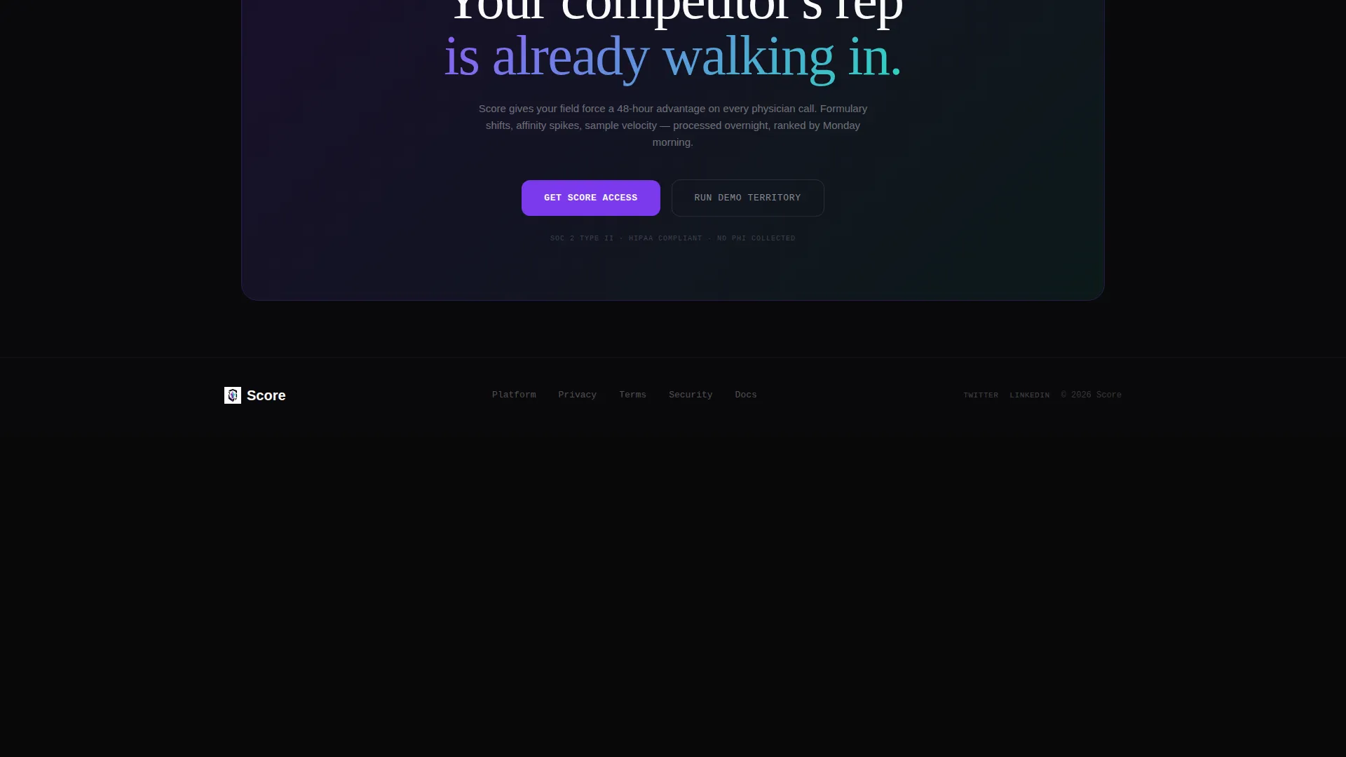
A floating bottom bar appears after the third scroll checkpoint. It anchors a two-step download flow: choose iOS or Android, then enter a corporate email for provisioned access. The bar stays visible without blocking content, making the call to action always reachable.
In-Browser Demo Territory Path
A secondary call to action lets visitors run a demo territory directly in the browser. A sample physician list feeds through the scoring engine in real time, so visitors experience the platform's logic before they ever tap the download button.
Page sections overview
| Section | Purpose |
|---|---|
| Dashboard Header Cell | Anchors page with product screenshot and brutalist headline |
| AI Score Indicators | Shows ranked physician affinity scores visually |
| Territory Heat Map | Displays pulsing regional hotspots and call priorities |
| Rep Route Cell | Demonstrates AI-reordered morning call schedule |
| Formulary Update Video | Loops live score recalculation on a formulary change |
| Social Proof Cell | Stacks customer logos with conversion lift numerals |
| In-Browser Demo | Lets visitors score a sample territory before downloading |
| App Download Bar | Pins two-step iOS and Android access flow at page bottom |
Design & branding system
The visual identity follows a bold brutalist theme powered by the AI Iridescent color system. Every color has a specific role in the page hierarchy, and the palette feels like a graphics processing unit rendering probability in real time.
- Void black (#09090B) dominates every grid cell background, keeping the interface dark and focused
- Shifting violet (#7C3AED) pulses through score indicators and progress rings to signal AI activity
- Holographic teal (#2DD4BF) marks interactive hover states and data spikes across the grid
- Searing white (#FAFAFA) sits heavy and oversized in brutalist type stacks with no kerning adjustments
Mobile & speed optimization
The bento grid layout is structured to translate its desktop hierarchy into a clean, scrollable single-column flow on smaller screens. Launch energy is preserved regardless of device, so the page feels fast and intentional on mobile.
- Staggered cell animations are timed to fire on scroll, keeping the experience smooth on touch devices
- The pinned download bar scales responsibly so it remains tappable without covering key content
- The in-browser demo territory path is accessible from mobile, letting field managers test the scoring engine on the go
How this template helps you convert
This template earns the download by showing the machine already working before the visitor reaches the call to action. Every scroll checkpoint builds confidence in the platform.
- The product screenshot header makes the scoring dashboard real and tangible from the first second, removing abstract doubt before any copy is read.
- Staggered proof-point cells demonstrate specific platform behaviors like route reordering and formulary-triggered rescoring, so buyers understand the product through experience rather than description.
- The in-browser demo territory path lets visitors feel the AI scoring engine before committing, turning a download decision into a confirmation of something they have already seen work.
Other information about this template
This template was built at the intersection of the Technology category and the AI for pharmaceutical subcategory, targeting the pharmaceutical AI lead scoring niche. It is a strong fit for teams preparing a product launch in specialty drug markets or competitive therapeutic areas.
- The bold brutalist theme and AI Iridescent palette make this template visually distinct from conventional pharma software pages
- The bento grid template style supports a modular content structure that can be adapted to different therapeutic area narratives
- The launch energy creative direction and product screenshot header concept are matched to the intersection context of this niche
- The app download landing page direction means every design and copy decision is oriented toward a single conversion goal: getting qualified pharma commercial users to install the platform

Theme
Bold Brutalist
Creative direction
Launch Energy
Color system
AI Iridescent
Style
Bento Grid
Direction
App Download
Page Sections
Full-bleed Dashboard Header
Brutalist Oversized Headline
Staggered Scroll Animation Cells
Dynamic Grid Pulse Behavior
Pinned Two-step Download Bar
In-browser Demo Territory
Related questions
Who is this landing page template designed for?
What makes the header design different from typical pharma software pages?
How does the in-browser demo path work within the template?
Can the bento grid cells be adapted for different product narratives?
What is the primary call to action on this landing page?



