AI for Senior Care Advanced Professional Website Template
Score is a bold brutalist landing page template built for a senior care AI lead scoring platform. It features an interactive browser-rendered admissions dashboard, a twelve-row comparison table, and a freemium conversion flow. The design uses a carbon fiber palette to communicate precision and urgency, guiding admissions teams and agencies from first scroll to a free trial signup.
by Rocket studio
Quick summary
Score is a single-page, conversion-focused template for an AI-powered lead scoring platform in senior care. It opens with a live admissions dashboard simulation, moves through a problem-to-solution arc, and closes with a no-credit-card free trial offer. Every section is engineered to move admissions directors from skepticism to signup.
Who this template is for
This template is built for teams who lose move-ins to slow response times and scattered follow-up. It speaks directly to the people managing high-volume inquiry pipelines in senior living.
- Admissions directors at assisted living communities managing hundreds of open inquiries at once
- Regional vice presidents standardizing follow-up processes across multiple buildings
- Marketing agencies allocating ad spend across senior living clients and needing sharper lead prioritization
What problem this template solves
Admissions teams in senior care are buried in inquiries with no reliable way to tell which families are ready to tour. Equal effort goes to every lead, and the ones most likely to move in get called last or not at all.
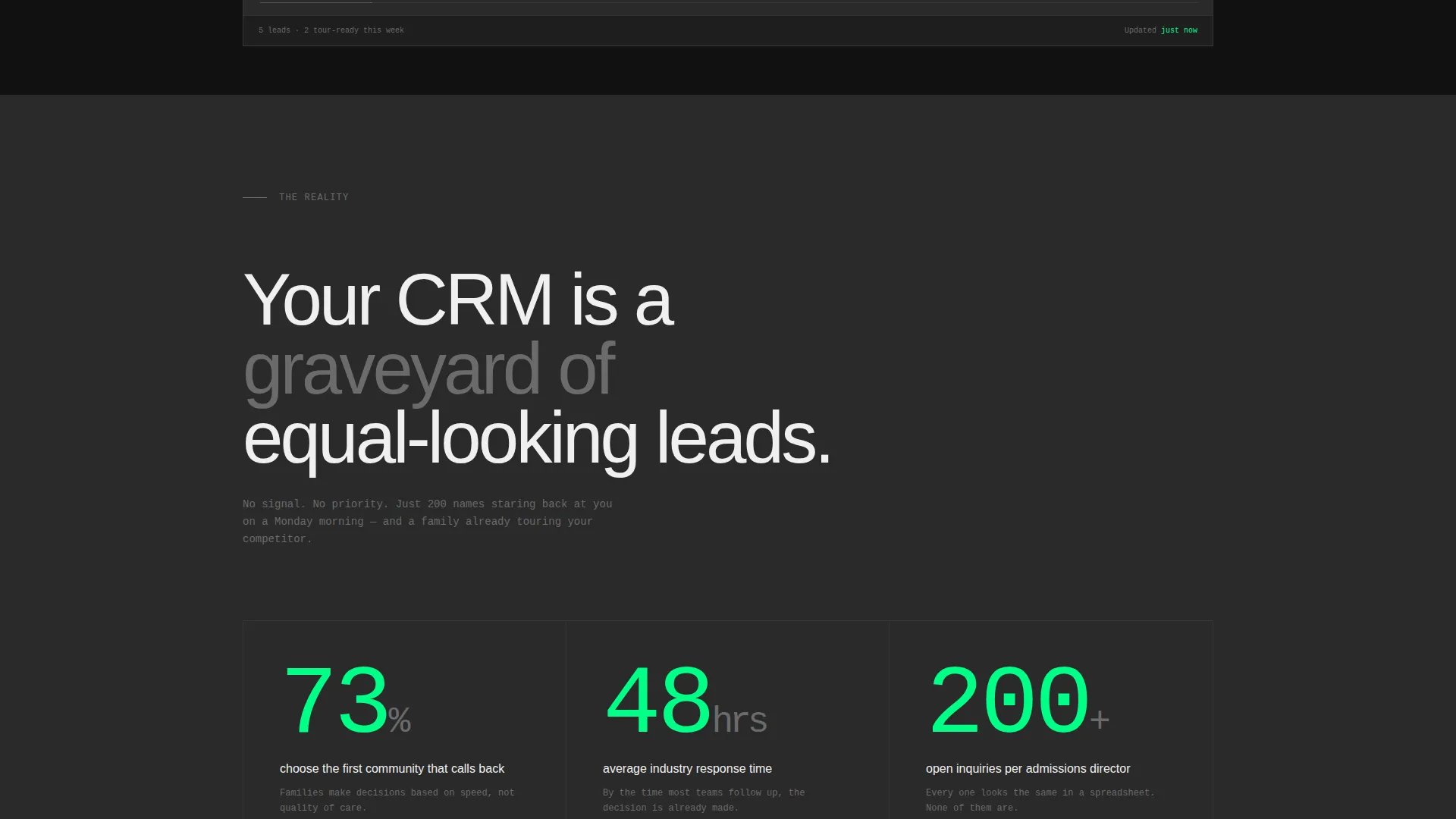
- 73% of families choose the first community that calls back, yet average response time sits at 48 hours
- Manual tracking and basic CRM tools give no behavioral signal data, no tour prediction, and no sentiment detection
- Without clear lead prioritization, agencies burn ad budgets and communities lose move-ins to faster competitors
What you get with this template
You get a complete, single-page layout that demonstrates AI lead scoring value before asking for anything. Every section is built to convert a specific audience segment at a specific point in their decision.
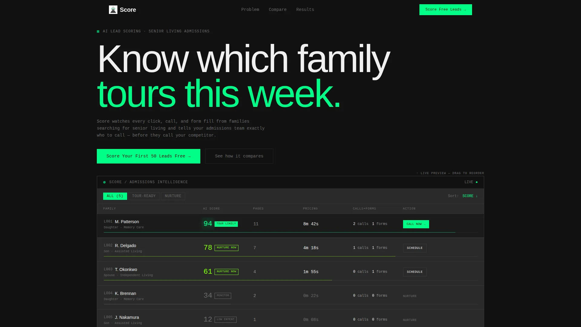
- An interactive header preview with a simulated admissions dashboard showing five anonymized family inquiries with live behavioral signals and pulsing scores
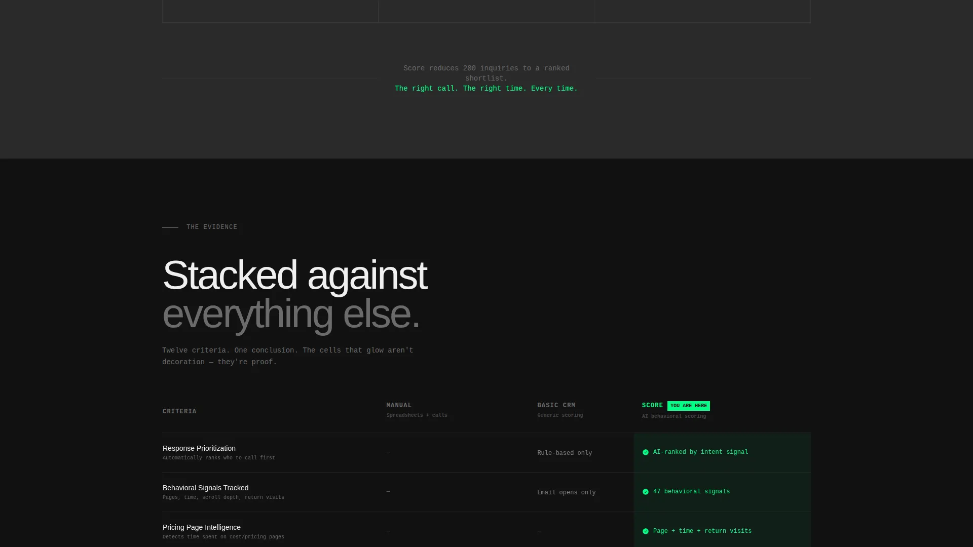
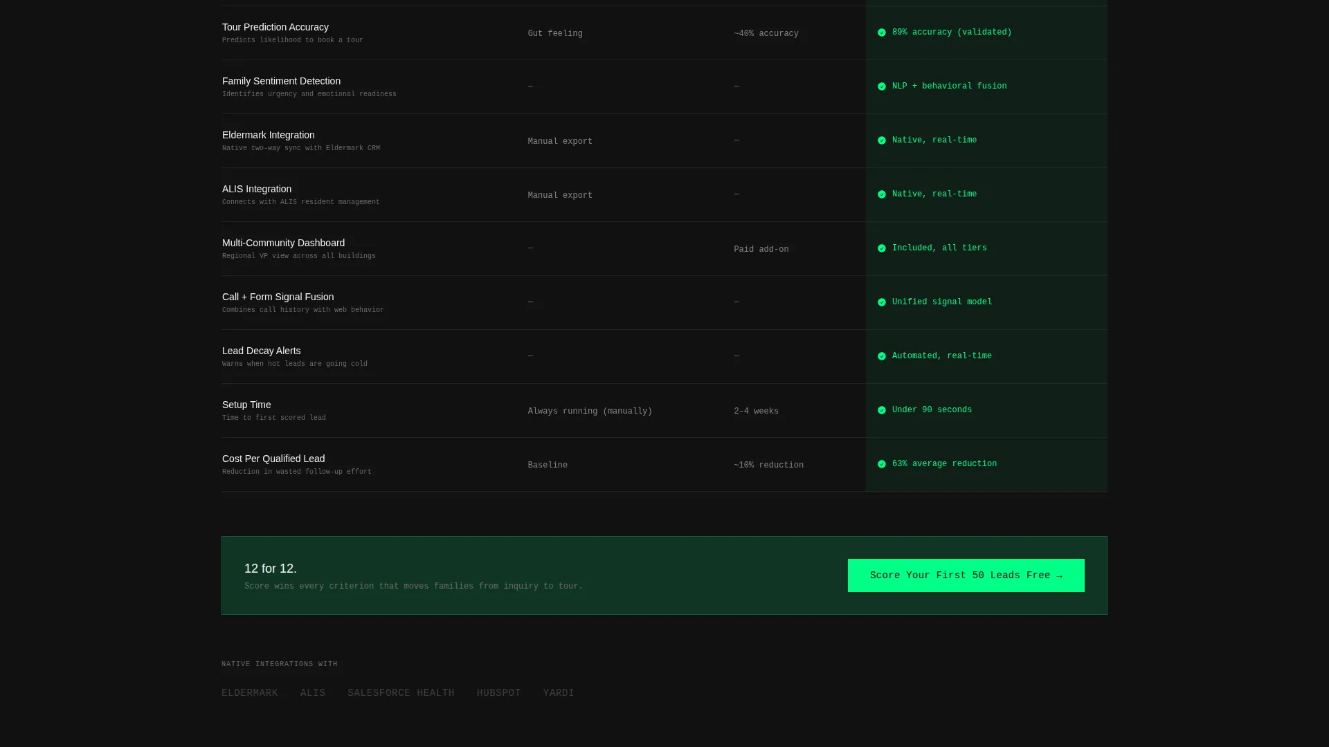
- A twelve-row comparison table stacking manual tracking, basic CRM scoring, and the platform side by side across criteria including tour prediction, behavioral signal tracking, and family sentiment detection
- A three-field freemium signup form (community name, monthly inquiry volume, and work email) with no credit card required, plus a secondary path to a recorded integration walkthrough
Feature list
This template combines interactive user interface components, structured evidence, and a focused conversion path into one cohesive flow.
Interactive Lead Scoring Dashboard
The header renders a functioning admissions dashboard directly in the browser. Visitors see five anonymized family inquiries with behavioral signals such as pages visited, calls made, time on pricing pages, and form completions. Each lead carries a pulsing green score from 0 to 100. Hovering the top-scored lead reveals a tooltip with a specific recommended action.
Draggable and Filterable Lead Interface
The dashboard is tactile. Leads can be dragged, sorted, and filtered within the preview. This interaction lets visitors touch the product before signing up, making the value tangible rather than theoretical.
Twelve-Row Comparison Table
The comparison table is the spine of the page. It stacks Manual Tracking, Basic CRM Scoring, and the platform across twelve criteria. Each row the platform wins pulses green, turning the table into a visual argument built from stacked evidence.
Problem Statistics Block
A raw-concrete section opens the problem arc with oversized industry statistics. The "73% of families choose the first community that calls back" and "average response time: 48 hours" figures fill the block to create immediate urgency without editorializing.
Community Case Study Viewport
The solution arc resolves with a single-community case study. Move-in rate before and after is displayed in two numbers large enough to fill the viewport. The simplicity of the format makes the result impossible to ignore.
Freemium Conversion Flow
The primary call to action reads "Score Your First 50 Leads Free" and appears three times: at the header, after the comparison table, and at the page bottom. The three-field signup form collects only community name, monthly inquiry volume, and work email. A secondary path below the fold links to a recorded integration walkthrough labeled "See Your CRM Connected in 90 Seconds."
Page sections overview
| Section | Purpose |
|---|---|
| Interactive Dashboard Header | Let visitors experience the scoring interface before any ask |
| Problem Statistics Block | Establish urgency with raw industry data on lead decay |
| Twelve-Row Comparison Table | Eliminate alternatives with side-by-side evidence |
| Community Case Study | Prove outcome with before-and-after move-in numbers |
| Primary call to action Strip | Drive freemium signups after the comparison table |
| Bottom Conversion Section | Capture final-scroll visitors with the free trial form |
Design & branding system
The visual identity follows a Bold Brutalist theme using a Carbon Fiber color system. The palette feels engineered and high-contrast, built to communicate precision under pressure rather than warmth or decoration.
- Background blocks alternate between deep matte black (#121212) and woven graphite (#2A2A2A) in massive monolithic sections, with titanium mid-gray (#6B6B6B) used for secondary text and inactive states
- High-voltage green (#00FF87) appears exclusively on scores, active call-to-action elements, and winning comparison table cells; it never decorates, it only activates
- Typography is oversized and monospaced where data appears, set in stark white (#F0F0F0) with no drop shadows and no gradients; weight and contrast do all the visual work
Mobile & speed optimization
The template is structured for clean rendering across screen sizes. Its bold typographic scale and high-contrast palette translate well to smaller viewports without losing visual impact.
- Large monolithic section blocks and full-width typography maintain readability on mobile without requiring rescaling
- The three-field signup form is sequenced for fast tap-through on touch devices, keeping the conversion path short and frictionless
How this template helps you convert
This template is built around a deliberate conversion architecture. Every section either removes doubt or removes friction before the next ask.
- The interactive dashboard preview lets visitors experience lead scoring immediately, building confidence before any form appears
- The comparison table eliminates competing options by displaying twelve objective criteria side by side, with winning cells pulsing green to guide the eye
- The no-credit-card free trial offer, repeated three times across the page, removes the final reason to hesitate and directs qualified visitors into a minimal three-field signup
Other information about this template
This template is designed specifically for the senior care technology market, where trust and evidence matter more than style. A few additional details worth noting:
- The comparison table includes references to senior living CRM integration criteria such as compatibility with Eldermark and ALIS, which are named in the template brief as relevant platforms in this space
- The secondary conversion path ("See Your CRM Connected in 90 Seconds") is a link to a recorded integration walkthrough, giving technical evaluators a low-commitment way to assess fit
- The template style is Comparison Table, the header concept is Interactive Preview, and the creative direction is Problem to Solution Arc, all of which align with the Freemium/Trial landing-page direction
- This template fits agencies and platform vendors operating in the senior living technology category who need a single page that functions as both a product demo and a sign-up funnel
Theme
Bold Brutalist
Creative direction
Problem→Solution Arc
Color system
Carbon Fiber
Style
Comparison Table
Direction
Freemium/Trial
Page Sections
Interactive Admissions Dashboard Header
Draggable and Filterable Lead Cards
Twelve-row Comparison Table
Problem Statistics Block
Viewport-filling Case Study
Three-field Freemium Signup Form
Related questions
Who is this landing page template designed for?
Does the interactive dashboard preview require a back-end connection?
Can I customize the comparison table rows and criteria?
Is there a version of this template without the freemium signup flow?
What makes this template specific to senior care rather than general SaaS?



