AI for Higher Education Specialist Education Website Template
Score is a predictive enrollment landing page template built for higher education AI lead scoring platforms. It features an interactive live-scoring widget, a spec-sheet layout with capability modules, and a centered comparison table. The Tech Glass visual identity and Monochrome Steel color system give it an authoritative, data-room feel that speaks directly to enrollment management professionals.
by Rocket studio
Quick summary
Score is a single-page comparison table template for an AI-powered enrollment lead scoring platform. It opens with a functioning behavioral-signal widget, flows through precision spec-card modules, and anchors on a twelve-dimension comparison table. The design language is cool, technical, and dense, built to earn trust from data-driven admissions teams rather than persuade them with narrative.
Who this template is for
This template is designed for enrollment technology platforms that sell to higher education institutions. The messaging, layout, and visual weight are calibrated for buyers who live in data and distrust marketing fluff.
- Enrollment management VPs at mid-tier private universities focused on improving deposit yields
- Community college deans working to fill allied health and career program cohorts
- Overworked admissions teams at regional public universities still managing leads in spreadsheets
What problem this template solves
Admissions teams struggle to prioritize outreach because traditional lead scoring relies on static rules that miss behavioral nuance. Counselors end up calling the wrong students, and deposit yields suffer. This template gives an enrollment AI platform a page that communicates the precision of its scoring engine without relying on vague promises.
- It replaces fluffy benefit copy with spec-density that resonates with technically savvy enrollment buyers
- It shows the scoring difference between rules-based and AI-predictive modes in the header itself, not in a slide deck
- It gives visitors two clear conversion paths before they ever scroll past the fold
What you get with this template
You get a complete, single-page landing page structured around the enrollment lead scoring value proposition. Every section is a deliberate component, not a filler block.
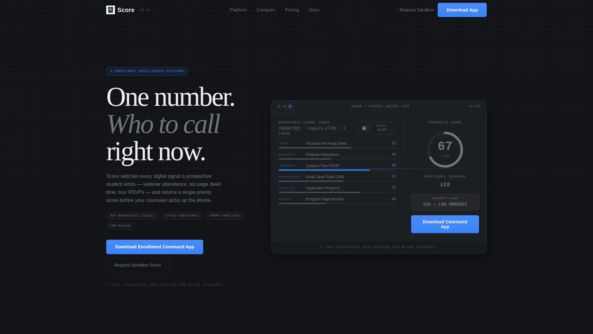
- An interactive header widget that simulates a live student record with animated behavioral signal bars and a composite score
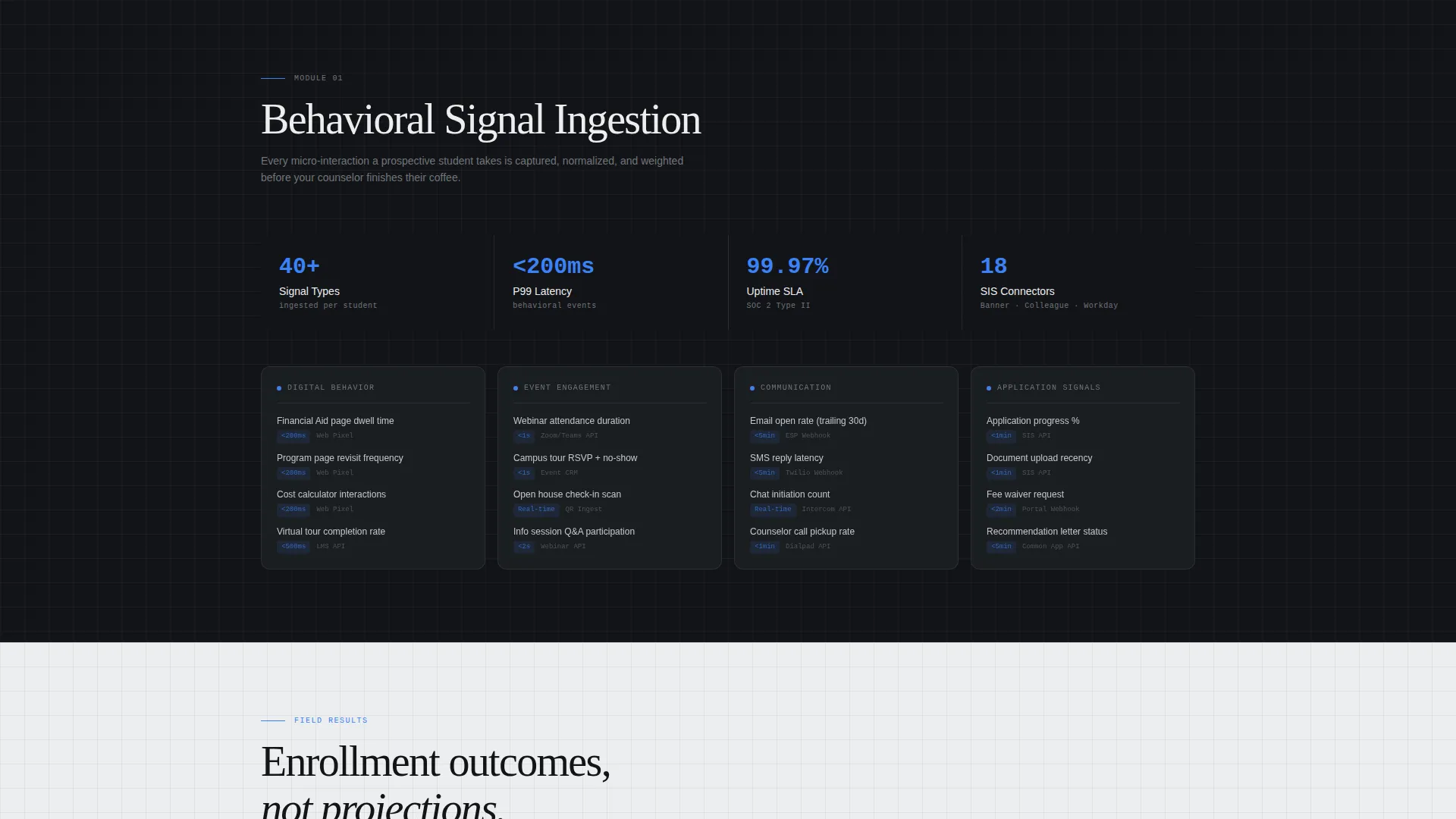
- A spec-sheet body with four discrete capability modules presented in grid cards with labeled spec fields
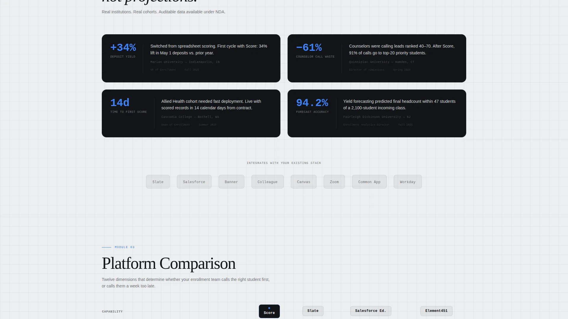
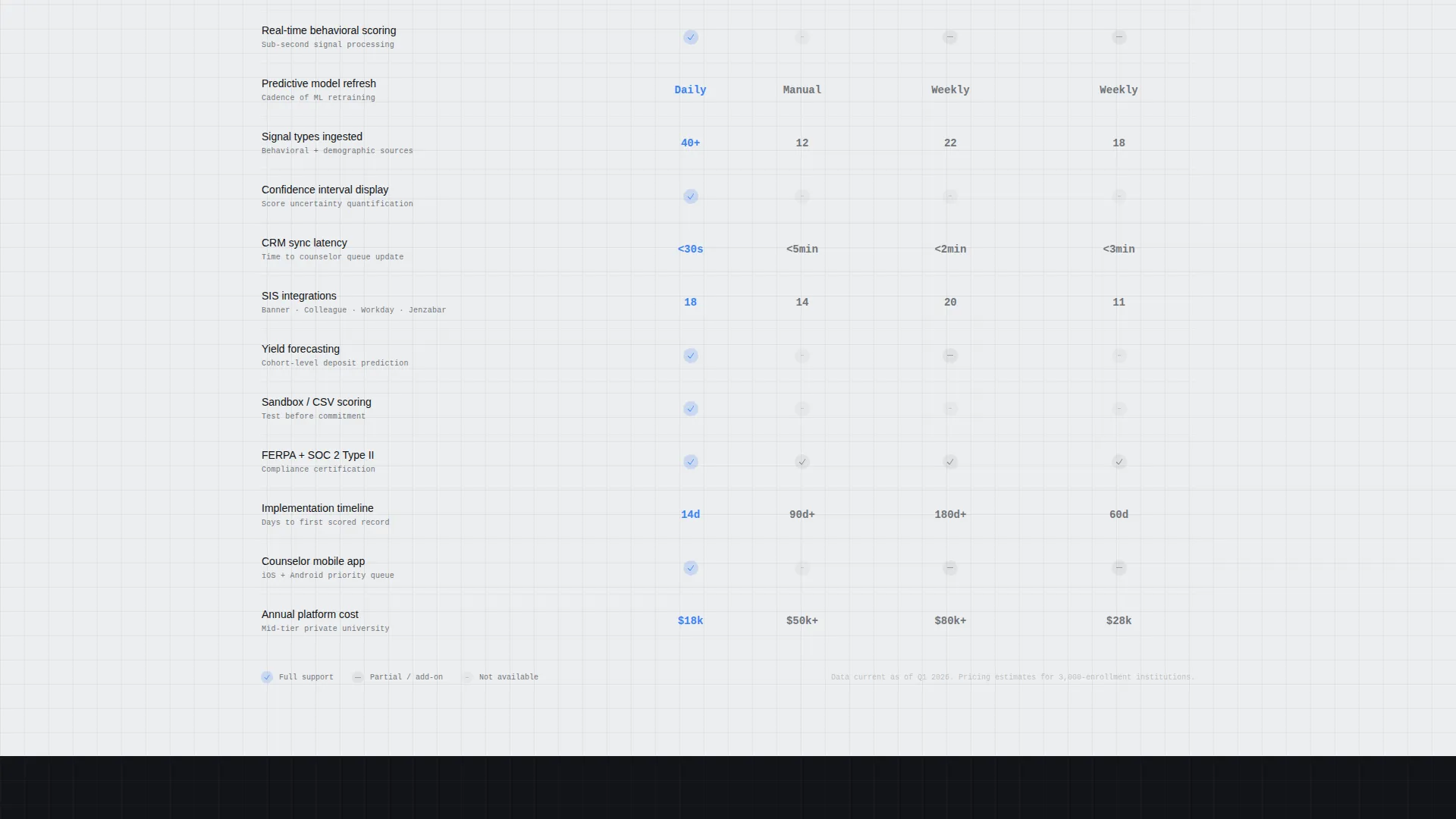
- A comparison table scoring the platform against manual scoring and competing tools across twelve dimensions, plus a sticky app-download call to action
Feature list
This template ships with purpose-built components tied directly to the enrollment AI use case.
Interactive Lead Scoring Header
The header embeds a simulated student scoring widget directly in the viewport. Visitors see behavioral signals rendered as horizontal bars, email opens, page visits, event sign-ups, and application progress, feeding into an animated composite score that ticks upward in real time. A toggle lets users switch between "Traditional Rules-Based" and "AI-Predictive" modes and watch the score and confidence interval shift live.
Spec-Sheet Capability Modules
Four discrete capability modules sit in identical grid cards below the header. Each module covers a core platform function: Behavioral Signal Ingestion, Predictive Scoring Engine, CRM Sync and Workflow Triggers, and Yield Forecasting. Spec-style labels, latency, integrations supported, model refresh cadence, give each card the density of a product data sheet.
Twelve-Dimension Comparison Table
The comparison table is the centerpiece of the page. It scores the platform against manual scoring and competing tools across twelve dimensions. Signal-blue checkmarks mark confirmed capabilities; chromium-outline empty cells mark gaps in competing approaches. Tabular figures keep numbers visually aligned and immediately scannable.
Dual Conversion Path Design
The primary call to action, "Download the Enrollment Command App," appears first inside the interactive header and again in a sticky bottom bar after the comparison table. Tapping opens a modal with platform toggles for iOS, Android, and Desktop, an institutional email field, and a checkbox for dot-edu domain verification. A secondary path, "Request a Sandbox Score," lets visitors submit an anonymized CSV of inquiry records and receive a sample scoring report by email within an hour.
Monochromatic Tech Glass Layout
Backgrounds alternate between forge-black and panel white throughout the page. Text renders in brushed chromium on dark sections and forge-black on light sections. Single-pixel chromium dividers at 20% opacity create a glass-sheet layering effect between sections, giving every data block visual separation without decorative noise.
Page sections overview
| Section | Purpose |
|---|---|
| Interactive Scoring Header | Demonstrate live AI scoring with a behavioral signal widget and mode toggle |
| Tagline Anchor Line | Deliver the core challenge statement in monospaced type below the widget |
| Signal Ingestion Module | Spec-card detailing behavioral data inputs and ingestion latency |
| Predictive Scoring Engine | Spec-card covering model logic, refresh cadence, and confidence intervals |
| CRM Sync Module | Spec-card showing workflow trigger capabilities and integration breadth |
| Yield Forecasting Module | Spec-card presenting cohort-level forecast outputs and use cases |
| Comparison Table | Side-by-side scoring across twelve dimensions versus alternatives |
| Sticky App Download Bar | Persistent primary call to action anchored below the comparison table |
| App Download Modal | Platform selection, institutional email capture, and domain verification |
| Sandbox Score Path | Secondary conversion flow for CSV submission and sample report delivery |
Design & branding system
The visual identity follows a Tech Glass theme built on a Monochrome Steel color system. Every color decision is functional, not decorative, each shade carries a specific role across the page.
- Forge-black (#121417) and polished panel white (#EDEEF0) alternate as section backgrounds; brushed chromium (#71757B) carries body text on dark surfaces and dividers at reduced opacity
- Signal-blue (#3B82F6) is reserved exclusively for interactive states, score indicators, checkmarks in the comparison table, and the primary call-to-action button
- Typography uses monospaced type for the header tagline and tabular figures throughout the comparison table, reinforcing the precision-instrument aesthetic
Mobile & speed optimization
The page layout is built to translate cleanly from a large monitor view down to a smaller screen without losing its data-forward character.
- The interactive scoring widget and mode toggle are designed for touch interaction, including a tap-triggered modal flow for the app download path
- Spec-card grid modules reflow to a single-column stack on narrower viewports, keeping each capability readable without horizontal scrolling
- The sticky bottom bar for the primary call to action remains anchored on both desktop and mobile, so the download path is always one tap away
How this template helps you convert
Every structural decision in this template is pointed toward one of two conversion outcomes: app download or sandbox score request.
- The interactive header makes the AI advantage tangible before a visitor reads a single line of body copy, reducing the cognitive distance between interest and intent
- The comparison table provides the rational justification a VP or dean needs to move a purchase decision forward, presented in a format they can screenshot and share with colleagues
- The dual call-to-action structure accommodates both the ready buyer and the cautious evaluator, capturing intent at both ends of the decision cycle without competing with itself
Other information about this template
This template is part of a broader set of intersection-matched designs pairing Tech Glass aesthetics with AI-focused higher education use cases. A few additional details worth noting:
- The template style is a Comparison Table layout, making it well suited for competitive positioning pages in the enrollment technology market
- The header concept is an Interactive Preview, a less common pattern that earns visitor attention by demonstrating the product instead of describing it
- The landing page direction is optimized for App Download, with a modal flow that includes institutional email capture and dot-edu domain verification built into the primary conversion step
- The Spec Sheet creative direction is intentional: dense, label-driven layouts build credibility with analytical buyers faster than narrative-led pages
- The template sits within the AI for Higher Education subcategory and is designed for the Higher Education AI Lead Scoring niche, making it a focused starting point rather than a general-purpose template
Theme
Tech Glass
Creative direction
Spec Sheet
Color system
Monochrome Steel
Style
Comparison Table
Direction
App Download
Page Sections
Interactive Lead Scoring Header Widget
Spec-card Capability Modules
Twelve-dimension Comparison Table
Dual Conversion Path Structure
App Download Modal with Domain Verification
Related questions
Who is the primary audience for this landing page template?
Can the interactive scoring widget be customized with real student data signals?
What does the Request a Sandbox Score conversion path involve?
How does the twelve-dimension comparison table work?
Is this template suitable for institutions building their own internal scoring tool?



