Score - Predictive Retail Landing Page Template
Score is a card-grid landing page template built for retail AI lead scoring platforms. It uses a Data Command visual theme, monochrome steel palette, and a live code snippet header to position your product as the analytical edge serious ecommerce teams need. The layout escalates from problem framing to head-to-head benchmarks, guiding high-intent buyers toward a comparison-driven call to action.
by Rocket studio
Quick summary
Score is a single-page, card-grid landing page template for retail AI lead scoring platforms. It opens with a full-viewport code block showing a live scored lead object, then walks buyers through cost-of-inaction cards, methodology reveals, and benchmark comparisons. The design runs on a monochrome steel palette. Every section earns the call to action before the visitor reaches it.
Who this template is for
This template is built for product and growth teams selling predictive scoring tools to the retail and ecommerce sector. It speaks directly to buyers who already use a competing tool and need a clear reason to switch.
- Ecommerce directors at mid-market direct-to-consumer brands managing seven-figure monthly ad spend
- Retail operations leads at omnichannel chains losing margin on blanket discount strategies
- Growth product managers at marketplace platforms who need to route sales effort toward high-converting leads
What problem this template solves
Most AI scoring platforms look like every other SaaS landing page. Buyers who understand data expect proof, not promises. This template solves the credibility gap by showing benchmark numbers before asking for anything.
- Generic SaaS layouts fail to communicate analytical depth to technically literate buyers
- Comparison-blind pages leave ecommerce decision-makers without a clear reason to act now
- Buried calls to action lose high-intent visitors who never scroll far enough to see the evidence
What you get with this template
You get a fully structured, modular card-grid landing page designed around a comparison and versus conversion flow. Every section is a discrete, swappable unit.
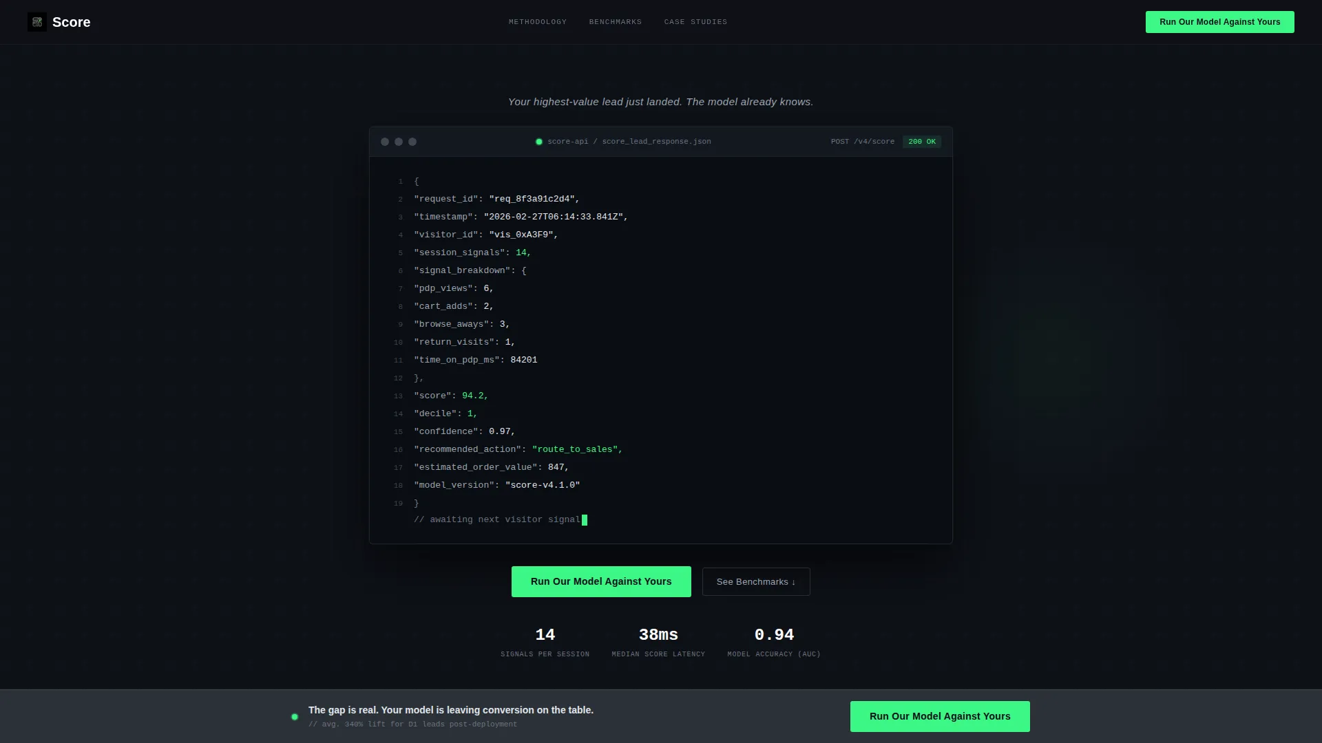
- A full-viewport dark-mode code snippet header with a blinking cursor and a highlighted JSON lead object
- Staggered two- and three-column card clusters holding a comparison table, a waterfall chart card, and a redacted case study card
- A persistent bottom bar call to action and a secondary gated PDF path below each benchmark card
Feature list
This template ships with purpose-built layout components and a tightly controlled visual system. Each feature below reflects a specific design or structural decision from the source brief.
Live Code Snippet Header
The header fills the full viewport with a dark-mode terminal block. It renders a JSON API response showing fields like visitor_id, session_signals, score, and recommended_action. A blinking cursor sits at the bottom as if processing is still live. A single line of sans-serif text fades in above the block.
Modular Staggered Card Grid
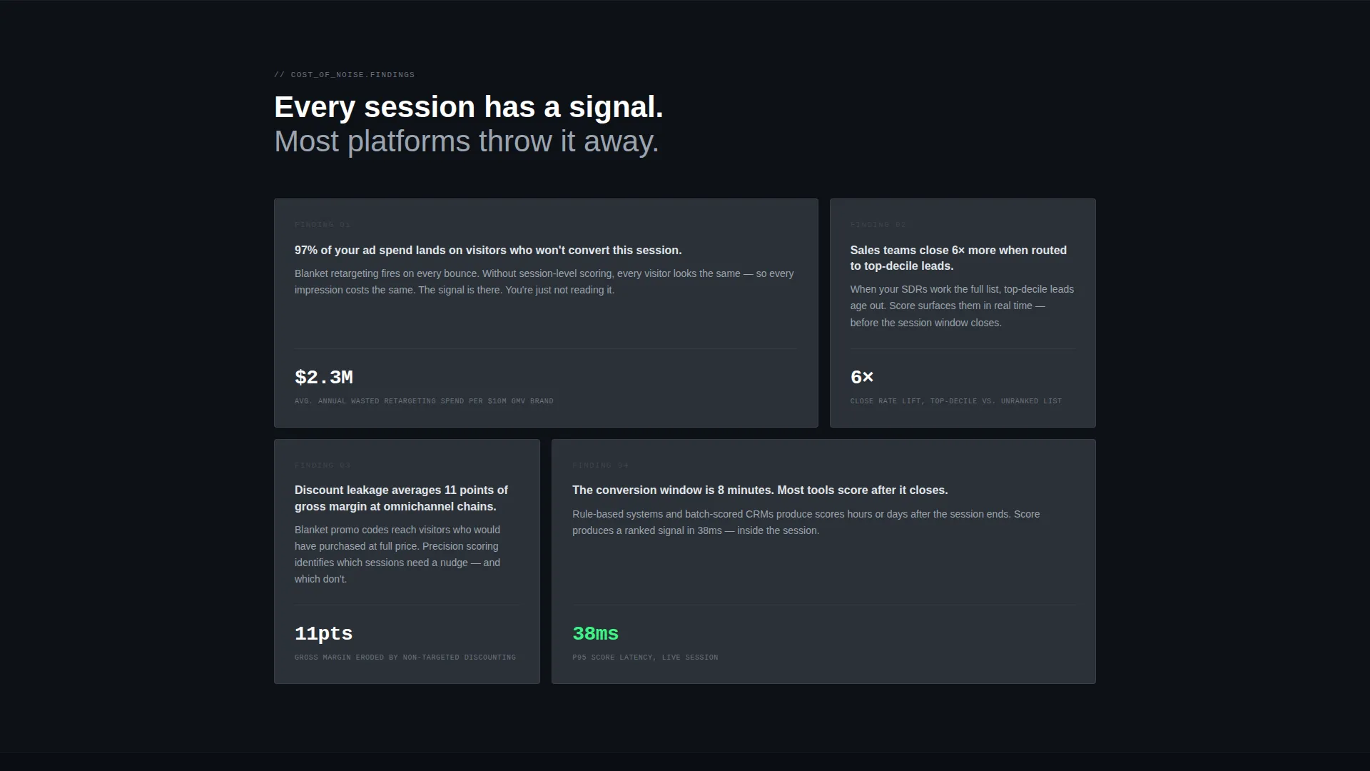
Cards are arranged in alternating two- and three-column clusters. This breaks visual rhythm intentionally, making the layout feel curated rather than templated. Each card is a standalone analytical finding, so individual cards can be reordered or swapped without disrupting the overall flow.
Comparison Table Card
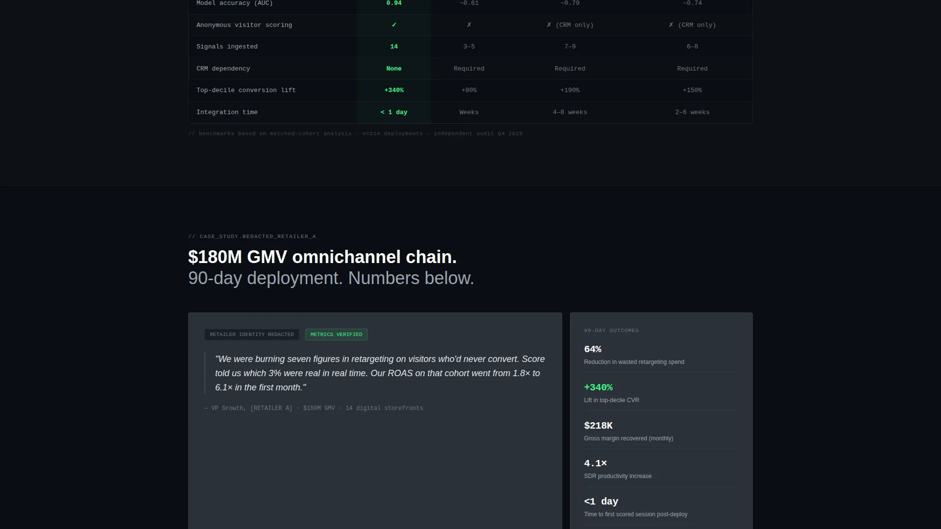
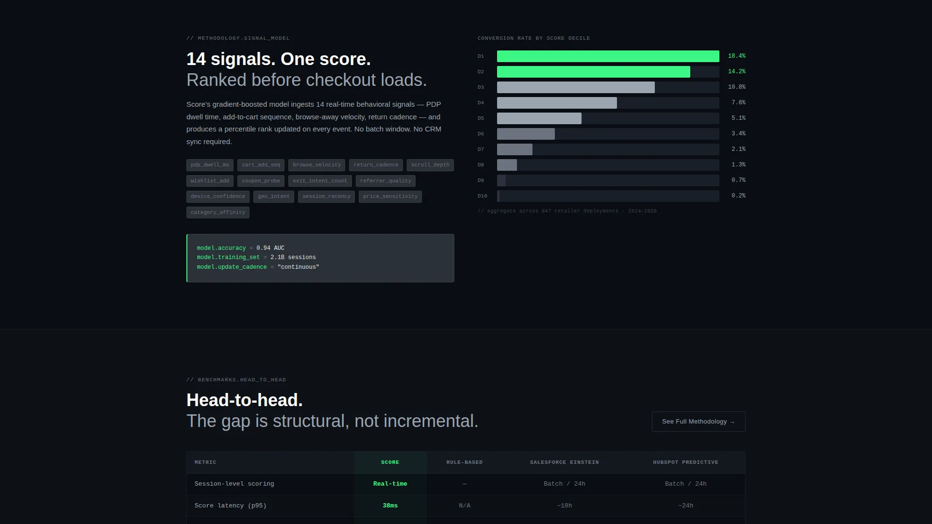
One dedicated card holds a side-by-side accuracy comparison table. It positions this platform against rule-based scoring and other predictive tools. The table is the centrepiece of the benchmark section and does the persuasion work before any call to action appears.
Waterfall Chart and Case Study Cards
A waterfall chart card displays conversion lift by decile. A separate card presents a quoted case study with the retailer name removed but key metrics visible. Together they show methodology and real-world outcome in a format that analytical buyers immediately trust.
Persistent Bottom Bar call to action
After the first comparison card scrolls into view, a bottom bar locks into place. It carries the primary call to action and stays visible as the visitor continues reading. Clicking opens a two-field form: work email and a dropdown for the visitor's current lead-scoring tool.
Gated PDF Secondary Path
Below each benchmark card, a secondary link reads "See Full Methodology." It gates a downloadable PDF behind the same email field used by the primary call to action. This gives detail-oriented buyers a lower-commitment first step while still capturing the lead.
Page sections overview
| Section | Purpose |
|---|---|
| Code Snippet Header | Opens the page with a live-feel terminal view of a scored lead JSON object |
| Cost of Inaction Cards | Early cards establish what mispriced or unscored leads actually cost |
| Methodology Reveal Cards | Middle cards expose the scoring logic and signal inputs used by the model |
| Comparison Table Card | Side-by-side benchmark against rule-based and other predictive scoring tools |
| Waterfall Chart Card | Shows conversion lift broken down by scoring decile |
| Redacted Case Study Card | Real retailer metrics with brand name removed to keep focus on outcomes |
| Persistent call to action Bar | Bottom bar with primary form, appears after first comparison card enters view |
| Secondary Gated PDF Path | Email-gated methodology download linked below each benchmark card |
Design & branding system
The visual identity follows a Data Command theme built entirely on a monochrome steel palette. Every colour decision reinforces the idea of raw analytical signal with no decorative noise.
- Terminal black (#0E1117) and brushed gunmetal (#2B3137) form all background blocks, running in flat hard-edged bands with no gradients
- Card surfaces sit at cold-rolled aluminum (#9BA4B0) with hairline gunmetal borders; body text is aluminum on black for strong contrast without warmth
- System green (#3BF786) appears only once per viewport, reserved for live data points, score badges, and primary calls to action, so every green element reads as a live status signal
Mobile & speed optimization
The card grid is built to reflow across screen sizes without losing the modular, report-style layout. Staggered column clusters collapse predictably on narrower viewports.
- Two- and three-column card clusters reduce to single-column stacks on mobile so each analytical card remains fully readable
- The persistent bottom bar call to action is sized and positioned for thumb-accessible tapping on mobile screens
- The monospace code block header scales proportionally so syntax highlighting and the blinking cursor remain visible on smaller displays
How this template helps you convert
The page is structured around a comparison and versus conversion model. Visitors are shown the performance gap before they are ever asked to act.
- Early cards frame the cost of mispriced leads, so the visitor arrives at the benchmark section already primed to care about the numbers
- The comparison table and waterfall chart do the heavy persuasion work mid-page, making the performance gap concrete before any form appears
- The persistent bottom bar call to action and the secondary gated PDF path offer two commitment levels, capturing both ready-to-engage buyers and methodical researchers in the same scroll
Other information about this template
This template is categorised under Technology, specifically within the AI for retail niche and the retail AI lead scoring intersection. It is designed to serve teams evaluating or replacing existing predictive scoring tools, including platforms commonly used in enterprise sales and marketing stacks.
- The dropdown in the primary call to action form includes options for Salesforce Einstein, HubSpot Predictive, Marketo, rule-based or manual scoring, and no current tool
- The "Industry Report" creative direction means each card reads like a discrete finding from a proprietary analyst brief, not a standard product feature list
- The template style is card grid modular, making it straightforward to add, remove, or reorder individual cards as your benchmark data or case studies evolve
Theme
Data Command
Creative direction
Industry Report
Color system
Monochrome Steel
Style
Card Grid (Modular)
Direction
Comparison/Versus
Page Sections
Live Code Snippet Header
Modular Staggered Card Grid
Head-to-head Comparison Table
Waterfall Chart and Case Study Cards
Persistent Bottom Bar Call to Action
Gated Methodology PDF Path
Related questions
Who is this landing page template designed for?
Can I customise the comparison table with my own benchmark data?
What does the persistent bottom bar call to action do?
What colour system does this template use?
Is this template suitable for a single-page layout or a multi-page site?



