Complete Sports Digital Presence Professional Website Template
Scoreboard is a split-screen landing page template built for sports digital menu platforms. It pairs live-data visual drama with a structured, report-style scroll to convert venue operations directors, food-and-beverage managers, and college catering coordinators into trial sign-ups. The Carbon Fiber color system and electric green accents make every section feel like a live broadcast dashboard.
by Rocket studio
Quick summary
Scoreboard is a single-page, split-screen landing page template designed for a sports digital menu platform. It uses a Data Command visual theme and an Industry Report creative direction to present hard venue data alongside live-feeling interface mockups. The goal is to earn trust through evidence, then convert visitors with a low-friction trial offer.
Who this template is for
This template is built for venue technology teams and concession operators who need to communicate a complex, data-driven product quickly. If your buyers are skeptical operations professionals, this page speaks their language before asking for anything.
- Venue operations directors managing multiple concession kiosks inside a single arena
- Franchise food-and-beverage managers running concessions at minor-league ballparks
- Catering coordinators at college athletic departments still relying on manual menu updates
What problem this template solves
Static menus cost venues real money every game. When concession screens cannot update in real time, operators miss pricing windows, carry unsold inventory, and lose fans mid-line. This template frames that business case clearly so potential buyers feel understood before they ever read a call to action.
- Communicates the revenue cost of slow, manual menu management with data-backed sections
- Shows the platform solving each problem in a paired, live-feeling interface mockup
- Moves cautious buyers toward a free trial or a gated report download without pressure
What you get with this template
You get a fully structured, single-page layout that guides visitors from problem awareness to a trial sign-up. Every section is purposefully sequenced, and the design system is ready to apply immediately.
- A split-screen (50/50) layout pairing industry data on the left with user interface mockups on the right
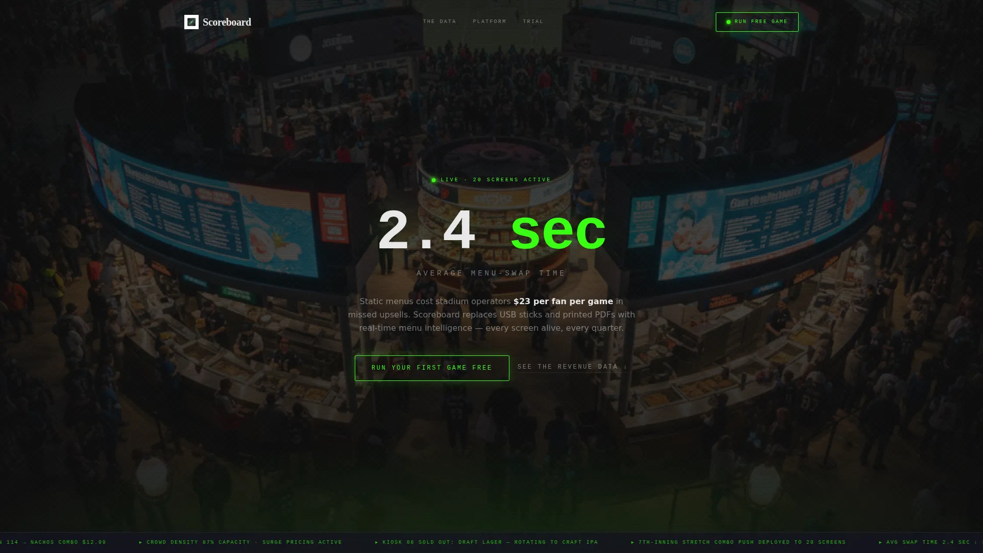
- A dark, full-bleed header with a glowing stadium concourse image and a single stat fade-in
- Two conversion paths: a three-field free-trial form and a gated PDF lead capture for softer leads
Feature list
This template ships with several purpose-built design and layout decisions that support the platform's core message and conversion goals.
Split-Screen Data-and-Demo Layout
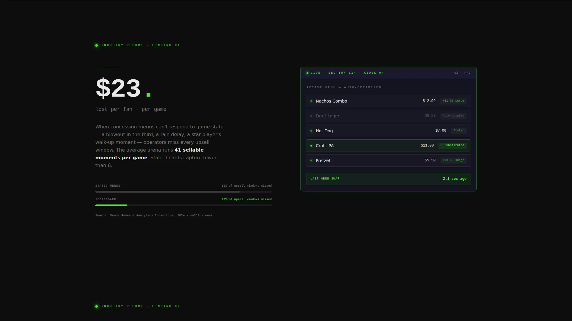
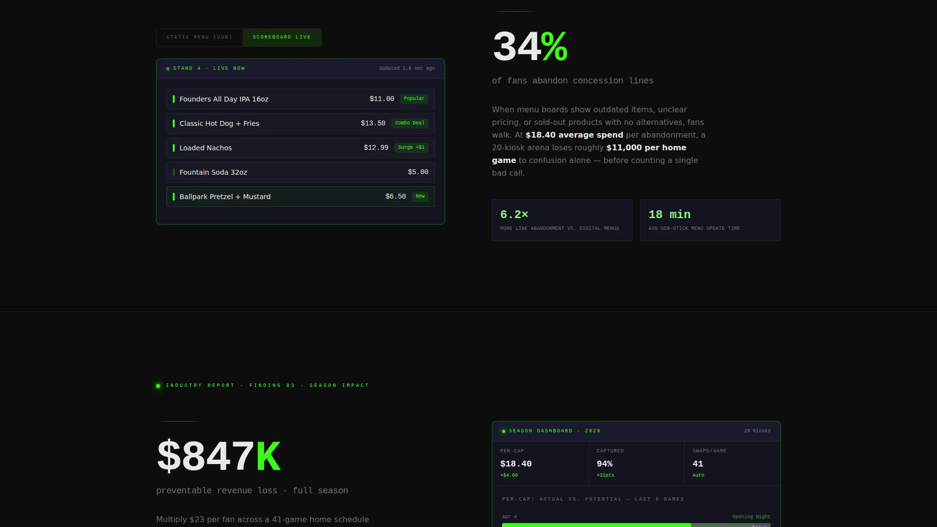
Each scroll section divides the screen evenly. The left side presents a concrete industry statistic or pain point. The right side shows the platform interface responding to that exact problem. The pairing makes the product case feel immediate and credible.
Dark Full-Bleed Header with Stat Fade-In
The header opens with a bird's-eye stadium concourse photograph at night. Ambient light is crushed to near-black, leaving only glowing digital menu boards visible. After a two-second hold, a single stat fades in at center, followed by a subhead styled as a ticker crawl.
Escalating Industry Report Scroll
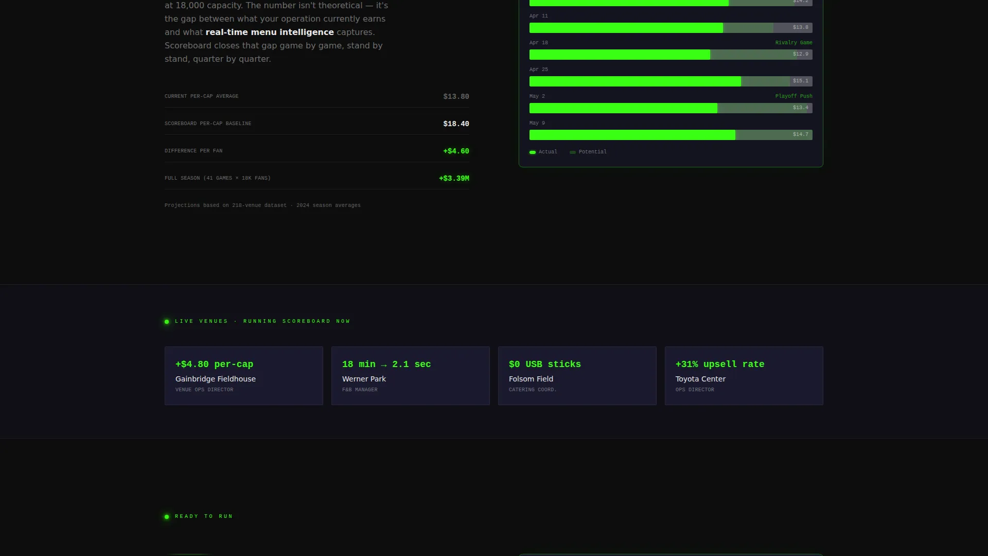
The page scroll builds stakes section by section. It moves from wasted inventory to lost per-capita revenue to full-season margin erosion. Each section feels like a page in a report that already understands the operator's operation.
Pinned Free-Trial Call to Action
After the third data section, a primary call to action pins into view. It reads "Run Your First Game Free" and opens a three-field form asking for venue name, number of concession screens, and a work email. Nothing else.
Gated Secondary Lead Capture
Below the primary call to action, a softer conversion path offers "Download the 2024 Venue Revenue Report" as a gated PDF. It asks only for email and role title, giving undecided visitors a way to engage without committing to a trial.
Carbon Fiber Color System
The full page uses a four-color palette: deep cockpit black, woven carbon gray, stadium-light white, and pulsing electric green. Electric green is reserved strictly for live-data accents, active toggles, and call-to-action borders, making every active element unmistakable.
Page sections overview
| Section | Purpose |
|---|---|
| Full-Bleed Header | Opens with glowing stadium image and a stat fade-in to establish immediate credibility |
| Data Section One | Presents average concession revenue lost per game to static menus, paired with a user interface response |
| Data Section Two | Shows the percentage of fans who abandon lines when menus are unclear, paired with the fix |
| Data Section Three | Highlights speed differential between manual and automated item rotation |
| Pinned Trial call to action | Three-field sign-up form activated after the third data section |
| Gated PDF Offer | Secondary lead capture for visitors not ready to trial |
Design & branding system
The visual identity follows a Data Command theme that feels like the back panel of a broadcast truck. Every surface is matte black, and only live-data elements glow, making the page feel operational rather than decorative.
- Carbon Fiber palette: deep cockpit black (#0D0D0D), woven carbon gray (#1A1A2E), stadium-light white (#E8E8E8), and pulsing electric green (#39FF14)
- Electric green is used exclusively for live-data accents, active toggles, and call-to-action borders
- The overall tone mirrors a press-box view during a sold-out night game: controlled, alive, and precise
Mobile & speed optimization
The split-screen layout is structured so that each column stacks cleanly on smaller screens without losing the data-and-demo pairing logic. The page is built for operators who may preview it on a tablet in a concourse office.
- The 50/50 split collapses to a single-column flow on mobile, keeping data points and user interface mockups in the correct reading order
- The pinned call-to-action adapts to remain visible and accessible after the third section on all screen sizes
- The dark color system reduces visual noise on mobile screens and keeps focus on the key data points
How this template helps you convert
The page is designed around a Freemium and Trial conversion model. Every layout decision serves the goal of getting a skeptical operations professional to take a low-risk first step.
- The Industry Report scroll earns trust before asking for anything. Visitors read three sections of data that mirror their own operational pain before the trial form ever appears.
- The pinned "Run Your First Game Free" call to action lowers commitment. A three-field form with no credit card implication makes the trial feel genuinely low-risk.
- The gated PDF offer captures leads at every readiness level. Visitors who are not ready to trial still enter the funnel by downloading a report, giving the platform a qualified contact to follow up with.
Other information about this template
This template is built specifically for the sports digital menu niche within the broader sports digital presence category. It sits at the intersection of venue technology and real-time operations management, which means the page design, copy structure, and conversion logic are all tuned for an audience that values data over marketing language.
- The template style is Split Screen (50/50), making it distinct from standard hero-plus-feature layouts common in general software landing pages
- The Industry Report creative direction means the page reads like a credible business document, not a product brochure
- The header concept is Dark Full-Bleed plus Glow, a treatment that works especially well for technology products tied to physical environments like arenas and ballparks
- The Freemium and Trial landing page direction means both conversion paths are included and neither competes with the other
Theme
Data Command
Creative direction
Industry Report
Color system
Carbon Fiber
Style
Split Screen (50/50)
Direction
Freemium/Trial
Page Sections
Split-screen Data and Demo Layout
Dark Full-bleed Header with Stat Fade-in
Escalating Industry Report Scroll
Pinned Free-trial Call to Action
Gated Secondary Lead Capture
Carbon Fiber Visual Identity System
Related questions
Who is this template designed for?
What does the split-screen layout actually show?
How many conversion paths does this template include?
Can the Carbon Fiber color system be adjusted for a different brand?
Is this a single page or a multi-page template?



