Daycare Membership Landing Page Template
Scout is a scroll-reveal landing page template built for a daycare membership site. It guides exhausted parents and HR coordinators from confusion to clarity with a live zip-code map, a progressive comparison table, and an interactive daycare card. The design uses a calming teal-and-mint palette with a warm marigold accent to keep visitors engaged and moving toward sign-up.
by Rocket studio
Quick summary
Scout is a single-page, scroll-reveal landing page template for a daycare membership site. It opens with frosted Dark Glass Panels highlighting key data points, then progressively reveals a zip-code map, a feature comparison table, and an interactive daycare card. The page ends at a focused three-field checkout, turning overwhelmed parents into paying members.
Who this template is for
Scout is designed for founders and product teams building a daycare discovery membership platform. It speaks directly to the people most likely to pay for that service and gives the site operator a ready-made conversion funnel.
- New parents returning to work within weeks and urgently searching for licensed daycare options
- Relocating families who need to assess childcare from a distance, quickly
- Human resources coordinators building structured childcare benefit packages for employees
What problem this template solves
Finding quality daycare is time-consuming and disorganized. Free search tools surface incomplete listings, hide availability, and leave parents with no way to compare options side by side. Scout removes that friction by showing the value of a membership before asking for payment.
- Parents waste hours on disconnected searches with no availability data or verified reviews
- Free tools hit dead ends at the moment a parent needs the most critical detail, such as a waitlist slot
- HR coordinators have no structured, professional resource to include in employee benefit guides
What you get with this template
This template delivers a complete, scroll-driven landing page with every section pre-built and logically sequenced. Nothing is left as a blank placeholder. Each section builds trust and momentum toward the membership checkout.
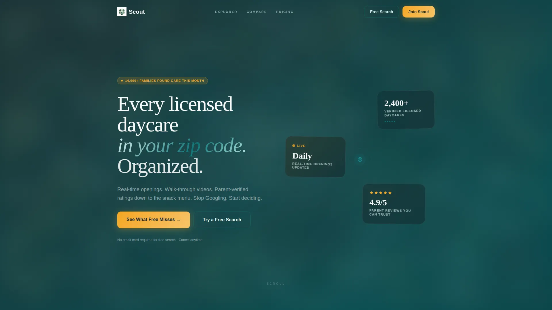
- A hero section with three frosted Dark Glass Panels displaying verified data points over a soft-focus playroom background
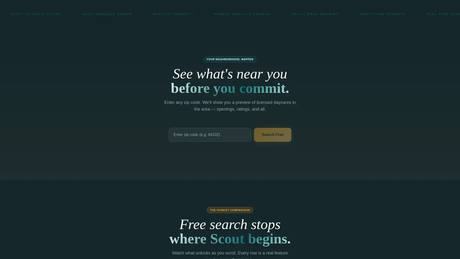
- A live zip-code input that populates a sample neighborhood map with daycare pins before the visitor pays anything
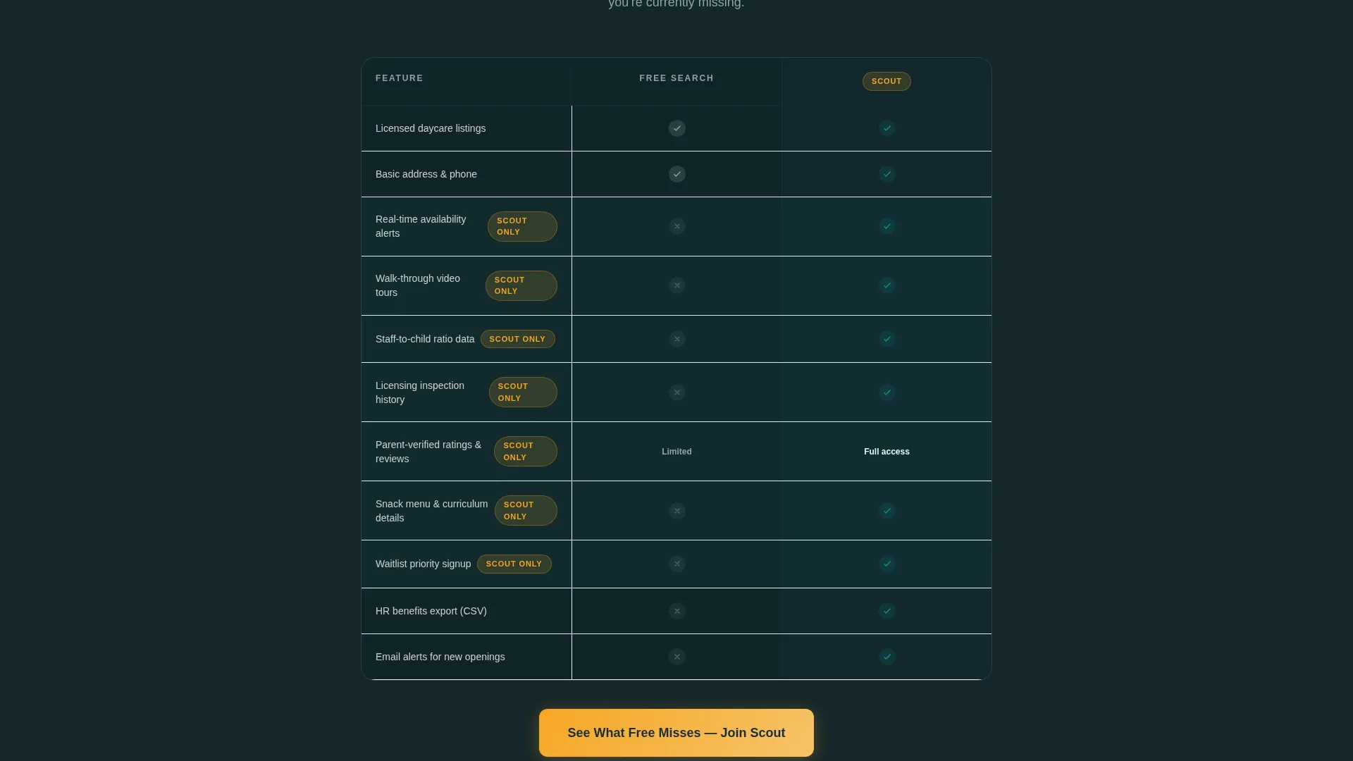
- A progressive comparison table, an interactive daycare card with a flip animation, and a focused three-field checkout form
Feature list
This template is packed with purpose-built components that guide a visitor from first impression to conversion. Each feature reflects a deliberate decision about what a time-pressed parent actually needs to see.
Dark Glass Panel Hero
Three frosted, semi-transparent cards float over a soft-focus background image of a sunlit playroom. Each panel holds a single, high-impact data point. A subtle teal-to-mint gradient runs along each card's edge, and a gentle cursor-driven parallax effect adds depth without distraction.
Live Zip-Code Map Preview
Visitors enter their zip code and instantly see a sample map populated with daycare pins in their neighborhood. This interaction proves the product's value before any payment is requested. It is the template's single most persuasive moment.
Progressive Comparison Table
A side-by-side table labeled "Free Search versus. Scout Membership" materializes row by row as the visitor scrolls. Each new row reveals a feature the free tier lacks, such as availability alerts, video tours, or waitlist priority. The reveal sequence builds a compelling case without a hard sell.
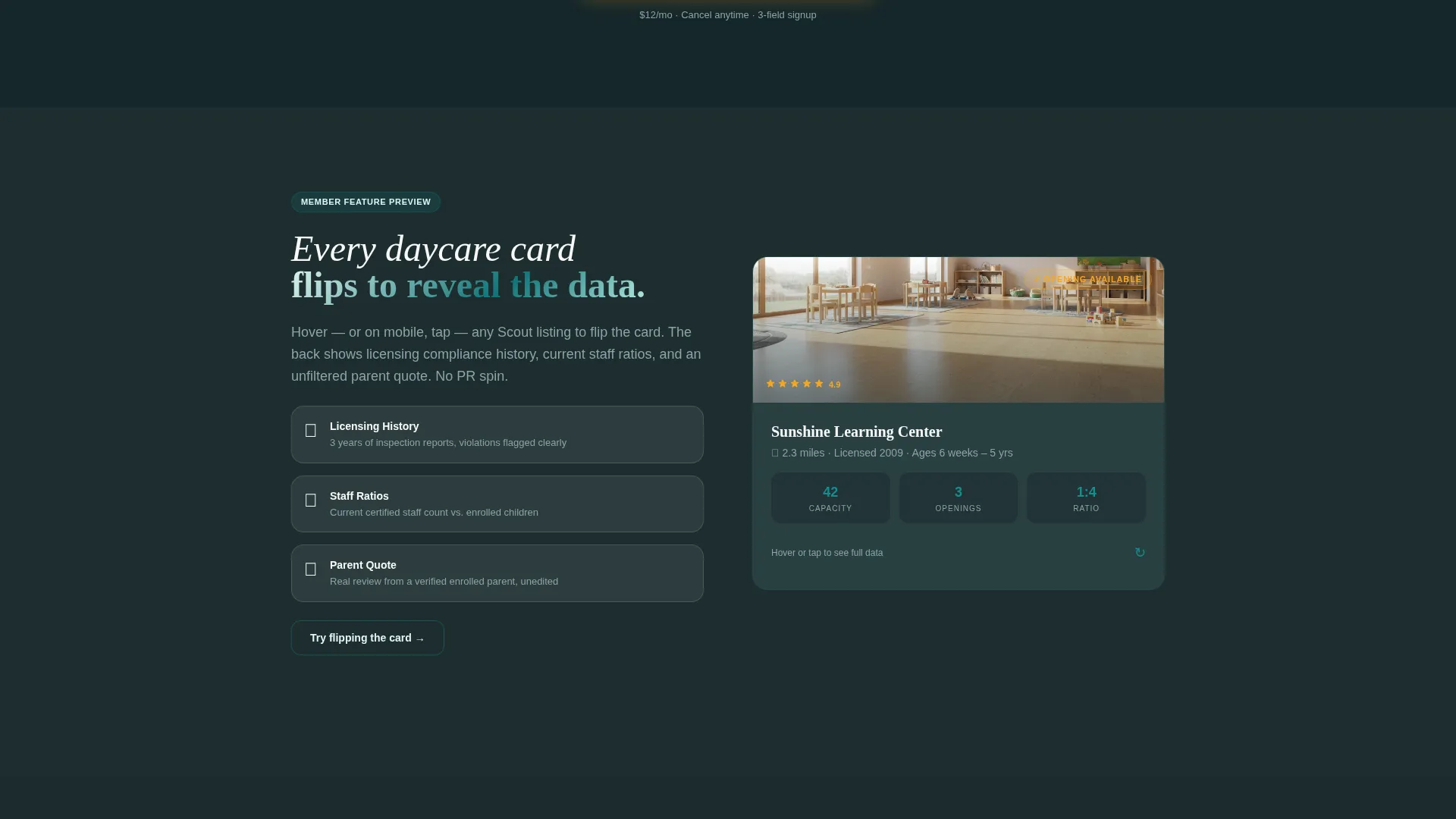
Interactive Daycare Card Flip
A sample daycare card flips on hover to expose licensing history, staff-to-child ratios, and a parent-verified quote. This component makes abstract membership benefits feel concrete and specific. It directly answers the question: "What exactly will I see inside?"
Scroll-Reveal Section Architecture
Every section of the page is designed to appear progressively as the visitor scrolls deeper. This pacing controls attention and prevents information overload. Each revealed layer adds one more reason to sign up.
Focused Three-Field Checkout
The payment form collects only three pieces of information: email address, zip code, and a pricing toggle between monthly ($12 per month) and annual ($99 per year). Reducing form friction at the final step keeps conversion rates from dropping at the last moment.
Page sections overview
| Section | Purpose |
|---|---|
| Dark Glass Hero | Establish trust with verified data points |
| Free Search call to action | Let skeptics try a limited result set |
| Zip-Code Map | Prove product value before paywall |
| Comparison Table | Reveal membership advantages row by row |
| Daycare Card Flip | Show exactly what membership data looks like |
| Membership Checkout | Convert with a minimal three-field form |
Design & branding system
The visual identity follows a Directory and Discovery theme built on the Teal Catalyst color system. The palette is designed to feel clinical enough to signal real data while remaining calm enough for a sleep-deprived parent at midnight.
- Core colors: deep decision teal (#0D7377), soft nursery mint (#E0F5F2), and charcoal trust (#1E2D2F) for structure and text
- Accent color: warm marigold (#F5A623) used exclusively for buttons, badges, and interactive hotspots to draw the eye toward action
- No stock photography of children; the hero sells the tool through data panels, not emotional imagery
Mobile & speed optimization
The template layout is built to function across screen sizes, keeping the scroll-reveal interactions and map preview usable on smaller displays. Mobile visitors, including parents searching from a phone at 2 a.m., should encounter no broken layouts or hidden content.
- All section widths and card components are designed to reflow cleanly on narrow viewports
- The zip-code input and checkout form remain prominent and easy to tap on touch screens
- The progressive reveal sequence is structured to maintain pacing on both desktop and mobile scroll behavior
How this template helps you convert
Scout is architected around a dual conversion path that meets visitors wherever they are in their decision. Skeptics get a free taste; ready buyers get a frictionless checkout.
- The primary call to action, "See What Free Misses," appears only after the comparison table has fully revealed itself, so the visitor has already seen the evidence before being asked to act.
- The secondary path, "Try a Free Search," lets hesitant visitors experience one limited result that strategically ends at a gated feature, nudging them toward membership through proof rather than pressure.
- The three-field checkout form removes every unnecessary barrier at the moment of commitment, keeping the path from decision to payment as short as possible.
Other information about this template
Scout is categorized under Technology with a subcategory focus on Daycare Digital Presence and a niche focus on Daycare Membership Sites. The template style is Scroll Reveal (Progressive), meaning the creative direction is Interactive Explorer, and the landing-page direction is Comparison/Versus. These structural choices are intentional and make the template well-suited for any directory or discovery product that needs to demonstrate data value before asking for payment. The template can also support adjacent use cases such as after-school program directories or nanny-placement membership sites where the same progressive proof model applies.
- Template style: Scroll Reveal (Progressive) with an Interactive Explorer creative direction
- Landing-page direction: Comparison/Versus, anchored by the "Free Search versus. Scout Membership" table
- Header concept: Dark Glass Panels with cursor-driven parallax depth
- Theme: Directory and Discovery, applicable beyond daycare to other local-service membership products
Theme
Directory & Discovery
Creative direction
Interactive Explorer
Color system
Teal Catalyst
Style
Scroll Reveal (Progressive)
Direction
Comparison/Versus
Page Sections
Dark Glass Panel Hero
Live Zip-code Map Preview
Progressive Comparison Table
Interactive Daycare Card Flip
Scroll-reveal Section Architecture
Focused Three-field Checkout
Related questions
Who is the primary audience this landing page template is built for?
Does the page require a visitor to pay before seeing any value?
What does the checkout form ask for?
Can this template be adapted for a different local-service membership product?
Why does the hero avoid photos of children?



