Scrap - Powerful Recycling Landing Page Template
Scrap is a recycling analytics landing page template built for salvage yard operators, fleet recycling managers, and municipal waste directors who need instant margin clarity. It pairs a live-data code snippet header with an animated dashboard panel, a versus comparison grid, and a relentless scroll rhythm that drives visitors straight toward the "Run Your Yard's Numbers" call to action.
by Rocket studio
Quick summary
Scrap is a single-page analytics landing page template purpose-built for salvage and recycling platforms. It opens with a styled terminal code snippet showing live commodity price calls, then accelerates through a before-and-after dashboard view, a detailed three-column versus grid, and a deployment timeline strip. Every section is shorter than the last, compressing the pitch the way the product compresses decision cycles.
Who this template is for
This template is designed for founders and product teams launching vertical software-as-a-service platforms in the salvage and recycling industry. It speaks directly to operators who still run margins on whiteboards and need a fast, convincing argument for switching to data-driven tools.
- Second-generation salvage yard owners running on gut instinct who need proof before committing
- Fleet recycling managers juggling multiple commodity price feeds across materials and loads
- Municipal waste directors who must report diversion rates to city councils each quarter
What problem this template solves
Most recycling operations collect the right data but have no fast way to see which materials are profitable and which are bleeding margin. The template frames this gap visually and immediately, so visitors recognize their own situation before they read a single feature bullet.
- Operators cannot tell which loads are profitable until after the truck hits the scale
- Generic dashboards and spreadsheets do not surface per-material margin or commodity deltas at a glance
- Compliance and diversion reporting eats manual hours that could be spent on higher-value decisions
What you get with this template
You get a fully structured, section-led landing page layout ready to customize for your recycling analytics product. Every section is designed to do specific persuasion work, from the header proof point down to the gated secondary call to action.
- A code snippet hero header with a live terminal block showing an API call pulling copper and aluminum spot prices into per-load margin output
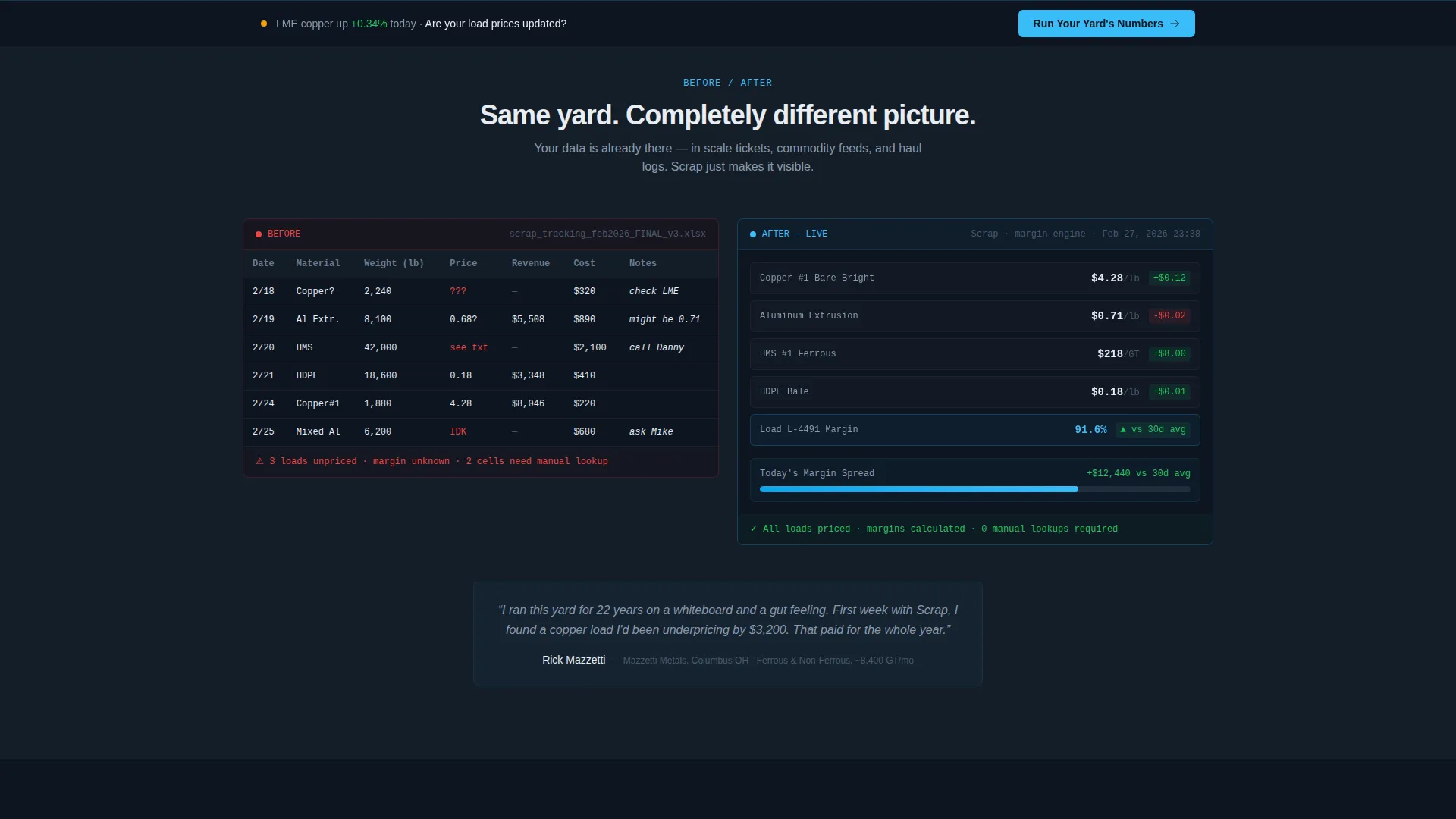
- A before-and-after section pairing a static messy spreadsheet screenshot against a live-animated dashboard panel with metrics populating in real time
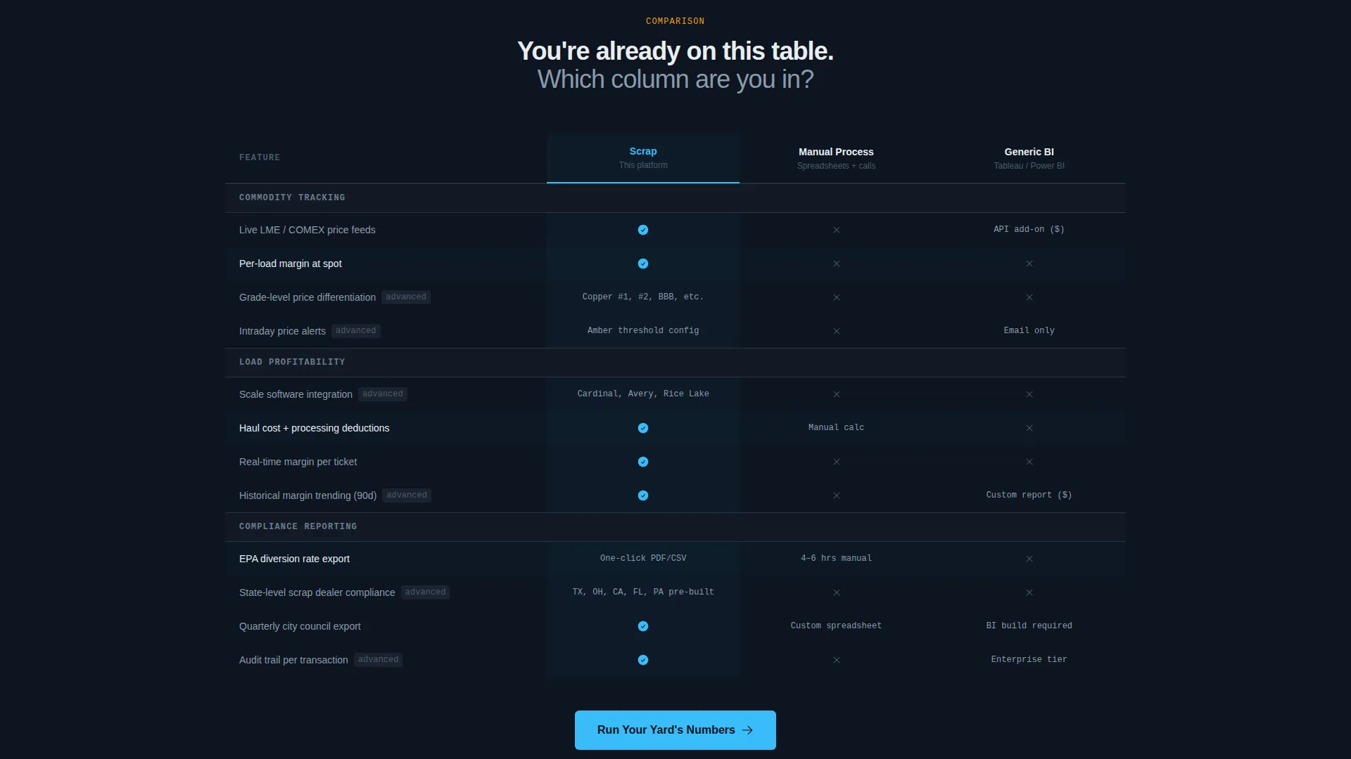
- A three-column comparison grid benchmarking your platform against manual processes and generic business intelligence tools, with checkmarks, X-marks, and feature callouts that grow more technical as visitors scroll deeper
Feature list
This template is built around components that earn trust through visible data proof rather than marketing language. Each section does a specific conversion job.
Terminal Code Snippet Header
The header centers a styled terminal block showing a real API call. It pulls live copper and aluminum spot prices and transforms them into per-load margin calculations in four lines of clean output, with numbers ticking green. No stock photography, no hero image. Just raw data proof up front.
Before-and-After Dashboard View
The first scroll section places a static screenshot of a messy spreadsheet directly beside a live-animated dashboard panel. Metrics populate in real time on the right side. The contrast is immediate and visceral, letting visitors picture their own operation in both columns.
Three-Column Versus Comparison Grid
The second scroll section compares commodity tracking, load profitability, and compliance reporting across three columns: your platform, manual processes, and generic business intelligence tools. Checkmarks and X-marks are paired with specific feature callouts. Content grows more technical as the visitor scrolls deeper, rewarding attention.
Deployment Timeline Strip
An integration logos strip paired with a three-step deployment timeline drives home how fast the platform activates. Day 1 connects scale software. Day 3 brings in live commodity feeds. Day 7 delivers full margin visibility. The rhythm closes the objection about switching cost.
Primary and Secondary Call-to-Action System
The primary call to action, "Run Your Yard's Numbers," anchors the bottom of the versus grid and repeats as a sticky bar after the first scroll. Clicking opens a two-field qualifier for yard type and monthly tonnage range. A secondary path, "See How We Beat the Competition," links to a gated feature breakdown PDF requiring only an email address.
Page sections overview
| Section | Purpose |
|---|---|
| Terminal Code Header | Opens with live API proof, no stock imagery |
| Before versus. After | Shows the messy-to-clear dashboard contrast visually |
| Versus Comparison Grid | Benchmarks platform against manual and generic tools |
| Integration & Timeline | Handles switching-cost objection with a three-day rollout |
| Sticky call to action Bar | Keeps the primary action visible after the first scroll |
| Gated Secondary Path | Captures competitor-curious leads behind an email gate |
Design & branding system
The visual identity runs on a Slate & Sky color system built to feel like a working scrapyard at dawn. Dark iron backgrounds sit against electric-blue data highlights, with amber reserved strictly for alert states and margin delta indicators.
- Deep yard slate (#1E2A38) covers primary backgrounds; weathered galvanize (#6B7B8D) fills secondary panels and data borders
- Open-sky cyan (#38BDF8) fires across live data points, interactive highlights, and the terminal output numbers
- Caution-stripe amber (#F59E0B) appears only on alerts and delta change indicators, keeping its meaning clear
Mobile & speed optimization
The layout is built around a compressed scroll rhythm where each section is shorter than the one before it. This structure keeps the page feeling fast and focused on any screen size.
- Section compression naturally reduces scroll depth on smaller viewports, maintaining the relentless pace on mobile
- The sticky call-to-action bar activates after the first scroll, keeping the conversion entry point reachable without hunting for it
- The terminal code block and data grid are styled components, not heavy image assets, keeping the visual proof lightweight by design
How this template helps you convert
The Comparison/Versus landing page direction does the persuasion work before any call to action appears. Visitors who reach the bottom of the grid have already seen themselves on the losing side of the versus column.
- The terminal header establishes instant credibility by showing live API output rather than promises, so skeptical operators trust the platform before they scroll
- The versus grid builds a case section by section, with progressively technical callouts that reward the most engaged visitors and prime them for the qualifier form
- The two-path call-to-action system captures both ready buyers through the "Run Your Yard's Numbers" qualifier and research-stage prospects through the gated competitive breakdown PDF
Other information about this template
This template was built under the Startup Velocity theme with Launch Energy creative direction. That combination means the design moves with urgency and every layout decision reinforces speed and clarity over decoration.
- The template style is Dashboard and Data Grid, making it a strong fit for any analytics or vertical software-as-a-service product that needs to prove value through visible data
- The header concept is Code Snippet, a deliberate choice to lead with technical credibility rather than lifestyle imagery
- The Comparison/Versus landing page direction makes this template particularly well-suited for markets where prospects are actively evaluating alternatives or still using manual workflows
- The Slate & Sky color system and amber alert palette can be recolored to match any brand while preserving the visual logic of the original design intent
- This template sits at the intersection of the Technology category and the Salvage and Recycling Analytics vertical, but the layout structure translates to any commodity-driven or operations-heavy software product


Theme
Startup Velocity
Creative direction
Launch Energy
Color system
Slate & Sky
Style
Dashboard/Data Grid
Direction
Comparison/Versus
Page Sections
Live Terminal Code Snippet Header
Before-and-after Dashboard Panel
Three-column Comparison Grid
Deployment Timeline Strip
Sticky and Anchored Call to Action System
Gated Competitive Breakdown Path
Related questions
Can I change the commodity types shown in the code snippet header?
What does the two-field qualifier form capture?
Can the versus grid work with only two comparison columns?
Is the secondary call-to-action path always gated?
What industries beyond salvage yards can use this template?



