AI & Machine Learning Specialist Professional Website Template
Screen is a hub-and-spoke AI screening landing page template built for talent-acquisition platforms that process thousands of applications at once. It uses a Midnight Blue color system, a sticky anchor nav, and a Feature Matrix layout to guide visitors from a cinematic header through capability-by-capability proof points toward a live demo click-through.
by Rocket studio
Quick summary
Screen is a single-page, anchor-nav landing page template for AI-powered candidate screening platforms. It opens with a full-bleed dark header and builds through a Feature Matrix of comparison modules. Every section is designed to show capability, not just describe it, pushing visitors toward a live product demo without a form.
Who this template is for
This template is built for teams launching or marketing an AI hiring and screening platform. It speaks directly to buyers who manage high application volumes and need to demonstrate speed and accuracy before asking for a signup.
- Talent-acquisition leads at mid-market SaaS companies handling large inbound application flows
- Agency recruiters managing multiple open roles across different industries simultaneously
- HR directors at hospitals or logistics firms where unfilled roles carry immediate operational cost
What problem this template solves
Manual resume review is slow, inconsistent, and expensive at scale. Hiring teams need a way to communicate the value of AI-assisted screening without asking visitors to read a wall of text or fill out a form before they understand what the product does.
- Visitors leave before they grasp the platform's capability because the value case is buried
- Feature-heavy products struggle to show speed and accuracy in a single scroll session
- Technical and non-technical buyers need different proof points, and most pages only serve one group
What you get with this template
You get a fully structured, dark-themed landing page with a sticky anchor navigation system, modular comparison sections, and a persistent click-through call-to-action bar. Every section is self-contained and sequenced to build trust before asking for a click.
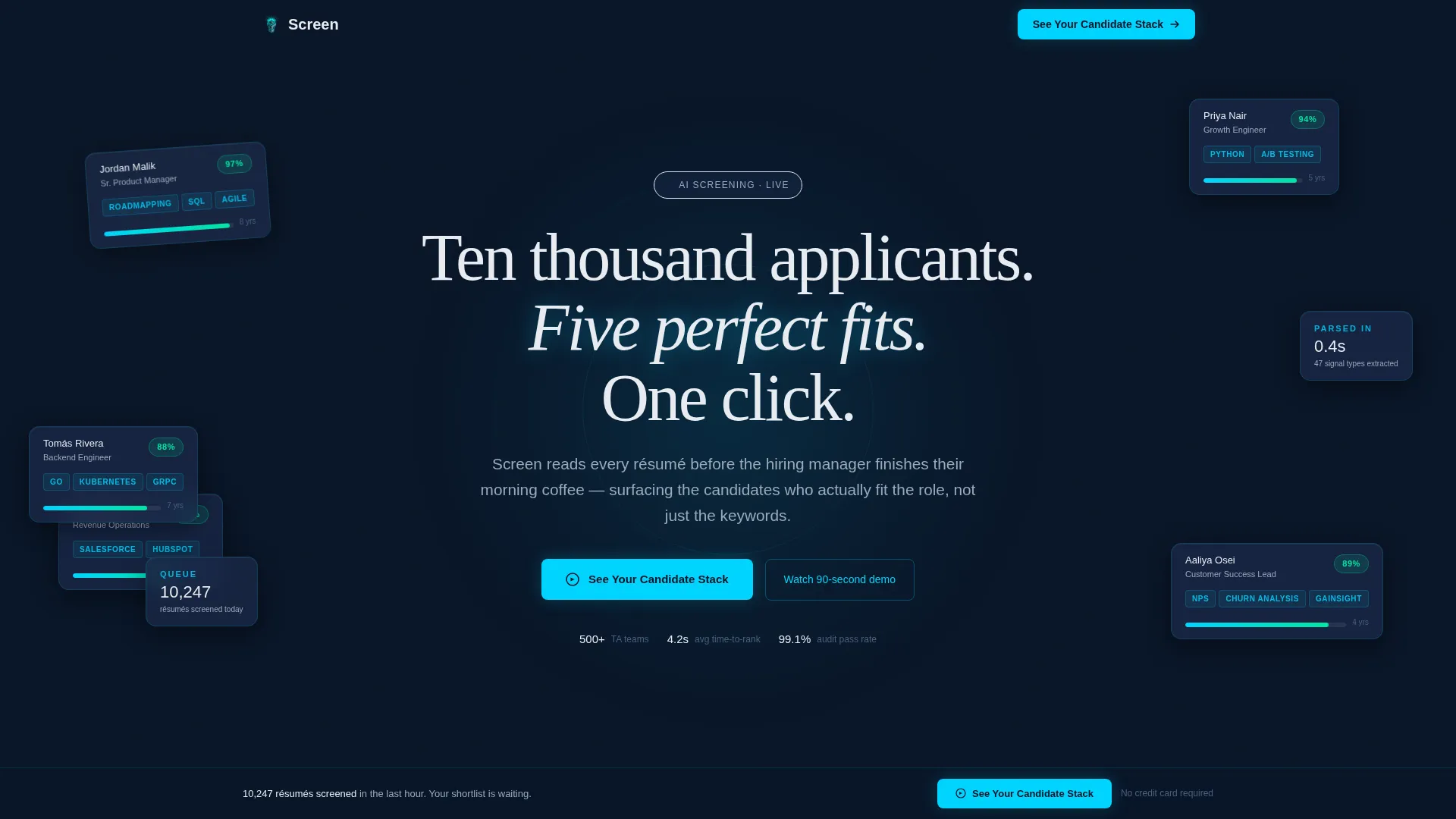
- A cinematic full-bleed header with floating candidate card fragments and a radial cyan glow effect
- Five anchor-linked spoke sections covering Parsing, Ranking, Bias Guard, Integrations, and Compliance
- Single-stat interstitial blocks between spokes, a persistent bottom call to action bar, and a secondary text link for technical buyers
Feature list
This template includes the following built-in structural and visual capabilities, all grounded in the source brief.
Full-Bleed Dark Header with Glow Scene
The header fills the entire viewport with deep navy (#0A1628) and projects a soft radial cyan glow from the center. Translucent candidate card fragments drift inside the glow, creating immediate atmosphere without any stock photography.
Sticky Anchor Navigation Bar
A hub-and-spoke anchor nav locks to the top of the page after the header. Spoke labels including Parsing, Ranking, Bias Guard, Integrations, and Compliance let visitors jump directly to the section most relevant to their role.
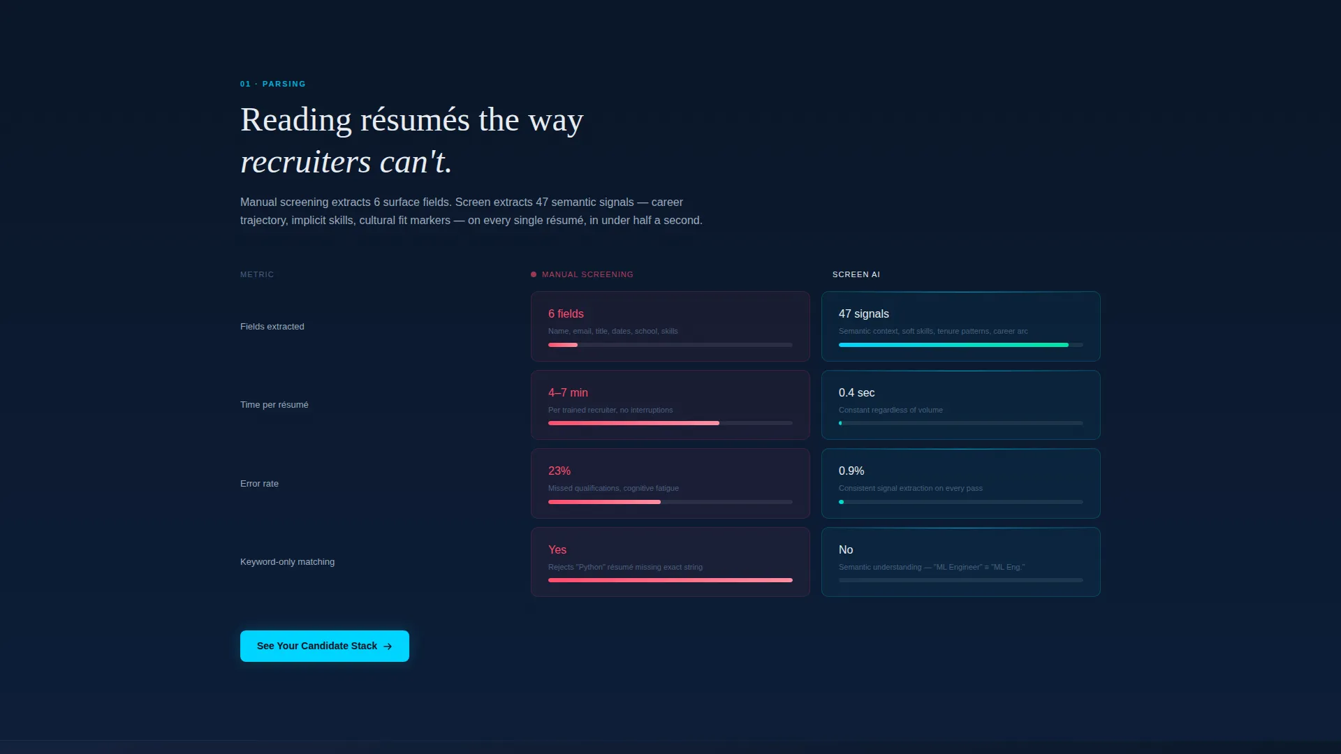
Feature Matrix Comparison Modules
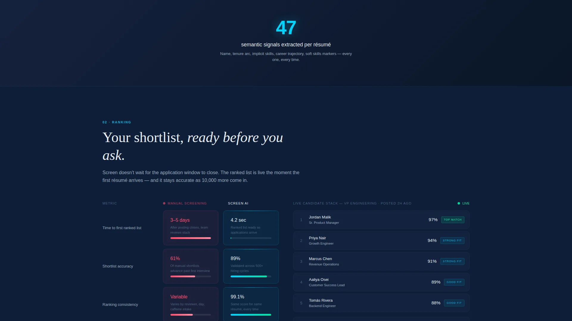
Each spoke section presents a side-by-side comparison grid. The left column shows what manual screening looks like in terms of time, error rate, and cost. The right column shows what the AI delivers, with animated counters and micro-bar charts that fill on scroll.
Single-Stat Interstitial Blocks
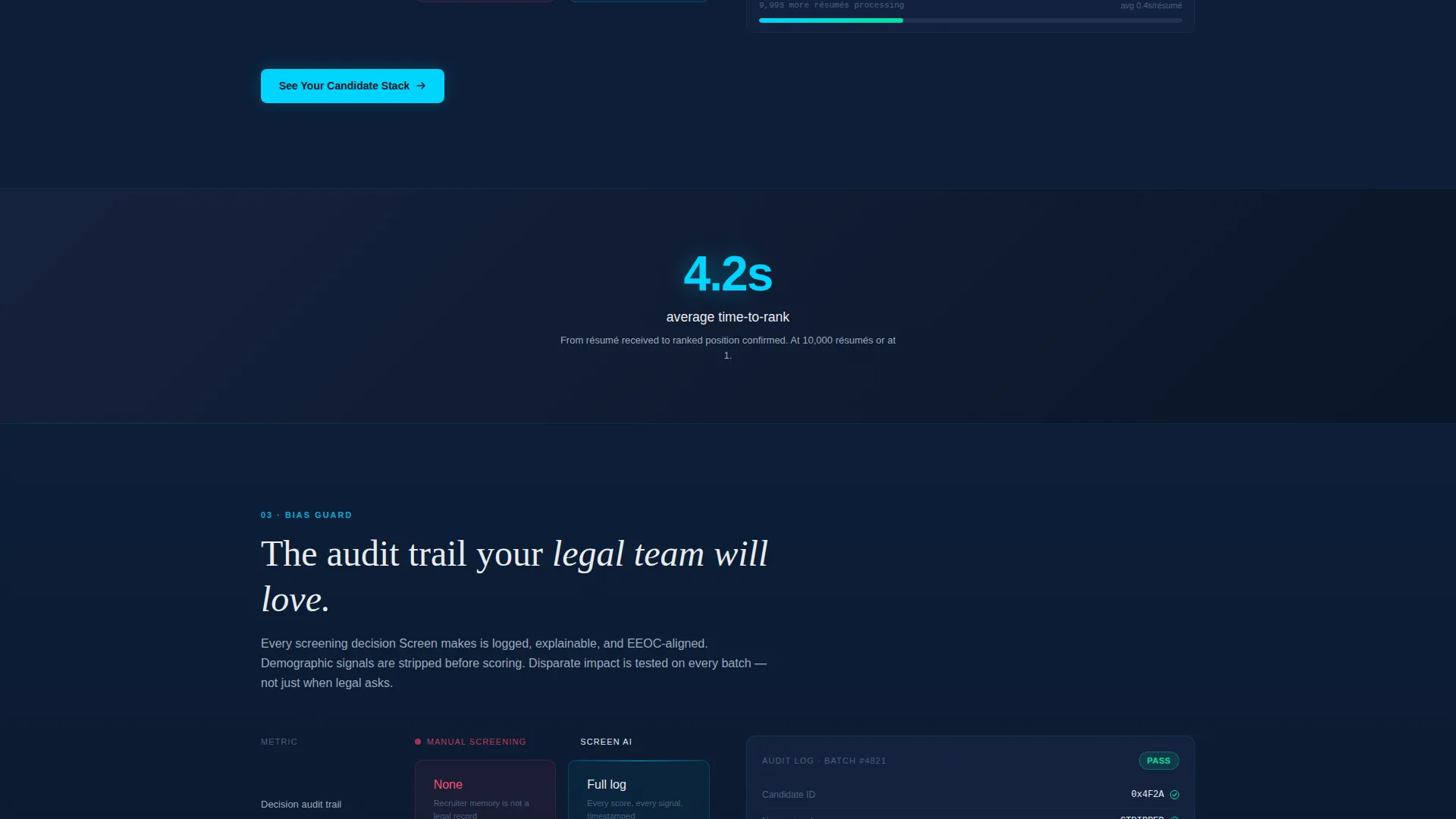
Between each spoke section, a full-width interstitial displays one glowing proof-point statistic against the dark background. These give the eye a visual rest while reinforcing a specific performance claim from the platform.
Persistent Bottom call to action Bar
After the second scroll, a bottom bar slides up and stays visible. It carries the primary call-to-action ("See Your Candidate Stack") so the demo entry point is never more than one click away, regardless of scroll position.
Secondary Technical Link in Integrations Spoke
The Integrations spoke includes a secondary text link labeled "Read the integration docs." This serves technical buyers who need documentation proof before committing to a demo click-through.
Page sections overview
| Section | Purpose |
|---|---|
| Full-Bleed Header | Establishes atmosphere and primary call to action |
| Sticky Anchor Nav | Links all spoke sections for quick navigation |
| Parsing Spoke | Shows AI resume parsing versus. manual review |
| Ranking Spoke | Compares AI candidate ranking to human sorting |
| Bias Guard Spoke | Addresses screening consistency and fairness |
| Integrations Spoke | Covers platform connections with docs link |
| Compliance Spoke | Surfaces regulatory and process alignment |
| Stat Interstitials | Delivers single proof-point breaks between spokes |
| Persistent call to action Bar | Keeps demo click-through always accessible |
Design & branding system
The visual identity follows a Directory and Discovery theme using a Midnight Blue color palette. The overall effect is a command-center aesthetic where elements are dark at rest and pulse to life on interaction.
- Background layers use deep command-center navy (#0A1628) with cool gunmetal (#1B2A4A) for card surfaces and section dividers
- Interface white (#E8ECF1) handles all body text and labels, while electric cyan (#00D4FF) drives active states, hover rings, and data-visualization accents
- All primary call to action buttons are solid cyan on navy with white text, and anchor nav pills sit in gunmetal with cyan underlines on active state
Mobile & speed optimization
The template is structured for responsive layout scaling. The hub-and-spoke architecture keeps each section modular so content reflows cleanly at smaller breakpoints without disrupting the comparison grid logic.
- Each spoke module is self-contained, making it straightforward to stack vertically on narrow screens
- The sticky anchor nav and persistent call to action bar are designed to remain functional and visible on mobile viewports
How this template helps you convert
Every design and copy decision in this template points toward a single outcome: earning the demo click. There is no form on the page. The product earns trust through evidence before asking for anything.
- The Feature Matrix accumulates proof across five spoke sections, so by the time a visitor reaches the bottom, they have seen the platform's capability layer by layer rather than reading a single claims paragraph.
- The persistent bottom call to action bar and the interstitial stat blocks keep the demo entry point visible throughout the scroll, reducing friction between decision and action.
Other information about this template
This template is categorized under Technology, specifically the AI and Machine Learning subcategory, with a niche focus on AI HR screening platforms. It is best suited for teams who want to communicate a sophisticated product through a show-don't-tell page structure.
- The click-through model routes visitors directly to a pre-built demo environment seeded with sample applicant data, so the first experience is the product itself
- The template style is Hub and Spoke with Anchor Navigation, which works well for platforms that have multiple distinct capability areas to showcase in a single session
- The header concept is a Dark Full-Bleed with Glow scene, and the creative direction is a Feature Matrix, both defined in the matched intersection context for this template
Theme
Directory & Discovery
Creative direction
Feature Matrix
Color system
Midnight Blue
Style
Hub & Spoke (Anchor Nav)
Direction
Click-Through
Page Sections
Full-bleed Dark Header with Glow
Sticky Hub-and-spoke Anchor Nav
Feature Matrix Comparison Modules
Single-stat Interstitial Blocks
Persistent Bottom Call to Action Bar
Technical Buyer Integration Link
Related questions
Does this template include a lead capture form?
Can I edit the spoke section labels in the anchor nav?
Who is this template designed for?
How does the persistent bottom call to action bar behave?
Is this template suitable for a platform still in early development?



