Micro-SaaS & Developer Tools Cost Calculator Website Template
The Scribe AI Meeting Notes Bento Grid Landing Page Template is a glassmorphic, Tech Glass single-page layout built for AI meeting intelligence tools. It uses an interactive bento grid design to showcase transcript-to-summary transformation, a live time-savings calculator, and a seven-axis competitor comparison grid, helping visitors experience real product value before they ever click sign up.
by Rocket studio
Quick summary
This template gives designers and founders a fully structured, proof-first landing page for an AI meeting notes product. Every bento grid tile is interactive and purposeful. The deep void black base, frosted glass cards, and electric periwinkle highlights create a visual identity that feels sharp, credible, and modern. Visitors touch real output before they commit.
Who this template is for
This template is built for teams who need to show, not just tell. It is ideal for designers and developers launching an AI productivity tool who want to skip building from scratch.
- Product managers and founders who need a fast, polished launch page for a meeting intelligence product
- Designers who want a ready-to-edit bento grid design without starting from scratch
- Micro-SaaS teams looking to generate early sign-ups through interactive, proof-first content
What problem this template solves
Most AI tool landing pages rely on static claims. Visitors read promises but never experience the product. This template solves that by making every bento grid tile a live demonstration of value, not a bullet point.
- Visitors can toggle between raw transcript and structured notes inside a single bento tile, seeing the product work in real time
- A time-savings calculator lets visitors set their weekly meeting load and watch the numbers change
- A comparison grid lets evaluators check every axis side by side without leaving the page
What you get with this template
You get a complete, section-led bento grid landing page ready to edit, customize, and share. The layout is modular, meaning each bento box serves a specific purpose and can be updated independently.
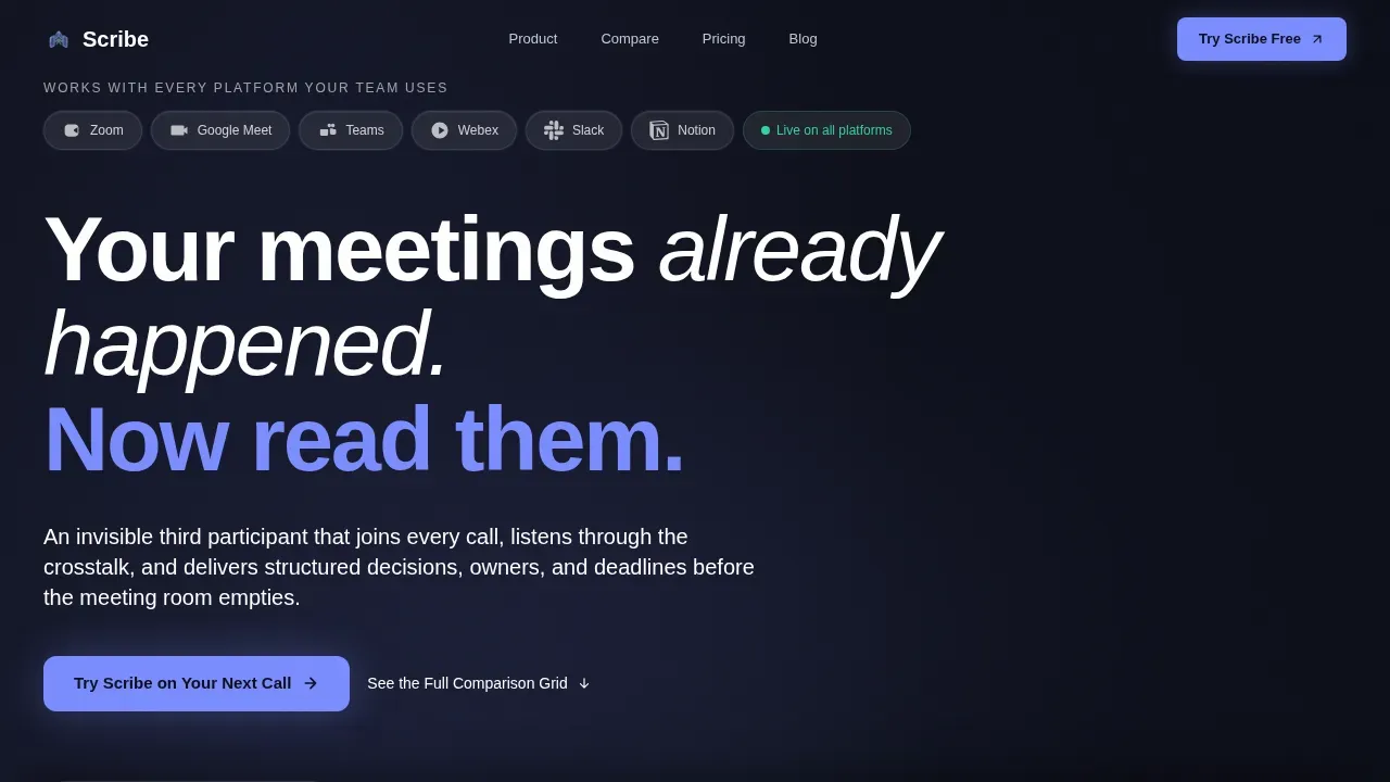
- A hero section with an animated transcript-to-summary transition, a logo bar, and a primary call-to-action
- An interactive bento grid section with a transcript toggle tile, a time-savings slider tile, and supporting feature tiles
- A seven-axis competitor comparison grid, social proof cards, a two-field conversion form, and a persistent bottom bar
Feature list
This template is packed with interactive bento grid components. Each tile is built to display a specific type of information clearly and drive a next step.
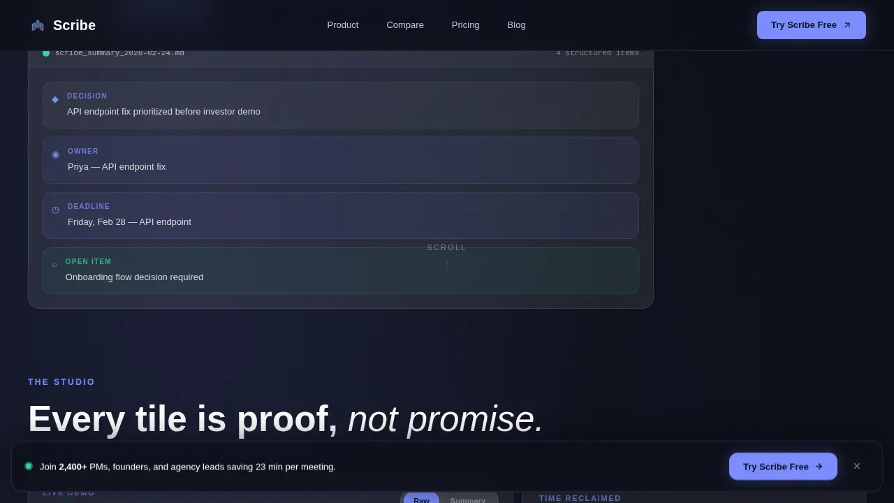
Interactive Transcript Toggle Tile
This bento tile lets visitors click between a raw call transcript and a structured notes summary. It uses real example content from a 47-minute product review call, giving visitors a direct preview of what the AI produces. The format shift is animated and immediate.
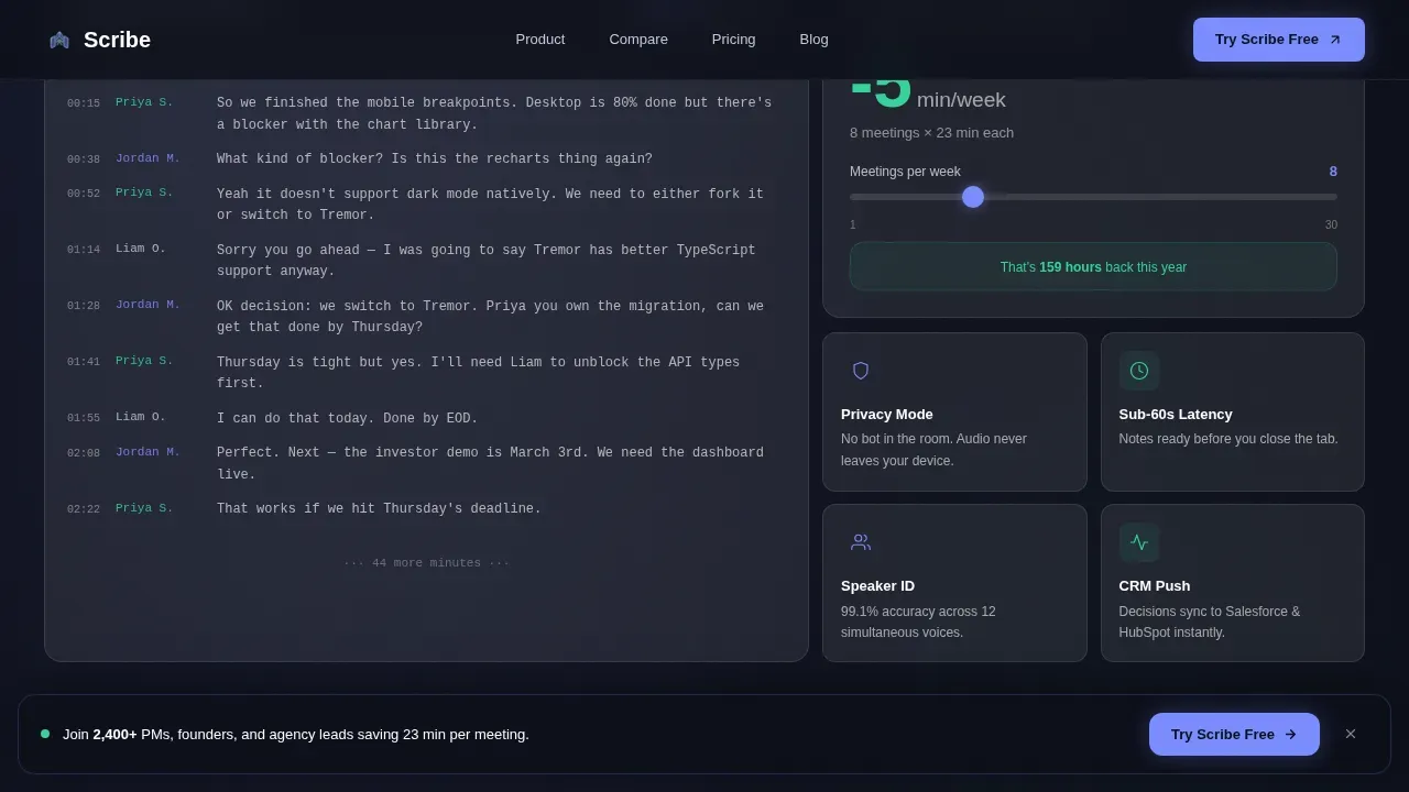
Live Time-Savings Calculator
A bento grid tile displays a running counter for average time saved per meeting. Visitors use a slider to set their number of meetings per week, and the tile generates a real-time total. This is one of the clearest reasons visitors move from curious to convinced.
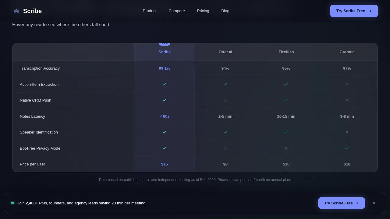
Seven-Axis Comparison Grid
This bento section lets visitors explore a competitor comparison across seven dimensions. Each row lights up on hover, with competitor columns dimming to frosted gray while the primary product column holds the electric periwinkle highlight. Charts and grid rows display clearly across the full screen.
Logo Bar Header
The header features a horizontal logo bar with recognizable platform icons rendered in monochrome glass. Each logo sits inside its own frosted pill. Above the bar, a headline and a looping video-style animation show the transcript condensing into a clean summary card on the right hand side.
Persistent Bottom Call-to-Action Bar
A frosted glass bar docks to the bottom of the page on scroll. Visitors can click to open a two-field form that captures their work email and calendar platform choice. This ensures the conversion option is always visible without interrupting the bento grid narrative.
Glassmorphic Social Proof Cards
Testimonial tiles share specific outcome notes from product managers, founders, and agency account leads. Each card uses the frosted card surface and soft silver text to display editorial-style quotes with role and company context. These bento tiles add trust at every scroll step.
Page sections overview
| Section | Purpose |
|---|---|
| Hero Logo Bar | Display platform logos, headline, and transcript-to-summary animation |
| Transcript Toggle Tile | Let visitors compare raw notes to structured summary output |
| Time Savings Tile | Show meeting time saved via an adjustable weekly slider |
| Versus Comparison Grid | Compare product against competitors on seven axes |
| Social Proof Cards | Share testimonials with specific outcome metrics |
| Conversion Form Section | Capture work email and calendar platform choice |
| Persistent Bottom Bar | Keep the primary call-to-action visible on scroll |
| Footer | Display horizontal footer in Vercel flow format |
Design & branding system
The branding uses a Tech Glass visual identity built on a glassmorphic color system. Every bento card surface uses frosted translucent white at 8 to 12 percent opacity over a deep void black base. This creates the impression that information floats just above the background.
- Colors: deep void black (#0B0D17) base, electric periwinkle (#7B8CFF) for active states, warm signal green (#34D399) for completed action items, and soft silver (#C2C9D6) for secondary notes
- Typography: DM Sans bold for headings, DM Sans Light for body copy, and JetBrains Mono for transcript and code-format text, keeping branding consistent and readable
- Branding animations include a film grain overlay, fade-in-up stagger on bento tiles, marquee scroll for the logo bar, and hover-triggered dimming on the comparison grid
Mobile & speed optimization
The bento grid design is built with responsive layout principles so each bento box stacks and scales across device sizes. The template uses a desktop-first approach but adapts cleanly to smaller screens.
- Server Components handle static bento sections for fast initial load, while Client Components manage interactive tiles like the transcript toggle and time-savings slider
- Responsive design within the bento grid framework ensures the layout adapts to various device types without breaking the visual hierarchy
- The large bento boxes holding primary features stay prominent on any screen, while smaller supporting boxes reflow below them
How this template helps you convert
Every design choice in this template moves visitors closer to signing up. The bento grid layout reduces cognitive load by letting visitors scan specific tiles rather than read a full wall of text.
- The transcript toggle tile lets visitors access real output before they commit, making the product case without a single claim
- The time-savings calculator personalizes the value for each visitor by showing saving figures based on their own meeting volume
- The persistent bottom bar ensures the call-to-action is always one click away, even as visitors explore every bento tile deep on the page
Other information about this template
This template is part of the Micro-SaaS and Developer Tools category under Technology. It is designed for the AI Meeting Notes niche and follows the Comparison/Versus landing page direction with an Interactive Explorer creative approach.
- Designers can duplicate the template to create variations for different product angles or branding updates without losing the base bento grid structure
- You can upload your own logo, edit the default prompt copy, apply your own branding colors, and add or delete tiles to customize the grid for your specific product
- The bento grid design supports various content types including video embeds, charts, notes lists, and voice-related feature tiles, making it adaptable beyond the default Scribe AI meeting notes use case
- The Scribe AI meeting notes bento grid landing page template is named after Scribe, an AI-powered tool that automatically transcribes and structures spoken conversations into formatted documentation
- You can preview the full bento grid on your computer before publishing, check each tile format, and share a preview link with stakeholders to collect feedback before going live
Theme
Tech Glass
Creative direction
Interactive Explorer
Color system
Glassmorphic
Style
Bento Grid
Direction
Comparison/Versus
Page Sections
Interactive Transcript Toggle Tile
Live Time-savings Calculator
Seven-axis Competitor Comparison Grid
Glassmorphic Logo Bar Header
Persistent Conversion Bar
Social Proof Testimonial Tiles
Related questions
Can I edit the bento grid tiles without coding?
Can I start from scratch or use the default prompt layout?
How do I customize the branding colors and logo?
Does the template support video and interactive elements?
Can I duplicate this template to create multiple versions?


