Scrim - Dynamic Esports Landing Page Template
Scrim is a dynamic esports management landing page template built for competitive gaming organizations. It leads with a bold dashboard preview, a head-to-head comparison table, and motion-driven feature sections. The design uses deep void black and electric indigo to match the intensity of a tournament stage. One clear call to action drives free-tier signups.
by Rocket studio
Quick summary
Scrim is a single-page template designed for esports management software. It opens with a live-rendered dashboard screenshot, then delivers a direct comparison table before any storytelling begins. Motion-driven sections build confidence as visitors scroll. The entire page funnels toward one frictionless call to action: "Start Running Your Org."
Who this template is for
This template is built for teams and individuals who manage competitive gaming operations at any level. It speaks directly to people who live inside spreadsheets, Discord threads, and tournament brackets simultaneously.
- Org managers running multiple rosters across several game titles at once
- Amateur team captains coordinating scrims and qualifiers with limited tools
- Talent scouts reviewing player performance data late into the night
What problem this template solves
Most esports teams manage their operations across a patchwork of tools. Roster changes happen in group chats. Scrim schedules live in spreadsheets. Player stats get copy-pasted between tabs. The result is slow decisions and missed opportunities.
- Roster swaps, scrim scheduling, and player stat tracking all handled from one place
- No more jumping between five apps to confirm a lineup before a match
- Conflict alerts and calendar data visible at a glance, not buried in a thread
What you get with this template
This template gives you a fully structured, single-page layout ready to present esports management software with real conviction. Every section is purposeful and conversion-focused.
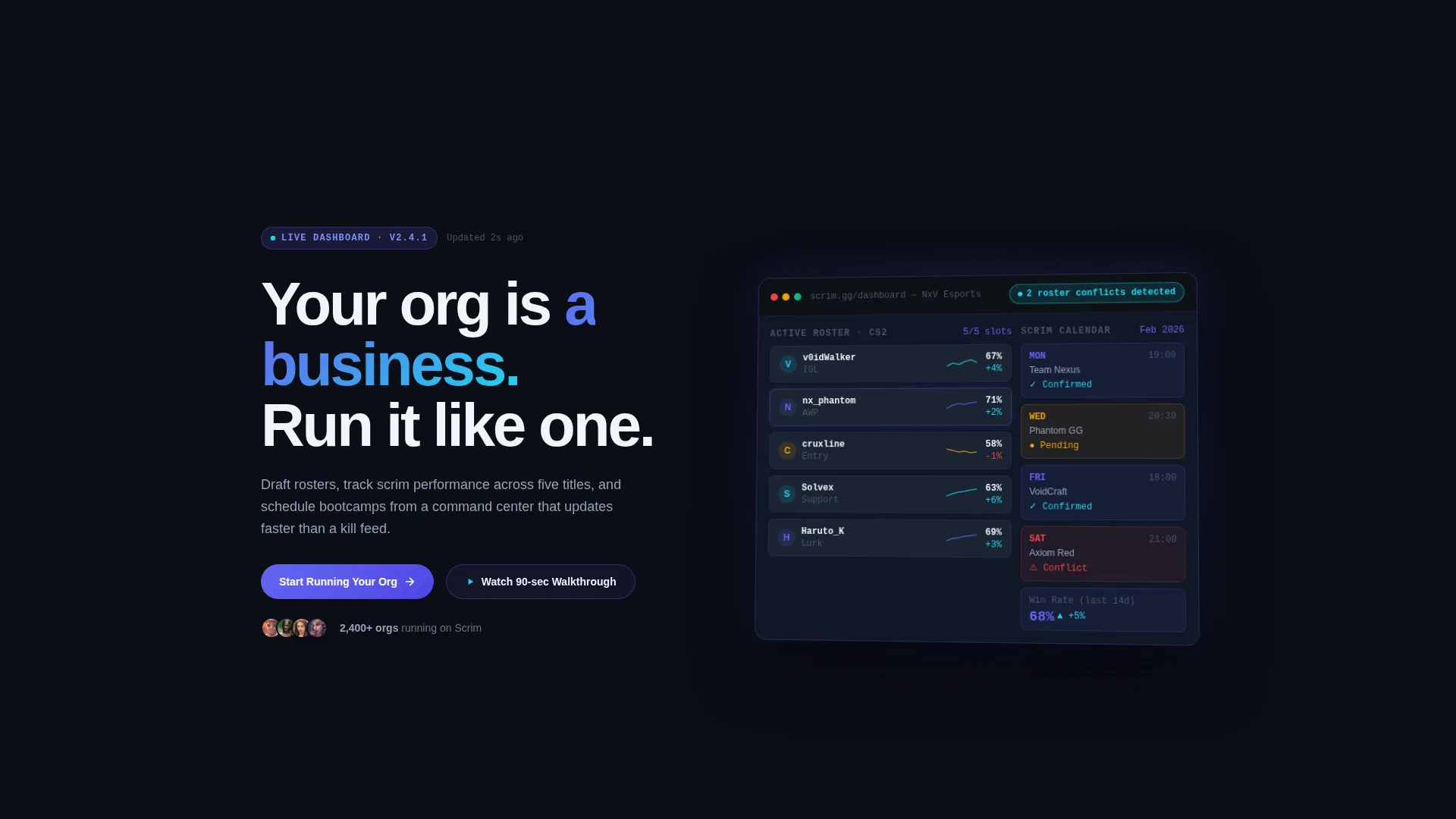
- A floating dashboard preview header with a live-style roster management screen
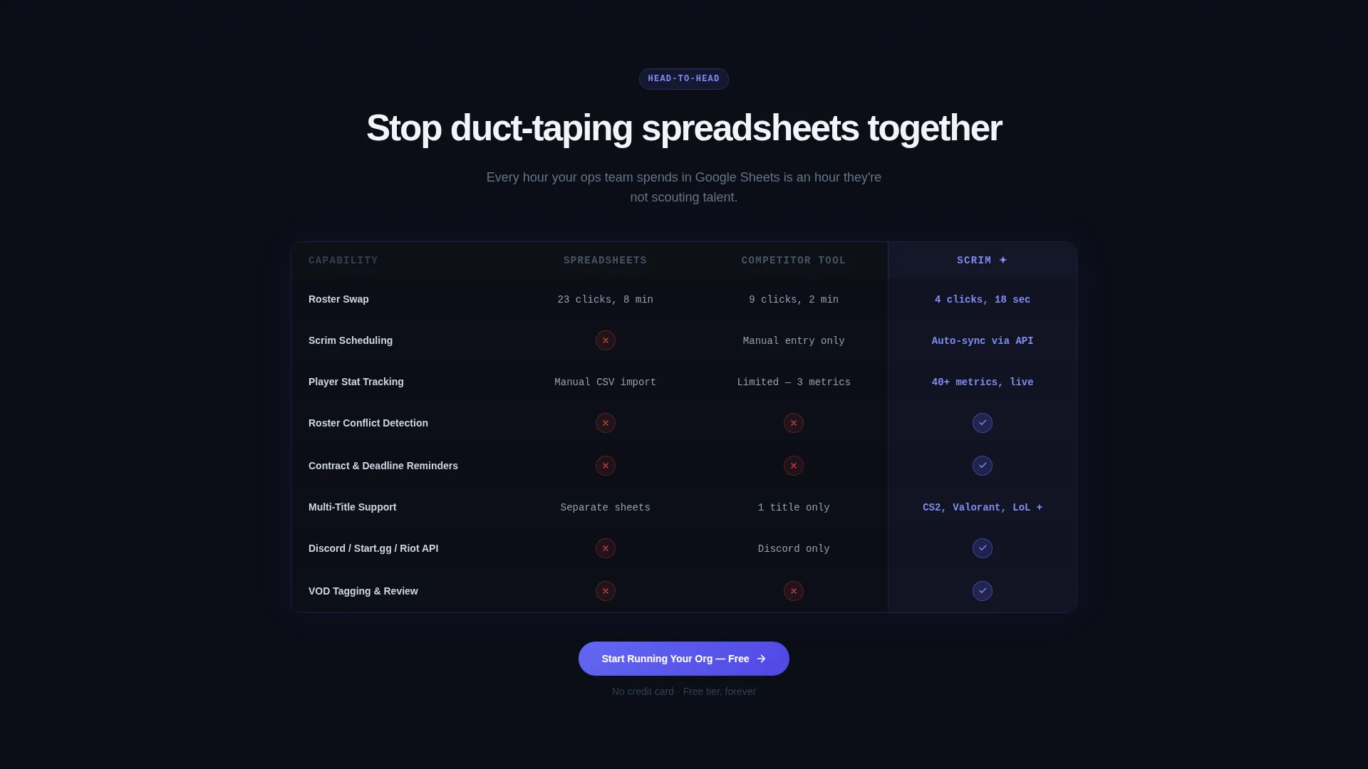
- A three-column comparison table covering five key management tasks with specific click-count metrics
- Animated feature sections, a pinned call-to-action bar, and a dual-call to action final section
Feature list
This template includes several purpose-built components that work together to move a visitor from skeptical to signed up.
Floating Dashboard Header
The header renders a realistic roster management screen mid-season. Five player cards show gamertags, role icons, and win-rate sparklines. A pulsing cyan notification badge reads "2 roster conflicts detected." The screenshot floats on a void-black background with an indigo glow radiating from behind it.
Head-to-Head Comparison Table
Three columns compare managing a team with spreadsheets, with a competitor tool, and with the platform. Rows cover roster swaps, scrim scheduling, player stat tracking, contract reminders, and multi-title support. Each cell uses checkmarks, X marks, or precise time-saved metrics such as "4 clicks versus. 23 clicks."
Dynamic Motion Section Animations
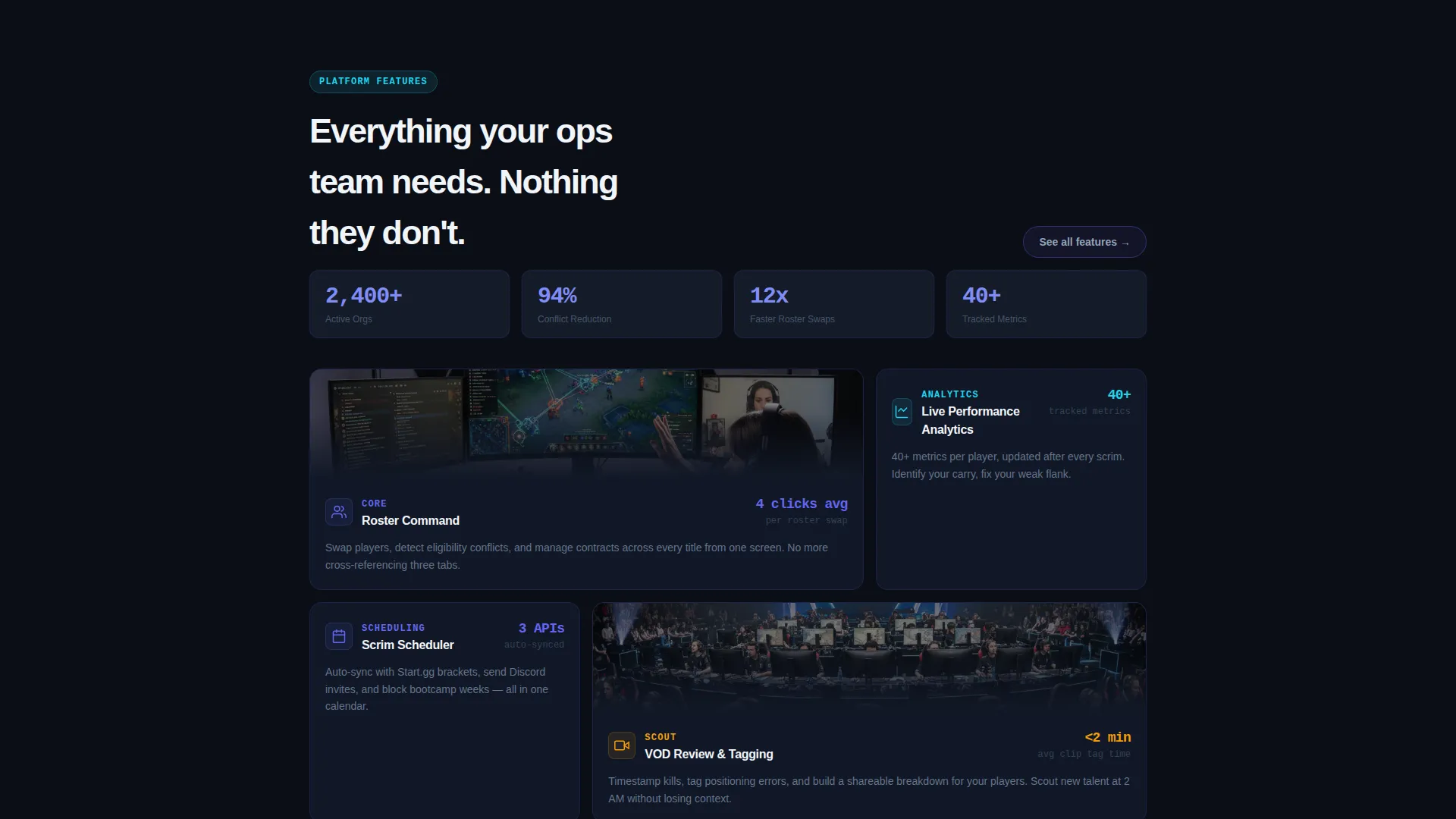
Feature blocks animate in as the visitor scrolls. Cards slide laterally like a draft carousel. Stats count up in real time. Each section enters with a kinetic snap that mirrors the rhythm of a highlight reel, reinforcing confidence at every stage of the scroll.
Pinned Call-to-Action Bar
After the first scroll, a slim top bar pins itself to the viewport and displays the primary call to action. It reappears centered below the comparison table and anchors the final section, keeping the conversion path visible without interrupting the reading flow.
Integration Reference Section
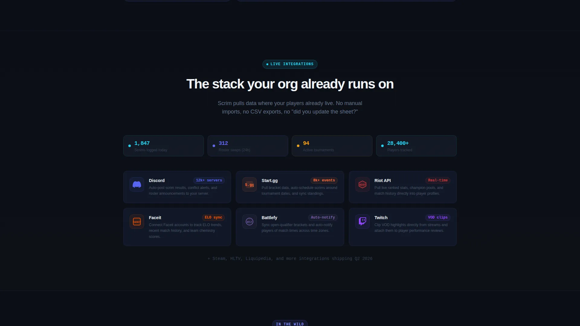
A dedicated section references connections to external platforms used in competitive gaming operations. This positions the software as part of the existing ecosystem rather than a standalone replacement.
Dual Secondary call to action Block
A "Watch a 90-Second Walkthrough" button sits beside the primary call to action. This gives motion-first visitors a lower-commitment entry point before they decide to sign up, widening the conversion funnel without adding form friction.
Page sections overview
| Section | Purpose |
|---|---|
| Dashboard Preview Header | Hooks attention with a live-style roster screen and headline |
| Comparison Table | Proves platform advantage over spreadsheets and competitor tools |
| Animated Feature Cards | Illustrates key capabilities with motion-driven presentation |
| Real-Time Stats Block | Counts up live metrics to reinforce platform performance claims |
| Integration Reference | Connects the software to tools already used by the target audience |
| Final call to action Section | Anchors the page with the primary signup button and walkthrough link |
Design & branding system
The visual identity is built around a Dynamic Motion theme using an Electric Indigo color system. Every color choice reinforces the tournament-stage atmosphere described in the brief.
- Deep void black (#0B0E17) forms the base, cool slate (#1E293B) surfaces card backgrounds, and electric indigo (#6366F1) pulses as the primary accent
- Reactive cyan (#22D3EE) is reserved for hover states, live-data accents, and the notification badge pulse
- The overall effect is a blacked-out arena aesthetic where everything is dark until action triggers color
Mobile & speed optimization
The template is structured for fast visual loading and clean rendering on smaller screens. The Dashboard Preview header and comparison table are the two heaviest visual elements, so their layout is designed to remain legible and impactful at any viewport width.
- The floating dashboard screenshot scales and repositions gracefully on mobile without losing its glow effect
- The comparison table adjusts column widths to stay readable on narrow screens
- Motion animations are scoped to scroll triggers, so they do not block the initial page render
How this template helps you convert
Every layout decision in this template is made to reduce the distance between a first impression and a signup click.
- The comparison table appears immediately after the header, so visitors see the platform's advantage before they have time to lose interest or navigate away.
- The pinned call-to-action bar stays in view throughout the scroll, removing the need to search for the next step at any point in the page.
- The dual-call to action block at the bottom captures both ready-to-sign-up visitors and those who want one more proof point before committing.
Other information about this template
This template is categorized under Technology, specifically the E-Sports Vertical SaaS subcategory, targeting the esports management software niche. It is built as a Calculator/Tool First landing page, meaning the most persuasive element, the comparison table, is front-loaded rather than saved for later in the scroll.
- The template style is Comparison Table, and the landing page direction is Click-Through with no on-page form
- The integration reference section surfaces connections to platforms such as Discord, Start.gg, and Riot APIs as proof of ecosystem fit
- The header concept is Dashboard Preview, which is a deliberate choice to lead with the product itself rather than abstract marketing language
Theme
Dynamic Motion
Creative direction
Calculator/Tool First
Color system
Electric Indigo
Style
Comparison Table
Direction
Click-Through
Page Sections
Floating Dashboard Preview Header
Three-column Comparison Table
Scroll-triggered Motion Animations
Persistent Pinned Call to Action Bar
Dual Call-to-action Block
Integration Reference Section
Related questions
Does this template include a sign-up form?
Can I use this template for a single esports title or does it require multi-title setups?
How does the comparison table content work?
Is the dashboard screenshot in the header a live data feed?
Who is the secondary 'Watch a 90-Second Walkthrough' button for?



