Extended Size Activewear Waitlist Landing Page
Sculpt is a masonry-style waitlist landing page built for an extended size activewear brand serving sizes 1X through 6X. It pairs a dark, ruby-lit visual identity with an atmosphere-first scroll experience, a floating "Save My Size" sign-up bar, and a tactile size-range slider. The result is a page that earns trust before it asks for anything.
by Rocket studio
Quick summary
Sculpt is a coming-soon landing page template for an extended size performance wear brand. The design leans into a Luxe Minimal aesthetic with obsidian backgrounds, ruby accent glows, and a masonry grid layout. Visitors scroll through cinematic fabric shots and manifesto typography before a floating waitlist form invites them to save their size.
Who this template is for
This template is built for founders and creative directors launching an inclusive activewear brand that genuinely serves extended sizes. It suits teams who want to build waitlist momentum before a full product release.
- Extended size activewear brands targeting sizes 1X through 6X
- Apparel founders preparing a pre-launch or coming-soon campaign
- Designers who want a high-fashion, editorial aesthetic without a heavy build
What problem this template solves
Most activewear landing pages default to a standard look that sidelines plus-size and extended size customers. They rely on flat product imagery and generic layouts that feel impersonal. Sculpt fixes that by leading with body-first storytelling and earning the visitor's trust before making any ask.
- Removes the cold, transactional feel that alienates extended size shoppers
- Replaces dropdown-heavy forms with a tactile size-range slider from 1X to 6X
- Builds brand credibility through atmosphere and editorial design before the waitlist call to action appears
What you get with this template
You get a fully structured single-page layout built for pre-launch conversion. Every section is designed to accumulate emotional resonance before the sign-up moment arrives. The template hands you a ready-to-edit visual framework with a clear purpose at every scroll depth.
- A dark full-bleed header with a ruby-glow silhouette and wide-tracked chrome typography
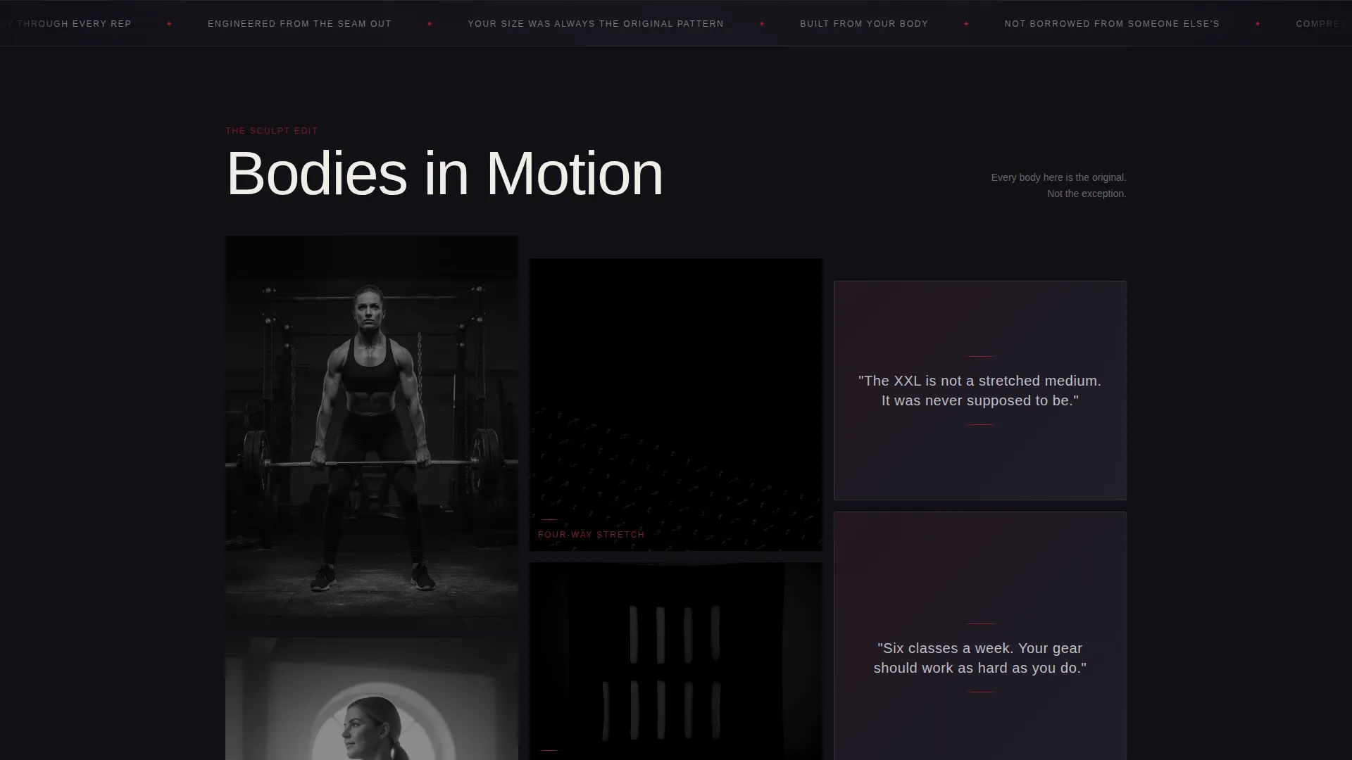
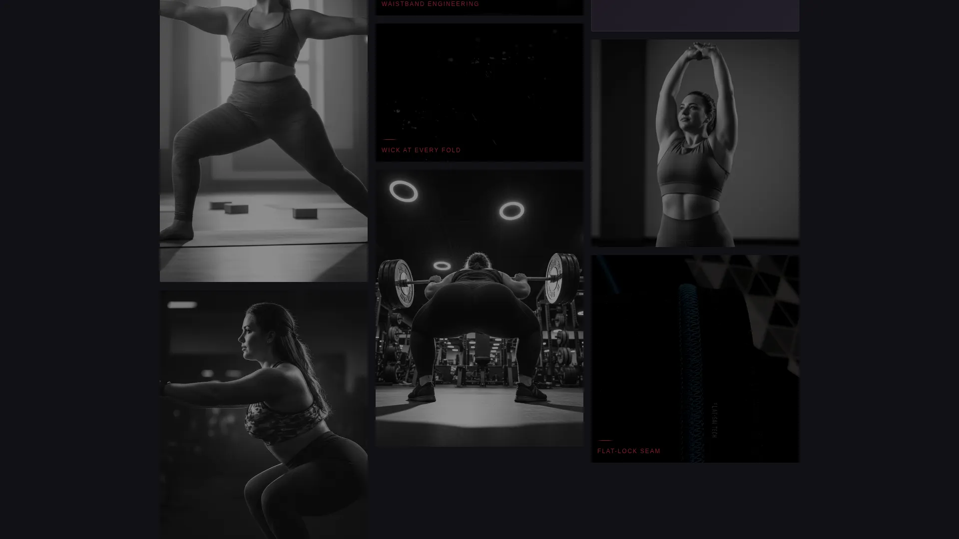
- A masonry grid that alternates between fabric macro shots, studio portraits, and single-line manifesto fragments
- A floating waitlist bar with email input and a tactile 1X-to-6X size-range slider
Feature list
This template is built around a small set of deliberate, high-impact features rather than a bloated component library.
Dark Full-Bleed Glow Header
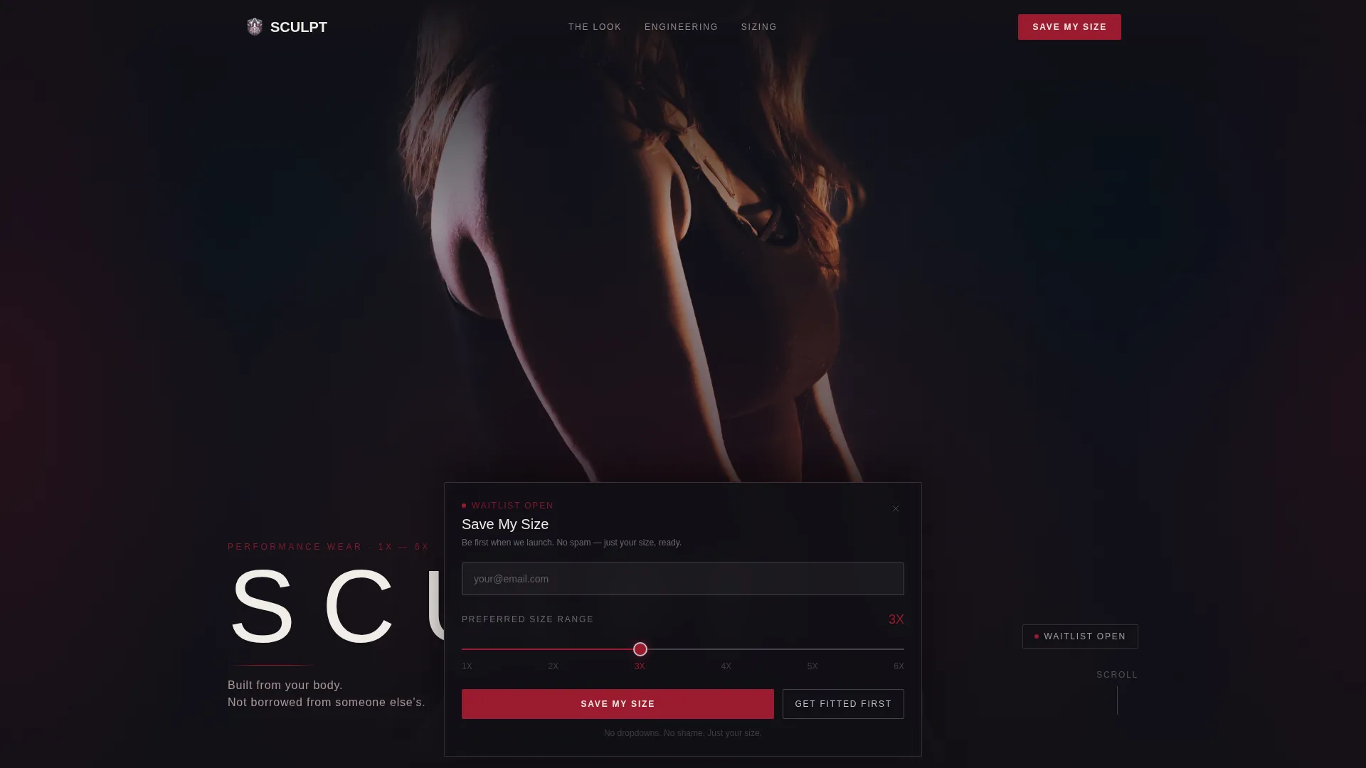
The hero section fills the entire viewport with obsidian black. A single figure emerges from the dark, lit by a soft ruby-edged glow tracing the silhouette in motion. The brand name runs in ultra-thin chrome-weight sans-serif type, wide-tracked across the composition.
Masonry Scroll Grid
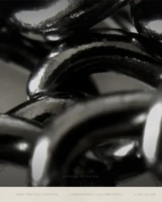
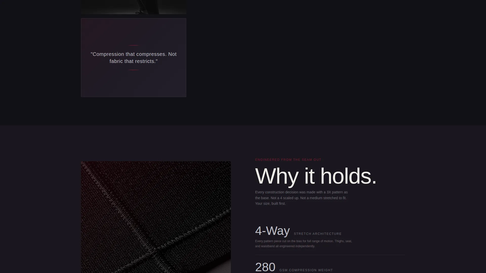
The core of the page is a Pinterest-style masonry grid. Tiles alternate between cropped fabric macro shots, candid studio portraits, and chrome typographic manifesto fragments. Some tiles are tall and cinematic; others are tight squares of texture. Each tile fades up on scroll entry.
Fade-Up Tile Animations
Every masonry tile materializes on a slight fade-up as it enters the viewport. The motion is slow and deliberate, reinforcing the brand's unhurried, editorial tone without distracting from the imagery.
Floating Waitlist Bar
After the visitor passes the third scroll depth, a chrome-bordered bar slides into view. It carries the primary call to action: "Save My Size." The bar stays accessible as the visitor continues scrolling.
Tactile Size-Range Slider
The waitlist form includes a slider, not a dropdown. Visitors drag to select their preferred size range across the full 1X to 6X spectrum. The interaction is intentionally frictionless and free of any shame-adjacent design patterns.
Secondary Sizing Path
A second call to action reads "Get Fitted First" and links to a sizing philosophy page. It gives hesitant visitors a lower-commitment next step while reinforcing the brand's body-first positioning.
Page sections overview
| Section | Purpose |
|---|---|
| Full-bleed hero | Opens with body-in-motion silhouette and brand name |
| Masonry mood grid | Builds atmosphere through alternating image and text tiles |
| Manifesto fragments | Delivers brand voice in single-line chrome typographic statements |
| Floating waitlist bar | Captures email and size preference after third scroll depth |
| Secondary call to action path | Offers "Get Fitted First" link to sizing philosophy page |
Design & branding system
The visual identity follows a Luxe Minimal direction built around four core values: darkness, precision, warmth, and intention. Every color choice reinforces a sense of quiet luxury rather than loud sportswear.
- Deep ruby (#9B1B30) used for accent panels, hover states, and the signature rim glow
- Polished chrome silver (#C0C0C8) applied to typography, user interface borders, and the floating waitlist bar
- Near-black obsidian (#121016) covering all backgrounds for a jewelry-box depth effect
- Soft blush (#E8D0D0) reserved for secondary text and dividers to soften contrast without losing elegance
Mobile & speed optimization
The masonry layout and fade-up animations are designed to translate cleanly across screen sizes. The floating waitlist bar is built to remain functional and accessible at every viewport width.
- Masonry grid reflows gracefully from multi-column desktop to single-column mobile
- Fade-up tile animations are lightweight and do not depend on heavy JavaScript libraries
- The size-range slider is touch-friendly and sized for comfortable interaction on smaller screens
How this template helps you convert
The conversion strategy is built on earned trust rather than immediate pressure. The page accumulates brand credibility across multiple scroll depths before the sign-up moment appears.
- The immersive hero and atmospheric masonry grid build emotional resonance early, so the visitor feels understood before any form is shown.
- The floating "Save My Size" bar appears only after the third scroll depth, timing the ask for the moment when interest is already established.
- The tactile size-range slider and the "Get Fitted First" secondary path reduce friction and give visitors two distinct ways to engage based on their readiness.
Other information about this template
This template sits at the intersection of inclusive fashion and high-end editorial design. It is well suited for brands that want to position extended size activewear as a premium category rather than a corrective afterthought.
- Template style: Masonry/Pinterest layout with a coming-soon/waitlist conversion goal
- Theme: Luxe Minimal with a Ruby and Chrome color system
- Header concept: Dark Full-Bleed with a ruby-edged glow effect
- Creative direction: Atmosphere and Mood, designed to accumulate feeling before selling
- Niche fit: Extended size activewear, plus-size and inclusive fashion category
- The page is designed for a pre-launch or waitlist phase, not a full e-commerce build
Theme
Luxe Minimal
Creative direction
Atmosphere & Mood
Color system
Ruby & Chrome
Style
Masonry/Pinterest
Direction
Waitlist/Coming Soon
Page Sections
Dark Full-bleed Glow Header
Masonry Scroll Grid
Fade-up Tile Animations
Floating Waitlist Bar
Tactile Size-range Slider
Secondary Sizing Path
Related questions
What conversion goal does this template serve?
Can I edit the manifesto copy and imagery to match my brand?
Who is the target audience for this template?
Does the size-range slider cover the full extended size spectrum?
Is this template suitable for a brand that has not yet launched?