Secure — Fintech Platform Landing Page Template
Ledger is a Bold Brutalist fintech landing page template built for a financial services mobile app. It combines an interactive comparison table, six working micro-demos, and a frictionless one-field signup flow. The dark Carbon Fiber color system and neon cyan accents create a vault-like atmosphere that lets visitors experience the product before committing to anything.
by Rocket studio
Quick summary
Ledger is a single-page fintech landing page template designed around an interactive comparison table. It targets users of a money-management mobile app, from freelancers to young couples, and drives freemium sign-ups through hands-on micro-demos and a one-tap phone-number form. The bold brutalist aesthetic signals power without relying on lifestyle photography.
Who this template is for
This template is built for fintech startups and indie developers launching a financial services mobile app. It suits teams who want to demonstrate real product value before asking for a sign-up, and who prefer a conversion-focused, interaction-led layout over a passive marketing page.
- Freelancers and side-hustlers who need to showcase a unified money dashboard to an audience already juggling multiple income streams
- Early-stage fintech teams who want a freemium or free-trial conversion model and a comparison table as the main selling argument
- Designers and developers who want a production-ready Bold Brutalist template they can adapt quickly without building from scratch
What problem this template solves
Most fintech landing pages ask visitors to trust a product they cannot see or touch. That creates drop-off before the sign-up form even loads. This template solves that by putting an interactive, feature-rich comparison table front and center, so visitors experience the app before they commit.
- Visitors often leave before converting because static pages give them no way to explore the product, this template replaces passive reading with six interactive micro-demos
- Freelancers, couples, and side-hustlers have different priorities, and a toggle-driven comparison table lets each group find their own reason to sign up
- Long signup forms kill momentum, so the template reduces friction to a single phone-number field that sends a download link via SMS
What you get with this template
You get a complete, single-page fintech landing page layout ready to customize. Every section is purposefully ordered to move a visitor from curiosity to conversion without distraction.
- A full-bleed dark hero with a floating phone mockup, a pulsing cyan glow, and a brutalist headline in mono type
- An interactive comparison table with real-time price toggling, six expandable micro-demo rows, and two distinct call-to-action paths for free and Pro tiers
- A sticky bottom bar that appears after 60 percent scroll depth, repeating the primary call to action without interrupting the reading flow
Feature list
This template ships with a focused set of interactive and visual components drawn directly from the design brief.
Interactive Comparison Table
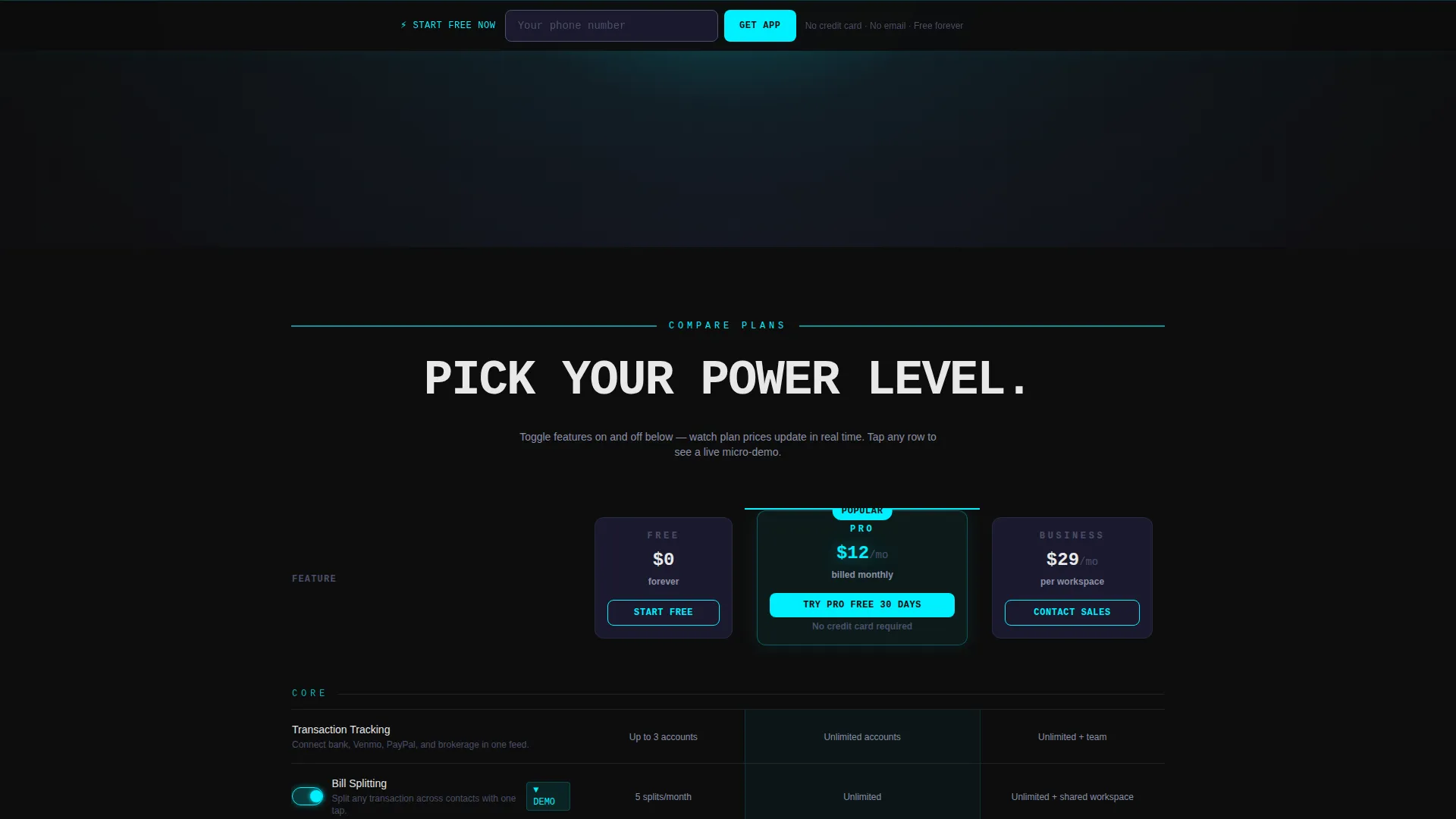
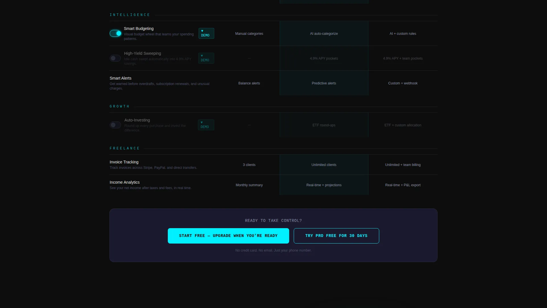
The comparison table is the core of the page. Visitors toggle features on and off and watch plan prices react in real time. Each row expands on tap to reveal a micro-demo, making the table an active product preview rather than a passive checklist.
Six Expandable Micro-Demos
Six feature rows inside the comparison table open into working mini-interactions. The budgeting row reveals a draggable budget wheel. The investing row shows a simulated portfolio you can rebalance by dragging allocation sliders. These demos let visitors touch the product before signing up.
One-Field SMS Signup Flow
The primary conversion form asks only for a phone number. One field, one tap, then an SMS download link. No email address, no password, no credit card required for the free tier or the 30-day Pro trial.
Sticky Conversion Bar
After a visitor scrolls past 60 percent of the page, a sticky bottom bar locks into place repeating the primary call to action. It maintains conversion pressure across all remaining sections without blocking content.
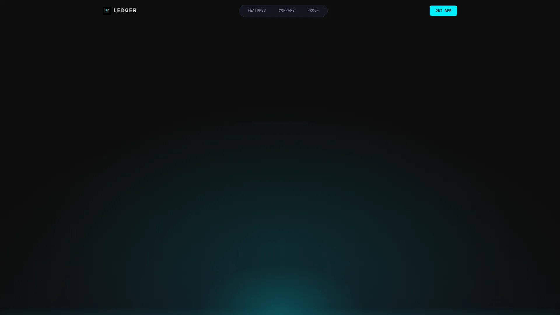
Dark Full-Bleed Hero with Glow Effect
The header is a full-bleed black canvas with a single phone floating at center. The screen displays a live-style dashboard showing a checking balance, a savings goal at 73 percent, two pending splits, and a micro-investment ticker. A soft cyan glow pulses once on load, then settles to a steady ambient halo.
Brutalist Section Dividers
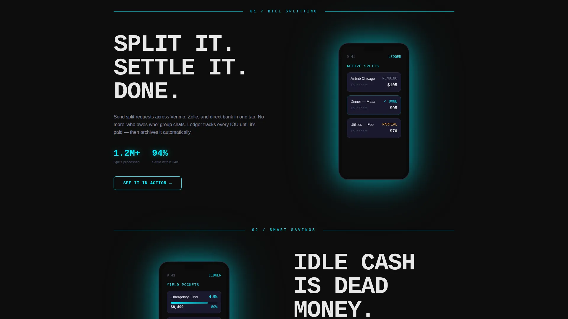
Each thematic content block below the comparison table opens with a thick horizontal rule and an oversized mono-caps feature name. A phone mockup follows, showing the relevant app screen with cyan interface elements against a black shell. The visual rhythm escalates from utility features to investment ambitions as the visitor scrolls.
Page sections overview
| Section | Purpose |
|---|---|
| Dark hero header | Establishes tone and anchors the floating phone mockup with a pulsing cyan glow |
| Hero headline block | Delivers the brutalist "YOUR MONEY. ONE NERVE CENTER." statement in mono type |
| Interactive comparison table | Lets visitors toggle features and pricing, expand micro-demos, and choose a conversion path |
| Bill splitting section | Introduces the splitting feature with a phone mockup and a brutalist section divider |
| Smart savings section | Showcases automated savings rules with a dedicated app screen mockup |
| Automated investing section | Escalates the pitch to portfolio allocation with a draggable simulation |
| Free tier call to action | Anchors "Start Free, Upgrade When You're Ready" at the base of the free column |
| Pro trial call to action | Highlights the 30-day no-credit-card Pro offer in full cyan glow |
| Sticky bottom bar | Reappears after 60 percent scroll to maintain conversion presence |
| SMS signup form | Captures phone number only and delivers a download link instantly |
Design & branding system
The visual identity follows a Bold Brutalist theme built on the Carbon Fiber color system. Black dominates every background with zero apology, while neon cyan is used sparingly so every glow carries meaning.
- Four-color palette: deep matte black (#0D0D0D) for backgrounds, woven graphite (#1A1A2E) for card surfaces and table rows, titanium mid-tone (#4A4E69) for body text and secondary labels, and reactive neon cyan (#00F0FF) reserved for hover states, toggle switches, active call-to-action borders, and the hero glow halo
- Typography uses brutalist mono type for headlines and section dividers, with oversized all-caps treatment on feature names to create visual authority without relying on imagery
- No lifestyle photography or human faces appear anywhere on the page; the visual language is entirely machine-led, using the phone mockup and its glowing screen as the sole emotional anchor
Mobile & speed optimization
The template is designed with a mobile-first layout because the product it promotes is a mobile app. Every interactive element is built to work on touch screens at the sizes real users carry.
- The comparison table is touch-responsive, with tap-to-expand micro-demo rows that open cleanly on small screens without horizontal scrolling
- The sticky bottom bar and the one-field SMS form are sized for thumb-tap accuracy, keeping the conversion path accessible on every screen size
- Phone mockups and glow effects are layered to remain visually coherent on both high-density mobile displays and standard desktop monitors
How this template helps you convert
Every layout decision in this template serves the freemium-to-paid conversion goal. The page earns trust through interaction before it asks for anything.
- The interactive comparison table and six micro-demos let visitors experience real product behavior, which builds confidence and reduces the uncertainty that typically causes drop-off before sign-up
- The one-field SMS form removes every conventional barrier: no email address, no password, no credit card, so the moment a visitor decides they want the app, nothing stands between that decision and the download link
- The sticky bottom bar maintains a visible conversion prompt across all scroll depths, ensuring the call to action is always one tap away without interrupting the content visitors are actively reading
Other information about this template
This template is categorized under Technology and sits within the Financial Services Software and Software as a Service subcategory, with a specific niche focus on financial services mobile apps. It is a strong starting point for any team building a freemium fintech product page.
- The template style is a Comparison Table layout, which makes it especially well-suited for products with tiered pricing or feature differentiation between a free and a paid plan
- The creative direction is Interactive Explorer, meaning the page is built around user interaction rather than passive content consumption
- The header concept is Dark Full-Bleed with Glow, a deliberate choice to signal premium product quality through restraint and atmosphere rather than loud visual noise
- The intersection match score for this template configuration is 13, indicating a strong alignment between the Bold Brutalist theme, Carbon Fiber color system, and the Financial Services Mobile App niche
Theme
Bold Brutalist
Creative direction
Interactive Explorer
Color system
Carbon Fiber
Style
Comparison Table
Direction
Freemium/Trial
Page Sections
Interactive Real-time Comparison Table
Six Working Micro-demos
One-field SMS Conversion Form
Sticky Bottom Conversion Bar
Dark Full-bleed Hero with Cyan Glow
Brutalist Section Dividers and Mockup Blocks
Related questions
Can I edit the comparison table columns and rows?
Does the template include the interactive micro-demos out of the box?
Do I need design experience to use this template?
Is the sticky bottom bar included as a built-in component?
Can this template support a different color scheme?



