Insurance Digital Presence Professional Website Template
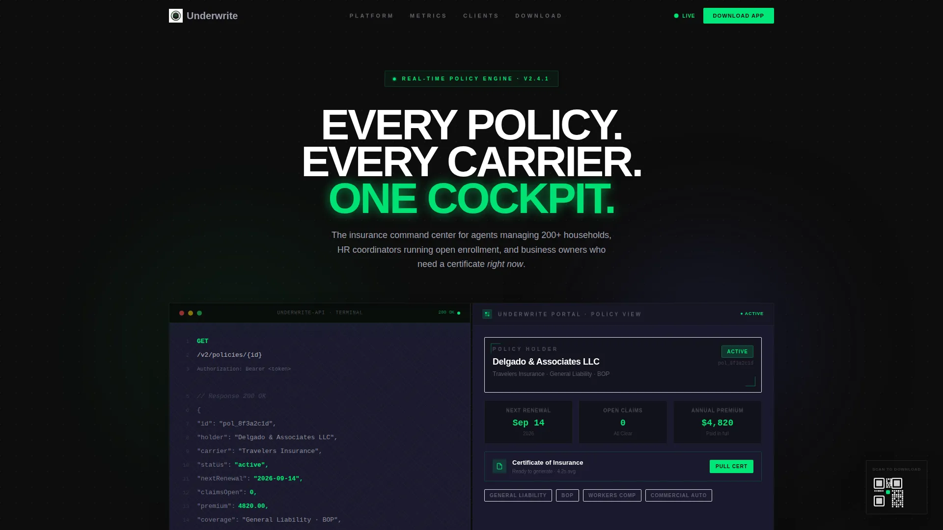
Underwrite is a split-screen insurance client portal landing page built on a Data Command theme. It targets independent agents, HR benefits coordinators, and small-business owners who need instant access to claims, renewals, and coverage documents. A Carbon Fiber color system, stats-first layout, and app-download call to action make every section feel engineered for speed and clarity.
by Rocket studio
Quick summary
Underwrite is a single-page insurance client portal landing page. It uses a 50/50 split-screen layout to show raw API data alongside a polished app interface. Signal green metrics hit before any explanation arrives. The page is built to drive app downloads from agents, coordinators, and small-business owners who need policy control at any hour.
Who this template is for
This template is built for insurance professionals and small-business owners who need a fast, credible digital front door for their client portal app. The audience already knows the problem. They need proof the solution is real.
- Independent agents managing large household books across multiple carriers
- HR benefits coordinators fielding open-enrollment questions outside business hours
- Small-business owners who need to pull a certificate of insurance on short notice
What problem this template solves
Policy management across multiple carriers creates constant friction. Documents live in email threads, deadlines get missed, and certificate requests stall entire contracts. This template makes the case that a well-built portal eliminates that friction entirely.
- Visitors leave without downloading because no proof of value appears early enough
- Stats buried below the fold fail to answer the unspoken question: will this actually save me time?
- A weak call to action loses mobile visitors before they reach the App Store or Google Play badge
What you get with this template
You get a complete, ready-to-customize insurance client portal landing page with a clear visual identity and a conversion-focused structure. Every section is pre-built to deliver proof before it asks for action.
- A 50/50 split-screen layout pairing live API code with a rendered dashboard card in the header
- Seven oversized stat blocks in signal green, each opening a feature section before any copy appears
- A primary app-download call to action with App Store and Google Play badges, a single-field email input, and a persistent QR code
Feature list
This template ships with a focused set of built-in components that work together to build trust and drive installs.
Stats-First Impact Layout
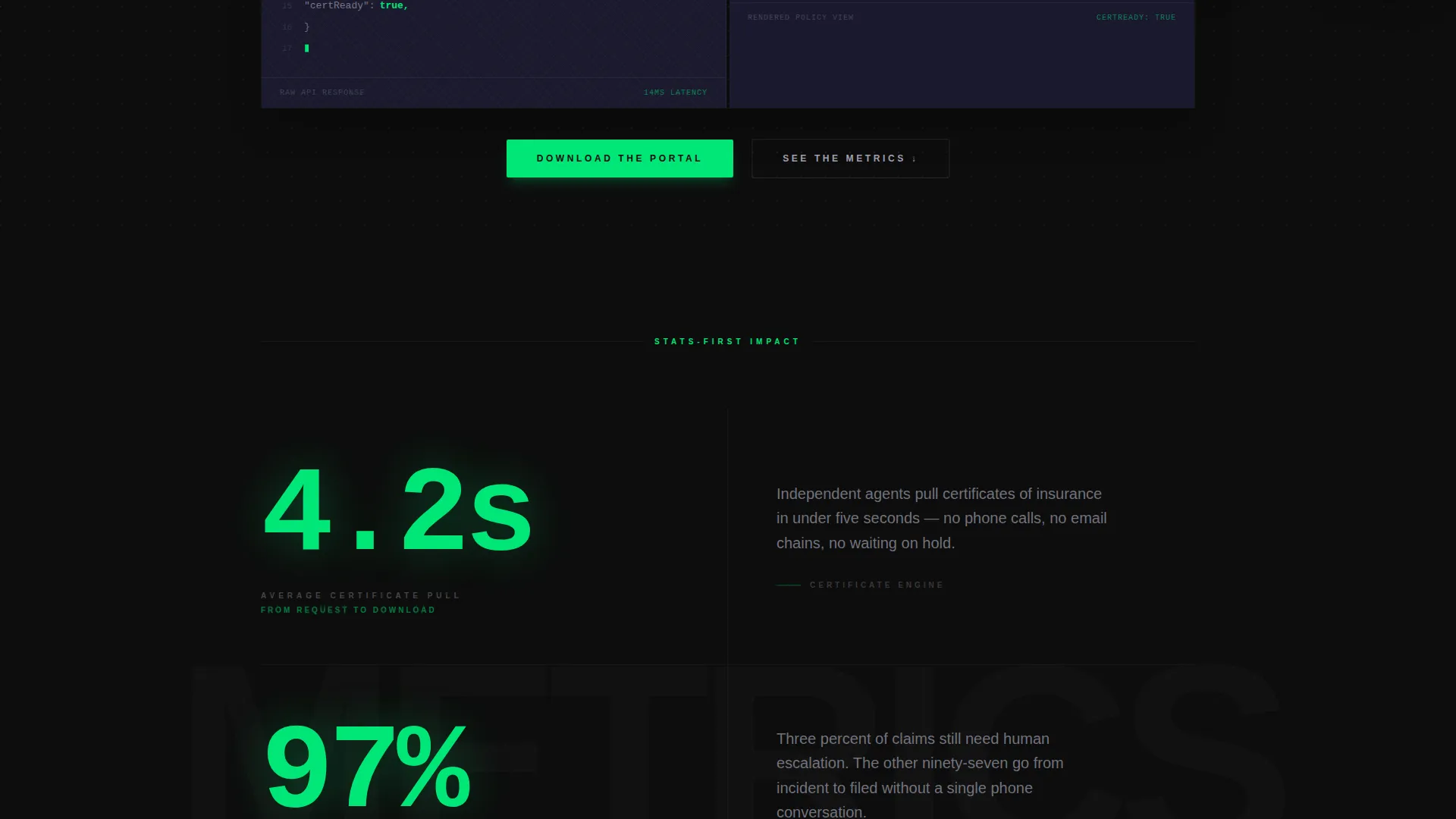
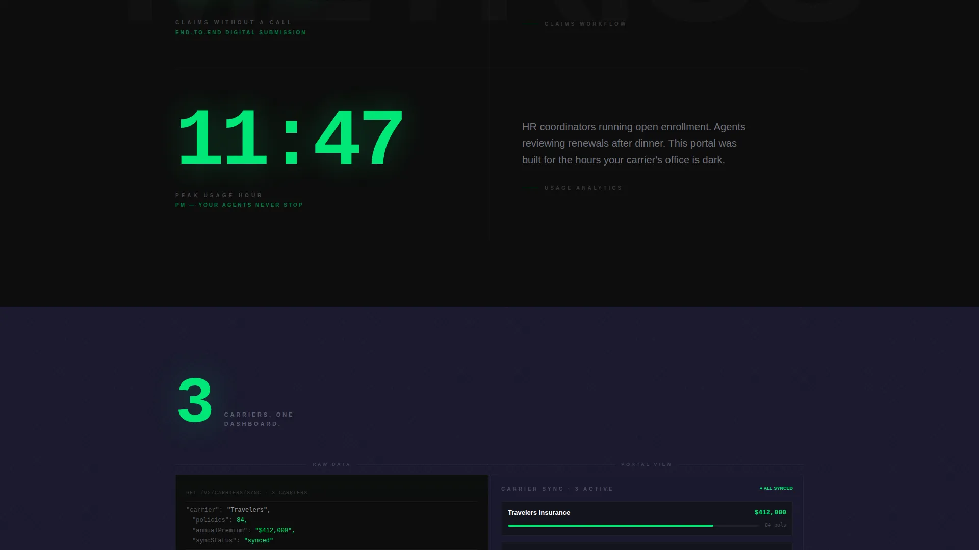
Each section opens with one oversized statistic rendered in signal green against cockpit black. The number is large enough to read from across a room. Only then does the split-screen reveal the feature behind it.
Split-Screen Code and Interface Pairing
The header divides the viewport in two. The left panel shows a syntax-highlighted API call fetching a policy object, with a JSON response displaying live fields in signal green. The right panel shows the exact rendered dashboard card that the same API call produces.
Progressive Metric Scroll
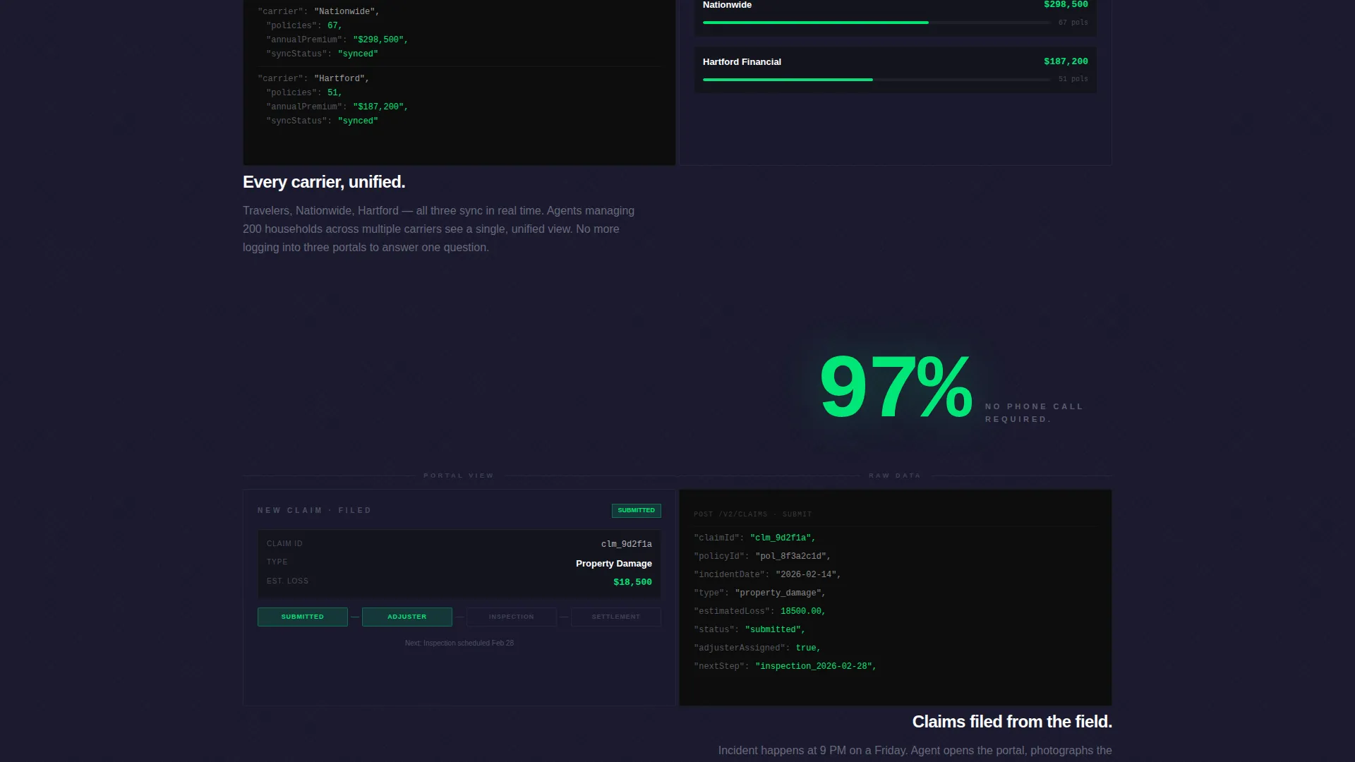
The page sequences seven real metrics and five live-app screenshots in a deliberate scroll order. Each metric builds the cumulative case that this portal eliminates paperwork rather than digitizing it.
App Download Call to Action Block
The primary call to action reads "Download the Portal" with App Store and Google Play badges centered beneath it. A single-field email input labeled "Or send yourself the link" captures desktop visitors who plan to install later.
Persistent QR Code Anchor
A secondary QR code floats in the bottom-right corner throughout the scroll. It stays visible without interrupting the reading flow, giving mobile visitors a direct install path at any moment.
Carbon Fiber Color System
Deep cockpit black, woven carbon gray, brushed titanium, and signal green form a consistent four-tone palette. Signal green is reserved exclusively for live-data accents and interactive states, so every highlighted number carries immediate visual meaning.
Page sections overview
| Section | Purpose |
|---|---|
| Split-screen header | Pairs API code with rendered dashboard card to establish engineering credibility |
| Stat block one | Opens with "4.2 seconds" average certificate pull time before feature reveal |
| Stat block two | Leads with "97%" claims-submitted-without-a-call metric before feature detail |
| Stat block three | Anchors "11:47 PM" peak login hour to surface the around-the-clock use case |
| Feature split rows | Alternating left-right panels showing raw data or architecture beside polished app screens |
| App download call to action | Primary download block with App Store badge, Google Play badge, and email input field |
| Persistent QR anchor | Floating bottom-right QR code for frictionless mobile install throughout the scroll |
Design & branding system
The visual identity follows a Data Command theme built on a Carbon Fiber color system. Every tone has a defined role, and signal green is never used decoratively.
- Backgrounds alternate between cockpit black (#0D0D0D) and woven carbon gray (#1A1A2E), creating depth without distraction
- Body text lives in brushed titanium (#A0A0B0), and every moving number, such as a claim status, premium amount, or renewal countdown, pulses in signal green (#00E676)
- The overall feel is lightweight, high-performance, and unmistakably engineered, like running a thumb across the textured weave of a carbon-fiber panel
Mobile & speed optimization
The app-download direction means mobile visitors are the primary audience. The template is structured to load key proof points fast and keep the install path visible at all times.
- The persistent QR code anchor remains in the bottom-right corner on scroll so mobile visitors always have a direct install path
- The single-field email input gives desktop visitors a low-friction fallback that does not require an immediate app store visit
- Section structure is front-loaded with stats and screenshots so visitors on slower connections see compelling proof before scrolling far
How this template helps you convert
The page earns the tap by building a cumulative evidence stack before asking for anything. Every design and copy decision serves the download goal.
- Seven oversized metrics hit in sequence, each answering a specific objection before the visitor can form it, so trust is built progressively through the scroll
- Five live-app screenshots alongside each feature section give visitors a concrete preview of what they are downloading, reducing install hesitation
- The three-path call to action block, covering App Store, Google Play, and an email link option, removes every possible friction point at the moment of highest intent
Other information about this template
This template works as a standalone landing page for a new portal launch or as a conversion page linked from an existing insurance agency website.
- The split-screen layout adapts naturally to a range of insurance niches, from personal lines to commercial coverage and employee benefits
- The stats-first creative direction is designed to work even when a visitor arrives with high skepticism, because proof comes before claims
- Builders can swap the placeholder API fields and dashboard card data to reflect real metrics from their own portal without restructuring any section
- The template is categorized under Technology with an Insurance Digital Presence subcategory, making it suitable for insurtech product teams as well as independent agencies
Theme
Data Command
Creative direction
Stats-First Impact
Color system
Carbon Fiber
Style
Split Screen (50/50)
Direction
App Download
Page Sections
Stats-first Section Openings
Split-screen Code and Interface Header
Progressive Metric and Screenshot Scroll
Three-path App Download Block
Persistent Floating QR Code
Carbon Fiber Four-tone Palette
Related questions
Who is this landing page template designed for?
Can I customize the metrics and app screenshots?
Does this template include app store link placements?
What makes the split-screen header different from a standard hero?
How does the persistent QR code work on this page?



